Introduction
In this lab, we were tasked with creating visualizations using RStudio and the programming language, R. R is a very popular information visualization programming tool that is used to create all kinds of visualizations and allow for in-depth data manipulation and cleaning. Using R, I decided to create visualizations based on a kaggle.com dataset that featured all NHL draft player data from 1963.
As a big fan of ice hockey, it will be interesting to see the different strategies used by NHL teams of different rankings during the NHL Draft. When it comes to hockey, each player is essential to the team’s success, and what positions the team decides to focus on can give insight into what the team wants to strengthen and focus on for the next year. With the use of R, we will look at the average standing of NHL Teams, and what positions certain teams decided to focus on throughout the years of the NHL Draft.
Materials and Methodology
There were three main materials used for this lab:
Before using R, it was important to find a data source that could be used. Through Kaggle.com, I found a large dataset titled, “NHL Draft Hockey Player Data (1963-2022)” by Matt OP. It was recently updated three months ago, and the user has created various other sports-themed datasets, which made it feel like a safe option to use for this project.
After inputting the data into RStudio, I started creating subsets of useful information from the main data frame that could be used to create visualizations. In order to create the subsets and visualizations, I had to import the “tidyverse”, “rmarkdown”, and “flexdashboard”, which allowed me to use different libraries to achieve results. Despite having some initial difficulties, by the end I was able to create four different usable subsets, but only created visualizations from three of them.
Results
In my first attempt to create a visualization, I took all NHL teams listed in the dataset and measured them against their average overall draft pick. When it comes to the draft, the larger the overall average pick number, the better the team is doing. Below is the visualization:

From the graph, we can see that Tampa Bay Lightning has the highest average Draft Pick Number, meaning that they typically do well in the season. The worst, currently active team are the Anaheim Ducks. The teams that are mentioned below the Anaheim Ducks are teams that either no longer exist, or ran for less than 10 years. It is interesting to mention though that the Cleveland Barons ran for 9 years while the Oakland Seals ran for 20 years, and the Barons still managed to have a higher average draft pick than the Seals.
After making this initial graph, I wanted to see how teams at different levels of success picked different positions during the draft, and how their strategy may have changed over the years. Despite seeming like a small task, creating the dataframe subset and visualizations for this particular part were quite difficult. To create the final subset used for the visualizations, I first created a subset that took the team, year, and the number of the specific positions they drafted each year as columns. To my surprise, there were many more columns than just the five main positions: center, right-wing, left-wing, defense, and goalie. The other columns featured variations of those position names, which I figured out how to remove. This possibly led to slightly skewed data, but the data within each removed column was negligible.
After creating this, I realized it may be too much information to visualize, so I decided to take the highest performing team, lowest performing team, and a midrange team, as well as make the year range 2001-2022. Those teams were the Tampa Bay Lightning, the New Jersey Devils, and the Anaheim Ducks. I created another subset that took the information from those teams only to visualize. Here are the results, with a main focus on the center, defense, and goalie position.


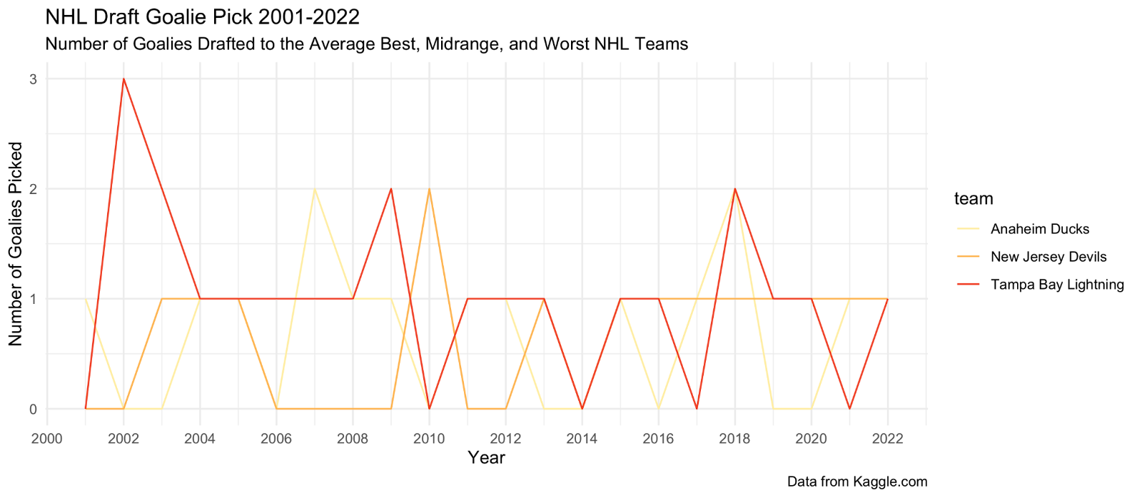
After creating the graphs, I added a color scheme that was representative of the team’s standing, red being the best ranked and yellow being the lowest ranked. Additionally, I changed the x-axis scale and separated the points a little more to make it more readable.
I definitely was expecting to find a little more when comparing the charts against one another, as well as against the different teams. But, there were some interesting findings. The lowest ranking team, the Anaheim Ducks, have focused more attention on drafting more defensemen than centermen, possibly in an attempt to play defensively if they are not strong enough as a team to be offensive and score multiple goals throughout the game. Surprisingly, their draft picks for goalies are very similar to the TB Lightning, which begs the question of whether they should be focusing more on good goaltenders if they are planning on playing defensively.
The New Jersey Devils were chosen as a mid-range team because of their average ranking, and they just so happen to be my favorite team (Go Devils!). Since I do have prior knowledge of the Devils and how they play, it pleased me to see that they are focusing their attention on creating a stronger defensive line up. In the past, their defensive line has proven themselves to be weaker, with many goals getting past them with little effort from the other team. Similar to the Anaheim Ducks, the Devils should focus on getting a stronger goalie line up as well, due to past complications and injuries with the goalies they have playing and on deck.
Lastly, after taking a look at the highest performing team, the Tampa Bay Lightning only had two draft picks this year, one being a defenseman and one being a goalie. In recent years, they focused more specifically on choosing centers as opposed to the two other teams, considering they acquired 10 centermen since 2018. This could be due to their strength as a team, and will allow them to train their centers to be valuable and strong players for future years.
Reflection
Initially, this task seemed very exciting and daunting at the same time. I ran into quite a few issues in R, ranging from the problem being caused by my lack of experience with the platform or a syntax error that caused me to lose data. Additionally, there were many times where I had to restructure subsets to achieve proper visualizations, since those who viewed my initial graphs were confused by the format. As one typically feels when it comes to coding, there were many times I felt stuck or could not come up with a solution to get to my desired result. In the end, I was able to create graphs that were reasonably similar to what I was intending to make at the beginning of this lab. While these graphs to me are informative, they may be difficult for those who do not know the rules of hockey or the NHL Draft. In the future, I hope to create graphs that are more universally understandable and readable. As I gain more experience with R and RStudio, I am interested to see what other types of visualizations I can create, considering the possibilities are quite extensive.
References
Chang, Winston. n.d. “R Graphics Cookbook, 2nd edition.” R Graphics Cookbook, 2nd edition. Accessed October 26, 2022. https://r-graphics.org/.
Holtz, Yan. n.d. “The R Graph Gallery.” The R Graph Gallery – Help and inspiration for R charts. Accessed October 25, 2022. https://r-graph-gallery.com/.
Op, Matt. 2022. “NHL Draft Hockey Player Data (1963 – 2022).” Kaggle. https://www.kaggle.com/datasets/mattop/nhl-draft-hockey-player-data-1963-2022.
RStudio. n.d. “RStudio Cheatsheets.” RStudio. Accessed October 25, 2022. https://www.rstudio.com/resources/cheatsheets/.