Introduction
The pie chart and its related visualizations are controversial, and, despite its many criticisms in readability and statistical accuracy, they are still a prevalent visualization technique. Pie charts have paved the way for other circular graphs like ring charts, sunburst charts, and multi-level pie charts, which are graphically striking, but I personally find them challenging to decipher at first glance. Only after a thorough reading of the visualization does it begin to gain clarity, but I am still often left with lingering questions on how the data is displayed and what it all means. If they are so flawed, why do we still use them consistently and how did we get here? This timeline traces a brief history of the pie chart and the discourse surrounding its evolution.

Materials
This timeline was created using TimelineJS, which is an open-source tool developed by Northwestern University Knight Lab. A Google Sheets template is provided with clearly defined fields for users to input and customize with text and various media sources, including images and videos. The fields are linked to the TimelineJS tool, and once the sheet is published to the web and referenced within the tool it will quickly update to reflect changes to the google sheet.

The primary source for the research in this brief timeline is “Why humans love pie charts: A historical and evolutionary perspective” by Manuel Lima, design lead at Google. Lima provides a comprehensive history of pie charts, criticisms and defebse of the visualization, and discusses the significance circular graphics have across many cultures to justify their continued use. I cross-referenced this information through The History of Infographics, Wikipedia, and Infogram.

Methods & Process
The selection process for the milestones in this brief timeline was straightforward and aims to illustrate the graphic and thematic evolution of the pie chart. At the title slide I chose to adjust the default zoom of the timeline to 0 in order to display more of the extents of the entire timeline since the first year included is in the 1800s and a majority of the timeline would be cut off. This choice allows me to highlight that most of the milestones included are more recent.
Slides 1 – 3: History
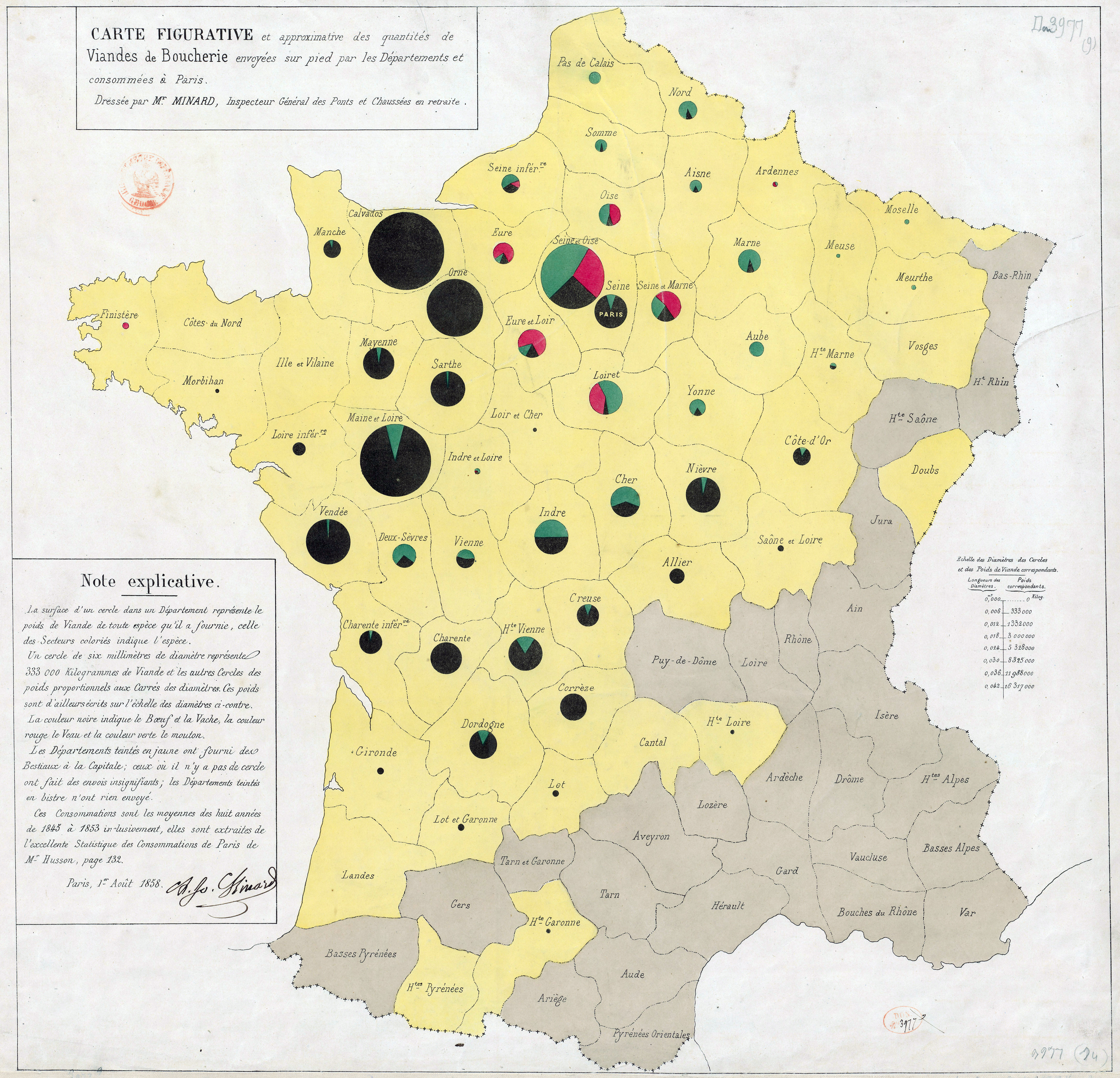
The first three slides (shown below) include first instances of the pie chart in unique variations from the 17th Century. It was important to show these diagrams in its whole, as opposed to displaying it as the background image, since the point of displaying imformation in a pie chart is to easily see relationships as parts to a whole at first glance. While using this media as the background image is zoomed in, allowing users to more easily read the labels, it also crops the image so users are unable to read all of the labels. each of these diagrams. I chose to include background images to complement these diagrams by selecting images of other works from the author or an image that provides context to the time period. It was important to select images that provide visual intrerest, but also would not distract from the main image or the supplemental text.


Slides 4- 5: Discourse
The next two slides (shown below) provide a brief summary of criticisms and defense of the pie chart throughout the 20th Century. Instead of using background images for these diagrams, I chose to use solid colors generally associated to the topic discussed, a dark grey for criticisms in slide 4 and white for defenses in slide 5. While the start years are approximations from the articles I read, I could not input “Present” as the end year so I chose to use 2022 as the year of creating this timeline to help illustrate that the criticisms and defense of the effective use of pie charts is still an on-going debate. The intent is to help users visualize the current year within this timline, which is not only helpful in providing perspective of the past, but also where more recent research in the next two slides falls in relation.

Diagram from “Willard C. Brington’s “Graphic Methods for Presenting Facts”

Diagrams from Walter Crosby Eells’ article “The Relative Merits of Circles and Bars for Representing Component Parts” comparing participants’ perception of segments in pie charts versus bar graphs
Slides 6 – 7: Evolution & Future
Slides 6 and 7 (shown below) provide information on recent research into the cognitive perception of pie charts and radial forms, as well as a look into newer permutations of the pie chart in radial visualizations. In these slides, I chose to use main images as well as background images that add visual interest to the theme discussed, but also complementary in providing context to the theme. For example, the main image in slide 6 is a diagram from Mark Changizi’s “The Vision Revolution” and the background image is the cover of his book.


Reflections
Using TimelineJS was straightforward and I found it fairly easy to create an effective timeline using this tool. While most of my time spent was on doing research and writing concise text for this topic, I still found myself spending a considerable amount of time on selecting and formatting images, even though the formatting options were limited. If I did this exercise again, I would spend more time finding additional milestones and expanding on subsets of pie charts, with criticism and defense slides for each of those iterations. Considering how recent Changizi’s cognitive research on the human perception of circular forms is, it would be interesting to see if and how criticisms and justification of using circular graphs continue to evolve. I think I would also spend time formatting things more precisely with html in TimelineJS to make it a more dynamic resource with in-text links.