Introduction
For my final project, I wanted to work on a soccer dataset. I am an avid fan, when it comes to soccer (i.e Football) and I follow English football on a regular basis. My aim was to create a visualization that could describe a whole soccer competition in just one page. Initially, I planned to start with the Football World Cup 2018, but soon I had to drop that idea because just one team had qualified till now. One of the major competition that was held recently, was Euro 2016 and I decided to go with that for my project. Euro is the second most popular competition after the World Cup, where countries from the European continent compete every four years to lift the title. In 2016, Portugal were crowned European Champions after they defeated France 1-0 in the finals.

(Credit LIONEL BONAVENTURE/AFP/Getty Images)
My hope was to get insights into:
- How every team performed in the competition?
- How many goals did they score and concede?
- What were their possession stats?
- How did Portugal win the competition (i.e road to victory)?
- Can a person who does not watch soccer regularly, understand this?
Inspiration
Eventually, I wanted to create a story which could take the user through the whole competition. For inspiration, I looked at a few examples online. The first visualization shows the big picture of the Fifa under-17 World Cup, which includes the teams involved, their first kits, their best place from the previous cups, how many World Cups they were involved in, their coaches and the players to look out for. I really liked the layout (semi-circle) just how it describes all the details one after another- packing all the information in one picture. I also like the different colors that are used based on their kits to differentiate team details, this makes it visually appealing.

Figure 1
The next visualization I looked at was a dashboard which described the performance of every team, it covered different statistics like win/loss, attack, passes, clearances and attempts. I liked how this combined all the stats to give a holistic picture. I built mine based on this visualization because it resonated with what I was able to make on tableau.

Figure 2
While searching for my third example, I was looking for a visualization that described information to the user as if telling some sort of a story. I found this infographic, which showed information in that way. This is image created on Photoshop or Illustrator and obviously this can’t be created using any visualization software that I use but it does a good job of telling a story.
Methodology
On searching, I found out that there was no specific dataset available for this project, hence I collected all the data from Wikipedia, UEFA Euro 2016’s website and SkySports website. I then transferred all this data into excel and started making separate spreadsheet for all the things that I wanted to analyze. These spreadsheets were then saved as .CSV files for easy access in Tableau Public. The whole project is made in Tableau Public because it was very convenient to make a dashboard on it and was the perfect software to analyze and visualize data.
The first spreadsheet I made was of all the previous winners. To develop a story, I wanted to show some history of the competition- which countries have won the cup in the past and how many times. I got the data from Wikipedia and after working on it in Excel, transferred it to Tableau to build this visualization. I used circles with different sizes to represent the countries and how times they have won the cup. Basically, I got idea from an image that I had seen which showed trophy to represent a country and a number on it to represent the number of times it has won the cup. Next, I added colors to make it look differentiable.

Next, I wanted to show the countries that were participating in the competition. I wanted make it interactive and bit attractive, so I thought about using Carto to represent the countries on a world map but soon realized that it could be done on Tableau too. It was quite easy, Tableau picked up the country’s name and automatically mapped it on the world map by generating the latitude and longitude. I also added colors and hover feature to it- which showed the country’s name while hovering over it.

I then added the group stage points table. To begin with, I only had the final points and groups with me so I looked at the scores and made a spreadsheet on excel which included win, loss, draw and the points for all the countries in different groups. After transferring it to Tableau, I thought the best way to show it would be in a table format where people could look at it and understand how each country performed and got to the next (Round of 16) stage.

Next, I wanted add some statistics for the whole competition so that one could analyze each country’s performance in terms of wins, losses and draws. I also added a statistics for how many goals each team scored per game and how many they conceded per game, this statistics tells you about team’s attacking and defending capability. To find out more about each country’s ball possession during the game, I included the possession stats as well. Further, I also included the discipline stats as to how many red and yellow cards each team got during the competition. For all the statistics I made bar chart because I thought it would be the best way for people to interpret things (also the example which I used for reference used bar chart). I did not give any color to these bar charts to avoid confusion. Also, it was important to add the scores of round of 16, quarters, semis and final to form that story and tell what happened.


Usability Test
Although, at this point my visualization was still not complete, I decided to go forward with my usability testing. I felt this was the right time to conduct a usability test with participants, so that I could get an idea as to whether people are making sense of this visualization or not. Also, what other statistics or things I was missing in the visualization. For participants, I wanted to recruit two kinds- the people who followed soccer (they could tell me what I was missing) and the ones who didn’t (they could let me know whether the visualization was comprehensible or not).
Method
It was informal user testing, where participants first asked certain questions and later assigned some tasks while thinking aloud. The test was conducted on my laptop and I was sitting next to them and taking notes. There were total of four tests conducted, where two people had soccer knowledge while the other two didn’t.
Questions involved were:
- Have you watched any soccer match before?
- Do you understand the game properly?
- Have you any idea about the terminology that is involved in it?
Tasks:
- Using data right from the beginning of the visualization, can you describe its road to victory (tell me how Portugal won the Cup).
- What was the possession % difference between Croatia and France?
- Which country conceded the least number of goals?
- How many red and yellow cards did Germany receive during the competition?
Findings
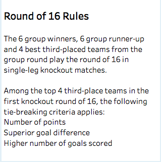
Include rules in the visualization: Only one person was able to complete all the tasks, this person was into soccer and followed it regularly. Rest three had problem completing first task itself. Portugal actually finished third in the group stage and still won the Euro Cup. When people saw Portugal third on the table, they did not get how the country qualified for the Round of 16. This was the problem, usually top two teams qualify but in this case there were 6 groups and the next required 16 teams, so the top 4 third place teams also qualified. Hence, I needed to include these rules in visualization for people to understand how Portugal even qualified for the next round.
Participants were somehow able to complete next 3 tasks.
Don’t use abbreviations: Those who weren’t into soccer did not understand abbreviations and demanded full forms. I then changed all the abbreviations to its full form.
Include filter options or numbers in the bar chart: While comparing, participants demanded some filter options and said if number were written on bars, it would have been more easier to compare.
More Visuals: Participants also suggested to include more visuals in the visualization, something about players and to use bigger screen while showing visualizations. To implement this, I added the Golden Boot winner with some goal and assist stats. Next, I also changed the discipline statistics from bar chart to side by side circles.


Final Visualization: https://public.tableau.com/views/Euro_2016_5/Dashboard1?:embed=y&:display_count=yes
Future Directions
With the visualization I was able to get all the statistical information for Euro 2016 like how the team performed in terms of win, loss, draw and possession, how many goals they scored and conceded, how Portugal from being at third position in the group stages won the finals. With usability test, I also got to know what people could make of my visualization. For future, I want explore other statistics as well and use other softwares like Gephi to create visualization about the players competing in the Euros but are connected by the same clubs. I also look forward to create an infographic on photoshop or illustrator, which would make this story look better visually.