Introduction
Coming to the end of 2019, my graduation from the IXD program is close. I’m very interested in working as a UX designer after graduation and it will be exciting to get a job here. Besides preparing myself for future job searching, I would like to do some research on the job market. For example, the average working hours and the regular paid in big cities, especially in New York, could be helpful to me.
My target readers could be new graduates who are interested in the payment condition, and working professionals who want to learn more about the job market. For me and my target readers, I’m going to visualize the working hours, the hourly paid and total paid in my final project. I will also try to find how these dimensions change over different fiscal years.
Inspiration
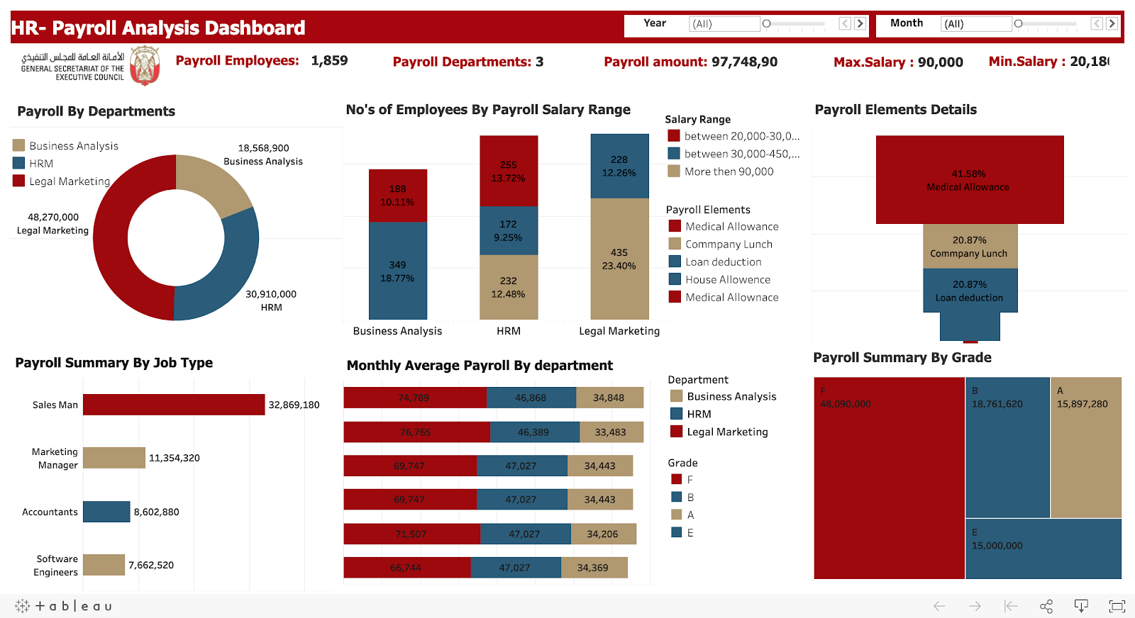
I got many impressive inspirations on the payment analysis. This is one of the projects I found on Tableau Public. This is a clear and informative dashboard visualizing the payroll data. I’m also going to use bar charts and line charts to illustrate my topic.
Tool & Dataset
NYC Open Data. A website giving the public access to thousands of public datasets, which helps people learn about New York.
– Citywide Payroll Data (Fiscal Year). This dataset is about salary and overtime payment of municipal employees. It aims to analyze how the city budgets have been used for payment. It could be also helpful for me to visualize the job market condition. The dataset is based on fiscal years and it was updated on Nov 25, 2019, which should include the entire 2019 fiscal year.
Tableau Public 2019.2. It’s a free data visualization tool with both the online version and desktop version.
Process & Result
Get prepared
First of all, I went over each column of the dataset and got a basic understanding of it. There are 17 columns of it, including fiscal years, regular hours, gross paid, etc.

There are 3.33 million rows in the dataset, which could be hard to operate. I decided to use Openrefine to sort the data that I want to use the most. The dataset contains payroll records from 2014 through 2019, with the working location of New York City and other cities. It also includes the employees who are ceased as of June 30. I would like to work on the records with activity employees during 2019. But it turned out that the size of the dataset was too large for Openrefine as well. Then I decided to work with Tableau Public only.
Working hours
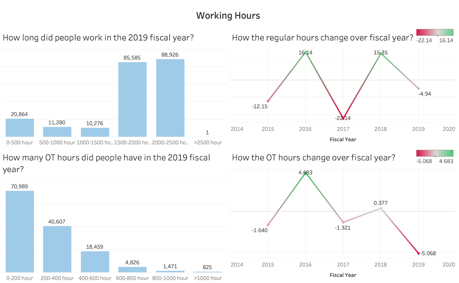
I’m interested in regular working hours and overtime hours in big cities and I decided to work on it first. I went through the minimal and maximum regular hours and decided to make a group of every 500 hours. Then I got groups of “<0”, “0-500”, “500-1000”, “1000-1500”, “1500-2000”, “2000-2500” and “>2500”. Since the negative values are not helpful in illustrating the whole picture of working conditions, so I excluded them. Next, I counted the number of people that fall into the groups by using calculating fields. I also filtered the active status and fiscal year to make sure I got the data only about active employees in 2019. Then I did the same thing for OT hours in 2019. I made groups of every 200 hours and got a graph of it. Since I’m going to create graphs about money, time and population, I think it could be helpful to assign different colors to different categories. I assigned blue to hours, green to payment and yellow to population.
Moving forward, I’m interested in how the hours may change through different years. Therefore, I made two graphs showing the difference in average working and OT hours through each fiscal year. I eliminated negative values with the filter. For the color, I used green to represent the increase compared to the previous year and red to represent the decrease.
Hourly Paid
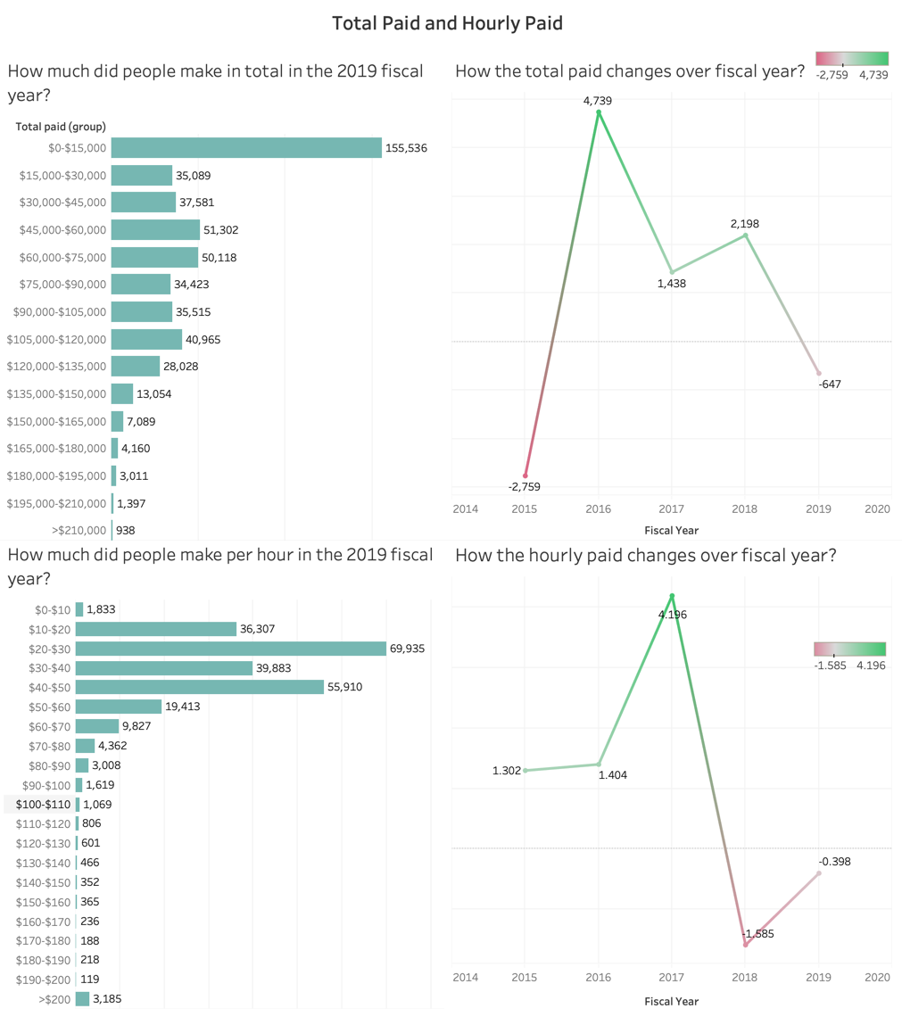
There is a base salary that could be useful to analyze the payment condition, but I found that there are different types of pay basis, such as by day and by annum. Then I decided to calculate the hourly paid by dividing the regular gross paid with the regular hours. This could be accurate to illustrate the difference in salary. The hourly paid ranges from 0 to 57,113.7, which could be hard to group. Before making a decision, I calculated the average and the median of the hourly paid, and they were around 30-40. I think it could be reasonable to group them by every 10 dollars and make the last group to cover the amount larger than 200. I excluded the negative groups since it did not make much sense to the analysis.
Moving forward, I made the calculated field to count the number of people that fall in the corresponding range. Same as the working hours, I also filtered the data by the active status and fiscal year.
I’m also interested in how it might change from 2014 to 2019. I created a graph on how the average hourly paid changed through fiscal years and eliminated the negative values. Like the working hours, I applied the same color palette to it.
Total Paid
While hourly-paid is helpful to illustrate the regular payment, the total payment could be helpful to figure out how much money can an employee get. I combined the regular paid, total OT paid and total other paid to get a total paid. I grouped them by every 1,500 dollars to have a reasonable number of groups and display the general payment condition as well. Likewise, I also eliminated the negative values and filtered them into active employees in the 2019 fiscal year. In order to track the changes in total paid, I created a graph as I did with the working hours and hourly paid.
Different Boroughs
As one of my users suggested, I created a graph about how many employees are there in each borough in the 2019 fiscal year. To make it more informative, I also created a graph about the average total paid, hourly paid and regular hours by different boroughs in 2019 and deliver a storyboard. Same as the previous graphs, I filtered the data to get positive values of active workers in the 2019 fiscal year.

Further thoughts
I was very interested in making more investigation into the career fields. I planned to group the job titles into general career fields and see which field gets the highest-paid. However, when I went through all the job titles, I found out that it’s hard to group them manually since there are hundreds of them. If there is a column of industry, it could be more interesting. Then I tried different ways to visualize the relationship between the payment and career field, such as the top paid jobs in all the boroughs. But unfortunately, there is no perfect way to do so.
UX Research & Findings
To recruit proper users for the UX research, I prepared some screening questions for them. I would find out some working professionals who are interested in payroll information and have the idea of the general payment situation of their working boroughs. I found two users who are my potential readers. One of them is working at the Pratt Library and another one in College.
To begin with, I introduced my topic and showed my dashboards in detail. I asked my users if they have some questions about the graphs, either about the visualization or the result. Additionally, what other angles they were interested in that were not included so far.
I also got great feedback from professor Sula and my classmates. I made more iterations based on those suggestions and feedback, which are as followed:
- Be more specific about the topic of the project. When I tried to walk my first users through my project, he got confused about it because my topic was too general. When talking to other users, I made it more specific saying my topic is about the working hours and payment condition of municipal employees. It was more easy to understand.
- It would be great if there could be an analysis of gender. Gender equality has been a hot topic for many years, but as far as I’m concerned, there is still a large difference in payment for different genders. If I’m a reader of the graph, I would like to learn more about it.
- One reader was interested in how many employees are there in different boroughs, therefore I created a graph about that. When compared with the average paid by boroughs, I got more exciting findings.
- Try to make a whole story with a single dashboard. It would be more helpful to combine worksheets that are related to each other in one dashboard. In this way, readers can tell a complete story of it. Since my worksheet covers many different aspects, the way I group them is important for readers to understand. In my final edition, I grouped worksheets by categories to make them easier to understand.
- If two graphs have the same categories on the same axis, it could be helpful to place those categories in the same order. In Fig 4, I sorted the x-axis by the amount at first. But it might take more time for readers to sort it out themselves. Therefore, I used the same order for the x-axis to make it more intuitive.
- Using the same color palette for the same category might be more instinctive and clear. At first, I assigned different color palettes for changes in working hours and paid. It might bring confusion to readers. Therefore, I make them consistent using red and green only.
- Using descriptive titles could help readers better understand my graphs. Since my dashboards contain many different categories of worksheets, it could take some time for readers to follow the story. In this case, I adjusted the titles to question format so that readers could understand them more easily.
Analysis
Fig 3 is helpful in analyzing the working hours. We can find out that most of the municipal workers are working from 1500 hours to 2500 hours, which could be placed within a normal working-hour range. The OT hours are also reasonable, considering that most of the employees worked overtime less than 400 hours. Another interesting finding is that the trends of how the working and OT hours change are quite similar. When compared with the trend of the changes in hourly paid(in Fig 4), it could explain itself to some extent. The decrease in regular hours might be related to an increase in the hourly paid.
Fig 4 shows an overview of the payment condition. I think there is a large gap in the total income. Lots of employees made less than $15,000/year. Although there are only 938 people who earned more than $21,000, the top payment actually runs to $672,000. Same finding from the hourly paid graph. A large number of people get $20-$50 per hour when there are over 3,000 people who earn over $210 an hour. The top hourly-paid is around $57,000. The changes in the total income have a close trend to the changes in regular hours, except for the change from 2016 to 2017. The reason could be a large increase in hourly paid, which keeps the total paid increase from the previous year.
From Fig 5, we can find out that although Manhattan has the most employees in the 2019 fiscal year, the average total paid in the lowest among all the boroughs, and the hourly paid is the highest. It’s an interesting finding. Maybe the reason behind might be found from the fourth graph in this dashboard. Employees in Manhattan has the lowest working hours, which could lead to the lowest total pay. The high hourly-paid might also be attractive, that’s why there are so many employees here.
Reflections
First of all, choosing a proper dataset is quite important. I’m very excited when I first found out the dataset because it interested me a lot. I noticed a large number of rows it got, but I didn’t pay much attention to it until Tableau Public usually got stuck when processing. Whenever I tried to save the workbook to Tableau Public, it just showed an error. I spend a lot of time waiting for it to compute. If I had a chance to do it again, I would deal with a smaller dataset and save some time.
I once got stuck on what aspects can I take to analyze the dataset. Then I decided to talk to people and do UX research and get more inspirations. I found it a really great way of dipping further into the topic and making iterations based on the feedback. I didn’t plan to analyze the number of people in different boroughs first. However, during one of my UX research, I was suggested to create a graph about it. I found it a good complement to analyzing other graphs. I think talking to other people is helpful for me to get more inspirations and make further research.