Introduction
Rivalries and wars were born along with humanity. Human deprives resources of the outside, from the environment or from others in order to maintain their own survivals. And wars are the critical presentation of such a need. Thus, the history of humanity is actually a history of wars: the rise and falls of tribes, kingdoms, and nations, are all closely related to wars, small and big ones.
However, as each individual, there is nothing more disastrous than wars. It is an old Chinese saying that no matter a kingdom is rising or falling, it is always the people who suffer. Despite the infinitely many lives lost in wars, those who survive will inevitably take the burden of reconstructing. And there is no easy life for anyone.
Such a situation does not get any better as the technology evolves and social structure develops. Greater and greater technology enables the greater and greater destruction war can bring to the world, which eventually transferred to those poor working labors. This makes me wonder if wars and conflicts are inevitable, what are the issues addressed the most in peace agreements and whether peace agreements can better facilitate the life of ordinary people.
This study, after briefly introduces the development of weapons and wars, focuses on the peace agreements which concludes the war. The major component of such a study built upon a dataset of all the peace agreements signed since 1990. Through data analysis, text analysis and data visualization, I intend to look into and present the topics that are mostly addressed in peace agreements and discuss the living situations of the top twenty countries that suffered the most from wars.
Findings
-Type of wars
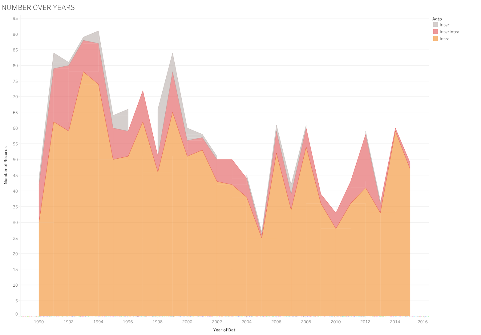
Through observing this graph on types of agreements signed post-1990, it is not hard to figure out that most wars happened in these two decades was intrastate wars. There are some wars that are both intrastate and interstates, where the war in Seria is a typical example where supernations participate in the intrastate wars of other nations, competing for their own benefits.
Purpose of wars

Through this graph on the cause of wars, it can be told that the majority of wars are related to governance. There are only a few wars for territory specifically.


-Result of Wars
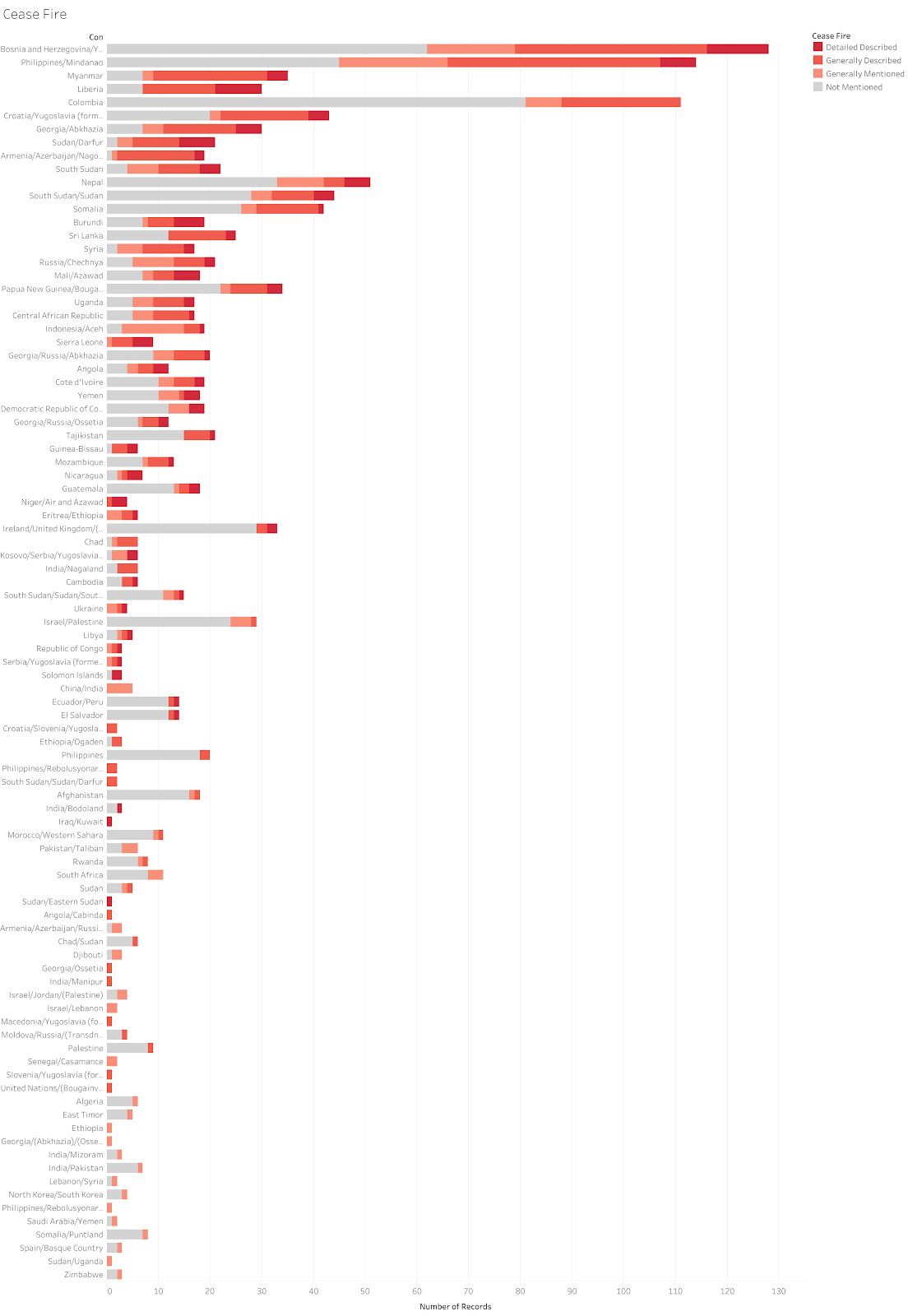
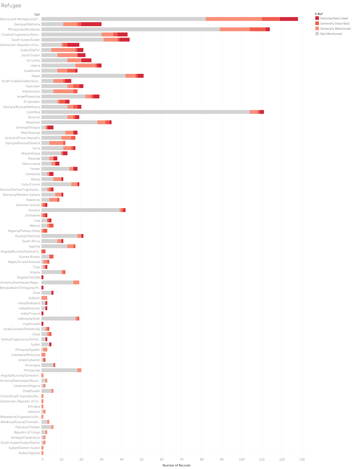
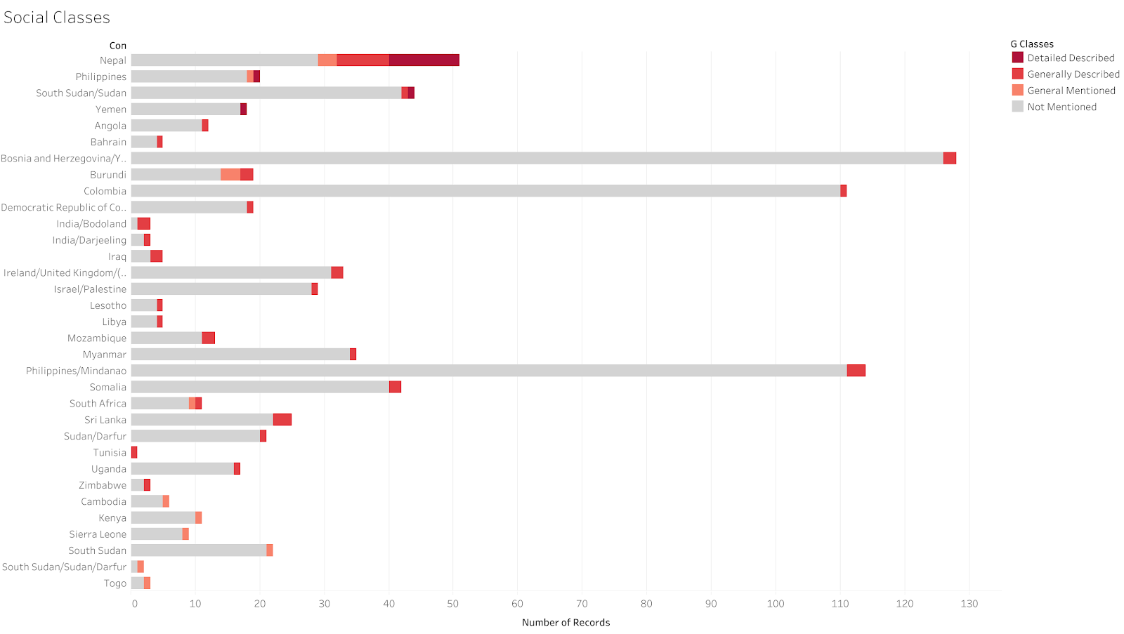
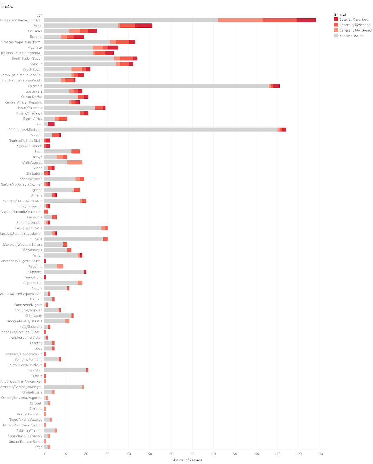
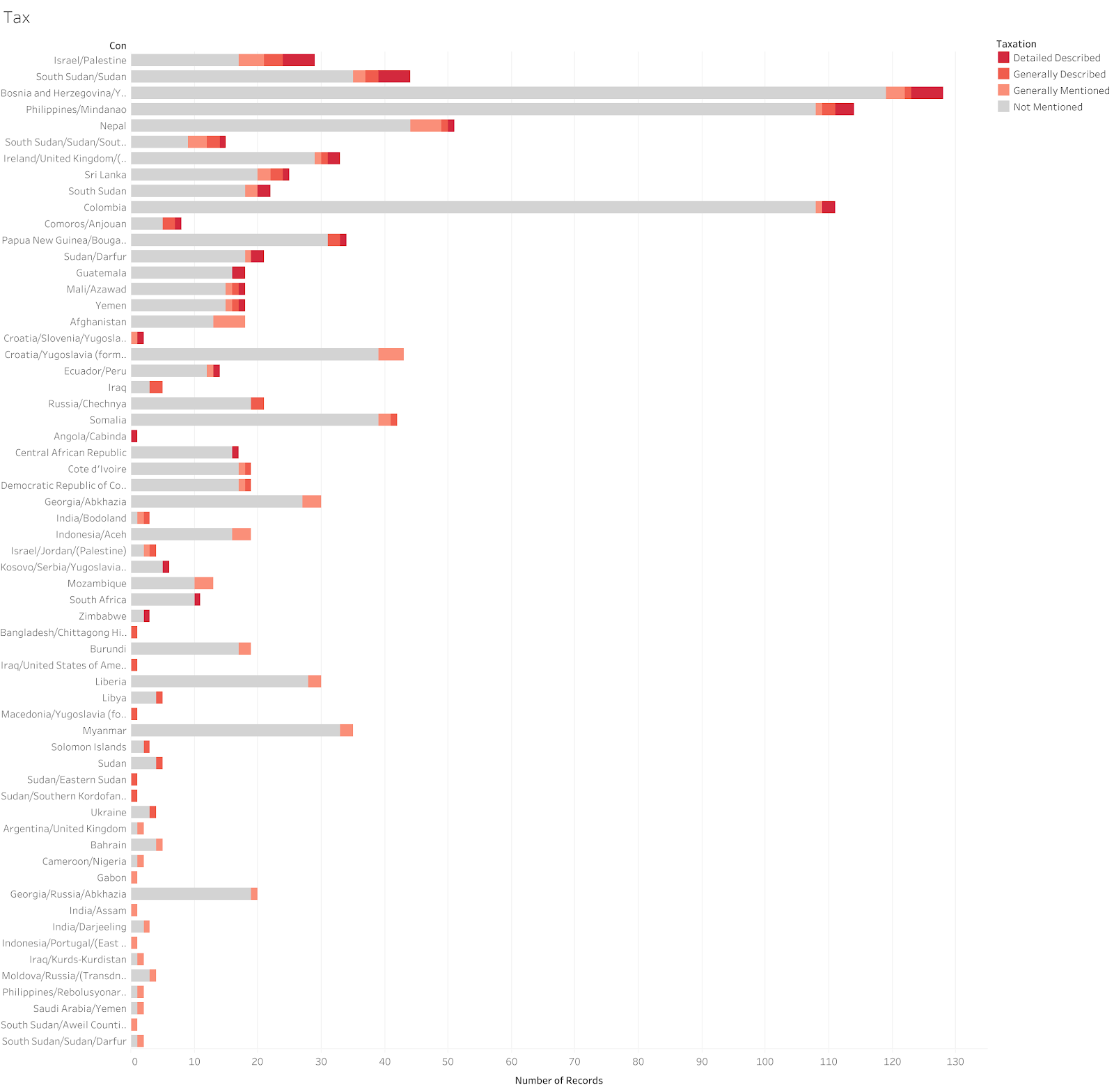
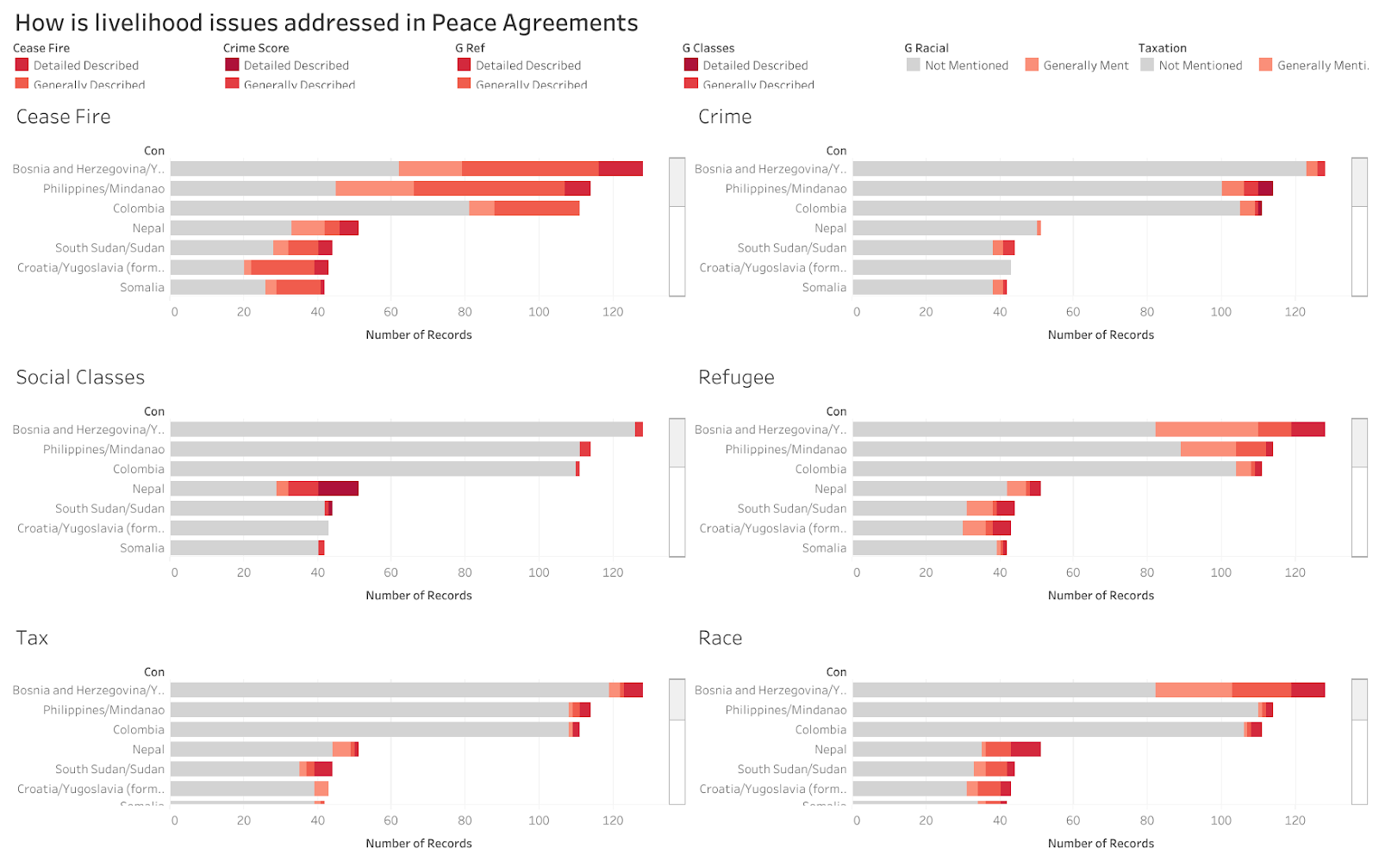
Not surprisingly, peace is the most well-discussed topic in peace agreements. More than half of the agreements address details about fire ceasing. Race, refugee, social classes and tax are common topics to be addressed in agreements. Around one-third of the total agreements discussed these issues in details.

here is a link to the complete study
Honestly speaking, the war is not solving too many problems as indicated in these graphs. Ideally, wars are fought to accomplish a certain purpose. As introduced at the very beginning, war is the tool for depriving/against deprive, power or wealth. Such a goal is necessary to appear in the agreement so that the fruit of the war can be assured. However, such a tool is not so easy to handle, and may not achieve the goal all the time. The most common outcome of fighting a war is regret fighting the war, a peace agreement can hardly address all the significant categories related to human lives and there is no wonder why ceasefire is the most well-described category among all.

From the network, we can tell that united, implementation, international and republic are the four most important keyword across all agreements. Not surprisingly, it well describes the current situation of post-war negotiations. The two sides are figuring out ways to reunite and republic under the supervision of the entire world. The implementation of the agreement needs to be planned carefully to assure the result.
Process
This project is divided into four sections, including a timeline presenting the development of weapons over the years, an analytical chart featuring a post-war life index of nations, a network analysis looking into the most popular keyword and phrasing in peace agreements and also an integrated info graph built upon GIS system.
-UX Research
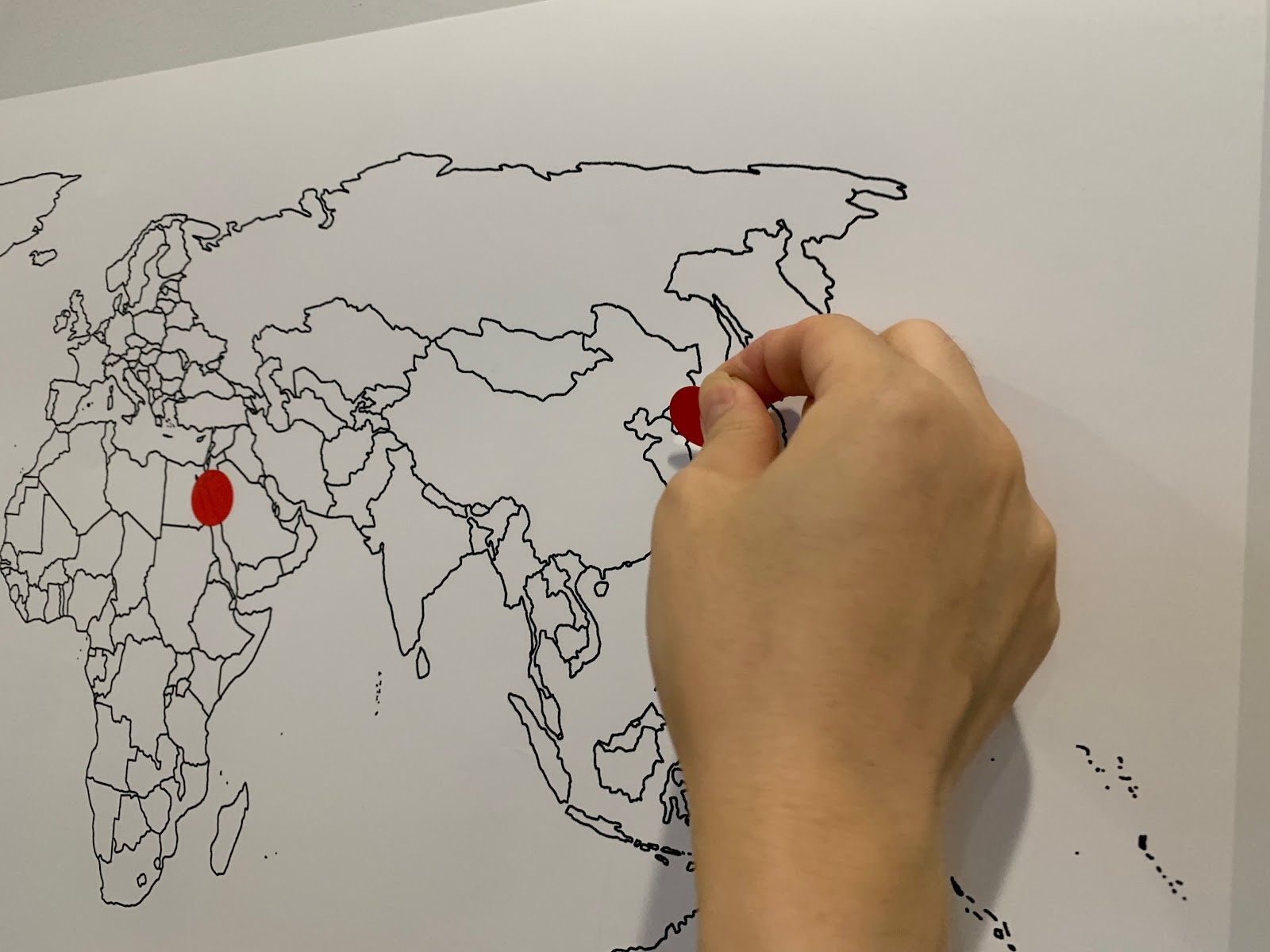
Before I started the project, I conducted user research on a couple of participants, testing their knowledge on contemporary war history. I first asked them to mark 5 conflicting zones on the world map.
Then, I asked them to propose the most common reason for initiating a war out of four choices: for territory, for faith, for governance, and for justice.

And the last question I tested on whether they think war is making life better or not.
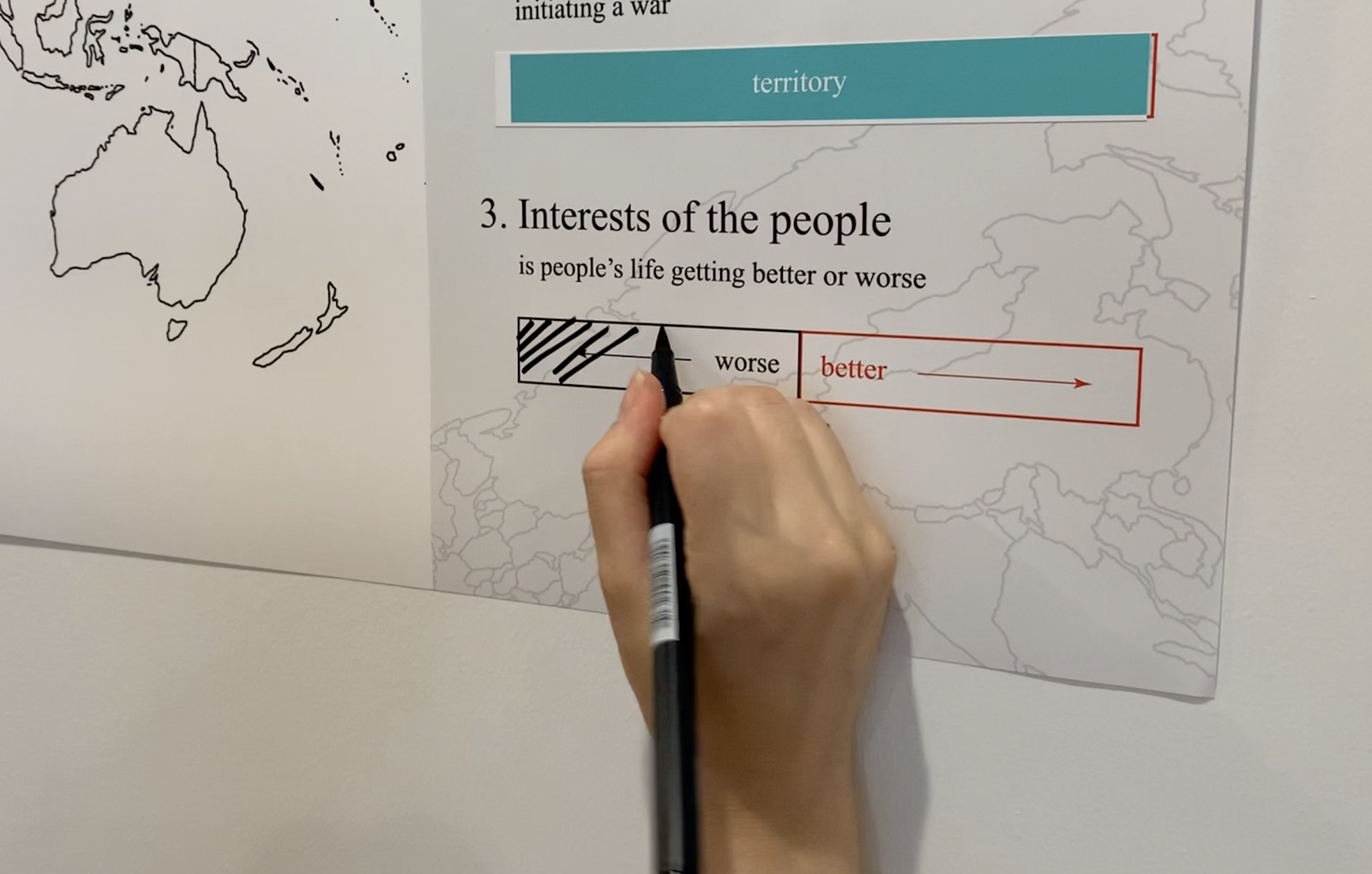
This research was conducted six times with eight participants in total. They have different interests and thus have a different knowledge level on current events. Despite the markers placed all over the places, they all agree that territory is the most common reason for a war and war can only make life worse.
-Timeline
For the timeline, I selected thirteen signature weapons in history and presented these weapons along with the data when they were invented. These weapons develop from Spears to Nuclear Bombs over thousands of years and have a significant presence in human history. For each weapon, I briefly described its invention and significance in history.
Here is a link to the timeline
-Analytical Chart
For the analytical charts, I first looked into the number of agreements signed over the years. The areas were colored according to the type of the war, whether it is within a nation’s border or not.
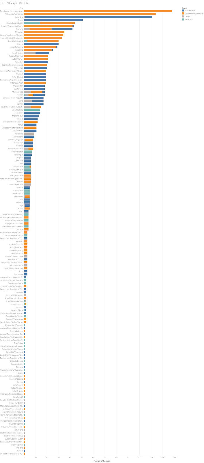
I also looked into the number of agreements each country signed. I colored the bar using different colors indicating the purpose of the wars, either it is for territory or it is for governance.
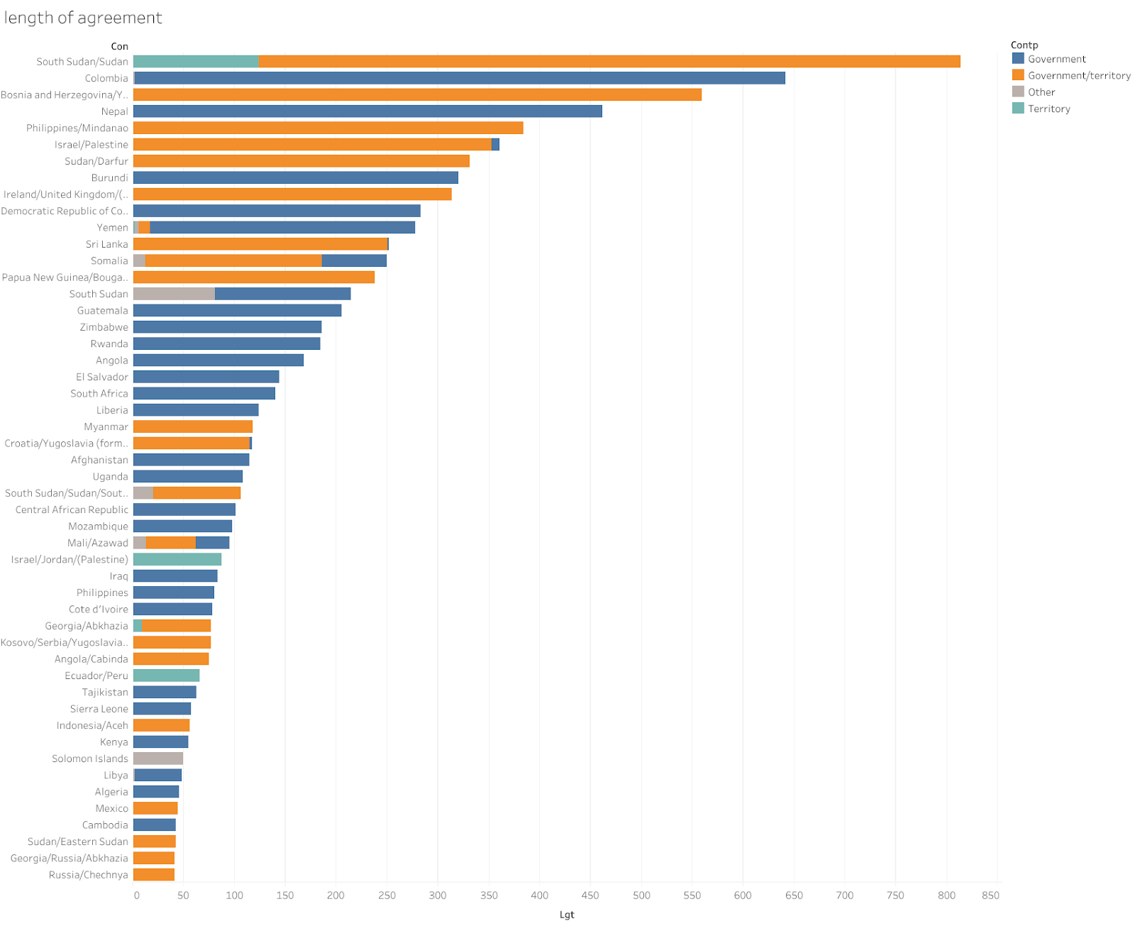
Also, I sum up the length of years mentioned in agreements. And it is colored according to the type of agreement as well.
One major purpose of this study is to figure out whether the living environment at those nations is benefited from the peace agreements. Therefore, I selected six categories as suggested in the user research and match them to on index in the dataset. The six indexes selected are Peace (Cease Fire), Satisfy (Crime), Social Equality (Social Class and Race), Residence (Refugee), and Economy (Tax). In the dataset, these six categories are rated from 0 to 3, indicating whether the topic is discussed in detail or not. However, since there is no one sentence twice detailed than the other one. These numbers are more of a category rather than a numerical value. Therefore, I treated these categories as dimensions rather than measurements to keep this research scientifically accurate. Also, I sorted the countries through a weighted calculation, in order to best emphasize whether a country is paying attention to a certain category or not.


(A world map with icons is created for the top nation in each list)
Later on, in order to narrow the project and consolidate on a certain conclusion, I filtered these graphs and saved only the record of the top 20 countries which signed the most peace agreements. Therefore, I can create an icon for each country presenting these six dimensions at the same time.
-Network Analysis
In order to analyze the written agreement, I use InfraNodes and Gephi to create a word network. A NLP tool is embedded in InfraNodes, therefore, I imported all the text descriptions from the dataset and created a draft network. Then, it is exported to gexf file and edited in Gephi. Eight nodes were removed from the graph to avoid over redundancy, including agreed, council, security, partie, sign, peace, agreement, and resolution. These words are necessary components for the document to proceed but do not have a close relationship to its actual content. Thus I removed those from the data library.

Design Choices
-Timeline
On the timeline, I deducted the information to three hierarchies. Title, date and brief description, and I also limited the timestamps under fifteen so that viewers are having an easier time taking the information in.
-Analytical Chart
On this graph presenting the number of agreements and the type of agreements, I choose to color Interstate wars, the wars that are in between nations grey because it is not a common type.
I colored the different purposes of the war differently. Governance is colored navy blue as it is traditionally the color the authority; the territory is colored green-blue as it represents the mountains, rivers and so on. As a mixture of these two, conflicts originated with both reasons are colored orange as it is appropriately more significant than the other two, corresponding to its presence.

For the life index, there are three levels of details indicated in the dataset. I colored 1 to 3 with different tints of red, and colored 0 light grey since it is the least important information in the diagram, but serves as a necessary category for comparison.

-Network Analysis
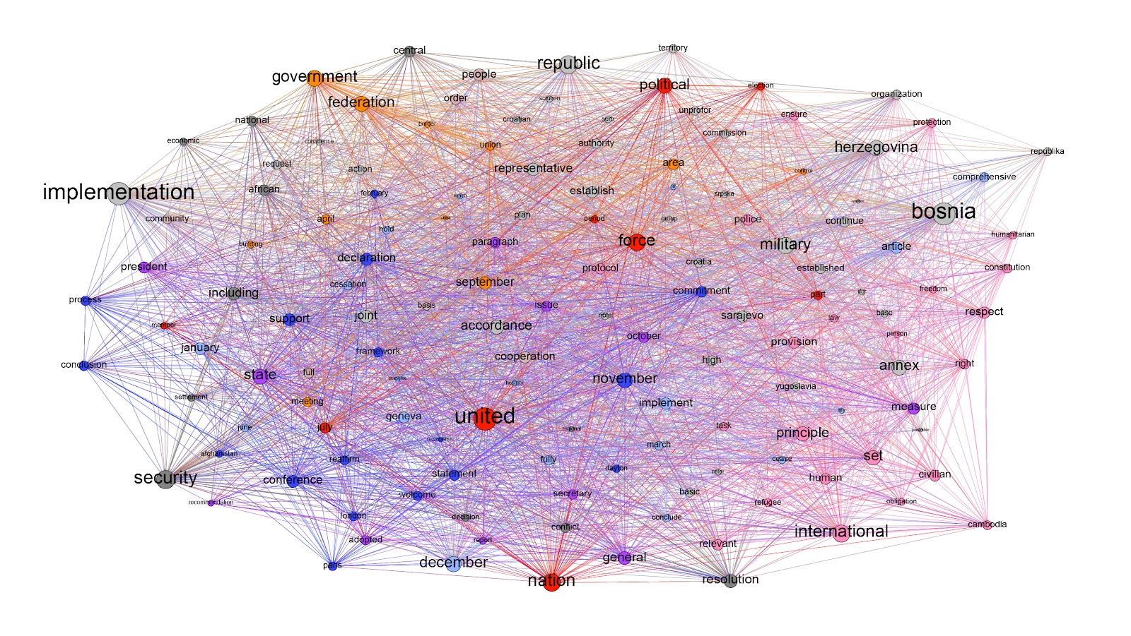
For the network analysis, I briefly changed the color in the graph. Pink for human-related topics; red for strong opinions; blue for statements; purple for the process; grey for key objects.
Revision
One thing I ignored until I conducted my second round user research was that no one can locate the countries just by seeing the names. And if people cannot imagine the country visually, it makes no sense to discuss their sufferings. Therefore, I used Carto to create a world map, coloring different countries depending on the number of agreements they carry.
Another feedback is that this study is still struggling with moving beyond general knowledge, there is not much vision implied. It was because the dataset was too broad and thus lack of a specific focus. This is something I can keep working on for the next step, integrating other datasets on related issues.
Also, a friend of mine pointed out that it would be great if there is one solid point can be suggested as the feature take away. This study covered various aspects of contemporary wars, but to the eyes of lazy viewers, they prefer not thinking but consume the answer. Therefore, I decided to create an illustrated graph presenting the price, in term of lives, to pursue a goal through the method of wars.
