Introduction
The relationship between genes and disorders is always an exciting topic in bioscience. In my lab practice, I would like to visualize the relationship between disorders and disease genes. In this way, it could be clear for researchers to know which kind of disorders have the greatest relationships with other genes and disorders. The networking graphic could be valuable information for further study.
Inspiration
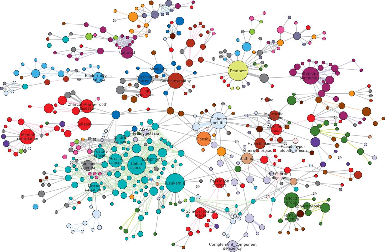
After I decided to pursue this topic, I looked for some inspirations online. I found many interesting network maps like the following one. In this map, each node represents a kind of disorder and their colors show different disorder classes. The larger a node is, the more genes are related to it.
Materials
Gephi– an open-source dataset analysis and visualization platform for Windows and macOS. It’s a powerful tool to visualize the connection between objects, etc.
Gephi Wiki– a website with many interesting sample datasets. I downloaded my dataset form it. The dataset has around 4000 nodes and edges.
Adobe Illustrator– a vector graphics editing tool. I used it to edit the SVG file exported from Gephi.
Process
To begin with, I imported the dataset into Gephi. The overall rows are around 4000, and they were in directed connections. Since it’s already a .gexf format, I didn’t need to refine the raw data in OpenRefine. I used the layout 2 to visualize the data. Since I got a large dataset, I also adjusted the density by scaling so that it could be more readable.
I chose to review the data by type first, the disorders are in green and genes in pink. Therefore, I could have a basic understanding of where the different types of nodes are. We can find out that the smallest nodes turn to be genes.

Since the goal of the lab is to find out the disorders with the greatest connections to others, I displayed the date with the degree. I picked up 10 disorders with the greatest connections and applied red to them to make them stand out. Others with weaker connections were in grey. Moving towards the preview part, I enabled labels on the network to identify the main characters in each graphic. But I found out that every node would have their labels on, and it turned to be very hard to read. The ideal state would be a graphic with only a few labels. Therefore, I imported the SVG file into Adobe Illustrator and eliminated most of the labels. These are the final graphics I created.

Reflections
Through this lab research, I found Gephi a very powerful tool, I can visualize a large network dataset with it. However, on the other hand, it could be buggy sometimes, especially when operating with macOS. It could also have some limitations, for example, users can not interact with the graph, and we might need other tools for further adjustment.
The graphic itself is informative to tell that some disorders are highly related to disease genes or other disorders, such as cancers and deafness. These disorders could be harder for researchers to study because they are so complex inside human bodies. However, on the other hand, it could bring some breakthroughs to the research since some disorders might have the same genetic origin.