As of this writing, Mercury is in retrograde.
According to astrologers, this means that Mercury is moving backwards in the sky, which may be interpreted as a portent of communication breakdown and mechanical failures until Mercury changes direction. (Take this as a reminder, dear reader, to back up your data!)
Of course, Mercury isn’t actually moving backwards in the sky. It merely appears that way from Earth because of the relative positions of our planets as we revolve around the sun. The fact that Earth revolves around the sun, and not the other way around, is common knowledge today.
With the exception of a few flat-earthers, most of us share an understanding of the basics: the sun is at the center of our solar system, and revolving around it are Mercury, Venus, Earth, Mars, Jupiter, Saturn, Uranus, Neptune, a few dwarf planets (hello, Pluto!), and the asteroid belt.
You likely also know that the heliocentric model (helio=sun, centric=center) we know and love was not always a given. Before Renaissance-era astronomers turned their inquisitive eyes to the skies, many humans were fairly confident that the earth sat stationery at the center of the solar system, surrounded by the sun and other planets. This theory is known as geocentrism (geo=earth). While it inspired some cool-looking visualizations, the theories that underpin it have long been disproven.
The solar system hasn’t changed much in the last few millennia, but the way we understand it—and represent it—has.

A Timeline of Visualizations
The timeline linked below was inspired by my curiosity about the history of heliocentric models of the solar system. I deliberately excluded geocentric models, as they are not exactly “data visualizations.” Because they are founded on disproven theories, they do not have a solid mathematical basis.

I created this visual history using the TimelineJS tool from Knightlab. This tool generates beautiful timelines by pulling in data from a Google Sheet. The template provided has columns for dates, text, images, metadata, and options for styling and formatting.
The visualizations in “Solar Neighborhood” fall into three categories:
One: Concentric circles
These visualizations primarily communicate that the sun is the gravitational center of our solar neighborhood. They also represent the planets’ sequence and paths of orbit around the sun. Ellipses, rendered as per Johannes Kepler’s laws of planetary motion, represent each planet’s path as well as the speed at which they travel around the sun.

However, because they are not to scale, none of these concentric circle models provide useful information on distance or size.
Honorary mention:
Though not a heliocentric model, Tycho Brahe’s hybrid model received honorary mention in “Visualizing Our Solar Neighborhood.” As shown below, it incorporates multiple systems of concentric circles. The moon revolves around the earth, the other planets revolve around the sun, and all of these revolve around the earth-moon system.

Brahe’s model combined contemporary mathematics with regressive theories of terrestrial movement. Brahe simply could not believe that a body as large as the Earth could move at the speeds required of the heliocentric model and that even so, Earth’s inhabitants would surely notice.
Newton’s First Law of Motion, which identifies inertia as the force that keeps moving objects in motion (i.e., Earth and its inhabitants), would not be discovered for another two centuries.
Spotlight on Uranus
I would be remiss to continue without highlighting Uranus, whose discovery as a planet set the astronomical community alight in 1781. I feature this planet’s discovery in my timeline because it extended the bounds of the known solar system. Take another look at Copernicus’ model from the 1500s. The outermost ring, just past Saturn, is labeled “stellarum fixarum sphaera – immobilis,” referring to the starry firmament, believed to be fixed in the sky.

Copernicus knew that beyond that were other stars and ostensibly, other solar systems, but had no way of knowing how far away they were. Identifying Uranus as a planet in our neighborhood rather than a faraway star opened the door for astronomers to test theories of celestial mechanics and effectively kickstarted the rush to discover new planets.
Two: Comparative representations
Comparative models figure heavily in “Solar Neighborhood.” More comprehensive data on our celestial neighbors empowered astrologers to create scale drawings, physical models, and improve the design of planetariums.
Orreries are mechanical models of the solar system. They demonstrate the placement of the sun, planets, and their moons. The most sophisticated orreries feature bodies that mimic planetary motion with the turn of a crank. Depending on the scale of the model itself, it may also represent the sizes of celestial bodies relative to each other.

Renderings on paper can represent distance or mass, but never both—any scale solar system that could fit on paper would have planets of microscopic size, invisible to the naked eye.
Nevertheless, Elijah H. Burritt was able to build an impressive set of visualizations in Atlas, designed to illustrate Burritt’s Geography of the Heavens (1835), based on the data available to astronomers at the time. Expand the image below and spend some time with Burritt’s drawings.
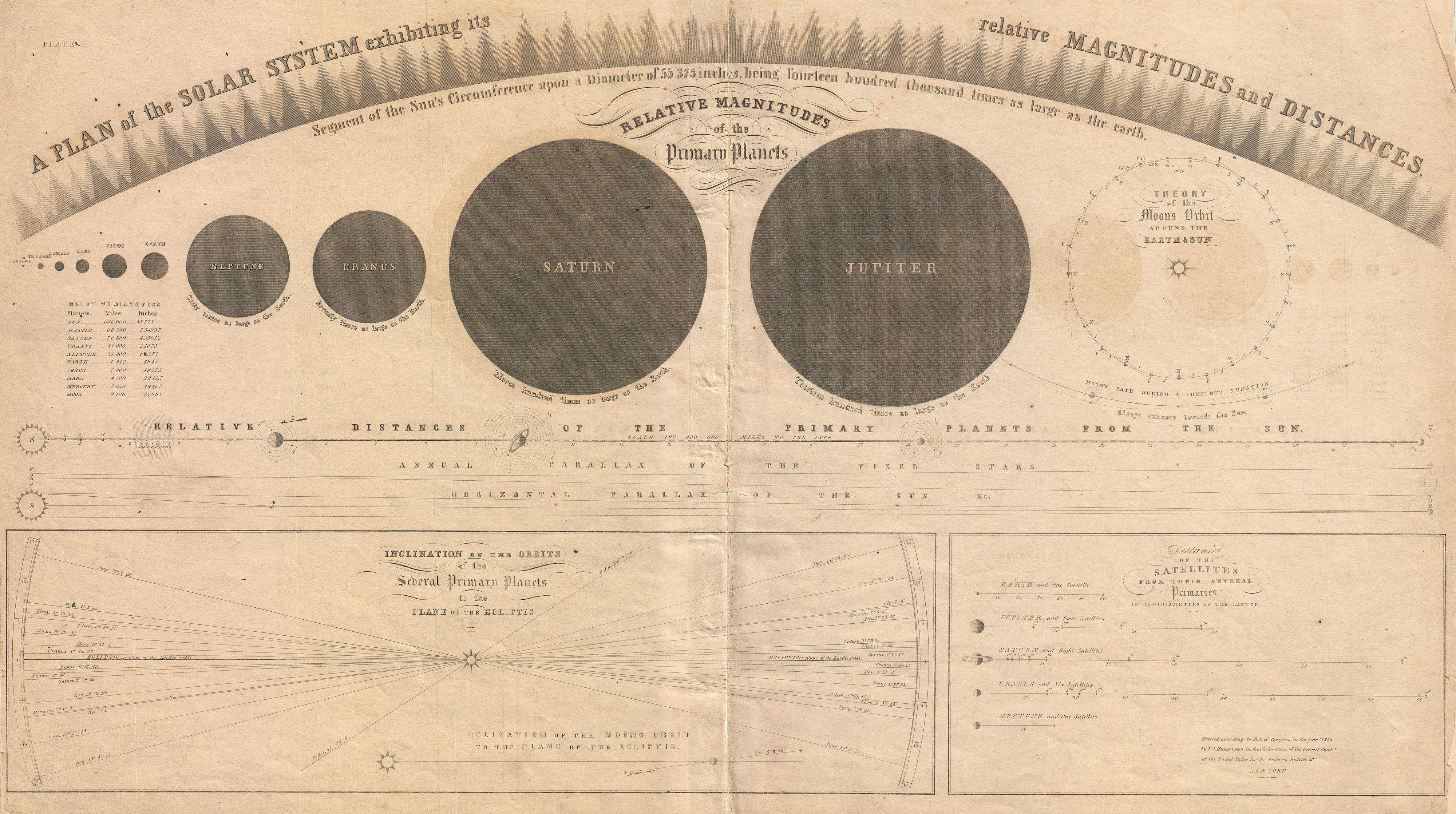
The arc across the top of the page is not decorative; it is meant to represent the magnitude of the sun—a body so massive in comparison to the planets that it scarcely fits on the page. If this arc segment were extended, it would create a circle over 55,000 inches in diameter! In contrast, the illustration showing distances of primary planets from the sun includes such fine detail that, with a close look, one can see as many as 8 moons surrounding Saturn.
Three: Immersive visualizations
With Burritt’s illustrations, amateur astronomers could visualize the expansiveness of our solar system and Earth’s relative minisculity. By the next century, an immersive, spatial experience became possible with the emergence of walkable, scale models of the solar system.
Due to their size, this type of visualization can demonstrate magnitudes and distances at the same time. An immersive solar system model could be as small as a city center, which has made it a frequent candidate for public works across the world.
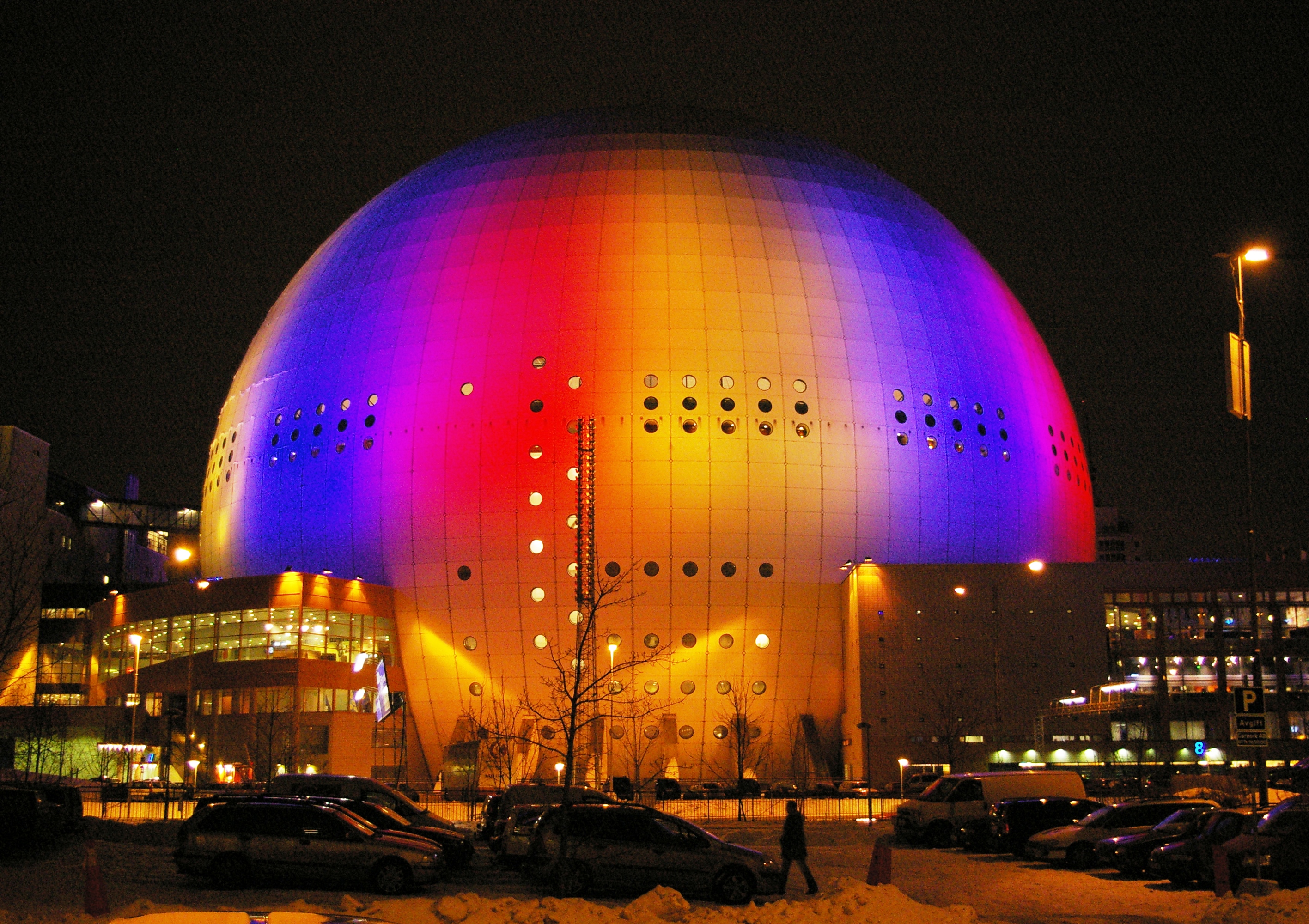
The final slide in “Solar Neighborhood” contains a video that follows the process of astronomy enthusiasts Wiley Overstreet and Alex Gorosh as their team set out to create a scale model of the solar system in a remote desert location in Nevada. In this model, Earth is the size of a marble and Neptune’s path of orbit has a diameter of over 7 miles!
Despite their impracticality as tools of measurement, immersive models an important purpose. They enclose the viewer, imbuing a sense of awe as they perceive their own minute scale in the solar system and the universe. Perhaps this is what makes them the most powerful visualizations of all.