Introduction
Weather forecast has never been the same as today. There was no such thing as a daily weather forecast at the beinging of 20th century. It took decades of data collection to publish a single weather map. However, as technology advanced, so did our methods of data collection and interpretation. Weather maps are synoptic charts of various meteorological conditions of a particular area at any given point in time. Visual interpretation of weather data warns us about any future weather changes that might affect atmospheric conditions.
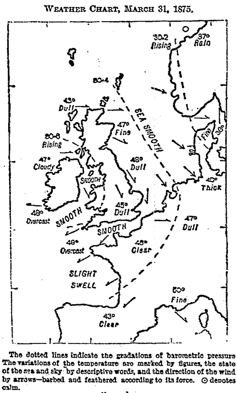
Through this timeline, I wanted to highlight the importance of weather maps and how we have come across processing such huge amounts of data, since the first weather map was made in 1816. Weather maps helped us develope early warning systems for a lot of weather phenomenons, but how were they intepreted before any technology existed.
Previous Visualizations
SUNY Buffalo State implemented a really asthetic timeline of the history of weather maps. The timline achieves to inform of all the major events during the weather maps history. Although the timeline is informative, I find it a little cluttered. The amount of text might become too overwhelming for some users. Also, some elements do not correspond to the correct position on the timline, like the painting of John Hoover (1858) is depicted between 1871 and 1880. However, the idea of depicting the timline along the x=y axis is really interesting as, it gives a sense of moving ahead in time.

Materials
In order to create this timeline, I used Timeline JS by knight lab, which is an open source tool to create asthetic and interactive timelines. I used a Google spreasheet template provided by Timeline JS to create my timeline, JSON could also be used to add some custom installations. Although the process was quite streamlined, it offered limited design options and a rigid format.

Methodology
I started my research with datavis.ca website. It was good starting point as I recoganized some of the major milstones in the history of weather maps. While reading through some of the research papers I found the article that perfectly summarized the history of weather maps and classified it into different eras.
Based on the information from this article and the SUNY Buffalo timeline, I complied together my own timeline highlighting the most important milestones in the history of weather maps. I cross-refrenced the images for my timeline from datavis.ca , galton.org and Google images.

Reflections
It was really interesting to know, how the first weather map hadn’t been on the internet until the start of this century (2003). Today, we can’t even imagine a world without weather maps. They inform every decision we take and accordingly build upon our early warning systems.
The modern weather maps are created with the help of supercomputers that can process million of bytes of data in minutes, giving us instantaneuos weather conditions of any given point in the world. This experiement gave me the opportunity to look into how modern technology has empowered us to visualize large amounts of data in intuitive ways. Further analysis of weather maps can be done to show how they have changed since the first map was published in the internet in 2003 and how design research has impacted them.
References
http://datavis.ca/milestones/index.php?group=1800%2B&mid=ms93
https://rmets.onlinelibrary.wiley.com/doi/pdf/10.1002/j.1477-8696.2000.tb04041.x