Introduction & Inspiration
To depict the topic, I would like to detour the journey beginning from the history of travel. The word travel comes from the travail which means the painful or laborious effort. Travel is work, never a leisure, not until the grand tour in the 17th century changed this. A bunch of privileged nobility let people travail for them, with the purpose of soaking up history, art and cultural heritage around Europe. Later, with the invention of the steam engine and improvement of transportation, travel became widespread to the public. The origin of what we know as travel agency and package tours was created by pioneer-Thomas Cook in the 19th century, Thomas Cook & Son service included transport, accommodation and food tickets. Tourism sector began to flourish from a recession during the 1970s, mainly due to the energy crisis, leading to lower costs and prices. Travel went from being something only for an exclusive group to become a leisure activity within the reach of many. The fallout from the subprime mortgage crisis in 2008, had a major impact on the United States and across the world. The economy slumped, and many college graduates struggled to find a job. That environment helped spur a new form of business that became known as the sharing economy. Airbnb just happened to have launched in time to take advantage of that moment. Founded in 2007, it was just getting off the ground in San Francisco when the recession hit. The platform gave travelers a more affordable alternative to hotels, and today it hosts over 7 millions listings around the world. Airbnb now is facing another moment of constraint, as COVID-19 disrupts hospitality and travel businesses globally.
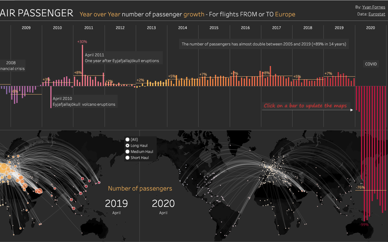
The graph(Figure.1) designed by Yvan Fornes captivated my eye. It is visually appealing and explicitly conveys the information. The graph indicates: two plumps in the history of 2008 and 2020; the traffic number of passengers in April 2020 is decreased compared with the year 2019. The below charts from Statista, show the leading online search engines(OTAs) in 2019-2020(Figure.2) and the year-over-year(YOY) change in short term rental bookings through selected leading online travel agencies worldwide from week 1 to week 35 in 2020. Interesting find from 2020 week 13 to week 35, Airbnb usage rate is out-weighted Booking and Expedia, this inspires me to dive in more about the reasons behind.


Process & Methods
Step 1. Finding datasets
I searched data and materials from various platforms that related to Airbnb, global air carried passengers, and OTAs. My datasets derived mainly from Eurostat, Inside Airbnb, Statista, and Tableau. The dataset I got from Eurostat states the passenger traffic to Europe from 2005 to 2020. From Inside Airbnb, I plotted dataset dimensions including listings and reviews. The listings data that I used to create charts and graphs are:
- City – New York, Paris, Rome, Hong Kong, Bangkok, Istanbul, Rio de janeiro, Mexico City, Cape Town, and Sydney which represent 5 continents.
- Host Total Listing
- Count of Listing
- Price
- Room Type – Entire Place, Hotel room, Private room, Shared room.
- Neighborhood
The reviews dataset I exploit the date data. The datasets were refined and very well captured, thus I imported them directly to Tableau.
Step 2. Create charts and graphs using Tableau Public.
By the aid of Tableau Public I was able to create visually rich charts and graphs without much effort. Though I still encounter a learning curve while figuring out which redundant data to filter and visuals that best narrate the data appropriately. My first trial chart imitates Yvons Forns’s creation(Figure.1), just to test out and familiarize myself with the platform.
Selecting the visual elements
Tableau has a good amount of visual selections enabling users to interact with. I used elements such as heat maps, vertical bars, symbol maps, circle views, and lines for this report.

Making visualization accessible
Color is a major factor in effectively communicating information out of charts and graphs. Choosing the appropriate color palette is crucial, for some folks have color vision deficiency(CVD). There are few color rules in data visualization like refraining use of red & green, and yellow & blue together. If you must use a red & green combination, there is a way to make it work. Dark red and light green with annotation for a person with CVD to distinguish the differences. Three major types of color palette exist for data visualization: qualitative palettes, sequential palettes, and diverging palettes. I used all three with the help of ColorBrewer(Figure.5) to choose my color schemes.


Results — Visualizations & Interpretations
Global travel severely affected by COVID-19
The graph(Figure.7) imitates Yvan Fornes design but adds a color twist. The dataset is from Eurostat and Inside Airbnb, I filter time range to correlate with Airbnb launched time 2008. These two graphs indicate the global travel sector flourishes gradually by year, not until 2020 when coronavirus hits. With the comparison of two graphs, it is clear that Airbnb declared listings rapid drops in response to the lockdown, travel bans and cancellations.


Listings for each city(Figure.10) started to fall as COVID-19 started spreading and touched the all time low in April 2020 as lockdown was imposed worldwide. Listings started to gain momentum in mid of 2020 except for Bangkok. Paris and Rome fell again in Dec 2020. The dip is observed again in March 2021 as the delta variant appeared.

Airbnb listings surge over year but drop dramatically as the outbreak of COVID-19


In response to social distance and fear of infection, travelers prefer an entire place for stay. The size of the sphere means the number of host listings. Entire place(red) in 2020 became larger.
Reflection & Future Direction
Plotting the right data is the most challenging part for me, I spent a great amount of time compiling the right datasets for this report or perhaps it is the way I started that made it difficult. I had an idea about what topic I’m interested in- Global Tourism, and tried platforms provided in the class-Pew Research Center, Information Is Beautiful, Data is Plural,Awesome Public Datasets, Statista,and additional Kaggle, World Bank, IATA. However, the dataset I got either not enough rows to visualize or not an open data. After the setback, I began searching charts and graphs from Tableau public instead. There, I found beautiful charts & graphs that inspired me and data sources. When I was collecting data, I found it’s easy to manipulate the dataset then shape the story into my own desire. Because we often collect data at our convenience which is dangerous, we might have innate biases without realizing it. For future direction, I would like to validate the proposition from my observations. The COVID-19 forages a new kind of traveler and travel style – the remote workers and destination-home. More and more companies encourage employees to work remotely, thus a flock of remote workers migrate to other cities as testing of home. This probably explains why Airbnb bounced back more quickly than any other OTAs. The flexibility of room type selection allows travelers to stay in the entire place without being exposed to danger. Airbnb 2021 announcement shows data that people now live with Airbnb, thus a series of modifications introduced on their search feature to reflect this trend. People travel for family and friends, they use short-term rentals as a tool to connect with their loved ones. Tourism not only impacts the local economy, but it is also starting to affect the social structures, culture and lifestyle of the destinations visited. Therefore, the challenge now may be the tipping point for the tourism sector to re-exam and use the data to forecast next disruptive opportunity.
References
5 tips on designing colorblind-friendly visualizations. Tableau. (n.d.). Retrieved October 20, 2021, from https://www.tableau.com/about/blog/examining-data-viz-rules-dont-use-red-green-together.
Airbnb 2021. Airbnb. (n.d.). Retrieved October 20, 2021, from https://www.airbnb.com/2021.
Carmen Périz Rodríguez (Hispana / Spanish Ministry of Culture and Sports), & People have always had a need to travel. (n.d.). Travelling for pleasure: A brief history of tourism. Europeana. Retrieved October 20, 2021, from https://www.europeana.eu/en/blog/travelling-for-pleasure-a-brief-history-of-tourism.
Free data visualization software. (n.d.). Retrieved October 20, 2021, from https://public.tableau.com/app/profile/manish.khatre/viz/MA-AirbnbTravelChallengeV2/CovidEra.
Free data visualization software. (n.d.). Retrieved October 20, 2021, from https://public.tableau.com/app/profile/yvan.fornes/viz/COVIDimpactonTravel/AirPassengerGrowthHistory.
Global Tourism Industry – Statistics & Facts | statista. (n.d.). Retrieved October 20, 2021, from https://lb-aps-frontend.statista.com/topics/962/global-tourism/.
Published by S. Lock, & 15, F. (2021, February 15). Covid-19: Year-on-year weekly change in short-term rental bookings with OTAS 2020. Statista. Retrieved October 20, 2021, from https://de.statista.com/statistik/daten/studie/1170252/umfrage/short-term-rental-bookings-with-otas-coronavirus/.
Published by Statista Research Department, & 23, A. (2021, August 23). Revenue of leading Otas Worldwide 2020. Statista. Retrieved October 20, 2021, from https://fr.statista.com/statistics/934995/revenue-of-leading-otas-worldwide/.
Sanford, W., & DuBois, D. (n.d.). COVID-19 impact on hotels and short-term rentals. AirDNA .
Wikimedia Foundation. (2021, October 4). Thomas Cook & Son. Wikipedia. Retrieved October 20, 2021, from https://en.wikipedia.org/wiki/Thomas_Cook_%26_Son.
Yi, M. (2019, October 25). How to choose the colors for your data visualizations. Medium. Retrieved October 20, 2021, from https://medium.com/nightingale/how-to-choose-the-colors-for-your-data-visualizations-50b2557fa335.