
Introduction
When finance professionals were making long-term investment recommendations in 2017, they had no knowledge that a worldwide pandemic would strike. None of their recommendations took into account what effect this could potentially have on the market. This dashboard looks at 9 tech stock companies that were highly recommended prior to the pandemic and sees how they have performed from February of 2017 to February of 2022 and gives an example of how a randomized portfolio of these stocks would have performed.
Questions being asked:
- Did stock recommendations from 2017 hold true despite a pandemic for tech companies?
- Would a randomized portfolio result as a gain or a loss?
- Where are the major highs and lows across the stocks and what can we learn from them?
Inspirations
For my visualization, I was inspired by other Tableau dashboards that focused primarily on personal portfolios or funds.
GSMF Portfolio Performance (Jun2020 – Sep 2020)
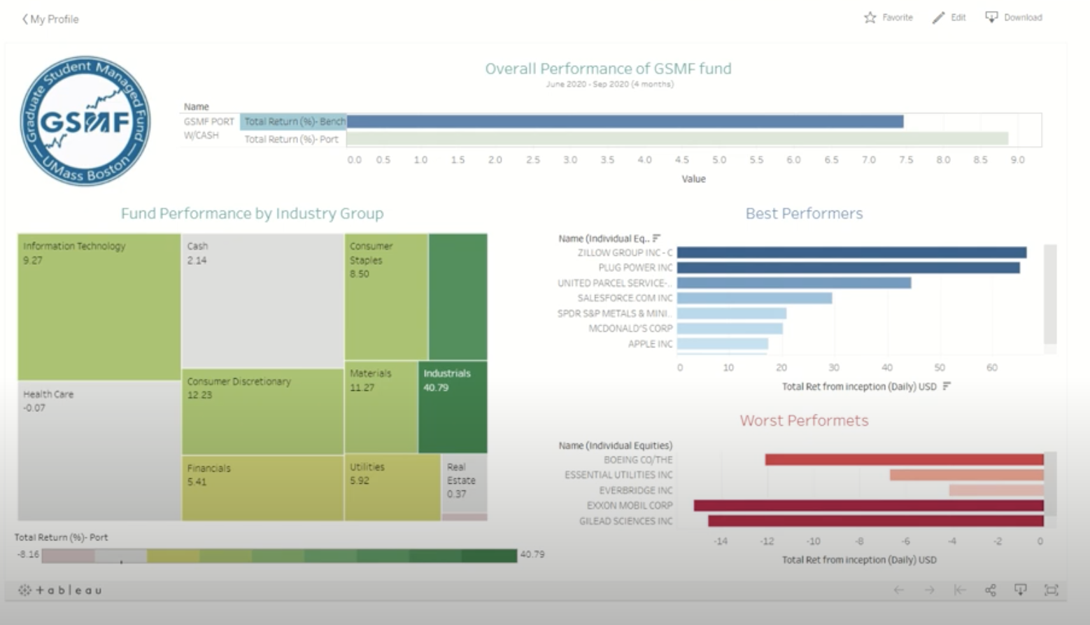
This dashboard showcases the performance of a student-managed fund by utilizing bar graphs and a treemap. The treemap looked like it would be representing how much the fund had invested in each sector, however, it actually was actually covering the % of return from the sectors. The numbers appear off size-wise as the -.07 return of the health care industry is bigger than the consumer discretionary sector with 12.23. The coloration of the red and green didn’t represent + or – return, on the graph a 2% return showed up in red as well. Despite the sizing and coloration flaws of this graph it inspired me to create a treemap for my design in which a portfolio based on cost is represented by a treemap.
This dashboard was also missing any sort of over-time comparison to see how they arrived at their return rates. Although these are displayed in bar graphs the viewer doesn’t know if Best/Worst performers contain all stocks held or if these are a representation of the top 5 and bottom 5. The comparison of the S&P 500 on this dashboard felt as though it would be better as a line graph, that way a view could see over time how the fund performed against the S&P 500 rather than just at the end. Seeing the lack of time storytelling on this dashboard inspired me to include a representation of the stock performance, the volume traded, and the portfolio’s performance over time.
Materials
Data Visualization: Tableau

In order to create this dashboard, I utilized Tableau Public. This is a free platform used to create data visualizations to share online.
Datasets: Yahoo Finance
Yahoo Finance Historical Data from 2/16/17-2/16/22 for Stocks:
APPL, MSFT, TSLA,NVDA, PYPL, MU, GOOGL, CRM, & AMZN
Portfolio Creation: Random Number Generator
The portfolio was created by generating # of shares in each of the ten stocks using a random number generator that could select a number from 50 to 500.
Stock Recommendation Sources: News/Finance Related Blogs
In order to represent a wide variety of recommendations, I sourced the stocks selected from an array of different articles. These articles focused on evaluating the company’s overall performance in recent times, as well as their opinions/predictions of how the company’s stock would perform in the future.
https://www.thestreet.com/investing/stocks/best-performing-tech-stocks-of-2017-14432299
https://www.fool.com/investing/2017/06/22/top-performing-tech-stocks-of-2017.aspx
https://www.marketwatch.com/story/6-tech-stocks-that-could-move-big-on-earnings-2017-01-21
https://evannex.com/blogs/news/could-tesla-be-the-top-stock-pick-for-2017-video
https://www.fool.com/investing/2017/01/30/3-reasons-amazoncom-is-taking-over-the-world.aspx
Results and Interpretation
Movement of the Stocks
The main movement in these selected technology stocks occurred from March 2020 onward. Up until then, the stocks were climbing slowly, but steadily. Some analysts say that this is due to the number of people who began to trade more actively over the pandemic, due to having more time on their hands.
This shows as well that although the stocks faced set back in March of 2020, the pandemic ended up being the time in which they all grew the most. As seen here some grew more than others.
Volatility
Although the top performers’ Amazon, Google, and Tesla have performed well over this time period, their rapid growth hasn’t reached a plateau. They are growth stocks, but riskier to invest in. The graph shows that they take the biggest drops, but also the largest gains on the recovery side. This chart can show which tech stocks may be better if interested in investing in growth or value stocks.

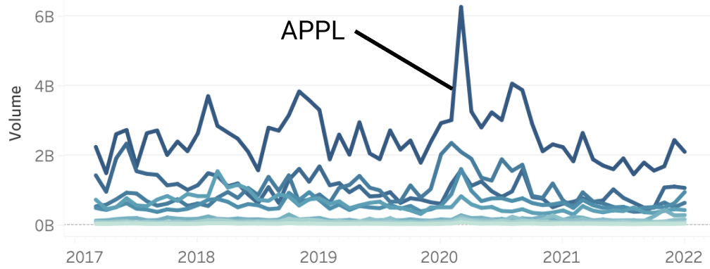
Active Trading
Despite Apple being amongst the bottom 2 growth-wise, the stock was consistently the most popularly traded from 2017 to 2022. March of 2020 was its highest volume, perhaps representing the many who were selling off in fear of the future. The other stocks show similar trends and return to the pre-pandemic volume by 2021.
The Portfolio’s Performance
The portfolio performed with an overall gain (each individual stock was a gain as well). Top performers correlate with the stock’s individual performance, as well as with the portion of the portfolio that the stock makes up based on cost. In this randomized portfolio, the shares worked out to produce large overall gains of $727,226 from an investment of $210,313. The ending value of the portfolio was $937,539. This is an extremely high return for 5 years.

Reflection & Future directions
This was an exciting project to take on for my first experience using Tableau. I enjoyed learning about all of the different features and playing around with the system to figure out how to create what I wanted on the dashboard. The experience was very positive overall.
Moving forward with the experiment I would like to look at the possible impact that inflation has on these gains to assess how well the stocks truly performed. This is more important to assess for the stocks that didn’t have much movement, as this could be more of a loss than a gain, even though at the moment, not accounting for inflation all stocks ended up gaining in value.