Project Topic
The topic of my visualization is “Popular Baby Names in NYC Between 2011 – 2019”. I found the dataset on the NYC OpenData website and I thought it would be interesting to see which names were popular at different points in time in NYC, and how the popular names differ by ethnicity. This data is recorded by the Department of Health and Mental Hygiene every time a civil birth is registered in the city, and is updated annually. My questions when creating the visualizations were:
- What is the breakdown of the number of names in the dataset by ethnicity?
- Which were the top 5 names for boys and girls in a given year?
- How did the top names for boys and girls change over time?
- How did the top names for boys and girls differ by ethnicity?
Discussion of Similar Visualizations
For my first critique, I had looked at a visualization titled “Which Names Is The Most Given In US?”. I was inspired by this visualization to use a bubble chart to provide an overview of the popularity of all the names in the dataset, and to design the chart in a way that the more popular names are denoted by bigger circles. I looked at another visualization on Tableau Public titled “Mary and the Names That Defined Our Generations”. This visualization plots the counts of the most popular boy and girls names for a given generation over time. The creator of this visualization focuses on the name that takes first place in terms of popularity for boys and girls for a generation, whereas I focus on the top 5 names for a gender and ethnicity. It was also interesting to me that the creator of this visualization used an area chart to show the changes in popularity over time. I opted for a line graph instead because it is easier to interpret and because in my case, I’m not visualizing a part-to-whole relationship (Choudhury, 2013). I found a third visualization on essentially the same topic as mine (and I think using the same dataset as mine), called “Most Popular Baby Names in NYC” which also utilizes a bubble chart to demonstrate the popularity of the names. However, the creator of this visualization did not separate the data into two charts – one for girls and one for boys – like I did, and kept all the names in one chart. The creator also did not use any colour differences in this visualization.
The Dataset
The dataset I used for this project contains 49,500 rows and 6 columns. The categorical dimensions in the dataset are the baby names, the mother’s ethnicity, and the gender of the baby. The quantitative dimension is the number of babies with a given name, and the time-oriented data is the year of birth. I used OpenRefine, an open-source data-cleaning software to clean the dataset such that it meets the guidelines of ‘tidy data’. According to these guidelines, “each variable forms a column, each observation forms a row, and each form of observational unit forms a table” (Wickham, 2014). I used Tableau Public to create a variety of charts and visualizations and compile them in a dashboard.
I looked through the resources listed on Canvas when looking for datasets and came across the NYC OpenData website. I scrolled through several pages of datasets and the one I eventually selected caught my eye because I thought it’s a fun yet interesting topic to explore (some other datasets I was considering felt a little too serious e.g. datasets on causes of death or mental health issues). This dataset also met the criteria in terms of what all it should contain and hence, I decided to go with it.
Cleaning and Visualizing
The dataset did not require a lot of cleaning but I did have to combine certain rows in the dataset into one as in some instances, one name had two rows – the first row contained the name with title case letters and the second row contained the same name with capitalized letters. To eliminate any redundancies, I selected the column for “Child’s First Name” and edited all the cells in the column by transforming them to title case. This eliminated any duplicate rows for a name and I double checked that this action resulted in what I was hoping to achieve by clicking on the “Text Facet” option and then skimming through the list of names to see if any redundancies came up (which didn’t).
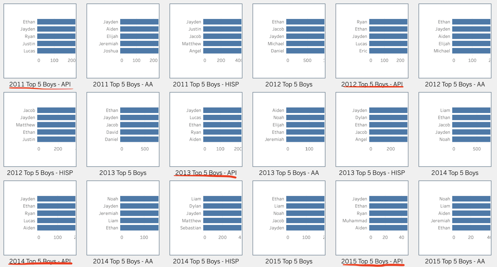
I visualized the data in Tableau Public. Going in, I had an idea of the different types of visualizations I wanted to include. I knew that the best way to visualize time-oriented data is by using line graphs. However, since the dataset is massive, I didn’t want to make the line graph illegible by including too many lines in one chart. Therefore, I only showed the top names over time for each gender and each ethnicity in the line graphs. I identified the top names by creating bar charts for each gender and each ethnicity that showed the counts for each name. I then sorted the bar charts by descending order and filtered by the 5 names with the highest counts. I created the bar charts for each year separately and then I included the top 5 names for each year into the final line graph.
The other chart I wanted to include was a bubble chart to give viewers a broad picture of all the names that were registered between 2011 – 2019 split by gender. I thought a bubble chart would be a nice way to show the popularity of the names through the different sizes and colours of the bubbles. Initially, the colours of the bubble chart were based on the names in the dataset and therefore, there were a lot of differently coloured bubbles.

My peer reviewer suggested showing a correlation between the names though the colour scheme. Hence, I changed the colours of the bubbles to a single colour gradient instead, and the final effect is that the colours get lighter as the popularity of the name decreases. I think this is a more intuitive way of visually showing the popularity of names through colours instead of having arbitrary colours assigned to the names by Tableau Public.
I also included a pie chart to show the breakdown of the counts of the names by ethnicity to see which ethnicity’s names are represented the most in the dataset, and a line graph to visually demonstrate how the total number of names recorded in the dataset have changed over time.
Final Dashboard & Data Analysis + Interpretation
The first row of charts in my dashboard contains two bubble charts – one for girls and one for boys – that shows all the names registered between 2011 – 2019.
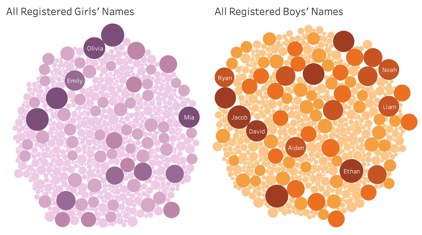
In these charts, the more popular the name, the bigger and darker in colour the bubble. Viewers can see the count for a name by hovering over the name’s bubble. I think this visualization does a good job of visually showing the sheer number of names in this dataset. I also deliberately did not pick colours that reinforce traditional gender norms such as pink for girls and blue for boys, and opted to go for more gender neutral colours such as purple and orange.
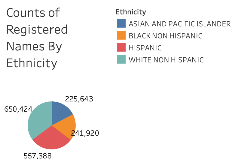
The second row in my dashboard contains the pie chart above which shows a breakdown of the counts of names by ethnicity. I was curious to see whether one ethnicity was more or less represented in this dataset, and through visualization, viewers can see that data from white and hispanic births makes up a greater proportion of this dataset than asian and pacific islander and black births.
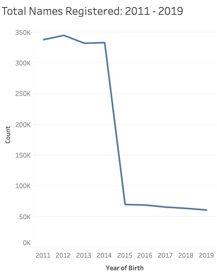
The second row in the dashboard also contains a chart that shows the number of names registered in a given year, between 2011 – 2019. What’s really interesting is that there is a steep decline in the number of names registered between 2014 and 2015, and post 2015, a fewer number of names were recorded overall. What’s also surprising is that post 2015, the level of registered names stays constant. I wonder if this is due to some kind of changes in the way the data is collected, or because post 2015 fewer people gave birth in NYC, or due to something else altogether.
The rows after the second row all contain very similar charts.
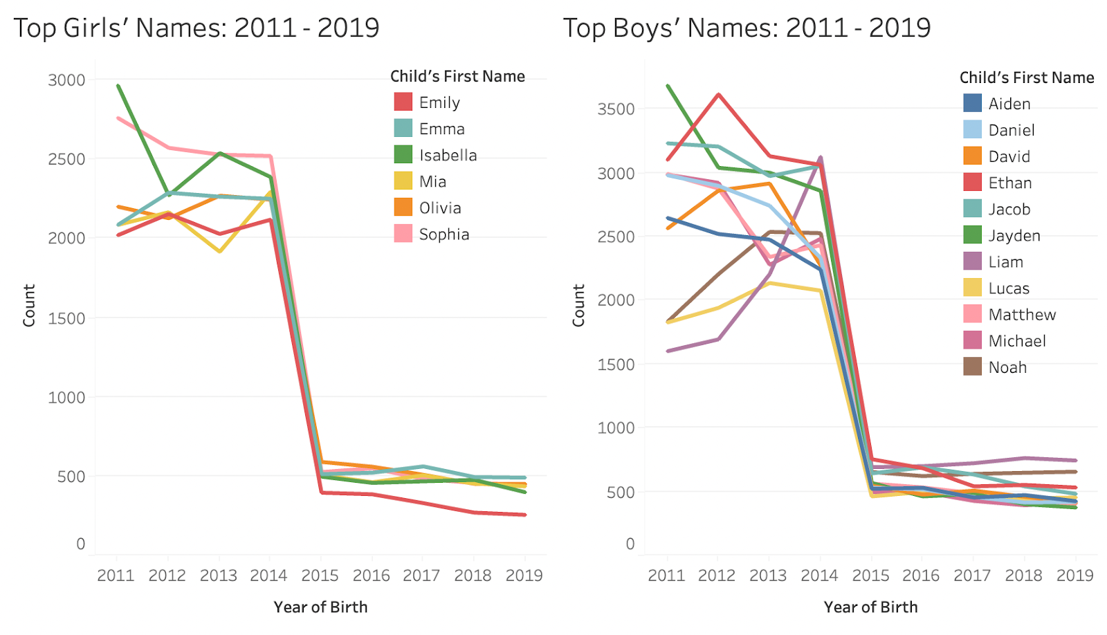
The charts are split by gender and show how the top names for each gender change over time. The charts above are for all the girl and boy names with no cuts by ethnicity. What’s really interesting in these charts is that the top names for girls are pretty consistent between 2011 – 2019 whereas for boys, there is more variation in the names that take up the top 5 spots. It’s also surprising to see that in the boys’ chart, Liam starts as the least popular name within the top names in 2011 but by 2019, it is the most popular name out of all the top names. I find it fascinating to visually see how people’s preferences change over time.
I also included charts to show how the top names for boys and girls change over time based on ethnicity.
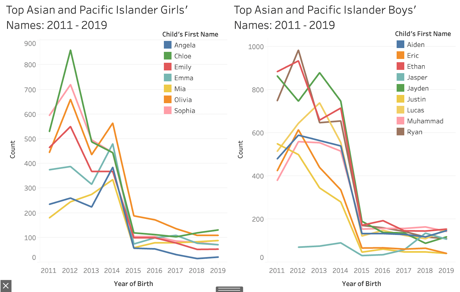
In these charts, it’s interesting to see how the names given to Asian and Pacific Islander girls and boys are very similar to top names overall for both genders – as seen in the previous charts – even though Asian and Pacific Islander births make up a smaller proportion of the dataset. What jumps out on these charts are the sharp peaks (especially in the girls’ chart) which again shows how preferences can change a lot year over year.

These charts show that names for black babies have the greatest variation in terms of the top 5 names between 2011 – 2019. It’s also interesting how Madison consistently took the top spot until 2016, when Ava overtook it for the first time.
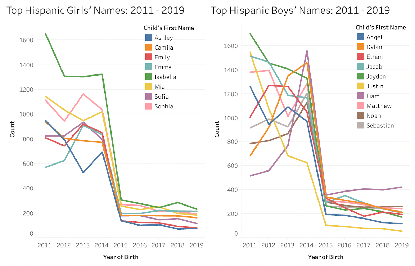
In the girls’ chart, viewers can see that Isabella was consistently the most popular name between 2011 – 2019 for hispanic babies, and again, it’s interesting to see that Liam starts out as the least popular name in the top 5 in 2011 and ends up as the most popular name in 2019, which is exactly what is seen in the “Top Boys’ Names: 2011 – 2019” chart.
As expected, the charts for the top asian and pacific islander, hispanic, and black names contain more ethnic names such as Muhammad, Angel, Amir, Camila etc., but overall, the names are pretty consistent even across ethnicities which I found very surprising. The dataset has the potential to be more inclusive by creating a separate ethnicity category for South Asians who typically don’t anglicize their names. My hypothesis is that separating out the South Asian names will increase the variation in names across charts.
Self Reflection + Future Directions
I was successfully able to clean data in OpenRefine and create different visualizations that are clear and tell a story in Tableau Public which I’m happy about. I ensured that all of my charts have clear titles, labels, and axes, as well as included legends wherever necessary to make the data easier to digest and understand for viewers. When thinking about the legend, I made sure to follow a consistent colour scheme and avoid the use of duplicate colours. There definitely was a learning curve when it came to working in Tableau and I won’t say it is the most intuitive and easy-to-use software. However, it is an incredibly powerful tool and I was very impressed with how quickly I was able to manipulate data in it and play around with different formats and styles of visualizing data.
For the future, I want to improve my data cleaning skills and also want to make more creative and aesthetically-pleasing visualizations that aren’t constrained to Tableau Public’s default chart types, as I saw in the examples I looked at when I was researching visualizations similar to my topic. I come from a background in biopsychology and hence, over the years, it’s been drilled in my head that charts and graphs are supposed to be straight to the point and readable. However, in an info viz class, I should remember to push the boundaries in terms of the aesthetics and creativity of visualizations a little more instead of just focusing on practicality and readability. As I grow more skilled at using Tableau Public and other data visualization software, I would like to visualize this dataset with the use of animations to show how the top 5 names change over time as seen in this visualization. I would also like to work with a dataset that contains more than one quantitative measure. In terms of improving this project, I want to look into how I can reduce the number of charts in the dashboard so that I can tell the story in a more concise manner, while ensuring that the data is easy to digest and understand.
References
Bowders, Z. (n.d.). Mary and the Names That Defined Our Generations [Review of Mary and the Names That Defined Our Generations]. Tableau Public; Tableau Public. https://public-pantheon.tableau.com/en-gb/s/gallery/worlds-most-popular-names
Choudhury, S. (2013, June 21). Choosing the Right Chart Type: Line Charts vs. Area Charts [Review of Choosing the Right Chart Type: Line Charts vs. Area Charts]. FusionCharts. https://www.fusioncharts.com/blog/line-charts-vs-area-charts/
Datasenze. (2017, November 6). Most Popular Baby Names in NYC [Review of Most Popular Baby Names in NYC]. Tableau Public; Tableau Public. https://public.tableau.com/app/profile/datasenze/viz/MostPopularBabyNamesinNYC/Dashboard1
NYC OpenData. (n.d.). Retrieved February 20, 2023, from https://opendata.cityofnewyork.us/
(n.d.). Best Year in Music [Review of Best Year in Music]. The Pudding; The Pudding. https://pudding.cool/projects/music-history/
Rousseau, D. (2023, January 18). Which names is the most given in US? [Review of Which names is the most given in US?]. Tableau Public; Tableau Public. https://public.tableau.com/app/profile/rousseau.dylan7598/viz/testname_16740556933990/Babies
Wickham, H. . (2014). Tidy Data. Journal of Statistical Software, 59(10), 1–23. https://doi.org/10.18637/jss.v059.i10
(2013, December 13). Popular Baby Names [Review of Popular Baby Names]. NYC OpenData; NYC OpenData. https://data.cityofnewyork.us/Health/Popular-Baby-Names/25th-nujf