Introduction
The scientific consensus is that the world is getting hotter. As a resident of a coastal city (and a resident of Earth), this concerns me greatly. While scientists tell us that the planet is warming, I wanted to explore the data itself for New York City. This lead me to climate data for NYC, answering the question of ‘how much warmer?’. However, it also prompted new questions, such as ‘are summers getting hotter?’, and ‘are temperature extremes getting worse?’.
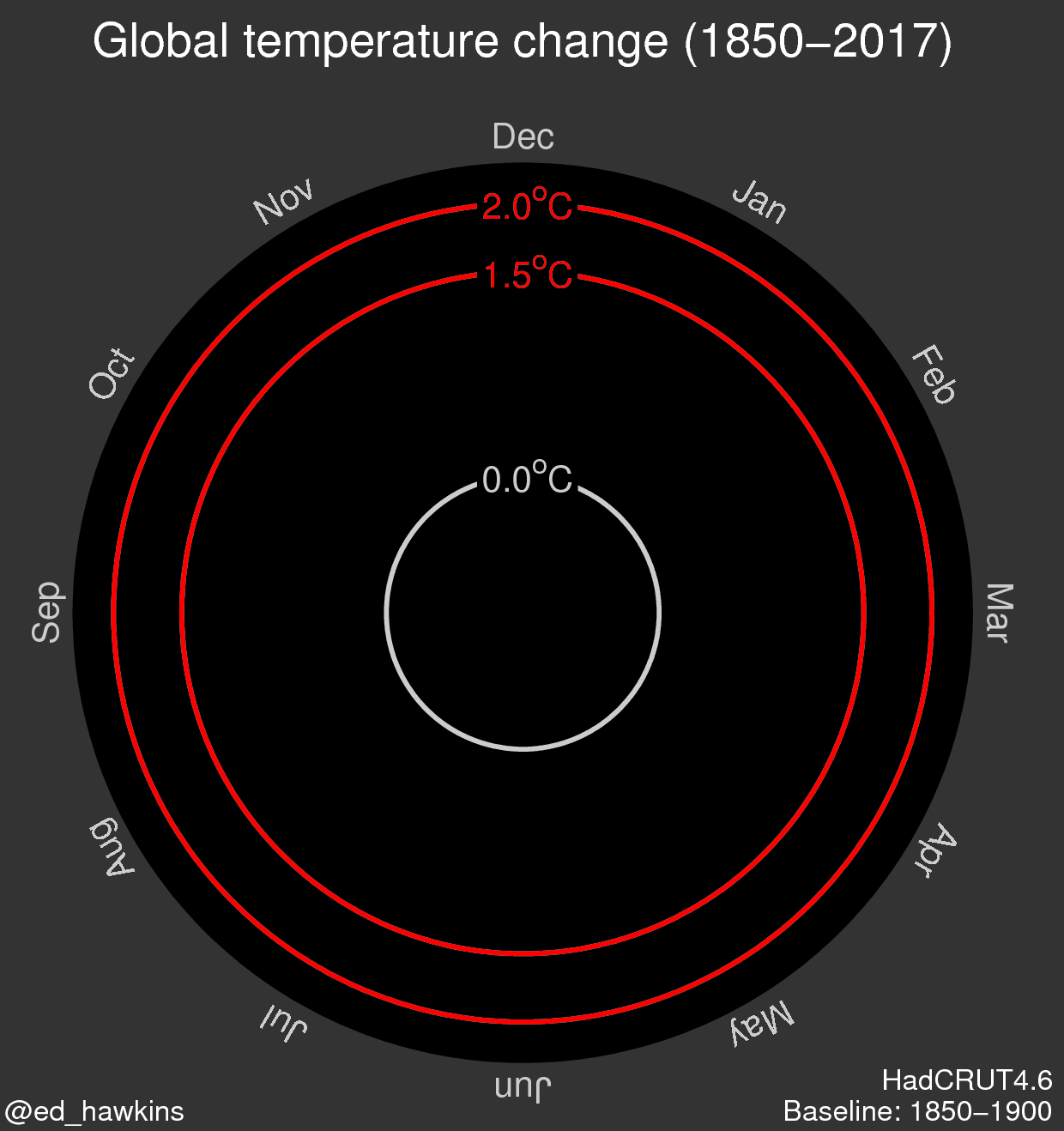
Inspiration

Image: Ed Hawkins
When I started looking for inspiration on how to design some visualizations for climate data, the image above is the first that caught my eye. It’s actually an animated visualization, using an ever-increasing spiral to show the increase in average temperature. It has an element of stress to it as the spiral grows in size more rapidly in the modern era, approaching the agreed upon hopeful limits for warming before catastrophe (the red circles near the edge of the visualization). It implies fear and the hope the spiral doesn’t cross a red-line threshold. It’s one of the most effective versions of a radar graph I’ve seen to date. While this visualization is a big inspiration, it is out of my league for the time being, so I settled for a more simple visual exploration of the data.
Materials
The visualizations in this article were created using Tableau Public, a free data visualization software. The data came from NOAA’s Climate Data Online data warehouse. The data used for these visualizations represents climate readings taken at the Central Park weather station. It spans from January 1935 to August 2018 aggregated at a monthly timeframe. It includes monthly average temperature, average monthly lows and highs, and monthly extreme temperatures, both lows and highs, in degrees Fahrenheit. The data used in these visualizations can be found here. A data dictionary can be found here.
Results, Interpretation, and Methods
In analyzing an overall trend, I looked at yearly average temperature from 1935 to 2018. The initial line graph contained a lot of variation from year to year, so a three-year rolling average was implemented to reduce the variation. The resulting line graph is below.

The linear trend line shows a steady climb in temperature, an increase in just over 2° Fahrenheit since 1935. This graph resulted in more questions than answers, so an exploration into more granular details was pursued. 
Graphing the lowest and highest recorded temperatures has surprising results. The graph indicates that extreme maximum and minimum temperature trends have remained mostly consistent for the duration of the data. So if temperature extremes aren’t changing that much over time (the hottest days aren’t getting hotter), what is happening?

I could see that a more granular view at monthly trends was needed, so I graphed average temperatures by month for each year since 1935 and added trend lines. It’s clear from this graph that the bulk of the warming is happening in the colder months, where the average temperatures have risen precipitously since 1935. Also interesting is that summer temperatures have stayed somewhat consistent over the years and October is the only month with a downward trend. While this graph illustrates that colder months are harder hit by warming than the summer, it doesn’t clearly indicate why. To attempt to answer that question, I graphed average highs and lows per month for each year since 1935.
 This graph more clearly shows that both average lows and average highs are increasing in the winter months. Summer months are seeing a marked rise in low temperatures, indicating that summer days are not cooling off as much they used to. A rise in overall temperature (both lows and highs are increasing) in winter months coupled with a strong rise in low temperatures during the summer months would contribute to an overall warming trend, as indicated by the first graph in this article.
Reflections
When I started this project, I wanted the most basic question answered: Is NYC warming? That question was easily answered, but it didn’t tell me anything else. All of the following questions that were asked and (somewhat) answered came as I dug into the data, a process and phenomenon that I deeply enjoyed. Despite my enjoyment of new questions and answers coming organically, I wish I knew more about the topic on hand before starting my exploration. If i had, perhaps I would’ve had different questions, and pursued different data. I’m proud of the work here, despite some of its issues (could be deeper, there are so many questions about Tableau, among others).
I would like to take a more complete view of this topic, utilizing daily data instead of monthly aggregates , adding locations around the world to compare to others, exploring geospatial data and other forms of climate data beyond temperatures. Environmental issues and their socio-political effects are a big reason of why I am pursuing this degree. I believe I’ll come back to this subject time and time again.
The dashboard for this project can be found here.