Public Landmarks in Arnhem, the Netherlands

To access the dashboard, please use this link.
Introduction
The historical and cultural landscape of European towns and cities is complicated. The ages of many municipalities can be measured in centuries of continuous, or near continuous, habitation. During these spans of time, the boundaries and fabric of towns and cities shift through periods of economic prosperity, famine, war, and natural disasters. A good way of coming to terms with this type of change is through paying attention to public landmarks still in existence in a location. As a town or city changes, inhabitants erect new buildings and markers that express the needs, interests, and styles of that moment in time. The new does not replace the old entirely, however. New structures take their places beside older neighbors, older buildings gain new leases on life by being reconfigured for updated uses, and ancient boundary markers that once showed the outer edges of a location sit inside new borders as reminders of where the town or city used to end. Buildings and borders also provide insight into the social life of residents. Streets and neighborhoods develop particular identities with some being home to the local elite and others to the working poor. Though often stable for long periods of time, even these distinctions are also subject to change.
One of the problems of understanding the historical and cultural landscape of European towns and cities is that it is difficult to see temporal, geographic, and socio-economic patterns in the documents normally used to write histories. This raises some key questions. How might someone who is interested in understanding the history of a place grasp changes to it over time? How might someone trace settlement and use patterns for streets and neighborhoods? How might someone be able to understand the age, density, and variations of public landmarks and what might those distributions“say” about a city or town?
One potential solution to these questions is to visualize landmark data for a town or city and place it in a dashboard that allows visitors to explore the historical and cultural landscape of that place. As a test case, I created a dashboard for the city of Arnhem in the Netherlands. Arnhem has prehistoric, Roman, and Medieval roots. The evidence of its earliest occupation is archeological and is largely buried. The medieval portion of the city was lost to war, fire, and other disasters though a few items survive (Mijngelderland, n.d.). Like the majority of the Netherlands, Arnhem experienced growth and prosperity during the Golden Age of the 17th century (Broekhoeven, et. al. 2000). The French Occupation of the late 18th and early 19th centuries, however, brought destruction once again. After the defeat of the French, the city became a prosperous resort destination in the 19th century (Broekhoeven, et. al. 2000). In the 20th century, Arnhem is perhaps best remembered for the mass-scale destruction the city suffered during the failed Operation Market Garden in 1944 (Pruitt, 2019). This complex history is legible, in part, in the landmarks that survived these tumultuous periods.
Inspiration
As I began thinking about how to visualize the landmark data for Arnhem, I was inspired by three examples, all of which were available in the gallery section of the Tableau Public website. The first is a map of mutual aid societies in the United Kingdom.
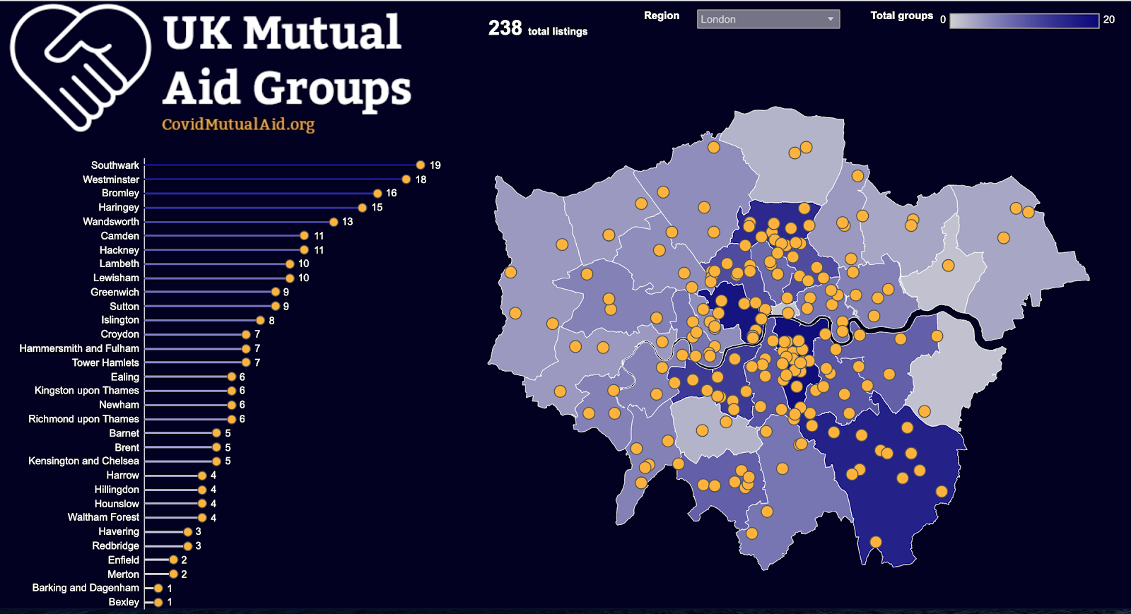
The way the visualization pairs the map data, which has been restricted to neighborhoods in London as opposed to the the entire country, and the names of local organizations allows visitors to see small-scale patterns that would be lost on a larger map.
The second is a map of Toronto that divides city neighborhoods by race and income.
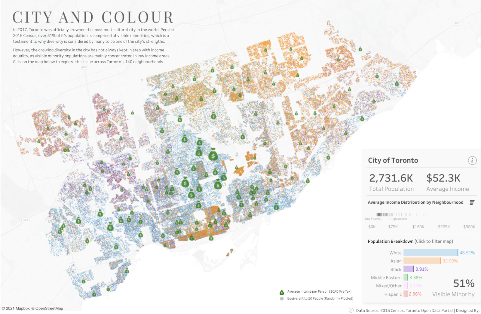
The ability to see socio-economic strata and race simultaneously, as well as settlement patterns, provides a more nuanced view of the city than one might get through other means (reading official records or even being onsite).
The third is a map of Manhattan detailing the construction history of the buildings on the island.
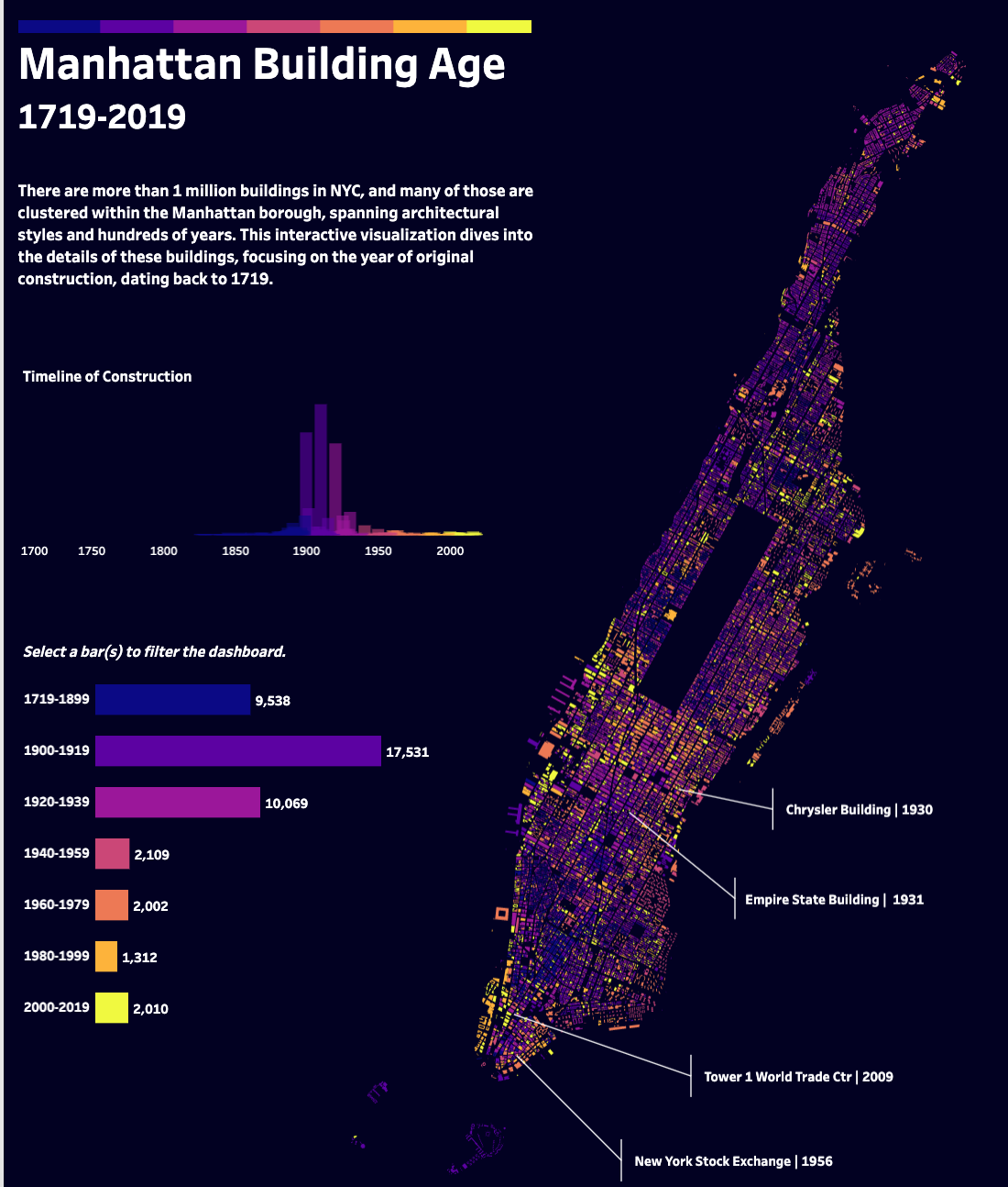
This visualization focuses on the way that the built environment in Manhattan unfolded over time and helps show how the complexity we see today is the result of the past and the present coexisting. The ability to isolate layers and map them to a timeline provides a very good solution to tracking changes in a city or town.
Materials and Data
To create the dashboard, I used publicly available data from the Dutch government. Specifically, I used a data set on public monuments in Arnhem, the Netherlands. The data included a .csv file as well as shape files for mapping. I downloaded a copy of the data and imported the .csv file into OpenRefine for data exploration and cleaning. After these initial operations, I imported the .csv file and shape files into Tableau Public in order to make the individual data sheets that would comprise the dashboard.
Methods
I began by exploring and cleaning the data provided by the Dutch government. The .csv file containing the variables and observations included columns with only “null” values and after ensuring that their deletion would not affect the final data, I removed them from my copy of the dataset. I then found that variables containing dates (e.g. construction date, date when the item received landmark status) were classified as numeric entries rather than date entries. I used OpenRefine to recast these variables to a more appropriate data type. Next, I translated key variable names from Dutch to English because there are far more people world-wide who speak English than Dutch and translation makes the information more readily accessible in the final dashboard. Finally, I used text faceting to group the various monument-types listed and provided English translations alongside the original Dutch. I attempted to auto translate the monument entries but found that many of the automatic translations lacked necessary nuance. A good example of this was the automatic translation of “krukhuisborderij” as “crankcase farm” rather than “L-shaped Farmhouse.” In other words, translating the faceted groups on a case-by-case basis was the best option for providing a more idiomatically correct version. Although I translated the entries for the types of monuments in the list, I did not translate the names of the streets on which they were located because leaving the street names in the original Dutch does not create an undue barrier to understanding the information.
Once the data was cleaned, translated, and organized, I imported it into Tableau Public. I needed data from both a .csv file as well as a shape file and after bringing both into the interface, I performed an inner join on the data sets using the unique identifier “object id.” After completing the join, I began building worksheets. These included a timeline of construction dates, a map with the locations of all the sites in the data set, a breakdown of landmark types by street, various analyses of the percentages of each landmark type, mappings of construction date to the date when the site achieved landmark status, and a list of streets with more than 50 landmarks on them. From these worksheets, I composed three different dashboards. Based on peer-review and light user testing of all three, I modified my project once more to create the final version. In particular, I combined visual elements from my first version and informational elements from my third to create a new panel in the lower right corner. After further discussion with Chris Sula, I then altered the dashboard so that the newly created feature acted as a filter object for the other items and reconfigured the entire composition so that map and timeline had different levels of visual focus.
Results
The dashboard offers a tool for coming to terms with the complex history of Arnhem. Being able to see the city as it is now and also peer through layers of time by using the map in combination with a time series, in which the map acts as a filter object, helps put the various landmarks represented in the data into a temporal context. Being able to see the distribution of landmarks by type and street, and being able to see which section of the city the streets and monuments belong to, also sheds light on the social lives of certain parts of the city. The juxtaposition of old boundary markers and farmsteads, for example, speaks of rural boundaries later enveloped by a growing city. Neighborhoods with mansions and villas serve as reminders of a period of prosperity. Similarly, a row of apartments dating to the 1950’s sandwiched between 19th century buildings conjures images of a post-war construction phase in which the city recovered after serious destruction.
Future Directions
Mapping public landmark data for a particular city provided an intriguing way of coming to terms with its complex past. Future versions of this type of project could include using different platforms other than Tableau Public to explore other functionalities. As the public landmarks are so closely associated with GIS information, a more GIS-specific platform might provide even more layering opportunities to build nuance. It would also be fascinating to try to reconcile the published data of public landmarks with other datasets of historically important places and items in the city and layer those in as well. Further, delving into any available data on income and class across time would also be enlightening. Finally, being able to merge the GIS components with a more robust timeline tool so that the various eras of the city can be isolated more cleanly (along the lines of the Manhattan map mentioned in the inspirations section) would be interesting. The library at the University of Utrecht maintains several historic maps in digital form and using those historical maps (rectified to current GIS standards) to locate each historical layer may help provide even more nuance and provide the illusion of “peeling back” layers of time.