Timeline of the History of Visualization
Introduction
For this lab, we were tasked with creating a timeline about a theme in the history of visualization. Scholars such as Michael Friendly, Robert Kosara, and R.J. Andrews, have already described various developments across time—from Ptolemy’s map of the world (c. 150 CE) to contemporary network visualizations. The main questions for this lab were which moments in the history of visualization would we choose to show and why would we choose them. To complete the lab, we were asked to place our selected events into an interactive chronology by using the Knight Timeline JS web application.
Inspiration
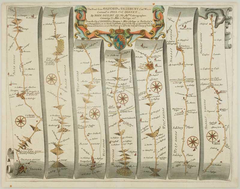
I began by examining examples of others who had used timelines to organize their historical overviews. In particular, I focused my analysis on Friendly’s and Andrews’ efforts. Andrews confines his History of Info-Graphics to a period between the 17th and the 19th centuries. He presents each innovation along a strip map, based on Ogilby’s Road Atlas, in which physical position indicates the technique’s place in the chronology. In their website of the “Milestones” of data visualization, Friendly and his collaborator, Daniel Dennis, use a minimally graphic timeline that stretches from Antiquity to the 21st century. Their site breaks moments in the history of the field into four categories—“cartography,” “statistics and graphics,” “technology,” and “other”—which allows visitors to explore various developments both chronologically and conceptually. Both approaches were inspirational but far outside the technical confines of the paired-down end result possible with the Knight Timeline application.
Using the Knight Timeline
The Knight Timeline offers neither spotlight functionality or stylized graphics, like those used in the History of Info-Graphics site, nor the convenience of a linked database, like that used in the Milestones site. Instead, the application relies on a GoogleSheet that allows users to input links to web-based assets (e.g. images and videos), input text blocks for explication, and provides rudimentary control over background color. The placement of titles, text, images, captions, and credits are outside the user’s control. Even with these limitations, however, the application allows users to create a visually appealing and easy to use timeline that is quickly publishable to the web. Further, the use of a GoogleSheet in the background allows the creator the ability to edit and update the timeline without having to republish it.
Process and Rationale
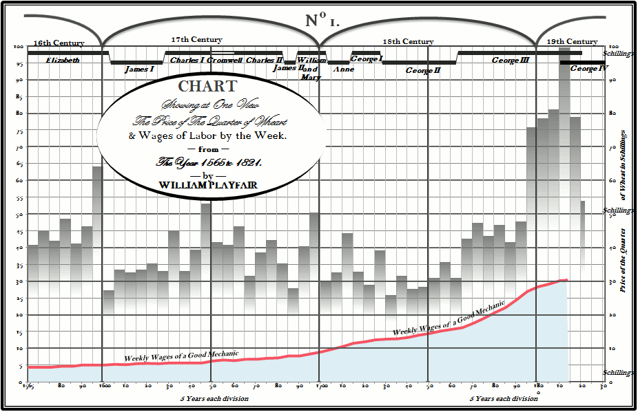
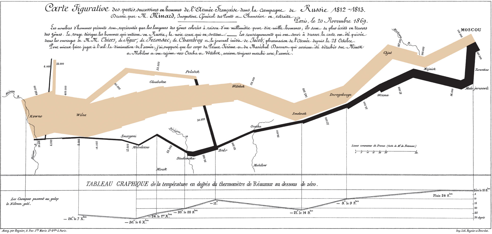
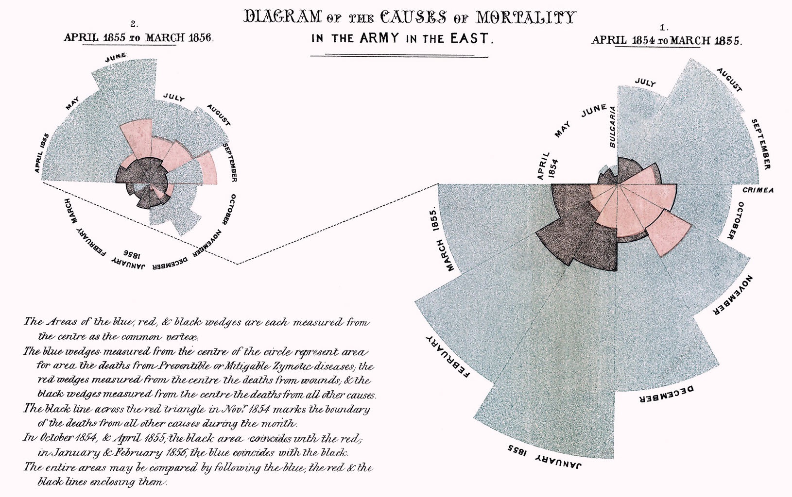
As I began thinking about which portion of the history of visualization I would approach, I was provoked by Robert Kosara’s article “The Repetitive and Boring History of Visualization” in which he discusses the’ propensity of scholars to dwell on the “big names” in the history of visualization—Snow, Playfair, Menard, and Nightingale. He poses an intriguing question regarding the importance of these contributions:
But are those really the examples we should be looking at? What impact did Minard’s chart ever have? Was Nightingale’s plot really that important for making her case for nursing as a profession? I haven’t seen much evidence beyond pure speculation. Snow’s map supposedly was key to convincing the powers that were to shut down that water pump that was spreading the cholera. But were they convinced by the map or by his scientific reasoning? (Kosara, 2016).
In other words, the author poses a fundamental question about the reach and influence that these “landmark” images had on society. Did they, for example, influence individual, group, or governmental behavior?
I was further intrigued by the Milestones site in which there is a conspicuous “dead zone” in the chronology from roughly 1950 to 1965 and which the authors call the “Lapse of Interest.” Other scholars (among them Andrews and Jeffrey Heer) discuss a “Golden Age of Visualization,” which spanned the 19th century and was driven by Playfair and Menard. According to these authors, the period after this Golden Age is marked by a steady decline until the advent of computer-driven visualization from the 1980s forward. The very specific timeframe offered by the Milestones site, along with its provocative label, drew my attention because it coincided with the height of the Cold War in the United States. This was a politically and socially tense period in history and also one in which the American government, and its citizenry, used various forms of information visualization to make potentially life-and-death decisions.
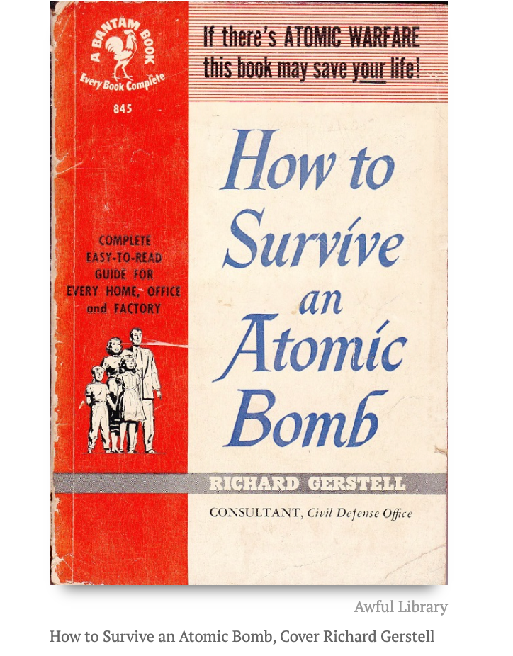
Rather than doing a fairly typical timeline of movements/developments in visualization, or about the pantheon of “greats,” my project focuses on the era of “lapse” and on normally overlooked examples coming out of it. In particular, I examine some of the rather “ho-hum” items of information visualization that, despite their dubious artistic merit, arguably impacted millions of lives. Specifically, I focus on info-graphics and info-visualizations from 1950 to 1962 geared toward preparing the American public to survive nuclear holocaust. The rationale for my choice is that much of what was produced (mostly by the government) was concerned with imparting survival information through graphical and textual means. Though often ugly, the information these visualizations provided deeply impacted the lives, thoughts, and political choices of millions of Americans. The attitudes, beliefs, and fears they encapsulated (and helped to perpetuate) resonate into contemporary society.
Methods
I began gathering images and information by searching for “Atomic Survival,” “Nuclear Survival,” and “Civil Defense” and limited the time frame to 1950 to 1965. These terms returned various pamphlets, manuals, and films from the era in question. I then selected representative examples and broke them into three “moments”—1950-1960, 1960-1961, and 1961-1962. The beginning decade (1950-60) overlaps with the period in which concern over atomic weapons was on the rise.
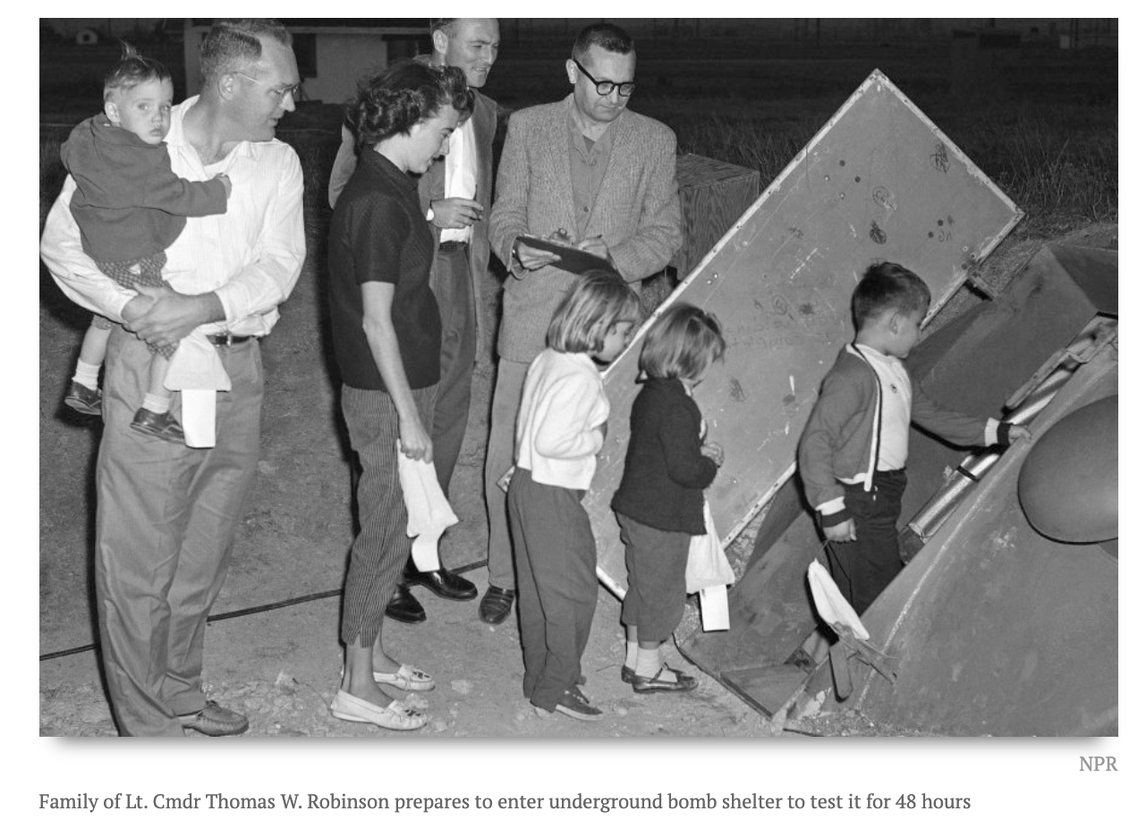
The next short phase (1960-1961) saw a rise in the proliferation of fallout shelters and a growing concern that thermonuclear war was a very real possibility.
The last segment (1961-1962) coincides with the Cuban Missile Crisis during which the United States came very close to a nuclear war with the Soviet Union.

In addition to chronology, I also arranged the information thematically. Specifically, I identify the period 1950-1960 as one of lingering optimism in which “how-to” guides provided strategies for actively participating in one’s survival. The period 1960-1961, I argue, can be associated with a growing pessimism in which shelters provided a passive means of safeguarding life because active measures were not sufficient in the face of more powerful weapons. I identify the last phase, 1961-1962, as the beginning of a deep fatalism that would persist until the end of the Cold War. For this period, the real possibility of global annihilation overshadowed the chances for survival (active or passive). I end by noting the lasting effect that this period has had on multiple generations and how the info-graphic and info-viz of this period, though ugly, deeply influenced personal, collective, and governmental behavior.
Peer-Review and Testing
After initial peer-review and testing, I added a short introductory text to the first slide to help frame the content of the timeline. I also added a reference, with video, to the 2019 missile scare in Hawaii on the final slide as a means of tying together the worry of previous decades with lingering fears in the 21st century.
Results

Timeline: Anticipating Armageddon: Survival Info in the 1950s and 60
The finished timeline tells a focused story about a particular moment in time. This is perhaps one of the most appealing things about the Knight Timeline application. Arranging things in a linear fashion helps create clarity and flow in a narrative. The downside, however, is that a linear presentation can impart the mistaken impression that things developed in an unbroken chain that led from a beginning state to an unavoidable end state. Certainly, the history of the Cold War is more complex than a straight-line march from year-to-year, decade-to-decade. There was nothing inevitable about the outcome of the Cuban Missile Crisis, or any of the other nuclear scares that occurred after it. A future iteration of this sort of project might benefit from more non-linear storytelling options as well as the potential for added “what if” scenarios to show how terribly wrong it all could have gone.