Observation at The Met Fifth Avenue: How is the museum tour guide in including different kinds of visitors.

The Metropolitan Museum of Art is the largest art museum in US and the third most visited art museum in the world. The main building in Manhattan’s Upper East Side in one of the world’s largest art galleries. As was posted on January 4, 2019 that 1,659,647 visitors were attracted to The Met Fifth Avenue and The Met Cloisters from May 10, 2018 to October 8, 2018. Based on the data from Wikipedia and MET official website, with such large number of visitors from all over the world, I began to curious how the visit guide provided by the museum service did well in considering different kinds of visitors.

According to what I learnt from Design Justice, the tour guide designed by MET should aim to ensure a more equitable distribution of the benefits and in this case, the museum tour guide should also consider non-English speakers, people with disabled, etc.

I went to The Met Fifth Avenue on 27th, Sep. to directly observe as a visitor and my goal was to see whether different kinds of visitors were guided friendly and effectively in visiting the museum. It was a cloudy afternoon with crowded visitors, and I waited for 10 minutes in line to get my ticket.
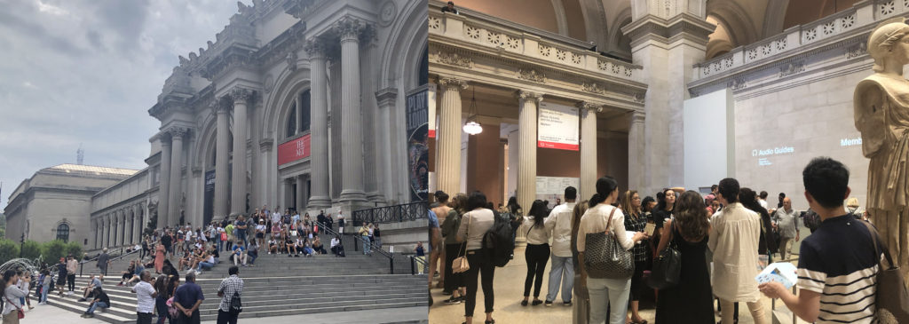
1 Manual Guide

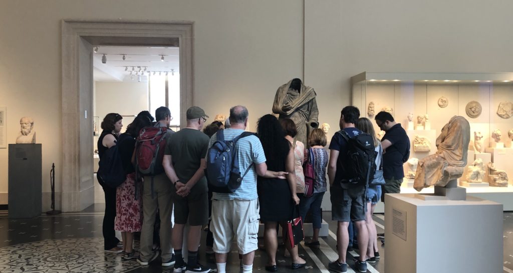
I saw several cicerones surrounded by a small number of visitors. I joined them for free. Some visitors followed by cicerones carried backpacks and not seemed like locals. The good thing for getting a manual guide is that you could directly ask questions and get answers, especially for history or art fanatics who are always filled with questions.

But this method is not that feasible for visitors who prefer to get through the museum quickly and are not fluently English speakers. Since you are guided by a certain route and listening to deep explanations of the exhibits really takes time. In this period, I found some of visitors would only follow a few minutes then left the group to visit by themselves.
2 Audio Guide Rent Onsite

These days the most commonly used tour guide in museum is audio guide. At the museum lobby visitors could easily find the words “Audio Guide”, and the return place was also obvious to find. During my observation period, I found no more than 50% visitors were using audio guide and I guess it was because the audio guide in MET was not free, or some were not first-time visitors or some just preferred to quickly visit the whole museum without deep explanations.

2.1 Whether considering non-English speakers.

Yes. The audio guide provided by MET contains 10 different languages, which is especially considerable for foreign visitors. When I visited the museum, I found a lot of Asian visitors renting audio guide and listening to the guide frequently. It’s much effective for them to get the explanations in their mother language.

2.2 Whether considering visitors with disabilities.

During my observation period, I did not find disabled visitors. But I found some information on the MET website that the museum offered assistive listening devices and real-time captioning for visitors with hearing loss.

2.3 Whether considering aged visitors.

I found an old woman who seemed uneasy to input numbers into the audio guide to get the explanations. And some visitors seemed tired to hold the guide near their ears to listen all the time and they needed to find a place to sit or change to another hand to hold the guide. I think the interaction method between visitors and audio guides is not that friendly especially for aged visitors. Manually inputting numbers could waste time. Besides, the guide is not that easy and convenient while the MET is large, and most visitors would stay more than 2 hours.

I guess it’s better to add automatic induction function to the audio guide and visitors don’t need to input numbers themselves but only to answer yes or no to listen the guide. In addition, always holding the guide near ear to listen is not convenient. Why not provide earphones to aged visitors together with audio guide? Or support the visitors using their own earphones.

2.4 Whether considering visitors who prefer quickly visiting the whole museum.

I did find a visitor hanging the audio guide around her neck, but she didn’t use it during the whole process. And some only listened a few seconds then gave it up. I guess the contents provided in audio guide were too long and they only wanted to get a concise version. They came to the museum to get something new but not preferred to get that deep understanding towards a single exhibit. In that case, perhaps better to provide different versions for visitors to choose from. For instance, a quick 1-minute explanation together with a detailed 5-minute version.

3 The MET App
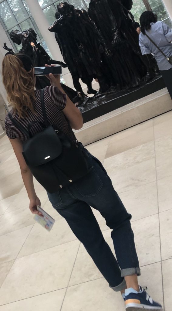
There is an App called The MET which also provides travel guides and even augmented reality function. The good thing is you could use it offline, while the bad thing is that you have to download it beforehand. How many visitors would take trouble to download an App to help them visit the museum? I guess better to develop a Web App for visitors who just want to visit temporarily.

During my observation period, I only saw a young woman using her iPhone to get the audio guide. Generally speaking, not a large number of visitors choose to get a guide on App. I believed one of the problems was not enough contents on App, compared to the audio guide you rent onsite.

Conclusion

In 2015, the MET did a thorough research on how to improve the audio guide and during the research they did find 40% visitors were foreigners and the importance of reducing the complexity of using audio guide. However, just like what Norman said, “The world is not neat and tidy and things not always work as planned.” All the tour guides provided by MET are roughly satisfied but still have space to improve. Perhaps reconsidering different visitors’ needs could help better the overall experience.

Reference

1 Wikipedia: Metropolitan Museum of Art: https://en.wikipedia.org/wiki/Metropolitan_Museum_of_Art

2 Met Welcomes Nearly 7.4 Million Visitors in 2018:

https://www.metmuseum.org/press/news/2019/2018-calendar-year-attendance

3 Improving the Audio Guide: A Look at Our Visitors:

https://www.metmuseum.org/blogs/digital-underground/2015/improving-the-audio-guide-a-look-at-our-visitors

4 Norman, D. A. (1998). The Invisible Computer: Why Good Products Can Fail, the Personal Computer is So Complex, and Information Appliances are the Solution. MIT Press. Chapter 7: Being Analog http://www.jnd.org/dn.mss/being_analog.html.

5 Costanza-Chock, “Design Justice: Towards an Intersectional Feminist Framework for Design Theory and Practice”

Person, Place, and Thing: An Architect, an Airport, and a Tesla

Person: Richard Saul Wurman

Although formally trained in architecture, Richad Saul Wurman has been credited with the term “information architecture” as he applied his architectural background to help shape the field.

Wurman initially never thought of himself as an information architect or even thought that his ideas would contribute significantly to the field. Instead, he simply saw a problem with the increasing amount of information that was available and wanted to find a way to organize it. The following excerpt from Resmini and Rosati’s (2011) article captures the parallels he saw between architecture and information architecture:

Wurman’s maintained that as much as architects are expected to create structure and order in the world through planning and building, information architects were expected to draw lines and derive some kind of order in dataspace, their primary task being to make this information simpler, more direct, and ultimately more comprehensible.

He addresses the problem of increasing information by proposing design solutions. Because of his background and the angle that he approached information architecture, much of what Wurman presented mainly concerns the visual aspects of presenting large amounts of information. Nevertheless, his contributions are significant as his perspective has changed the way information professionals view, manage, and present information.

Indeed, Wurman’s most significant contribution to the information profession is that he introduced principles of information design and how all aspects of the field can implement design solutions. As Wurman was concerned with “deriving some kind of order in dataspace,” the aesthetics and visual impact of information is just as important as, say, a database itself. The information within it needs to be easily accessible, understandable and effective. Thus, many information professionals now also consider this approach when designing new systems and databases, or when presenting any form of information. As the amount of available information continues to increase, Wurman’s approach to information architecture seems very much necessary to create structure, order, and comprehension.

Place: Changi Airport

The Changi Airport in Singapore is consistently ranked as one of the best airports in the world. With world-class dining, shopping, gardens, and art installations, it’s an attraction in it of itself rather than a mere layover. The amenities and layout of the airport truly make it an exceptional experience and is an example of what happens when user-centered research and design is utilized in a public space.

In designing the airport, the placement of chairs was an important factor. Kenneth Ho, Senior Manager of Airport Facilities, explains that in providing a comfortable and luxurious experience, “single seaters spaced far apart are available for travellers seeking solitude, while clusters of comfortable lounge seats are designed for bigger groups like families” (Changi Journeys, 2016). “Snooze chairs” are also provided with outlets so flyers can charge their devices while resting comfortably (Changi Journeys, 2016).

In addition to providing comfortable seating, the airport also recognized the importance of its layout and how it can influence human behavior. For example, high-traffic areas have no seats to ensure a clear passageway while chairs in public areas “have arm rests to deter people from lying across it” (Changi Journeys, 2016). It is often the little things, like arm rests on chairs, that most people often overlook but can make a big difference.

This idea of strategically placing and designing chairs reminded me of Don Norman’s (1988) discussion of doors in his book, The Design of Everyday Things. A well-designed door is one that you automatically know how to use. A poorly designed door is one where you end up trying to push it open when you should be pulling it open. Ultimately, good design is something that you don’t notice because you don’t need instructions telling you how to conduct something because it has been designed with the user in mind.

Just as user-centered design can help with the flow of airport foot traffic, it can also help in crafting a better information experience. The application of user-centered design may be even more imperative now as information is rapidly becoming digitized and people now have numerous options to consume it. While doors and airports may seem completely unrelated to the field of information, the goal remains the same, which is to provide a better and improved experience for the user.

Thing: Tesla Vehicles

Some say Tesla has revived and revolutionized the electric vehicle industry. Surely, the vehicles arrived at a prime time when climate change is a pressing topic for politicians and more renewable energy options are available, but environmental consciousness is not the only reason for crediting Telsa with revolutionizing an industry.

Sit down in a Tesla and the first thing you notice is the absence of buttons, knobs, dials, and other gadgets that are usually associated with a vehicle’s dashboard. Instead, a large touchscreen sits in the middle, where such buttons and dials would have been. This touchscreen essentially controls everything in the car, from air conditioning to music. What’s even more noticeable about this touchscreen is that it can be customizable. You can input your name and then create settings to your preference so whenever you get in the car and tap on your name, the car is catered towards your experience. This idea of creating a catered experience for the user is closely related to Heidi Cooley’s discussion of the iPhone in Finding Augusta: Habits of Mobility and Governance in the Digital Era. In referring to Lev Manovich’s note about “playing the iPhone,” Cooley states that this marks a shift from “the principally utilitarian functionality attributable to jog knobs, buttons, and keys that defined earlier mobile devices” (Cooley, 2014, p. 32) What Tesla did for electric vehicles is similar to what Apple did for smartphones in that both companies rejected traditional, or “utilitarian,” views of what their products should look like and instead reimagined how it could be.

By replacing the traditional dashboard with a touchscreen, Tesla achieves a more fluid interaction between driver and vehicle. Cooley even goes on to state how “this idea of human-device interaction as skin-on-skin contact discloses something profound about ourselves as well as our devices” (Cooley, 2014, p. 36). Perhaps this “skin-on-skin contact” that is evident in both the iPhone and now a Tesla is necessary for facilitating such a unique user experience. Ultimately, Tesla revolutionized the electric vehicle industry by reimagining the user experience of the automobile. There has not been a car like a Tesla before and it certainly is the first luxury electric vehicle of its kind.

References:

Cooley, H. R. (2014). Finding augusta: Habits of mobility and governance in the digital era. Hanover: Dartmouth College Press.

Designing the changi experience. (2016). Changi Journeys. Retrieved from http://www.changiairport.com/corporate/media-centre/resources/publication/issue-2/designing-the-changi-experience.html

Resmini, A. & Rosati, L. (2012). A brief history of information architecture. Journal of Information Architecture. Vol. 3, No. 2. Retrieved from http://journalofia.org/volume3/issue2/03-resmini/

Observing Human Information-Seeking Behavior at Roosevelt Island.

On April 13th, Saturday, ‘The Cherry-Blossom Festival’ was held at the Four Freedom Park at Roosevelt Island. The festival was organised to celebrate Roosevelt Island’s blooming cherry blossom trees and was also featuring traditional and modern Japanese performances and Cultural Fair.
The festival was free, and registration for the event was voluntary and was only there for organizers to estimate the number of people attending .

It was encouraged to take public transportation for the event as there is limited parking space available at Roosevelt Island. The modes of transport in and out of the island available were – subway, tram, ferry, bus and car.

The first sign of trouble which was visible while arriving to the island was that the waiting time to take the tram was no less than 2 hours. But at least the Subway and the Bus traffic was moving smoothly. Even after arriving the Island via the Subway, people were greeted with an extremely crowded subway station. But at this point all everybody desired was to escape the subway station and rush towards the necklace of cherry blossom trees present at the island.

While at the island, people enjoyed the beautiful displays and performances. The problems began when people started heading back home. The island had drawn such a crowd that all the modes of transport were jammed. The line to the subway station grew so long that the end of it was not visible. The bridge, tram, Subway, NYC Ferry, and bus service all experienced crowding and delays. The crowding got even severe after 1:45, when the NYPD briefly asked MTA to bypass the Roosevelt Island stop so that paralyzed F trains could move again.

This was the point where there was a sudden switch in the behavioral pattern of the attendees. It went from ‘relaxed, enjoying the beauty of spring’ to ‘Need to find means to get off the island at once’.
The surge of urgency and frustration seemed contagious. The people started gathering information to select the best possible mode to get off the Island.

The characteristics that were witnessed in their behavior were closely related to the characteristics stated by Ellis in ‘ Wilson, “Human information behavior”’
which are:

Starting: the means employed by the user to begin seeking information, for example, asking some knowledgeable colleague.
Chaining: following footnotes and citations in known material or “forward” chaining from known items through citation indexes.
Browsing: “semi-directed or semi-structured searching;”
Differentiating: using known differences in information sources as a way of filtering the amount of information obtained.
Monitoring: keeping up-to-date or current awareness searching.
Extracting: selectively identifying relevant material in an information source.
Verifying: checking the accuracy of information.
Ending: which may be defined as “tying up loose ends” through a final search.

It started with people asking MTA staff or visible event organizers the best means (of transport) which might take the least possible time. When no substantial answer was given to them they started chaining which in this case might just be following directions given to them by fellow attendees of the festival, who might’ve been trying to leave since an hour earlier, thus, having more experience in that current scenario.

Then they started browsing the different options available for getting off the island. Differentiating them by an estimate of time it might take if they opt for each of the available options, or in what direction of the city it would take them. They kept monitoring the progress of the lines, whether they were moving, or the amount of people present in the lines for the Subway or the Bus.

People then extracted the data which seemed relevant to them, making decision, for example selecting to travel by bus, because the line seems the shortest and they would definitely get a seat when the bus arrives. But still kept verifying the time when the bus would arrive by messaging the number present with the details of the bus, which informed them of the estimate time of arrival and current distance of the bus from the stop.
But in the end they still kept a track of whether the subway line was moving faster, so they could switch the mode they selected according to their observations.

The search for any sort of information begins with the need to solve the problems being experienced by the users. During the festival, the attendees faced a problem and looked for methods in which they could solve the problem. Even though everyone unknowingly followed the simple basic method of narrowing down to their preferred mode of transport, the ultimate decisions taken and the reasoning behind those decisions were all distinct. The process incorporated a series of encounters with information within the space rather than a single incident from which a decision was made.

References:

  1. Wilson, “Human information behavior”. – Ellis, D. (1987). The derivation of a behavioural model for information retrieval system design. Information Studies. Sheffield, University of Sheffield.
    http://inform.nu/Articles/Vol3/v3n2p49-56.pdf
  2. Kuhlthau, Carol C.”Inside the search process: Information seeking from the user’s perspective” “Journal of the American Society for Information Science’ 
    https://ils.unc.edu/courses/2014_fall/inls151_003/Readings/Kuhlthau_Inside_Search_Process_1991.pdf
  3. https://www.fdrfourfreedomspark.org/public-programs-events/2019/4/13/roosevelt-island-cherry-blossom-festival

Observation of National Geographic Encounter – Ocean Odyssey

By: Michelle Kung
INFO 601-02 Assignment 3 Event Attendance

What is it

National Geographic’s Ocean Odyssey is an exhibition about marine biology and conservation that promises visitors an interactive and immersive experience. Visitors get to see, hear, and feel what ocean life is like for different sea creatures. A member of staff guides small groups of visitors through the interactive spaces and encourages everyone to explore every part of each space. The Ocean Odyssey starts in the shallows of the Pacific Ocean and takes visitors all the way to the Californian coast.  

I visited the Ocean Odyssey in March, 2019 had found this experience to both be a lot of fun and highly educational. The new technology used gave the exhibition a lot of affordances that visitors were not familiar with. And the guide, acting as mediator, served as the signifier to ensure that visitors’ experiences were pleasurable and not frustrating.

Immersive environments created by audio visual elements

Effective use of audio and visual elements made interaction with information truly immersive and entirely effortless.

Visual

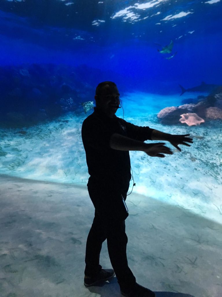
The Ocean Odyssey experience featured multiple audio-visual displays. But unlike conventional single screen-based information, these experiences were highly immersive. Users were invited to enter rooms in which every surface was a screen, including the ceiling and sometimes even the floor. Many rooms had curved walls that surrounded groups of visitors. Our guide encouraged us to “swim” into the rooms, adding to the immersive experience. Many users attempted to interact with different visual elements, by pointing at them, stepping on them, and following them. Sometimes, digital elements responded to users’ physical movements but sometimes there was no digital/ physical connection. On the whole, visitors seemed delighted when interaction was possible and not at all disappointed when it wasn’t. Perhaps users haven’t developed an expectation to be able to interact with any digital element yet.

One of the most spectacular exhibits was a 3D video of a life size humpback whale displayed in a room on a curved wall that surrounded visitors. Visitors were invited to wear 3D glasses to improve their experiences. The video showed how humpback whales feed on krill by opening its gigantic mouth. Users were so mesmerised and immersed in the video that a user screamed out loud in fear when the photorealistic whale swam towards the screen with its mouth wide open! Such rich visual information elicited emotional responses in users.

Audio
Buttressing the vibrant visuals were rich and realistic audio elements. Effective use of sound allowed users to be immersed in the underwater environment created by the Ocean Odyssey. In an exhibit showing what the ocean is like in the night time, sound was the main medium. Users sat in a small auditorium completely devoid of light, listening to the sounds of whales, dolphins, and other sea creatures. Users were passive receptors of audio information. 

Interactive videos enraptured users

The Ocean Odyssey also featured gesture controlled interactive video elements to teach users about the behaviour of sea lions and about bio luminescence.

Our guide explained what bio luminescence was as users moved their arms in front of a screen. The screen detected motion and displayed corresponding lights, representing bioluminescent bacteria. Users were encouraged to interact tactilely with all elements of the bioluminescent exhibit. This hands-on approach allowed users to learn about an otherwise abstract part of the ocean that they have probably never heard of or thought about.

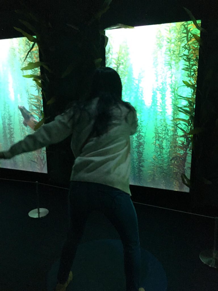
In the sea lion exhibit, our guide demonstrated using the screens to learn about sea lions. Individual users stood in front of individual screens, waving their arms and watching the sea lion swim in corresponding movements.

Traditional displays sadly forgotten

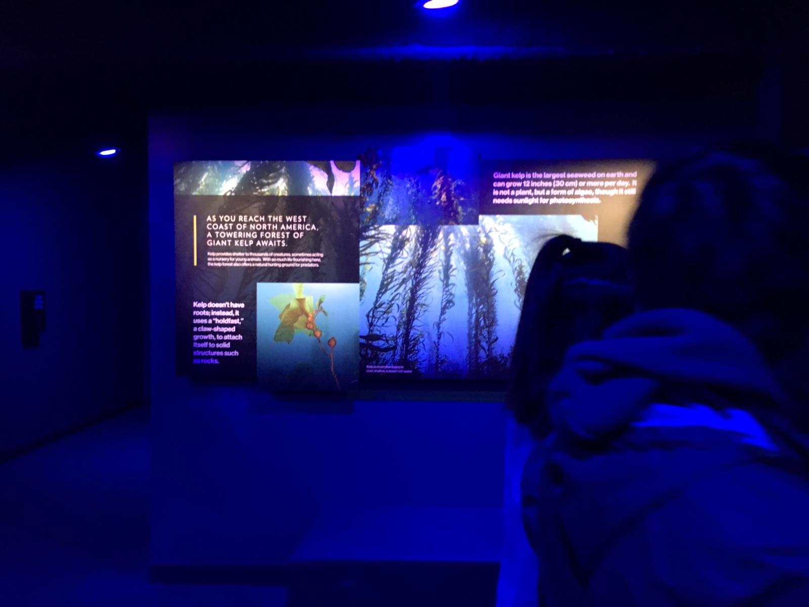
Unlike a traditional museum environment where static images and text are the bulk of the information, in this experience, they were peripheral. Unless the guide purposefully drew users’ attentions to non-digital image and text, they were largely ignored.

Perhaps a better designed information environment would make a more seamless transition between information that is digital presented to users, and traditional forms of information like posters and displays. Compared to interactive and immersive digital elements, traditional static visual graphics were much less interesting to users.

Quizzes and games

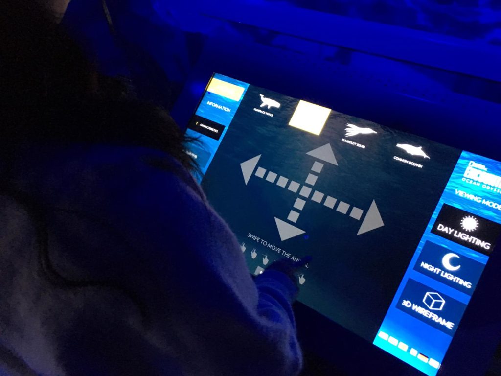
At the end of the exhibit, our guide led users into a room with many different games and quizzes on ocean ecology and conservation and allowed us to interact with them independently.  Most of these activities were screen based, apart from colouring sheets which no users used.

Users interacted with different screens equipped with pressure, laser, and gesture sensors, making each game interesting and different. Adults and children alike were captivated.

Reflection

I think the Ocean Odyssey experience was a really well designed information environment which allowed users to experience information in a fun, experiential, and dynamic way. It proves that learning doesn’t have to just be cognitive and challenges traditional approaches to learning by allowing users to engage with information physically and emotionally. I think this kind of experience, when curated as well as the Ocean Odyssey, can have great impact on education and edutainment.

But I’m not sure whether or not the information environment was designed with affordances in mind. Users were guided by a trained guide throughout, and were given instructions on how exactly to interact with each aspect of the experience. Of course, interactive experiences that blends digital with the physical are still very new so there isn’t as yet an established semiotic system that can allow users to know exactly how to interact with exhibits without a guide. I can imagine, in future, when more experiences incorporate interactive digital elements in physical spaces, there will be a need for the design of a standardised semiotic system that is well understood by the user to act as navigation.

References

Norman, Don. The Design of Everyday Things. New York: Basic Books, 2013.

Meetup: Designing Technology for Older Adults

In September, I attended my first Meetup – ‘Designing Technology for Older Adults.’ The speaker was Yasmin Felberbaum, a Ph.D. student at the University of Haifa. The focus of the talk was threefold: (1) the challenges of designing for older adults; (2) the design decisions that could improve products for these users; and (3) examples of well and poorly-designed products aimed at older adults. For this article, I will use Felberbaum’s research to show how these design considerations tie into our readings about user-centered design, design justice and the political economy of information. First, I will highlight the design challenges associated with older adults, and how these are undergoing a transformation. Next, I will discuss what inclusive design means in the context of Chock’s ‘Design Justice.’ Finally, I will use Felberbaum’s research to show how we can best design for an elderly population, reflecting principles championed by the Design Justice movement.

Design challenges for older adults 

The event began by defining an ‘older adult’ as anyone over the age of 65 and highlighting the challenges associated with designing for this segment of the population. These fall into three main categories:

  • Physical – motor changes, e.g., inability to hold a device for an extended time;
  • Mental – cognitive and emotional changes, e.g., loss of loved ones may cause depression or decreased motivation;
  • Educational – low levels of technology training and skills are still prevalent.

Due to population increases and improved life expectancy, estimates currently put the number of adults aged 65+ at roughly 2 billion by 2050, according to Felberbaum. However, the older adults of today are vastly different from those of the future, a point which Norman references in his ‘Being Analog’ article. As our everyday lives are becoming increasingly complex, ‘the slow evolutionary pace of life is no longer up to the scale and pace of technological change’; meaning that humans must now try to keep up with ever-increasing and oppressive amounts of knowledge. As a result, the current generation of young, digital native adults, are being shaped by different experiences with technology. They have higher expectations for technology to help them cope with so much information. The way that young adults today interact with technology is also fundamentally different. According to Benkler’s ‘The Wealth of Networks,’ our interaction with technology today is much more pervasive than it was 50 years ago. The conclusion we can draw from this is that to disregard older adults as an insignificant portion of technology consumers is seriously misguided. Not only will they become increasingly significant in size and purchasing power, but they will also be more demanding in the quality of that technology and how it serves their lives. They will be healthier and better technically educated and will fully expect to be included and designed for, much as they would have been when younger.

‘Design Justice’ as a way to overcome exclusive design processes

One of the main arguments presented by Felberbaum was that stereotypes about technology products for older adults, e.g., low adoption rates, are often a result of the exclusion of the user group from the design process. This omittance is just one example of designers overlooking users who do not conform to the stereotypical ‘imagined user […]. In the U.S., this means straight white middle-class, cisgender men, with educational privilege and high technological literacy, citizenship, native English speakers’ and, I would also add, young age. Constanza-Chock discusses recent attempts to overcome this in her Design Justice article. Design Justice champions a set of principles that, when included in the design process, should fairly and accurately represent marginalized users. It recognizes that the participation of these end users in the design process is crucial to creating products that are valuable for them. This is relevant to Felberbaum’s presentation, as she gathered her insights through the direct participation of older adults in her research process. She conducted in-depth interviews with her users, who were questioned and observed while using technology products with both inclusive and universal designs. The feedback gathered included which products users were more likely to adopt and why, what product issues they could not overlook and what they found attractive or helpful. Here is a clear example of Design Justice at work: the inclusion of the participants and recipients of the design as key contributors.

Constanza-Chock also presents the idea that designers with diverse backgrounds and experiences, especially those from marginalized communities, could help broaden perceptions of the ‘imagined user,’ resulting in fewer overlooked groups. While this is a worthy goal that should be encouraged, it may prove difficult when considering an elderly population. One of the very reasons that old adult marginalization occurs in design is because they are physically or mentally unable to participate in the process, or are retired from the workforce. Therefore, advocating that adults over 65 become designers to mitigate their exclusion may not be feasible. In these cases, applying concepts of user-centered and empathy-driven design become even more critical. These can help to supplement knowledge and experience gaps when designing for users that cannot fully participate in a process that was created precisely for their inclusion.

Best practice design for older adults

The final part of the event focused on the insights Felberbaum gathered from her research with older adults. These can be summed up as:

  • The social or gamification component of a product was vital to secure adoption and continued use;
  • Adoption only happens where there is a clear added value, e.g., what am I gaining by using this, that justifies introducing a new habit at a late stage of life;
  • The design should be universal and not inclusive – older adults did not want to use products aimed specifically at them due to stigma or emotions in acknowledging a perceived diminished place in society;
  • The lower the interaction and learnability requirement to use the product or device, the higher the adoption rate;
  • Where new information is necessary to use the product, this must build on existing or prior knowledge to secure adoption;

These insights provide good examples of best practice when designing for adults over 65, and they were all elicited by communicating with the target user group. These insights also touch on one of the action’s outlined in Gehner’s article, specifically: ‘understand that charity is not dignity; dignity is inclusion.’ I think this is particularly poignant and applicable to the outcomes of Felberbaum’s research as the products that had the most success were those that did not treat older adults as a separate segment of the population that needed unique designs. The older adults interviewed wanted to feel included, empowered and just like everyone else by being able to use the same products as their children and grandchildren – universal design was overwhelmingly the preferred choice.

Conclusion

The event made me think critically about my relationship with technology as a future older adult. It was also significant, as an aspiring UX designer, to see an example of design justice at work providing higher quality insights. Often, as Norman points out, what we attribute as issues with users, are a result of poorly designed products. Stereotypes, such as low adoption rates among older adults, are dangerous because they similarly focus the problem on the user and not the product, making designers less inclined to change their design process. The key takeaway for me was that it doesn’t matter what user segment you are designing for – if a user-centered approach is used, adoption will occur.

Works cited:

  • Costanza-Chock, S (2018). Design Justice: towards an intersectional feminist framework for design theory and practice, Design Research Society 2018.
  • Norman, D. A. (1998). The Invisible Computer: Why Good Products Can Fail, the Personal Computer is So Complex, and Information Appliances are the Solution. MIT Press. Chapter 7: Being Analog.
  • Benkler, Y. (2006). “Introduction: a moment of opportunity and challenge” in The Wealth of Networks: How Social Production Transforms Markets and Freedom. Yale University Press, 1–18.
  • Gehner, J. (2010). Libraries, Low-Income People, and Social Exclusion, Public Library Quarterly, 29:1, 39-47.

Listening in at an Audio Archive, an observation

The Rodgers and Hammerstein Archives of Recorded Sound at the New York Public Library of Performing Arts is the second largest archive of recorded sound in the United States.  It is home to a wide range of recordings including but not limited to music in just about every genre, recordings of theater, opera and comedic performances, oral histories, speeches, radio broadcasts and field recordings. The archive holds recordings on every kind of format from wax cylinders to shellac discs, magnetic tape, cassettes and digital audio files.

The collection can be accessed by visiting the third floor of the Library of Performing Arts and making a listening request at the audiovisual desk.  Patrons must look up the title, author and class mark, write it down and present a request slip to the library assistant.  Everything is classed according to its format for efficient shelving, not according to genre, record label or subject.  It is easiest to find a recording if one knows the specific track or artist she is looking for.  The online catalog is not designed for browsing like one might do in a record store.  Visitors can search via a massive card catalog or the song index that is also housed in card catalogs.  The card catalogs, though rarely in visible use, still provide something a little more like a browsing experience for those wishing to stumble upon something unexpected.  In addition to the catalogs, one can also peruse finding aides for different collections within the collection.  However the finding aides are varied, and some have very little information listed about what a particular title actually contains. Some of the finding aides have handwritten notes or corrections from previous researchers.  The sheer volume of material is astounding and somewhat overwhelming.  It is truly an amazing and treasure trove of a collection.

After making the listening request, a listener is given a set of headphones and is assigned a seat at a numbered listening station.  The listening stations are equipped with computers that have a special software program installed on them.  A patron must wait while the requested audio is collected from the vast archive that is located in the basement of the building.

A little known fact is that library staff known as the playback team are waiting in the basement to retrieve and play back audio for patrons.  They find the requested material and in the case of vinyl or shellac discs or audio reels, they also operate the playback equipment.  The playback equipment in the basement is connected to the computers on the third floor so that listeners can hear the requested sounds without actually handling the sometimes fragile audio carriers.  The computer software allows listeners to scroll or fast forward through digital audio files during playback, however if a listener has requested a vinyl LP for example, the listener must indicate which track he or she wants to hear via a messaging service on the computer screen.  The playback staff is notified of the listener’s message with a little “beep” and will move the needle to the the desired track on the record.  This can sometimes prove a little difficult for staff when patrons ask to hear specific tracks or parts of tracks repeatedly for their research.  Many patrons assume the entire system is computerized and do not realize the human labor involved in bringing the sounds to their ears.  They do not always understand why it might take a little time to process their request, in these days where messages are sent into space and back in fractions of a second.  Some that do understand the situation send humorous messages to the playback team via the messaging system, like “Dear Audio God, please play the next track.”

Listeners can stay for as long as they like during opening hours.  Some researchers, having made special trips from other parts of the country or abroad will stay the full day or multiple days, only taking short breaks to have lunch in the library cafe.  They are trying to get through hours and hours of material during the short time they have in New York.  While video or photos allow one to quickly scan and find points of interest, it does not work the same way for audio, particularly during interviews or field recordings.  One must sit and listen in real time, unless the audio has been logged or transcribed.  Recent developments in automatic transcription and partnerships with organizations such as Pop Up Archive may prove very useful for researchers in the future.

While the collection holds such a wide array of fascinating recordings and most likely has something of interest to just about anyone, it does not seem that there are many casual listeners or members of the general public who stop in to sample what the archive has to offer.  Lack of  awareness of the collection and accessibility are two issues that perhaps lead to less enjoyment and use of the RHA holdings.

In his article, “The User Experience,” Aaron Schmidt defines user experience as “arranging the elements of a product or service to optimize how people will interact with it.”  Librarians, curators and archivists working with audio collections must think about how people want to interact with the sounds in their collections.  Copyright issues, conservation, audio formats and accessibility are all issues to consider when planning out how audio collections will be encountered and experienced by library users.  In what ways do people want to listen?

From the user experience perspective, one issue members of the public must face is gaining access to the spaces where they can hear the recordings.  To access the listening stations, patrons must first place their belongings with security.  Then, as outlined before they must make a request to hear the material, some of which may or may not be immediately available since some recordings must be digitized before playback is allowed. This situation may not be a problem for researchers familiar with library procedures who need access to the recordings in order to carry out their work.  However, what about the patron who may not even know the collection exists, considering that it is located in a locked basement doors and difficult to browse online?  Audio collections tell fascinating stories through words, sound and music.  However, without more focus on user experience, they may go unheard.  Listening spaces in libraries are in need of an update.  As audio technology becomes less expensive and more widely available, why aren’t library users offered more options for listening?  Innovations in audio technology can raise awareness of collections, improve accessibility and offer library patrons new ways of listening.  How do you want to listen?