Person: Ellen Lupton
The person for this post is Ellen Lupton. She is a graphic designer, author and curator and is currently working as the curator of contemporary design at Cooper-Hewitt, National Design Museum in New York City. Her book Design Is Storytelling truly inspired me. Through this book Lupton uses real world examples inspired by fictional characters to depict how designers can harness the power of storytelling to create memorable experiences. I never really thought of designing as a way of telling stories. Even as a User Experience Designer, I believed that my job was to design interfaces that are intuitive and easy. “Good design is invisible”— was a motto I lived by until I came across Design is Storytelling.
The first thing that caught my eye in the book was the phenomenology of paths. Lupton mentions various examples about how our eyes keep searching for a path (A google search for a forest will give you various results of forests with some kind of path leading to somewhere). Another concept she talks about in her book is a Hero Story. A Hero Story is a tale about a protagonist (could be a person or a thing) that gets a call to adventure from the ordinary world to enter a new world, experiences hurdles, learns something new and then returns to the ordinary world. Even rudimentary tasks like buying groceries or going for a jog involves a hero story and everyone desires it . A hero story creates delight. The way we design an interface or a space like organising the home page for a website or curating an exhibition can invoke a hero story for people who interact with it. Combining the two concepts here, as designers who create paths for people to navigate, to what degree do we provide infinite paths or to what degree do we limit them? Finding the right balance based on context such that it doesn’t affect the user’s hero story is how we become good designers.
The third and most intriguing concept she talks about is that products can also have character. A product’s character could be centered around gender or age or profession and designers should use it to their advantage. For example when we think of Amazon, we associate it with quick delivery or Spirit airlines with cheap but awful flight experience. Similarly all products have some adjective associated with it and these adjectives make up their character. My favorite aspect of reading this book was its pictorial nature. Even though the book is filled with illustrations, they are not random and meaningless. Each illustration relates to a theme Lupton tries to highlight. They all tell a story. Lupton through her book Design Is Storytelling taught me that good design is not invisible. As designers we must create products that take the user on a journey, provide them with a hero story such that their experience is memorable. Even a bad design is better than an ambiguous design. Therefore we should strive to create good experiences that are memorable.
Place : New York City Subway
Lupton’s Hero Story inspired me to select a place that resonated with this idea. That is why I chose the NYC subway. Since I’m new to the city, traversing the subway system has been ,for the most part, a memorable experience. Even with the release of the MTA app to help you create your schedule based on the train timings, the subway has never ceased to surprise me and take me on an emotional journey.
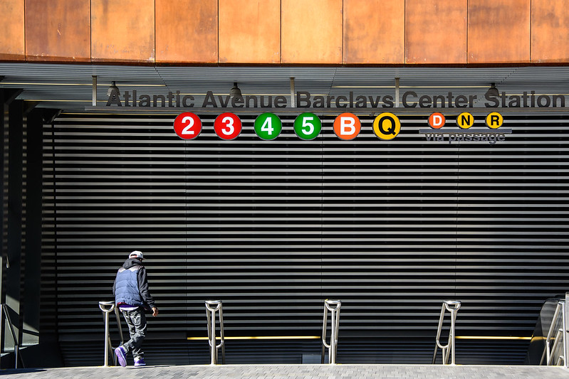
Last week my brother invited me to cook some traditional malayali food since I’ve been craving home food for a really long time. So I agreed to meet him at 11:00 am so that we’d finish cooking right on time for lunch. I checked the MTA app to see how long my commute would be and what transfers I would have to take and prepared myself to leave. As soon as I reached the station, I realised I did not have balance on my metrocard. When I tried to recharge, the metrocard recharge machine was only accepting cash in denominations of $20 or less and I had a $50 on me. I ran to a Deli store nearby to get change and finally managed to refill my metrocard but by the time I reached the platform, the train I wanted to take had left and the next one was scheduled to come in 12 minutes. This frustrated me. My next hurdle was transferring at Atlantic Avenue Barclays Center Station. I had not realised how extensive the station was and anticipated navigating through it would be difficult. On the contrary the signboards were very clear and I found my platform in less than a minute. My train immediately arrived and I was delighted by how easy that experience was. In a way I felt like a hero. Another aspect of the NYC subway that always catches my eye is the artwork at various stations. It’s also something that people keep talking about. As a matter of fact, I know people who use it to navigate. When my brother was giving me directions to his apartment, he told me to take the exit close to the mosaic of a woman in a saree.

The NYC subway is a great example for a good design system. Just as Lupton mentions in her book, the NYC subway system enables its commuters to create memorable experiences by taking them on an emotional journey. It helps them navigate to the path of their desire as well as provide them with a hero story.
Thing: Nintendo Switch
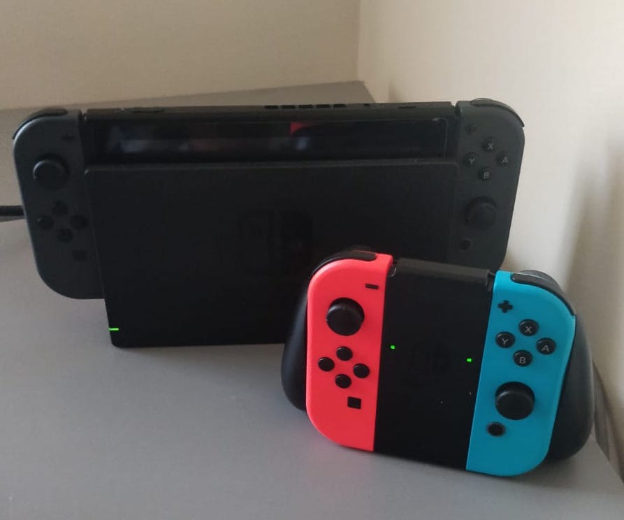
For my Thing, I chose the Nintendo Switch. The Switch is both a handheld and a home console with exceptional graphics for its size and motion controls to elevate your gaming experience. The reason I love the Switch is because of how simple and interactive it is. The Switch was the first gaming console I used and even as a novice, it was extremely easy to navigate. My favourite part of the Switch are the Joy-Cons. Everytime I attach the Joy-Cons to the grip it produces a click sound which is very satisfying. As a matter of fact, the animation for the Nintendo Switch logo includes the click. In Lupton’s book, Design is Storytelling she talks about how products have character. The click sound is the character for the Nintendo Switch. Every action you perform on the Switch includes the click.
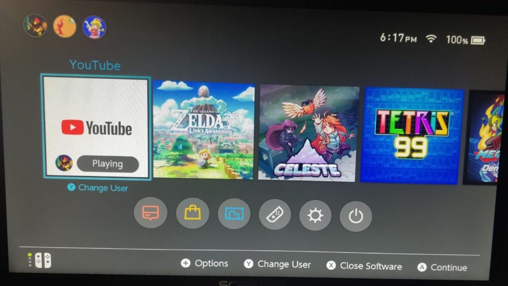
Another thing I love about the Switch is how easily navigable the homepage is. The first thing you see are the games you have on your system below which are the menu items. The icons designed for the Switch, according to me, are well researched because even without reading the labels you can still understand what they try to convey.
The Switch includes a touch-screen interface and Joy-Cons with inbuilt gyroscopes, IR sensors and motors which create a rumble effect while playing games. The first few games I played on the Switch were Super Mario Odyssey and Okami HD, both of which used the motion detection and the rumble features. I love the rumble effect because it never ceases to amuse me. It was designed to induce delight.
Design is about creating memorable experiences and the design for the Nintendo Switch is exactly that. It caters to both seasoned gamers as well as amateurs like me. I tried using other gaming consoles like the PS4 but the interface was overwhelming. Nintendo’s user base is vast and to create something that accommodates them all is an exceptional feat. The Switch’s interface does not look extraordinary nor is it overloaded with features. What makes the Switch beautiful is that even though its design is intuitive and simple it’s not invisible and that’s the reason I chose the Nintendo Switch as my Thing.
References
Ellen Lupton, (2017) Design is Storytelling published by Cooper Hewitt, Smithsonian Design Museum; 1 edition.
Ellen Lupton, <http://elupton.com/>
The Nintendo Switch Is the Future of Gadget Design,<https://www.wired.com/story/nintendo-switch-review/>
Nintendo Switch Technical Specifications, <https://www.nintendo.com/switch/tech-specs/>