Observation of The NYPL Stephen A. Schwarzman Research Library

The Stephen A. Schwarzman Building, located on Fifth Avenue between Forty-Second and Fortieth Street, stands as a centerpiece for the New York Public Library. It is a grand marble building that has remained a spectacle since 1911. Few things have been changed in the library, beyond modern updates and fixes, and most people want it to stay that way. But what about what goes on inside the marble? 

Are the librarians the same people that checked out the first books?

Have librarian practices remained the same?  

Is information still circulated through the same stacks that were built in 1911?

Do people still use the research library?

What type of people actually participate in library offerings?

Just how old is this library? 

To catch a glimpse at the answers to these questions, I spent a day observing researchers and patrons at the New York Public Library Stephen A. Schwarzman Building, as well as interviewing library staff.

Setting

I decided to spend most of my time in a smaller research room instead of the main Rose Reading Room for multiple reasons. First, tourists flock to the Rose Reading Room, and they are not the focus of my inquiries. Second, the Local History and Genealogy Milstein Division where I took up shop, allowed me to view researchers, librarians, and staff all at the same time. Third, this division of the library was broader than some of the other research rooms and as a result I would be able to observe a wider range of questions, requests, and interactions.

Observation

From the start I notice that everyone who enters the research room has one two reactions. They either straighten up and constantly check with the librarian visually to make sure they are not breaking any rules (similar to how people react to seeing a police officer), or they smile and say hello as if they feel welcomed. Both reactions indicate that librarians on title alone have a level of respect from the general public. It is for this reason that they have a certain code of ethics and an obligation to their community to keep the information in the library safe. It is also why diversity among library staff, and inclusion for all is so important in a library. As respected figures, librarians set a standard for others. 

Staff & Diversity

It is not difficult to see that the New York Public Library places value on diversifying their staff. The Local History and Genealogy division (LHG) in particular represents varying races, sexes, languages, genders, ages, and sexual orientations. The library publicly puts valuable information into all types of people’s hands, which I believe is an effort to normalize the idea that information professionals can be anyone.

Interestingly, I also noticed that most of the librarians in LHG were male. In my personal experience it has often been that most librarians are women. Despite this, I noticed, unsurprisingly, that there was no change in how the librarians interacted with patrons or researchers, or how their work got done. Overall, based on the ALA Manual definition of diversity- “race, age, sex, sexual orientation, gender identity, gender expression, creed, color, religious background, national origin, language of origin or disability”, the NYPL has kept up with ethical and responsible hiring standards. 

Patrons

If the librarians are the brain of the library, and the books are the lungs, the patrons are the heart. Without the people that wander the stacks looking for information, nothing would be read or investigated. The librarians would be out of job, and the books would be useless. It is for this reason that I found it interesting that not everyone has equal access to the library.

The key to everything NYPL has to offer is a library card. It is a simple plastic thing with a barcode number that can reveal a world of opportunity. Want to check out a book? Better grab your library card. What if you want to browse the internet for a bit? Got to use your library card. It seems the only thing you can do without a library card is stare out the window and enjoy the climate controlled building. 

To get a library card you need two things: an address, and an ID with that address on it. For most people that come to the NYPL this isn’t an issue. Even if your ID has a different address on it, you can pull up a bill or a piece of mail with your name and place of residence on it and they’ll welcome you to the club.

For a smaller, but still very relevant group of visitors, however, having an address is not easy. According to the Coalition for the Homeless, there are 62,391 people without permanent homes in New York City. That is 62,391 people who cannot use the library to find jobs on the computer, or check out a book to develop marketable skills. This exclusion of a group of people that would benefit significantly from library services is definitely a flaw in the NYPL system. 

Interview

After spending some time observing in LHG, I sat down with one of the librarians so that I could learn about the things I couldn’t see. Contrary to stereotypes, he had a demanding voice and stature and I felt compelled to listen to him.  

Information Overload

One of the more important topics revolving around librarianship, in my opinion, is how these professionals handle data or information overload. Not long ago librarians often had to fight against having too little information available to them. With the internet, digitization of thousands and thousands of records and collections, as well as increased patron contributions, librarians have an overwhelming amount of resources. When asked about this, the LHG librarian explained that he had to learn how to research more effectively. Databases have helped narrow down search results, but he mostly relies on his own ability to filter out the extra stuff. He also mentioned that in the research libraries in particular, patrons use the online catalog and databases to find their own materials before bringing it to him for assistance. This means, however, that his job also now includes teaching patrons how to use the library website, its databases, catalog, and other little overly complicated bits. 

With all of this new digital content and information floating along above our heads in the cloud, an important question is; Who owns it, and why do libraries have it? The librarian had a quick answer to this, which was if the library had to own everything it circulated, no one would know anything of importance. He pointed out a feature of LHG that was pretty popular with researchers; a file system of researcher-created records of families, places, and things. The library doesn’t necessarily own any of the findings in those files, but it keeps them and cares for them because it’s the library’s obligation to to do so. 

Burnout

Naturally our conversation concerning piles and piles of information lead straight into my next question. Did he ever feel burnout? Was he ever tired of his job and did he ever feel like the work wasn’t worth the punishment? He had been quick to respond before, but was slower this time. Yes, he did sometimes feel the effects of burnout, but not in a way that made him feel like his work wasn’t worth it. Rather, he felt that sometimes the institution thought his contribution was less than what it was in reality, and that was the frustrating part, reasonably. I found this interesting considering I had previous overheard two librarians gossiping about how the people making important organizational decisions knew nothing about the system. The conclusion from this is that the NYPL administration may not fully consider the insight of those who work in the very trenches they are redesigning. 

Politics, Neutrality & Librarianship

I managed to end my inquiry on the most difficult topic; Librarianship and neutrality. The librarian I spoke to had little trouble forming an opinion, ironically. He suggested that librarians can be neutral until there is a political or ideological thought that threatens the overall well-being of the library’s patrons or the collection. Generally, politics can’t play a part in researching a topic for someone, because that could limit what information you can give. Same goes for controversial ideas. He did mention at the end of our talk that he believes that it’s impossible to stifle your own beliefs completely, and that its the responsibility of the person to control how those beliefs come out. 

Conclusion

As I learned about the ins and outs of the library during my observation and conversation, I found the answer to my biggest question. Despite being old on the outside, most of the inside of the library was young and new. The librarians were informed and up to date on the pressing matters of their profession. The staff was diverse and welcoming. The exclusion of some groups in the city needed some work, but I feel as if the library is aware of this issue and is working on solutions. Overall, the NYPL Stephen A. Schwarzman Building is blazing into 2020 as a leader of library practices. 

References

Birdsall, William F. “A Political Economy of Librarianship?” Progressive Librarian, no. 18.

Cope, Jonathan. “Neoliberalism and Library & Information Science Using Karl Polanyi’s Fictitious Commodity as an Alternative to Neoliberal Conceptions of Information.” pp. 67–80.

Gehner, John. “Libraries, Low-Income People, and Social Exclusion.” Public Library Quarterly, vol. 29, 15 Mar. 2010, pp. 39–47., http://dx.doi.org/10.1080/01616840903562976.

Nauratil, Marcia J. “The Alienated Librarian.” New Directions In Information Management, vol. 20, 1989.

Rosenzweig, Mark. “POLITICS AND ANTI-POLITICS IN LIBRARIANSHIP.” Progressive Librarian, no. 3, 1991.

Rosenzweig, Roy. “Scarcity or Abundance? Preserving the Past in a Digital Era.” The American Historical Review, vol. 108, no. 3, June 2003, pp. 735–762., doi:10.1086/529596.

Vinopal, Jennifer. “THE QUEST FOR DIVERSITY IN LIBRARY STAFFING: FROM AWARENESS TO ACTION.” In The Library With The Lead Pipe, 13 Jan. 2016.
Observation: Visitors, artwork, and technology at the Museum of Modern Art

In 2013 the Guggenheim hosted a James Turrell’s retrospective that transformed the iconic rotunda of the Guggenheim into Aten Reign, a large scale and site specific work using light, changing colors, air and space, and the curves of the museum itself. Turrell transformed the Guggenheim into a site for artful reflection for all who entered the space. Rather than an object to look at or a subject to contemplate, the experience of being in this transformed space was the work of art. “A lot of it is the idea of seeing yourself seeing, and how we perceive” Turrell has said of his work that lacks image, object, or “one place of focus” (Guggenheim).

During the length of this exhibition, there was no art on the walls of the Guggenheim’s spiraled hallway. Visitors were encouraged to lay on the ground of the lobby and gaze at the ceiling, which, using light and color, had been transformed into overlapping ovals of bright fluorescent hues. It was ethereal, magical, meditative, sublime. In an attempt to preserve the sense of bliss and encourage quiet, unmediated reflection, no photography was allowed in the space. 

Something I can say with complete certainty is that hearing a security guard shout into an echoing rotunda “NO PHOTOGRAPHY” every two minutes was not conducive to an ethereal, magical, meditative, or sublime experience. Something I learned during my visit to the Guggenheim that day was that visitors will do whatever they want. They will get the validation of their experience that they expect. They will share their experience no matter what.

This experience, six years ago, has stuck with me and prompted me to think about how the relationship between people and their smartphones has affected the experience of viewing art in a museum gallery setting. This experience, among others, has largely influenced my interest in museum studies, digital media, and tech theory. 

Background

I used to always bring a journal into a gallery and take notes on the works I liked, the artists, themes, books I should follow up with. Now I take photos of wall texts, books I want to look into, and of other people taking photos in the galleries. Sometimes I feel weary and critical of my own increased use of technology in galleries, but recognize that people, including myself, want to personalize, document, and share their experiences. In Finding Augusta, Cooley discusses Michel Foucault’s conception of “speaking the self,” and that often “much of what we document of ourselves transpires at the nonconscious level of the proto-self, at the level of impulse” (Cooley, 2014). This interest in “speaking the self” extends into many, if not all, facets of our digitally connected world.

Prompted by this assignment to conduct an observation relating to information studies and our personal interests, I decided to do an observation at the Museum of Modern Art. My intention was to observe specifically how people use technology, specifically smartphones, in a museum gallery setting. 

Perspective, or, guiding questions for assignment

General questions to guide my inquiry:

  1. How do people engage with art in a museum gallery setting?
  2. How do people engage with technology  in a museum gallery setting (both their own devices or provided by the museum)?
  3. How does technology, specifically the use of personal devices, mediate a viewer’s experience with art in a museum gallery setting?
  4. What do people do with their personal devices? Social media, digital scrapbooks, text messaging, etc?
  5. How does the use of technology by others affect an individuals experience in a museum gallery setting?

Specific questions for observations:

  1. How many people who walked through the gallery used a photo to take a photo of a work of art?
  2. How many people used their phone for non-art related purposes, namely, communication?
  3. What other phone use did people engage in?
  4. How many people used a camera to take a photo of a work of art or the gallery?
  5. What other technology was used (either personal devices or provided by museum)

Observations and data

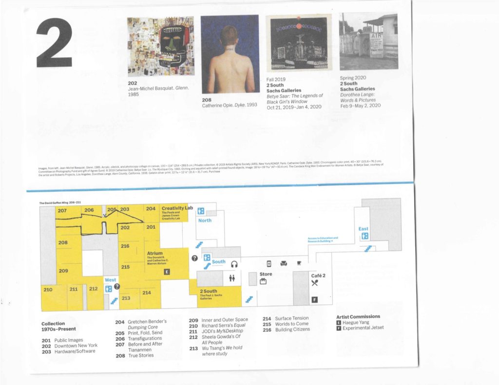
I sat between rooms 205 and 206 (marked on Fig 1) within an exhibition titled “1970’s-Present.” Immediately upon entering this exhibition space on the second floor of the museum, there were large paintings by Keith Haring, Jenny Holzer, and Basquiat. Further into the gallery I found a place to sit, where I could observe visitors walking through the gallery in either direction. My focus was on visitors who walked into room 205 and then through rooms 205 and 206. 

Fig 1. Area I was observing marked in pen.

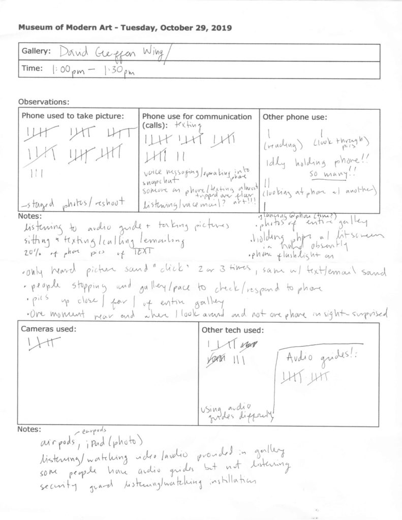
I used a worksheet to tally how people took photos of artwork in these gallery rooms with a smartphone, camera, or other device. Using a tally system I recorded how many people used their phone for communication (in some cases I couldn’t tell, in some cases I could see that people were texting, snapchatting, emailing, on Instagram, etc.). When I could, I recorded when people were using their phone for non communication or photographic purposes. The accuracy of these recordings were to the best of my observations as someone casually sitting on a bench in the gallery (I did not walk up to people or move to try to see anyone’s screens).

Fig 2. Worksheet/observations

Breakdown of tally (from Fig 2):

Phones used to take pictures33
Phones used for communication22
Other phone use5
Cameras used to take photos5
Other tech* seen
*Airpods, iPads, earpods
8

I realized while taking these observations that I did not include a section for audio guides. I added a section on my worksheet, but studying and observing audio guide use in the galleries could be an entirely separate set of observations and data that could easily include analytics from the devices.

A few things that stood out to me during these observations and while reflecting on the data:

  1. Within the scope of half an hour I had collected more data and notes than expected. I had intended to stay in the gallery for one hour but decided to end observing at half an hour.
  1. Almost as many visitors used their phones to communicate as take photos of the works, although visitors mostly used their phones to take photos.
  1. It was noticeable how many people idly held their phones in their hands. Rather than reaching for a phone from a pocket or bag to take a picture or send a text, the phone was constantly ready to be used. 

This last phenomena of visitors constantly holding their phone also points directly to our class discussion around Steve Jobs saying of the iPhone that it “fits beautifully in the palm of your hand.” This also relates to Foucault’s conception of “speaking the self” mentioned earlier, where we, as visitors in a cultural institution, see something that we react to (either emotionally, aesthetically, personally, etc) and find ourselves compelled to document and/or share. By focusing on cell phone use within the space of the gallery, I was in a unique position to notice a seemingly small detail that could have interesting implications in understanding how people connect to their technology in a museum setting.

Further research

Further research may include doing similar observations near works of art that are of higher profile. Had there been a place to sit and observe unobtrusively, I may have chosen to sit in the room with the Haring, Holzer, and Basquiat works. Immediately upon entering the 1970’s-Present exhibition, visitors are confronted with large scale, recognizable, and graphically engaging works by artists that are more recognizable than in the rest of the gallery. I am confident that different observations would have been recorded in that space given those particular works of art.

Further research that would be fruitful would be to understand what visitors do with their photos after they’re taken. If asked, “what are you going to do with that photo you just took?” Answers could range from, “I want to post it to my Facebook page,” to “I want to save this memory,” to “I am sending it to my friend who loves this artist,” to “I am working on a research paper.” I am interested in what the actual responses would be and their frequency. 

Conclusion

The conversation about technology in art and museum spaces is continuing to unfold as our lives and relationships become more and more mediated by technology. Much thought is being put into how museums and cultural institutions should relate to users and their lifestyles, many institutions have dramatically changed their photography policies in the past decade (Gilbert 2016), a direct result of the ubiquity of smartphones and visitors interest (and adamance) in documenting their experiences. As technology changes and evolves in ways that affect habits and our attachment to convenience and accessibility of social media, public institutions will need to grapple with how these developments affect their mission, rules, and expectations of visitors. 

Works referenced

Cooley, Heidi Rae. Finding Augusta: Habits of Mobility and Governance in the Digital Era. Hanover: Dartmouth College Press, 2014.

Gilbert, Sophie. 2016. “Please Turn On Your Phone in the Museum.” The Atlantic. Accessed October 2019. https://www.theatlantic.com/magazine/archive/2016/10/please-turn-on-your-phone-in-the-museum/497525/ 

“Introduction to James Turrell.” The Guggenheim Museum. Accessed October 2019. https://www.guggenheim.org/video/introduction-to-james-turrell

Observation at The Met Fifth Avenue: How is the museum tour guide in including different kinds of visitors.

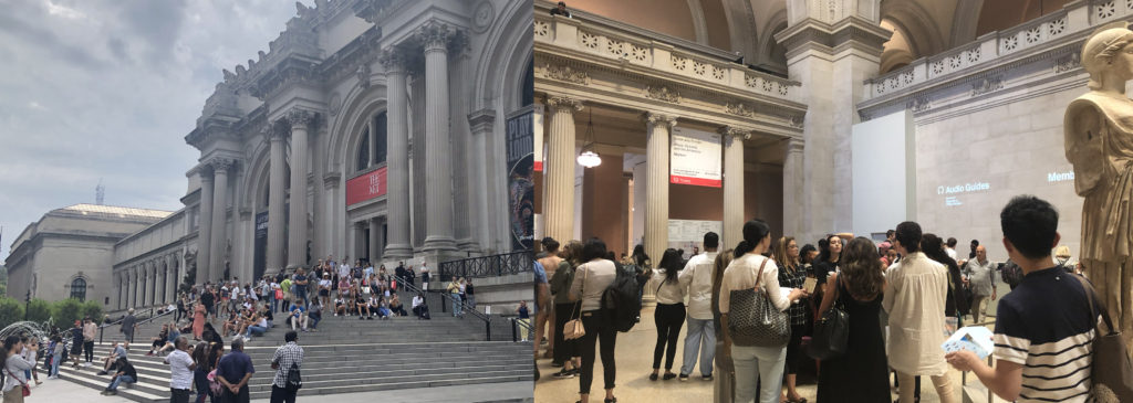
The Metropolitan Museum of Art is the largest art museum in US and the third most visited art museum in the world. The main building in Manhattan’s Upper East Side in one of the world’s largest art galleries. As was posted on January 4, 2019 that 1,659,647 visitors were attracted to The Met Fifth Avenue and The Met Cloisters from May 10, 2018 to October 8, 2018. Based on the data from Wikipedia and MET official website, with such large number of visitors from all over the world, I began to curious how the visit guide provided by the museum service did well in considering different kinds of visitors.

According to what I learnt from Design Justice, the tour guide designed by MET should aim to ensure a more equitable distribution of the benefits and in this case, the museum tour guide should also consider non-English speakers, people with disabled, etc.

I went to The Met Fifth Avenue on 27th, Sep. to directly observe as a visitor and my goal was to see whether different kinds of visitors were guided friendly and effectively in visiting the museum. It was a cloudy afternoon with crowded visitors, and I waited for 10 minutes in line to get my ticket.

1 Manual Guide

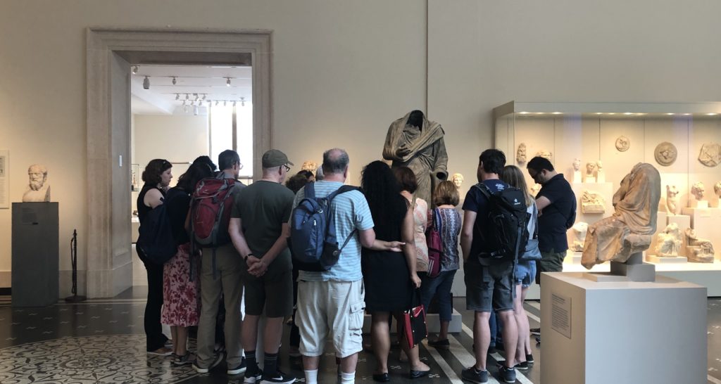
I saw several cicerones surrounded by a small number of visitors. I joined them for free. Some visitors followed by cicerones carried backpacks and not seemed like locals. The good thing for getting a manual guide is that you could directly ask questions and get answers, especially for history or art fanatics who are always filled with questions.

But this method is not that feasible for visitors who prefer to get through the museum quickly and are not fluently English speakers. Since you are guided by a certain route and listening to deep explanations of the exhibits really takes time. In this period, I found some of visitors would only follow a few minutes then left the group to visit by themselves.

2 Audio Guide Rent Onsite

These days the most commonly used tour guide in museum is audio guide. At the museum lobby visitors could easily find the words “Audio Guide”, and the return place was also obvious to find. During my observation period, I found no more than 50% visitors were using audio guide and I guess it was because the audio guide in MET was not free, or some were not first-time visitors or some just preferred to quickly visit the whole museum without deep explanations.

2.1 Whether considering non-English speakers.

Yes. The audio guide provided by MET contains 10 different languages, which is especially considerable for foreign visitors. When I visited the museum, I found a lot of Asian visitors renting audio guide and listening to the guide frequently. It’s much effective for them to get the explanations in their mother language.

2.2 Whether considering visitors with disabilities.

During my observation period, I did not find disabled visitors. But I found some information on the MET website that the museum offered assistive listening devices and real-time captioning for visitors with hearing loss.

2.3 Whether considering aged visitors.

I found an old woman who seemed uneasy to input numbers into the audio guide to get the explanations. And some visitors seemed tired to hold the guide near their ears to listen all the time and they needed to find a place to sit or change to another hand to hold the guide. I think the interaction method between visitors and audio guides is not that friendly especially for aged visitors. Manually inputting numbers could waste time. Besides, the guide is not that easy and convenient while the MET is large, and most visitors would stay more than 2 hours.

I guess it’s better to add automatic induction function to the audio guide and visitors don’t need to input numbers themselves but only to answer yes or no to listen the guide. In addition, always holding the guide near ear to listen is not convenient. Why not provide earphones to aged visitors together with audio guide? Or support the visitors using their own earphones.

2.4 Whether considering visitors who prefer quickly visiting the whole museum.

I did find a visitor hanging the audio guide around her neck, but she didn’t use it during the whole process. And some only listened a few seconds then gave it up. I guess the contents provided in audio guide were too long and they only wanted to get a concise version. They came to the museum to get something new but not preferred to get that deep understanding towards a single exhibit. In that case, perhaps better to provide different versions for visitors to choose from. For instance, a quick 1-minute explanation together with a detailed 5-minute version.

3 The MET App

There is an App called The MET which also provides travel guides and even augmented reality function. The good thing is you could use it offline, while the bad thing is that you have to download it beforehand. How many visitors would take trouble to download an App to help them visit the museum? I guess better to develop a Web App for visitors who just want to visit temporarily.

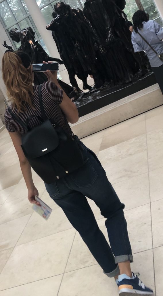
During my observation period, I only saw a young woman using her iPhone to get the audio guide. Generally speaking, not a large number of visitors choose to get a guide on App. I believed one of the problems was not enough contents on App, compared to the audio guide you rent onsite.

Conclusion

In 2015, the MET did a thorough research on how to improve the audio guide and during the research they did find 40% visitors were foreigners and the importance of reducing the complexity of using audio guide. However, just like what Norman said, “The world is not neat and tidy and things not always work as planned.” All the tour guides provided by MET are roughly satisfied but still have space to improve. Perhaps reconsidering different visitors’ needs could help better the overall experience.

Reference

1 Wikipedia: Metropolitan Museum of Art: https://en.wikipedia.org/wiki/Metropolitan_Museum_of_Art

2 Met Welcomes Nearly 7.4 Million Visitors in 2018:

https://www.metmuseum.org/press/news/2019/2018-calendar-year-attendance

3 Improving the Audio Guide: A Look at Our Visitors:

https://www.metmuseum.org/blogs/digital-underground/2015/improving-the-audio-guide-a-look-at-our-visitors

4 Norman, D. A. (1998). The Invisible Computer: Why Good Products Can Fail, the Personal Computer is So Complex, and Information Appliances are the Solution. MIT Press. Chapter 7: Being Analog http://www.jnd.org/dn.mss/being_analog.html.

5 Costanza-Chock, “Design Justice: Towards an Intersectional Feminist Framework for Design Theory and Practice”

Field Report – Exploring the Morris Museum

For my observation, I decided to go to the Morris Museum in Morristown, New Jersey to observe their current exhibit titled “Pen to Paper: Investigating Famous, Historical Letters.” When I saw this current exhibit online, I figured this would be the perfect exhibit to talk about the preservation of these letters and what this exhibit tried to tell the world about the famous people who wrote them. With that goal in mind, I went to the Morris Museum to view the exhibit. However once I arrived I realized that the museum also had a “traveling exhibit” about music boxes from the Guinness collection, which I found far more interesting.

One of my favorite pieces from this collection was the Plerodiénique Sublime Harmonie Cylinder Music Box and Writing Desk (pictured below).

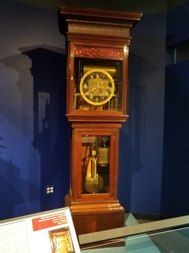
Another one of my favorite pieces was the Hall Clock with Compound Music Movement.

What interested me about this part of the exhibit is that they showed a lot of artifacts that had dual purposes, such as the music box that is also a desk and the clock that is also a music box. It was interesting to see that these items were created to have more than one function.

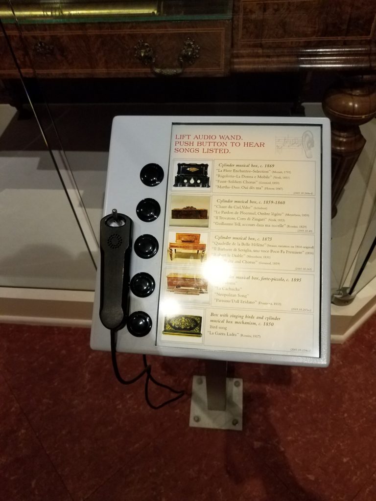
Another aspect that I enjoyed about this exhibit was that it encouraged the viewer to interact with the collection. There were display stands that had a hearing device and buttons that the viewer could press to hear what music from the presented time would sound like.

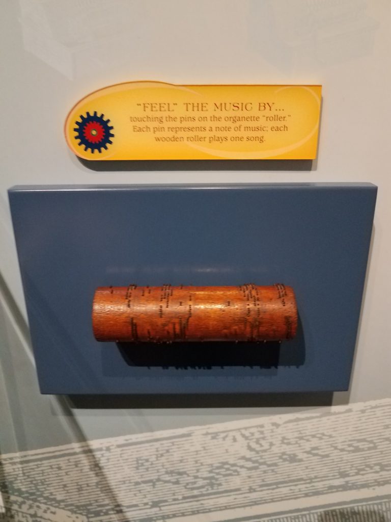
There was a wooden roller set out with pins. This was how songs used to be played during the time that these music boxes were created. It is was explained that each pin represented a note and each roller represented a song.

There was even a game that could be played at the end of the exhibit. For this game, you would put your hand on a speaker and try to feel the different vibrations that the different sounds made.

One of the reasons why I enjoyed this part of the museum so much was that it showed a time where technology was much different than it is now. These music boxes are major technological advancements when they were first created in the 1700’s-1800’s, even though in current society music boxes may not be considered a technology to a general viewer.

While touring the museum, I was surprised how small all the other exhibits were compared to the Guinness collection. I think this showed the emphasis that the museum wanted to place on this collection. I believe this is also the reason why I was much more fascinated with the Guinness collection over the other exhibits.  But even though the other collections were smaller, it seemed that the museum still made a conscious effort to show the comparison of older technology to newer technology.

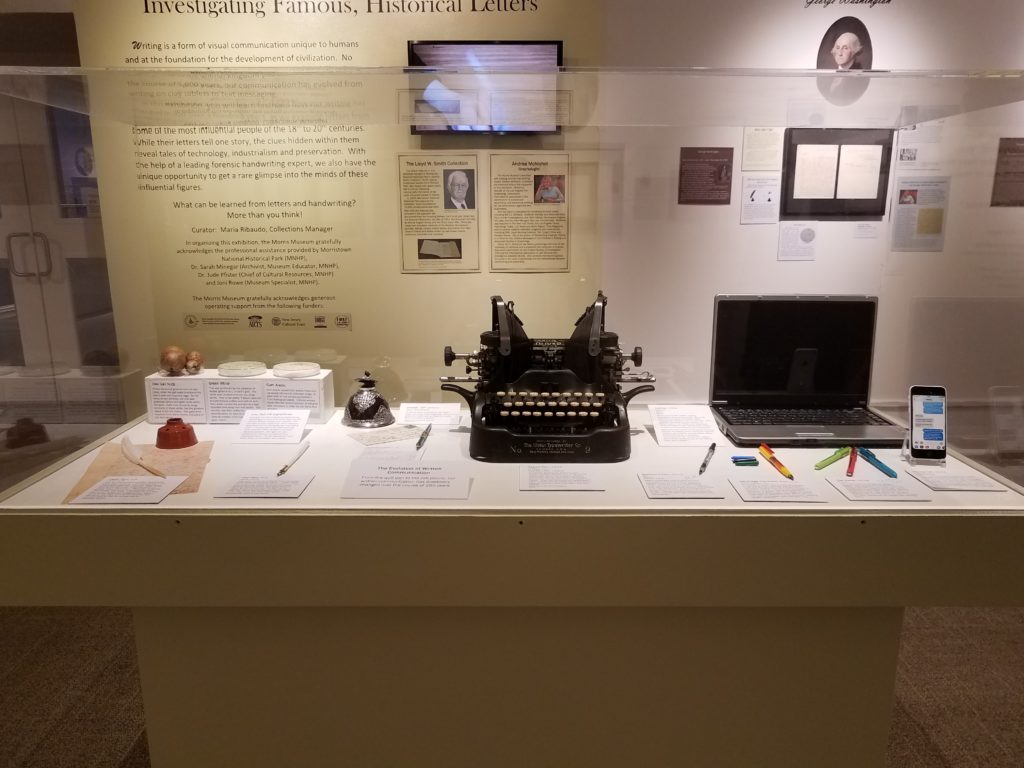
In the picture below, you see that the museum showed how writing has changed throughout time in their Paper to Pen collection. When I was reading Jentery Sayers article on technology throughout time, I couldn’t help but think about the collections that I saw at the Morris Museum. Originally I thought about the music boxes and how they could be considered “technology instrumentalism”m which means that they were a neutral technology. But then I realized that the Pen to Paper collection could be an example of “technology determinism” which is technology used for social progress. As Sayer mentioned most of these pieces from these two collections would be considered “symbols of progress, modernity, efficiency, and mastery over nature” (Sayers).

In this picture it shows elements that could have been used to make different colors of ink that would be used to write or draw, it shows a few ink wells, different types of quills and calligraphy pens, a typewriter, laptop, and cellphone.  As the picture implies, these all became means of communicating. Just in this one picture, we can see the progress and change of technology throughout time.

What I found most interesting about this exhibit was its incorporation of current technology into the collection itself. It almost felt like the current technology used for this collection overshadowed the idea of the collection which was looking at old letters from famous people in history. I say this because in the room, just below one of the displays, there were two pairs of headphones and IPads that were showing a short film. Then on the wall, there was a television that told about the making of quill pens and how society portrays old quill pens wrong in movies since most of the time the hair of the feather is cut off to make it easier to hold. It just seemed like the focus was mostly on the current technology since the letters left a lot of white space on the wall, while the television area took up a lot more space and the museum had changed the color of the wall to draw attention to it (which you can see in the picture with the display of past/current technologies that is above). Also, the short film and the television were both a form of white noise in the room, which grabbed my attention and probably the attention of a general viewer, which took my attention away from the famous letters.

In the end, it was nice to see the different exhibits that the Morris Museum had on display. It was interesting to see their way of incorporating technology into their exhibits as a way to attract the audience to engage with their collections. Because of my experience with museums and my interest in continuing to work in a museum, it was interesting and educational to see how other museums use technology. 

References:
Sayers, Jentry. (2016). “Technology” in Keywords for American Cultural Studies,” ed. Bruce Burgett & Glenn Hendler. NYU Press. http://keywords.nyupress.org/american-cultural-studies/essay/technology.

Morris Museum. Morris Museum. morrismuseum.org/.

Cultural Production & Social Movements: Exploring the Interference Archive

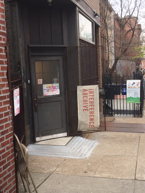
The word interference typically has negative connotations; in today’s capitalist landscape it can invoke the disruption of efficiency and streamlined workflow. In the context of activism, interference is necessary for dismantling oppressive structures. The Interference Archive in Brooklyn operates under this ethos: “to use the collection as a way of preserving and honoring histories and material culture that is often marginalized in mainstream institutions.”  Their standards align with ML Caswell’s idea of archival representation—as posited in “’The Archive’ Is Not an Archives: On Acknowledging the Intellectual Contributions of Archival Studies”—as “an ongoing collaborative process that welcomes diverse input, not an end-product (such as a finding aid) that presents an authoritative or definitive voice” (Caswell, 10).

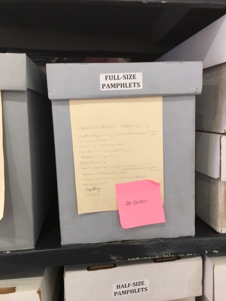
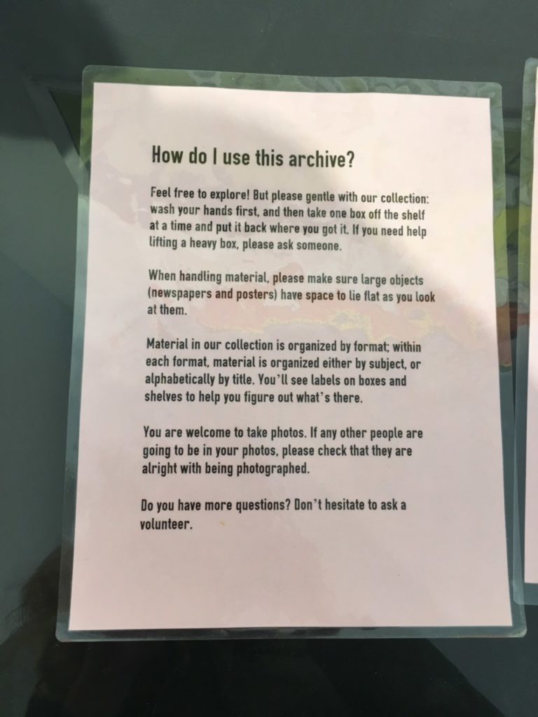
Founded in 2011, the archive is located in an unassuming gallery space at the intersection of Park Slope and Gowanus. It is an entirely open-access, open-stack archive, meaning that anyone from the public is free to enter during operating hours and browse the endless shelves of ephemera. For the easily distracted and endlessly curious like myself, the space is a dream. There are flat file shelves of posters, newspapers, stickers, buttons, and pamphlets from various activist movements, as well as a whole library of books and records in the back, and a shared work area with the independent publishing company Common Notions. The archive is open four days a week and is entirely volunteer run. Whoever is staffing at a given moment acts as a de-facto catalog, in addition to assisting in collection processing, stabilizing, and creating finding aids.  

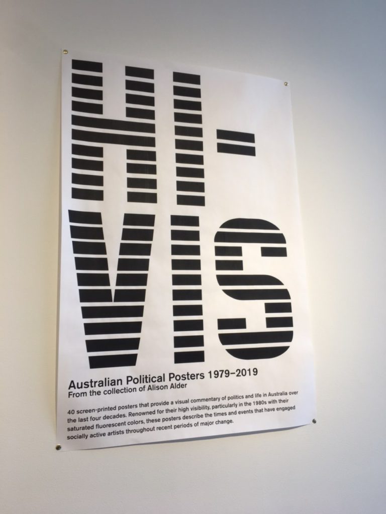
One of the first boxes that I browsed through contained records of anarchist infoshops from the Beehive Collective, an anarchist group located in Washington DC in the 1990s. In addition to their open stacks, the Interference Archive also curates exhibitions open to the public. A collection of Australian political posters from 1979 to 2019 is currently hanging in the front hall. The posters run the gamut of environmental activism campaigns to art festivals. The next exhibition, also posters, will be curated in partnership with The Poor People’s campaign, an organization for income equality founded by Dr. Martin Luther King Jr.

I had the fortune of being able to wander the Interference archive—no appointments are necessary—and speak to one of its founders, Kevin Caplicki. Kevin, whose background is actually in graphic design elaborated on the accessibility fostered by the archive. “Our collection policy is anything that’s produced in multiples, via grassroots social movements, that communicates their demands. The materials are international on scale and the idea is to provide a public space where all of these materials can be accessed by anybody because we, as a counter-institution, to engage with this material to understand radical history.” His description also brought to mind John Gehner’s hope for the future of libraries, “The promise of the social exclusion/social inclusion framework is that we don’t have to dwell on one particular aspect of a person or community—their income, age, gender, race, ability level—but simply on the fact that many people are forced to live on the margins and cannot participate in society as equals. Remedies are rarely immediate or easy, but libraries are well-equipped to do more and better” (Gehner, 45).

In the current political landscape, the archive serves as a space of dynamic conversation, where ephemera collected from past movements can enrich activism today. “We want these materials to inspire people to reproduce these kinds of resistance and organizing,” Kevin says. “Ideally, browsing the archive will inspire people to get organized now or create graphics now. Hopefully we can progress to a world that we want to live in.”

Kevin also elaborated on the manifold challenges that come with maintaining an entirely volunteer run community archive. For one thing, only a small portion of the archive is digitized just because resources for that equipment and manpower are limited (the archive is entirely donation based and community supported as well). “Labor and time are the biggest limitations. We do have monthly sustainers that donate that covers overhead costs.” As a horizontally run space, there are different groups that run different projects, but there is always a shortage of volunteers.

The archive often gets researchers, which Kevin says is a good excuse to figure out new points of access to the archive. The process of working with researchers usually starts by finding out what topics they are interested in, if they are interested in working with different formats. From there, the volunteer and researcher will just start pulling boxes and exploring.

“We try and find different new ways to create finding aids to guide people through the materials. As a staffer, I am here to go on the adventure of exploring the archive with visitors.”

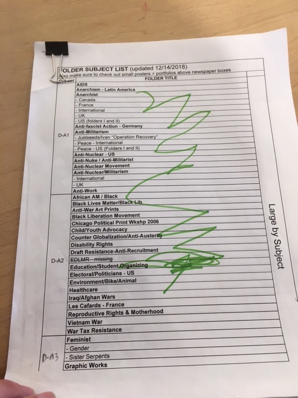
The space itself is meticulously organized. I was able to look through a finding aid of posters, organized in flat file cabinets in the back of the archive. “We want people to be able move from specific to general and vice versa whenever they need to,” Kevin says of the archive’s finding aids. On the poster finding aid, the posters are arranged into folders, which are listed by subject and geographic location. There are also finding aids for documents, stickers, and buttons.

The staff is a mixture of archivists, librarians, artists, activists, and others from the community. When I arrived, a group was in the process of stabilizing issues of the Globe from the 1960s. Some used gloves to handle the papers.

The space is truly dynamic: in addition to exhibitions, the archive also features film screenings, workshops, panel discussions, and can serve as a political organization space. As I left, I immediately began looking forward to when I could return again. The archive is always in need of volunteers and a simple email is all you need to get started. There are no library science or archive work prerequisites. In a neighborhood of rapid gentrification, the Interference Archive stands out as elevating the communities that have been overlooked in development.

Citations

Caswell, ML. “Archives on Fire: Artifacts & Works, Communities & Fields.” Reconstruction: Studies in Contemporary Culture, vol. 16, no. 1, 4 Aug. 2016, pp. 1–21.

Gehner, John. “Libraries, Low-Income People, and Social Exclusion.” Public
Library Quarterly
, vol. 29, no. 1, 2010, pp 39-47.

By Sarah Goldfarb, Info 601-01 (Structured Observation Assignment)

Airplane Entertainment System Observation

In this blog post, I will present my observation of the interaction between seven airplane passengers and the in-flight entertainment system of a Eurowings A340-300 aircraft. The observation was performed during a daytime flight from Dusseldorf to New York, on Sunday the 17th of March, 2019. In addition to the observation, I evaluated my own experience of interacting with the system.

Considering that online functions of phones and other devices are unavailable on most flights, the entertainment system becomes a passenger’s main source for information and entertainment. Like most modern in-flight entertainment systems, the Eurowings interface is touch screen based. The physical design shows no buttons or indications on how to turn the system on. Despite the lack of visual signifiers on how to wake the screen up, all passengers in my observation managed to start the system without any issues. Because of cultural conventions (Norman, 2013), people nowadays assume that screens without physical buttons will respond to touching, hence making this minimalist design work.

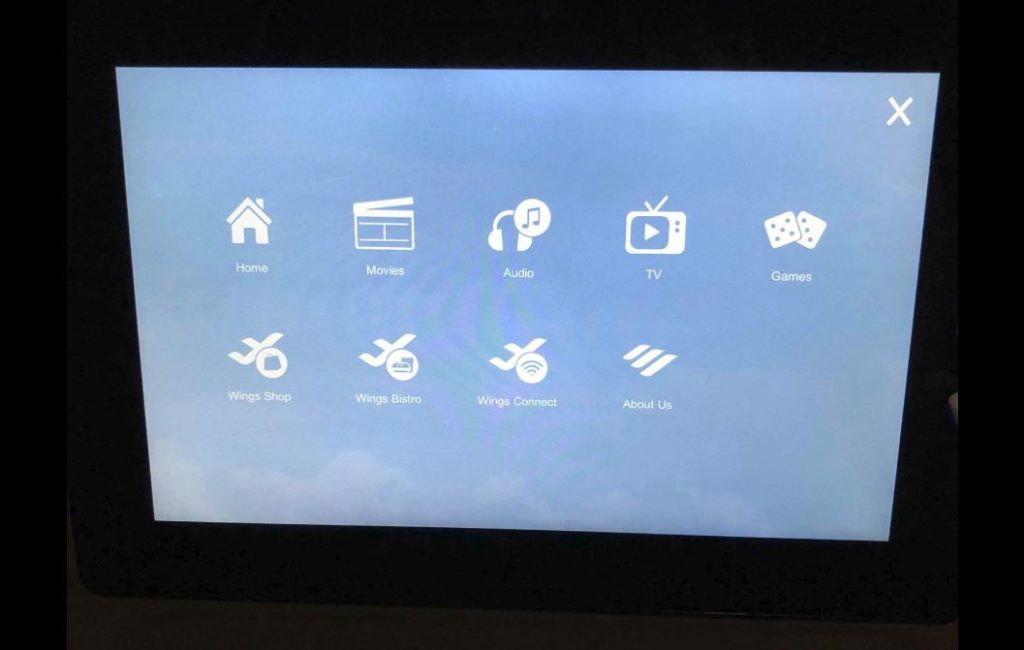
Most in-flight entertainment systems that I have come across as a passenger provide a rather user-friendly interface. Considering that most of these systems have similar standard content and functions, such as movies, food and beverage menu, and flight information, returning flyers will generally have a good idea of how to use the systems. The Eurowings entertainment system consists of a main menu with the following content; home, movies, audio, TV, games, shop, bistro, wi-fi, and “about us” (see picture below).

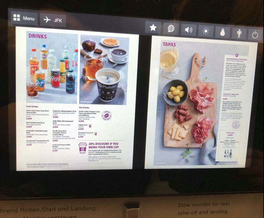
The positioning of the screen and the interface design appears to be inviting to users, as all passengers in my observation, including myself, started using it immediately following getting seated. Upon entering the system, four out of the seven passengers began to browse for movies, a function which was discovered without any apparent difficulties. Though once at cruising altitude, I observed how a passenger appeared to be struggling with ordering food. The menu was presented in a PDF format, instead of a built-in menu (see picture below).

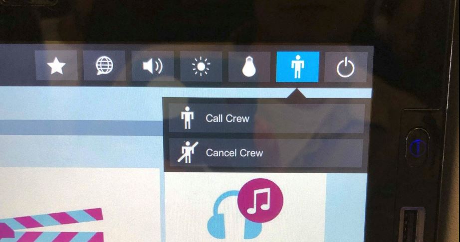
The small proportions of the screen made it difficult to read the menu, which led to the passenger picking up a physical copy of the Eurowings magazine, which luckily also contained the menu. I would suggest implementing a function to browse the food and beverage menu directly in the entertainment system to enhance the user experience. Once the passenger had decided what to order, she tapped the call-crew symbol on the screen (see picture below).

A slight moment later, a flight attendant and arrived to take the order. The call-crew button was also used on another occasion, where I observed how a passenger had a question for one of the flight attendants. These two events show how the entertainment system act as a link between a digital source of information and a human information source, i.e. an intersection of digital and physical. The fact that you can retrieve human information in addition to the recorded information within the interface implies encountering Goonatilake’s neural cultural and exosmotic flow lines (Bates, 2006).

Features on the screen further allow controlling the surrounding environment of passengers. By tapping the light bulb button on the screen, a passenger can switch the personal reading light on or off. Once again, showing how the digital interacts with the physical through the system. However, I noticed how some of the passengers got up from their seat and stretched to adjust the airflow from the ventilation above them. I would suggest making airflow adjustment a digital function placed within the interface, in order to further improve user and passenger experience.

Following the observation, I reflected on the importance of in-flight entertainment systems. In today’s society, people are used to having access to information at practically all times. I performed a minor, informal, in-flight experiment involving myself and a fellow passenger, where I decided we could not use the entertainment system for one hour. Being a daytime flight, none of us felt the need to sleep, neither did we have any books available. The prohibited use of the entertainment system resulted in reading all available papers provided in the back of the seat in front of us, and following that, a slight feeling of distress. This, somewhat disturbing observation, show how dissatisfaction can be generated when not having access to information. Conclusively, the in-flight system does not only function as a source for keeping passengers entertained and informed, but it also pleases our demand for constant information accessibility.

Another finding upon my observation was that all three information principals in Buckland’s article (1999) were encountered as passengers interacted with the entertainment system. Information as process was encountered as the flight attendant was called through the system, consequently providing information to the passenger. Information as knowledge was encountered e.g. when a passenger received insight from the flight information provided by the system. Information as thing was encountered as the screen presented informative visuals and audio through headphones to the passenger.

References:

Bates, M. J. (2006). Fundamental forms of information. Journal of the American Society for Information and Technology. 57(8), 1033-1045. Available at https://pages.gseis.ucla.edu/faculty/bates/articles/NatRep_info_11m_050514.html

Buckland, M. (1999). Information as Thing. Journal of the American Society for Information Science. June 1991, Vol. 42 Issue 5, p. 351-360.

Norman, D. (2013). The Design of Everyday Things. New York, New York: Basic Books.

Observation: Ridgewood Community Library

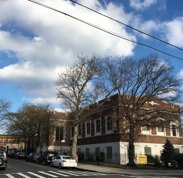
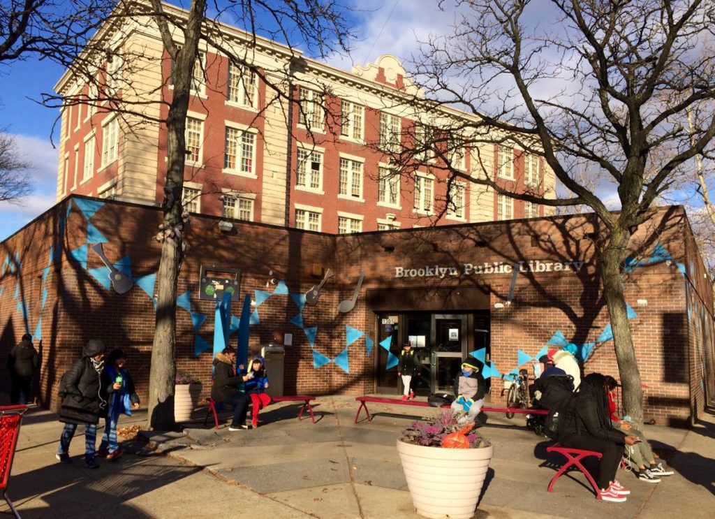
Ridgewood Library buildingThis week, I visited the Ridgewood Community Library, a branch of the Queens Library. Even though this is my neighborhood library, I had never spent time there except to pick up books I’d had transferred. The library is a fairly small branch housed in a beautiful brick building built in 1929. It was the first branch of the Queens Library to be constructed with funds from the city rather than from Andrew Carnegie. Renovated most recently in 2011, the library is fully accessible, with elevator access to every level. It is clean and well lit, with lots of natural light on the main level.
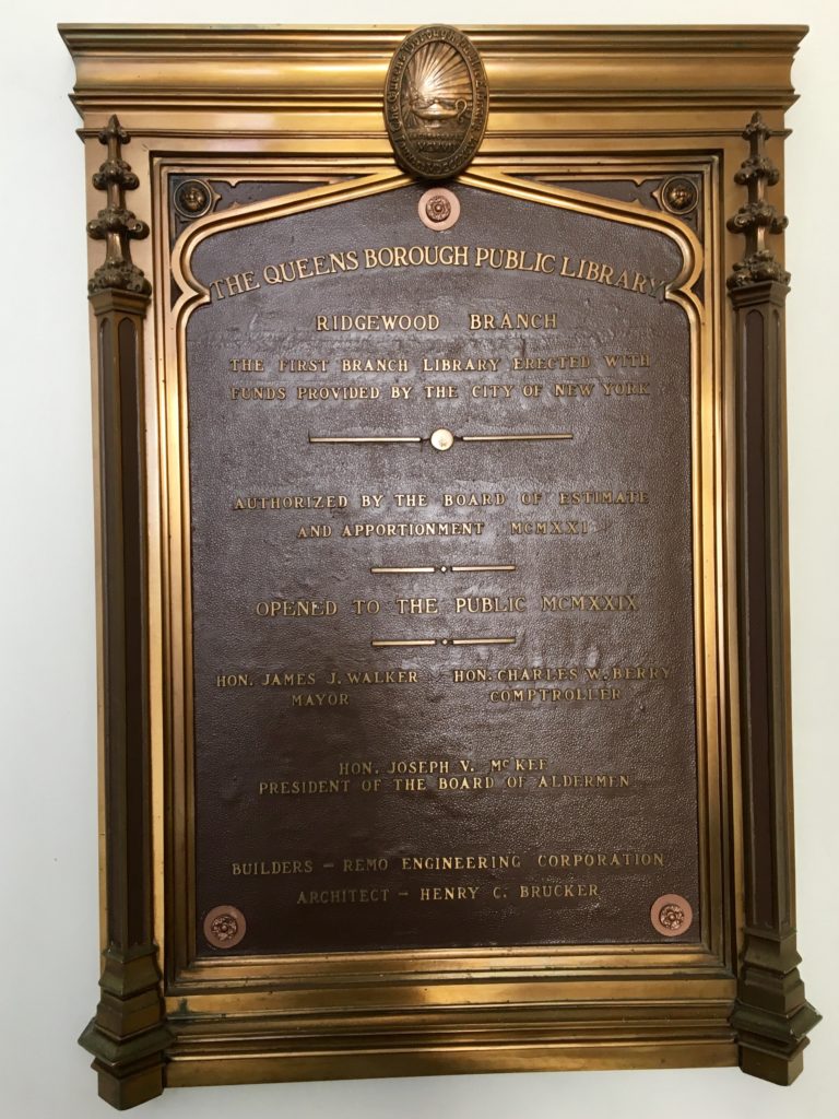
Ridgewood Library plaque


After entering the building at street level, I went downstairs to see the large meeting room for events, as well as a dedicated children’s room, which houses all of the children’s material. This room has its own circulation and reference desks, computers, and bathrooms.

The indoor book drop is located on this level just outside of the children’s room. The outdoor book drop is located down a ramp next to the main entrance, which allows for 24-hour book return. Both book drops use a computerized system with a retractable metal flap that opens when materials are placed on a conveyor belt. This system usually works smoothly, but I have had issues such as the machine being out of order or not sensing books that I placed on the belt.

I next went up one level from the entrance to the large main floor of the library, which houses the teen and adult sections. At the circulation desk at the center of this room, as well as the one in the children’s room, checking out books is fully automated, with a touchscreen monitor and a pad that senses library cards and books. This system is fairly straightforward to use, although in my experience, it’s not always clear how to complete the checkout process, and I’ve seen other people having difficulties as well. I think that instructions for checking out could be relayed more clearly on-screen.

The reference desk on this floor is positioned by the back wall toward the middle of the room. At the reference desk, patrons can sign up for the 20 teen and adult computers located in a balcony area, which offer free internet access, Microsoft Word, and limited free printing. A desk near these computers provides technical support. There is only one single-occupant bathroom for the entire floor, although I do appreciate its being labeled with the inclusive term “all-gender.”

This branch has different hours every day of the week, and is closed on Sundays. Ideally, it would have more consistent and longer hours to better serve patrons. I visited on a Tuesday, when it’s only open from 1 p.m. to 6 p.m. I asked the librarian at the reference desk if this issue was budget-related, but he explained that Tuesday has always been a short day due to staff training in the morning. The reference librarian did mention austerity measures currently in place that affect how many new materials the branch can acquire. The library’s programming, fortunately, is robust and seems to reflect the diverse population it serves. On its website, I saw a wide array of free programming, including kids’ Jeopardy, English as a Second Language (ESOL) lessons, a class on dealing with stray and feral cats in the neighborhood, a Financing Your Education session, and Flamenco dancing.

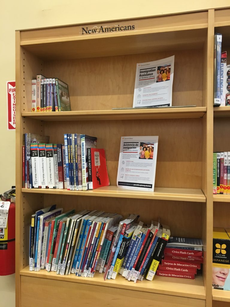
This branch is also impressive for its collections in languages that reflect Ridgewood’s immigrant population. In the adult section, there are designated shelves for languages including Albanian, Polish, Serbian, and Spanish. There is also a “New Americans” section geared toward immigrants, with videos, books, information pamphlets, and ESL materials. The literature near the circulation desk advertising library and community resources is printed in many languages. Having lived in Ridgewood for more than five years, I can attest to the large Eastern European and Spanish-speaking populations.

Ridgewood Library New Americans area


When I arrived at 1:30 p.m., the library was very quiet. Once school let out though, the teen section filled up and became loud and boisterous. Conversations reached the point of yelling, and because there weren’t enough tables or chairs, some students sprawled out on the floor. Since the teen and adult sections share the main floor, this noise filled the entire area and made it difficult to focus or hear the reference librarian as he answered a question.

While I think it’s great that teens are using the library, a more separate teen area like the younger children have would be ideal, as it would allow the rest of the library to remain a (reasonably) quiet environment. The reference librarian on the main level said that it can be a challenging place to work just because it does get so busy and loud. To me, these issues speak to the ever-present tension between providing access to everyone and ensuring that all groups of patrons have a good experience at the public library, all while dealing with space and budget constraints.

It seems like the best option for addressing the high volume of patrons at the Ridgewood branch would be to expand the building or move to a new location. Alternately, perhaps an additional neighborhood branch would help to address some of these issues. Of course, this is dependent on funding from the state and city governments as well as private sources. This blog post from YALSA (Young Adult Library Services Association) gives recommendations for dealing with noise and disruptions from teens after school when expanding isn’t an option. Suggestions include rearranging shelving and furniture to create noise barriers, opening up meeting rooms for teen use after school, and scheduling programming and activities for teens during this time.

Overall, while the Ridgewood branch faces challenges, I do think it’s doing a great job of targeting materials, programming, and resources to the needs and interests of the community it serves.


Observation of the 58th Street Public Library

The 58th Street branch of the NYPL is one of their smaller locations. My observation took place midday on a weekday. Some patrons did appear to be stopping by during a lunch break, quickly picking up hold materials before leaving. However most patrons did linger in the library, many for the entirety of my observation.

Physical Library Space

When you walk into the library it is all one room. To your immediate left are a handful comfy chairs and behind that a small children’s area. This has two small tables with three or four chairs around them, and a very small open area. Then on the left are the stacks. To your immediate right is the reference desk. This library does not have self-checkout, so it is the only location to check out materials. (There is a book drop in the vestibule of the library so you can return books without entering the main space.) Beyond that, on your right are a dozen or so computers, which can be checked out for 45 minute intervals, and the DVD collection. Straight ahead of you there are some more comfy chairs, two long communal tables to work at with outlets built in and hold/reserve shelves which line the back wall.

One of the first things you notice about the space is that it is designed primarily for adult patrons. There are mostly places to sit and read/work individually. Some parents/caregivers have modified the space to suit their needs. An empty space in front of the reference desk, where the line forms when the demand is higher, is taken over by unofficial stroller parking. There isn’t enough space in the children’s section to store any belongings and have space to move around.

Use of the Space

Patrons at the time of the observation seem to be coming to the space to either work independently or pick up holds from the hold shelves. Only a handful of patrons even visited the stacks during their time in the library. Those working either at the computers or communal tables didn’t visibly have physical library materials with them. Over the course of the observation there were two older patrons who read periodicals that the library had on display. But only two patrons visibly had library books at their spaces. And only one of them spent time reading their book. Patrons primarily took advantage of the computer/Wi-Fi/digital resources that the library offers, as opposed to books or periodicals.

This library fulfills a very important role as a ‘third space,’ somewhere that is not home or work/school where people can congregate and just be. For example, there were many retirees, who came here to spend time outside of their homes. While not apparent from the layout, according to their website there is also a second floor, which houses a space that can be reserved for community events/needs as well as their tech classes.

Library Staff

During my observation I saw four different members of staff working the reference desk. Only one of them was a women. Considering the stereotype of the middle age white female librarian this felt noteworthy. Additionally two of the men were people of color. This felt important because as you look around the library, they have a diverse range of patrons. Having a body of staff that reflects your patron-base allows them to best serve their patrons, and be aware of any special needs or considerations their patrons might have.

Recommendations

This is not a high-tech library that is going to have a maker space or a lot of automated systems. However there are small areas where they could probably integrate more digital services. The addition of a self-checkout station would allow patrons who are just picking up materials, and not asking questions, to quickly get their business done.

There also felt like a need for a more designated child friendly space. Some patrons verbally complained about the strollers left in front of the reference desks. Many also made faces when navigating around them. While space is at a premium in a library of this size, the reading area next to the children’s area could probably be rearranged to have space for the strollers. Then those seats could be moved to another area of the library.

Another option would be to take advantage of the second floor space. Maybe when there aren’t events up there have the space open for children to use. That way there would be space for them to run around or read aloud without disturbing the people working downstairs. However I have not seen that space so I don’t know how difficult that would be or if there is a computer set up that would make that difficult.

After School At The Cortelyou Library

Cortelyou Library
Cortelyou Library (photo by Mary Bakija)

The first thing you see when you enter the Cortelyou Library is the information desk. A librarian sits there, and if you make eye contact, she’ll smile and say hello. Many of those who entered on the day I was there, both children and adults, knew her. “I passed!” reported one teen, and the librarian gave the thumbs-up sign, while telling another, “I haven’t seen you in a while!” Other patrons either passed the desk quietly, or stopped with specific questions. It was a cool fall day, around the time the elementary school next door and the middle school down the street had ended classes for the day, and the librarian was constantly fielding questions.

“How does she get a library card?” one guardian asked, nudging the girl at her side, before accepting a form to fill out.

“When is storytime?” another guardian asked, in a thick Russian accent. The bilingual storytime wasn’t for a little while, so the family of five headed out, saying they’d return.

“Where’s the bathroom?” asked another guardian, shepherding her child in the direction the librarian pointed.

Where To Checkout?

Directly to the left upon entering is another highly used area: the self-checkout machines. People who came in knowing which book they wanted walked right up to one to use it to search. Others checked out after browsing a bit, or after picking up their book from the holds shelf nearby. Some popped in, renewed, popped out. A class of about a dozen pre-K aged children stood in line to check out books with their teacher at one of the self-checkout kiosks. The teacher had a bag full of the kids’ library cards and helped each child check out one or two picture books, which went fairly smoothly. (Putting coats back on didn’t go quite as well. The “flipping method” requires some finesse and experience, it seems. And then Max forgot his hat.) The teacher reminded the kids: “Keep the paper slip with the book, because that tells you when you have to bring it back.”

It’s interesting to see the information desk and the self-checkout stations so close to each other. It’s common to every branch of the Brooklyn Public Library that I’ve visited, and I have seen how useful it can be. During this observation, the librarian at the info desk spent several minutes recommending a book comparable to Nathan Hale’s series to a mother and her son, at which point a few people wanted to check out books. Rather than wait, they saw the self-checkout kiosks were available, and they used those. However, people also used them when no patrons were at the info desk. It was a little sad to see people actively avoiding that human interaction; the alternative view, of course, is that they might find self checkout to be more efficient, faster, or even a more private way to access information.

Where To Sit?

A nice piece of design in this branch is that there are two separate areas with computers: one for adults, and one for children in the children’s area. Several kids coming in after school raced to the computers, working together on projects and playing games. Adults were also busy at their computers — the entire time I was at the library, every computer in the adult section was occupied, and patrons were often waiting their turn for a computer to become available. Because both computer sections are surrounded by bookshelves, as patrons young and old waited for a chance to use a computer, they also interacted with the physical collection, browsing titles and picking up books.

The most apparent constraint of this branch is its small size. Though this was a peak time for the branch, it’s representative of the weekday after-school crowd. According to the library system’s BrooklynStat service, in fiscal year 2018, the branch recorded 198,901 visits, making it the fifth most popular branch in the system. Taking into account Sundays and holidays, the library was open about 300 days during the year, so that’s an average of about 663 people that visited this branch each day. And, at least in its busy times, you can really feel that. It’s bustling and vibrant, warm and welcoming, convivial and social, and incredibly kid-friendly. By 3:30pm the day I visited, every chair was occupied, and additional children dashed around tables or sat on the floor. The noise had increased — in addition to the general chatter and energy of the crowd, three infants wailed unconsolably for 20 minutes straight — and the space was more comparable to a school cafeteria than to what most people imagine a library to be.

How To Improve

The wide, single-story building was built in 1983. The library doesn’t have stats available online that date back to that time, but we can see some change in the neighborhood by looking at census data. According to the Department of City Planning, the population of Community District 14, where the Cortleyou Library is located, was 143,859 in 1980. By 2010, the population had grown by nearly 17,000 people. The library may have filled the neighborhood needs effectively in the ’80s, but the neighborhood has grown, and perhaps it’s time for the library to grow, as well.

If I were to improve the library in just one way, to accommodate the demand and the various users, I think separate, walled sections would be helpful. During my observation, several adults entered the library, looked around for a seat, observed the hectic atmosphere, and then turned around and left, perhaps to sit in one of the several coffeeshops on Cortelyou Road instead. If the spaces for children and for adults were separated, it would impact the energy and sociability of the library — I for one wouldn’t have made a new kindergartener friend, who shared facts from the non-fiction book she’d just read about glass. But it would be nice to have a dedicated, quieter space, where adults (and children) could enjoy a bit of peace. I’d add a few comfortable chairs in there, too, as all those currently in the library are firm plastic seats at tables.

Public Service

Though not exactly the “street-level bureaucrats” described by Michael Lipsky in his paper Toward a Theory of Street-Level Bureaucracy (because the Brooklyn Public Library is not run by the government, but is a nonprofit organization that receives funds from a number of sources, which does include local, state, and federal governments), Lipsky’s descriptions felt like they’d come alive here in some ways. Librarians represent a larger organization, and certainly some people who don’t know exactly where the library’s funding comes from may not distinguish the library from a government agency. And as shown above, librarians interact with citizens extensively.

“The potential impact on citizens with whom [a street-level bureaucrat] deals is fairly extensive,” Lipsky wrote. At the library, that couldn’t be more true. I saw it in action, quite positively, throughout the afternoon, as librarians and support staff assisted patrons with all sorts of requests, tirelessly fielding repeated, similar questions without irritation.

The physical and psychological threats Lipsky outlines are also a possibility at the library. There is certainly a psychic toll on everyone working, from the librarian who was trying to settle down a man who was yelling, to the security guard who reminded a girl about some of the responsibilities she has for her younger brother, to the volunteer who shelved books near the hysterical infants. And every single one of them worked with patience. It’s exhausting to be “on” like that all the time. But for the right person, like the librarian I saw at work that day, and with the right training and support, it might be easier to see it not as exhausting, but rather as rewarding.

Effective Engagement @ Cooper-Hewitt

Effective Engagement @ Cooper-Hewitt

by Elizabeth Phyle

To observe an information environment I spent time at the Cooper-Hewitt Museum watching audiences interact with their exhibit. The Cooper-Hewitt is at the forefront of incorporating technology into their visitor experiences. In addition, they have “Senses: Design Beyond Vision” on view until the end of the month. I am very interested in how museums incorporate tactile activities to facilitate visitor engagement with the material. The “Senses” exhibit and their other hands-on exhibits gave me a chance to observe how these features provide deeper engagement as well as how they potentially divert attention from more substantial information.

Perspective taking

I believe that sense are an under-utilized tool in museums. We ask visitors to look, listen, and read a lot while they walk through a quiet gallery. It was shocking the difference in atmosphere between the more traditional exhibits and the “Senses” exhibit. The energy was palpable while people were engaged in touching and smelling as well as looking and listening. Some of the most interesting installments were the ones that took a risk; using the senses to convey something beyond words. For example there were translucent white boxes with phrases on top of them describing a moment or feeling that is specific enough to conjure an image in your mind. Then you press a button, lean in close, and the artist’s interpretation of that scent whiffs over you. Watching people interact with the exhibit was fascinating. People had strong, immediate reactions; often in the form of interjections, not words. The scent named “the feeling for someone once loved, but no longer” elicited pained “oohs.” The one named “being perfectly entangled with another” caused many visitors to smile and “awwhh”. Not everyone thought that every scent was a perfect representation of the emotion described, but it served as a fantastic conversation starter either way. Any good exhibit asks visitors to shift their perspective. By asking them to uses their senses in unfamiliar ways the exhibit forces perspective shift. Context shifting is an important skill in a multi media and medium world. Other museums could incorporate sound, touch and smell into their exhibit in similar ways to help visitors realize their own perspective and take on the perspective of others.

One installment that compelled the visitor to enter the life of another was called “Portal_Soundscapes” Here visitors listened to sounds from cities around the world including voices from refugee camps. I found it very powerful, but unfortunately not many people visited it while I was in that area. This may be partly because it was slightly off the main path, or it may be that visitors did not want to engage in more serious topics while they were playing. Things like this that offer a wide snapshot of human experience could be useful in history museums. Oral histories are powerful, but visitors can also benefit from abstract views of the human experience like asking “what do humans sound like?”

The nagging questions that I had all the while was, how much are people actually taking away as they flit from one thing to the next? It is a tall order to expect visitors to be able to go from scratching and sniffing a wall to reading the placard text about accessible design. I saw that some visitors would skip any exhibit here that didn’t have some of sensory activity associated with it. Like bee’s between flowers, many people would walk up to the installment, do a quick skim for any feature that they could do something with, but if all there was was something to read or information to listen to they would flutter to the next spot and repeat. This certainly telling about how we prefer to interact with our surroundings, but to what extent should museums cater to these impulses? This reminds me of the discussion of user-centered versus system-centered design that we encountered in Talja and Hartel as well as the class discussion we had surrounding it. They discuss the traps in images about user-centeredness being warm and compassionate opposed to a cold and quantitative system centered design (Talja and Hartel 2007). Compared to traditional museum experiences where the visitor is expected to conform to the museum, we can see with the rise of sensory exhibits and pop-up museums how museums are being pressured to cater to the visitor. However, museums should not lose sight of their mission and institutional strengths. The Cooper-Hewitt overall did a fantastic job of balancing education, collection presentation, and interaction.

Conscious Consuming of Information

At a small out-of-the-way alcove there was a headset with two short hospital soundscapes. One was of a traditional hospital setting with high frequency beepings, rushing of gurneys, panicked footsteps, and doctors yelling out stats. The other one was what a “humane patient experience” could sound like. It explains how information could be communicated between nurses and doctors while preserving a environment that is beneficial to the patient. This reminds me of the way they Sengers ended the article on Practices for a Machine Culture, she argues for “technical artefacts that enrich human experience, rather than reducing it to a quantified, formalized, efficient, and lifeless existence (Sengers 2000).” Hospitals are a great example of a systems-centered environment. Since their work is so technical, fast pace, and high pressure, it is unsurprising that the externalities of their system is not something that has traditionally been at the forefront. This exhibit allows visitors to think critically about these externalities as well as examine the role that sound plays in decoding our environment and on our stress levels.

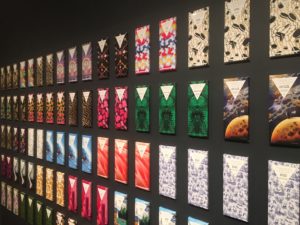
Cooper-Hewitt is a unique case for consumerism in museums because at its core it is a product design museum. The question then become are they feeding consumer culture or educating on it? There was only one stark example that I found of product promotion in the museum. There was a wall of chocolate bars in different flavors and enticing packaging, which you could conveniently find for sale in the gift shop. I could find no educational value in this installment. The purpose it served was only to generate excitement about a product. Again this brings us back to the user-centered discussion. The designers tell the user what they need and proceed to embed their product into the grooves of our lives. This is not the same as responding to a demand.

On the other hand, working through this exhibit may be an effective way for visitors to learn about the ways we react in accordance with our senses and ways we are likely to be deceived. The disability and sensory design area showed how certain scents can spark appetite and memory for dementia patients, and how color coded design can help our brains understand the functionality of items. Examples like these shows how the exhibit is educating visitors to what product design has the potential to be. In “Saturated: The Allure of Science and Color” there was a old Mac computed on display with this quote from Steve Jobs, “For most consumers, color is more important than megahertz, gigabytes, and other gibberish associated with buying a typical PC.” This placed in an exhibit about color allows visitors to reflect on their own consumer decision and how they are affected by design. This fits in to the discussion about design justice introduced to us by Constanza. The products we buy are all encoded with values, and along with the values are the frameworks of our society and all the power structures that entails (Constanza 2018). Museum experiences that let the visitor “behind the scenes” on how and why things are designed allow them to decode their consumer environment.


Talja, S., Hartel, J, (2007). Revisiting the user-centred turn in information science research: an intellectual history perspective. Information Research, 12(14).

Constanza-Chock, S. (2018). Design  Justice: towards an intersectional feminist framework for design theory and practice. Design Research Society. University of Limerick. 25th-28th June 2018.

Sengers, P. (2000). Practices for a Machine Culture: A case study of integrating cultural theory and artificial intelligence. Surfaces. Presses de l’Universite de Montreal.