Person, Place, Thing: Film, Politics, and Poetry in the Archives

Person: Katherine Groo 

I first heard of Groo, who is a professor of film and visual culture at Lafayette College, through her controversial Washington Post piece in December 2018 titled “FilmStruck wasn’t that good for movies. Don’t mourn its demise.” The essay was in response to the then-recent announcement and subsequent outrage that the popular movie streaming service FilmStruck (run by Turner and Warner Bros. and known for its arthouse titles) would be shutting down. In the essay, Groo writes bluntly, “FilmStruck was never a library or a film archive. It was a for-profit streaming platform that provided access to those who could pay for it.” Groo goes on to discuss actual film archives and libraries, including some that also function as (free) streaming services, such as the Internet Archive and Kanopy. She notes that cinema tends to produce many, many artifacts that are not seen as valuable enough for preservation, and suggests that instead of advocating for the for-profit streaming service with its selection of classics, FilmStruck fans advocate for funding for film libraries and archives or other models that will provide open access to a broader collection of movies. The essay helped me to understand what libraries and archives can and should do, by exposing the biases of a streaming service that is at first glance structured much like an archive. More recently, Groo published a book called Bad Film Histories: Ethnography and the Early Archive, in which she discusses her interactions with ethnographic film fragments from the first few decades of cinema. Like her FilmStruck piece, Groo’s book is a fascinating look at archival theories and practices from the academic perspective of a film historian. Despite the fact that she comes from a film background and is not a trained archivist, Groo’s thinking has grounded my understanding of my place as an archivist, working with historians, researchers, and other patrons. She takes the idea of the archive and asks readers to consider alternatives to old models of value-based preservation and profit-based access. Groo discusses how deeply things are shaped by how information professionals organize, name, and share resources. In her FilmStruck essay, Groo writes that history is never a “comprehensive body of works tucked away in an archive,” and that there are always new ways of understanding what we think we know that are not dependent on canonical bodies of work, made canonical by individuals and forces of society not necessarily documented with the works themselves.

Place: Interference Archive
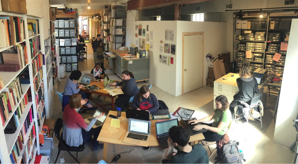
My terrible posture in this picture (I’m in the green shirt) haunts me.

I was first introduced to Interference Archive, which is located in Park Slope, several years ago, and I have been volunteering there since. It’s a place that has shaped my idea of what archives can look like and how archivists can be community members and activists. Interference Archive is an entirely volunteer-run organization that collects archival materials related to social movements and makes those materials available in their open-stacks space. One of the most fascinating things about Interference Archive is their emphasis on accessibility to their materials. All of the collections, including things like posters, zines, buttons, books, and records, are available in their open stacks for any patrons to touch and interact with. For many people who have only interacted with archival collections through the barriers of academic or museum collections with all of their barriers, the openness at Interference is shocking. They also put on exhibitions and programs related to their collections or to relevant work being done by members of the community. The lack of institutional affiliation means that Interference Archive is able to have entirely independent programming. Their programs include workshops, speakers, film screenings, kids events called “radical playdates,” and many more types of events, expanding ideas of what role archives can play in a community. At Interference Archive, the collections are not behind barriers and used only for research; they are the totally integrated into present-day action. As an archivist, I want to think about how the work I am doing is best not just for the materials I work with, but for the people those materials serve. The Archive does not simply house political content and move on; its structure, goals, and events reflect the radical potentials of the materials they collect.

Thing: Lost & Found 

Another inspiration to me as an archivist that comes from outside the archives field is Lost & Found: The CUNY Poetics Document Initiative. Lost & Found is a project and publication based at the CUNY Graduate Center, with doctoral students in their Enlish program serving as researchers and editors. Focusing mostly on 20th century American poets, Lost & Found editors use archival materials to research their subjects, and to draw previously unpublished works, correspondence, journals, lectures, and writings in translation into publication for the first time. The series is published annually as a collection of chapbooks—previous issues include works from Audre Lorde, June Jordan, William S. Burroughs, Kathy Acker, Diane di Prima, and more—but research originally done for Lost & Found also frequently turns into book-length publications. The series’ founder, Ammiel Alcalay, says that the principle behind the series is for researchers to “Follow the person.” This is a pretty surprising position for many literary scholars to take—one that at first ignores the canonical context for a writer’s work in the form of literary “schools,” periods, or groups of associates—and instead focuses first on the hard evidence of an individual’s archival output. This series is so exciting to me as an archivist because it integrates scholarly research and archival work. It’s an example of how archivists can help open up new ways of seeing subjects and people.

Resources:

Groo, Katherine. Bad Film Histories: Ethnography and the Early Archive. Minneapolis: University of Minnesota Press, 2019.

Groo, Katherine. “FilmStruck wasn’t that good for movies. Don’t mourn its demise,” The Washington Post, 3 Dec. 2018.

Interference Archive.https://interferencearchive.org/

Lost & Found, The Center for the Humanities. https://www.centerforthehumanities.org/lost-and-found
Bringing a businessman, a library, and a movie into the information world

Imagining new contexts is an excellent way to capture the role of information in topics familiar to me. This article considers start-up founder Adam Neuman, The Beinecke Rare Book & Manuscript Library, and William Burrough’s cut-up film “Towers Open Fire,” a person, place, and thing that pre-date my information science career. Put in the context of information science, all three encounters have taken on new meanings.

By Jack O’Malley

Person: Adam Neumann

Adam Neumann was the CEO of WeWork. “Was,” is the word that hints at a fascinating business case that has recently evolved into a character study. As The New York Times summarizes, WeWork’s fall from a $47 billion private valuation to $7 billion after a botched IPO, which failed partly due to concerning revelations about Nuemann, “came with an even more astonishing exit package for Mr. Neumann: The 40-year-old could receive more than $1 billion after selling his shares to SoftBank and collecting a $185 million consulting fee.”1 A more critical article in The Atlantic paints a more vivid picture, writing that WeWork’s failure “has established Adam Neumann, who escaped from the wreckage a billionaire, as a figure of almost mythical monstrousness—like some capitalist chimera of Midas and Houdini.”2 

In a way, observers have invested themselves in classifying Neumann. Everyone wants to answer the question “where does he fit in our understanding of American business?” Yet, stories like these two gloss over the business itself, which employs thousands of employees and serves hundreds of thousands of tenants (or members). The obsession with Nuemann follows a classic error of thinking, which assumes a singular case has more to tell us than the norm. The space Neumann literally takes up in the news crowds out reporting about the fate of those who outnumber Adam Neumann by the hundreds of thousands. Even The Atlantic has trouble imagining creatively who WeWork might be for. “Most modern workers deal with the supply, transport, marketing, sale or investment of stuff,” they write, acknowledging the social force that made WeWork popular.3

Of course, many modern workers don’t sit at a computer. In the eighteen months that I was employed by WeWork, most of the WeWork staff at any given location were people of color making an hourly wage in exchange for manual labor. “Stuff” is often the labor of others. Inventing categories for Adam Neumann seems somehow to have erased many others. 

The Beinecke Rare Book & Manuscript Library 

The Beinecke at Yale holds some incredible relics: James Baldwin’s papers, over 700 Japanese manuscripts, the Lewis and Clark exhibition maps, and (I once a heard a rumor) William Howard Taft’s trousers. These objects have real power that might convince you that Benjamin’s “aura” really does exist. Incredibly, if you request it, you can touch them. As a student, I thought the chance to be so close to knowledge was simply a privilege; coming to believe it is a right brought me to library science. I highly recommend a trip! 

The university keeps this unique space open to the general public and accepts requests from all researches interested in accessing the stacks. In fact, the librarians do almost everything short of handing out flyers on the corner to invite people to see their collection. They admirably emphasize diversity in their holdings, hold readings and award prizes, give tours, and display their most recognizable objects, like the Gutenberg Bible. Still, in the best way, it feels most true to stay that the librarians and curators just want everyone to stand closer to the books.4 

“Towers Open Fire” 

Best described as “really funky,” this William Burrough’s movie explores the theory of “cut ups” in a series of random images, not all pictorial, and a voiceover. The climactic moment … I won’t spoil! Watch it, show your friends, and see if you all agree on the climax. Burroughs argued that, although the arrangement is random, “in any case you will find that it says something and something quite definite.”5 In its own way, the rapid cutting internalizes user theory. Burroughs was emphatic about the egalitarian nature of the cut ups. I love it because the movie does not do any of the work we expect from a typical movie. In fact, it can feel like watching the movie is the only way to summarize it. Just as it doesn’t do any work, it doesn’t tolerate miscommunication, and the only assumption it makes about a user is that they hit play.

A few years ago, finding “Towers Open Fire” on YouTube made me feel that, yes, information truly is free! That excitement has given way, however, to anxiety about the long term preservation of the film. For instance, an Italian language film clip channel posted the video above, and, while I appreciate that I could find Burroughs work with a simple search, I do not want to trust a semi-anonymous YouTube user. In addition to concern for long-term preservation of what might look like nine minutes of b-roll, I’ve come to recognize another problem too. If there are preserved copies, why aren’t they as accessible as the one on YouTube? 

End Notes

1 Amy Chozick, “Adam Neumann and the Art of Failing Up,” The New York Times, November 2, 2019, sec. Business, https://www.nytimes.com/2019/11/02/business/adam-neumann-wework-exit-package.html.

2 Derek Thompson, “WeWork’s Adam Neumann Is the Most Talented Grifter of Our Time,” The Atlantic, October 25, 2019, https://www.theatlantic.com/ideas/archive/2019/10/how-weworks-adam-neumann-became-billionaire/600607/.

3 Thompson, “WeWork’s Adam Neumann Is the Most Talented Grifter of Our Time.”

4 “History and Architecture,” Beinecke Rare Book & Manuscript Library, December 20, 2018, https://beinecke.library.yale.edu/about/history-and-architecture.

5 William Burroughs, “The Cut Up Method,” Accessed November 5, 2019, https://www.writing.upenn.edu/~afilreis/88v/burroughs-cutup.html.

Person, Place, Thing: Ian MacKaye, Grand Central Station, Directories

(Photo: SAUL LOEB/AFP/Getty Images)

Person: Ian MacKaye

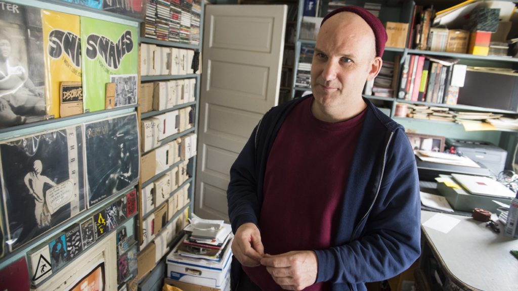
Ian MacKaye is a DC native and founder of the independent punk and hardcore label Dischord Records.  Some may call him one of the founding fathers of the DC punk and hardcore scene because of his involvement in seminal bands Minor Threat and Fugazi, and the support he offered other DC musicians through his label.  Most notably, Ian MacKaye has archived the DC scene since the late 1970’s. By saving flyers, tapes, records, photographs, zines and other ephemera relating to the music scene, MacKaye took on the role of a community archivist as a teenager.  Much of his collection stemmed from saving every little bit that had to do with his own bands and label, and eventually he branched out, saving much of the materials encompassing the entire DC scene.

The act of saving may have started out as a hobby or a simple habit, but as MacKaye’s collection eventually grew it became admired, recognized and most importantly, it was deemed as useful.  MacKaye has been the subject of various documentaries and books, and much of his resources have been referred to, not only tell the story of his own projects, but to help shape the voice to the influential, underground, scene he helped found.  This is especially important in that he saved materials that many people didn’t think to save, and so without his collection much of the story would have been lost. In 2013, he was invited to speak at the Library of Congress on his role as a citizen archivist, which was impressive considering MacKaye has no formal archival training. He has continued on his mission and has begun to digitize not only the papers from his collection, but the music as well. Much of the formats of the 1980’s are fragile cassettes, which MacKaye has been repairing and restoring to improve their sound upon digitization.  Most recently he has had the help of Smithsonian archivist Nichole Procopenko to assist in the organization and proper storage of his collection. 

(Photo: Frank English)

Place: Grand Central Station 

Grand Central Station has a special place in many New Yorker’s hearts.  It’s a majestic building full of rich history and sneaky little easter eggs like the whispering gallery.  The building is a preserved gem of old New York, unlike its old counterpart on 34th street which saw its demise in 1963.  There are many areas in the building worth exploring, if one has the time; I almost always discover something new when I’m passing through, whether it be a new chandelier or a Vanderbilt acorn.  One of the most striking things about Grand Central aside from its aesthetics is its impressive flow of information. By observing the main concourse one can see people meeting their loved ones and scurrying toward their destinations.  Although the internal systems and infrastructure that run Amtrak, Metro North and the various freight lines are behind the scenes, the central brain of the main concourse is the four faced clock with the information booth inside. Here, information is exchanged quickly and efficiently, almost rendering the large timetables as unnecessary bystanders. Within seconds, the booth’s attendants can easily tell you which of the 124 tracks you need to be on at any given time.  

If you decide to skip the information booth the timetables are still reliable and easy to understand.  They are organized by the five lines of the Metro North, each with color-coded headers that correspond with the colors of the map.  The map design and the corresponding schedules are clean designs without a lot of clutter which makes them easy to read. This design is far less intimidating than the NYC Subway map. This is especially important for travelling visitors that will likely interact with the station during their time in New York. The placement of the central information hub and the timetables along the edges of the concourse provide for an organized system that allows ample room for people to get where they are going. Part of the charm of this station is the hustle and bustle of the people in the main concourse and it wouldn’t be as organized if there were no efficient information system to manage and maintain the crowds.

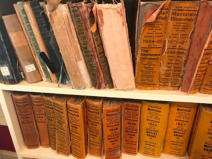
(Photo: Montclair History Center)

Thing: Directories

In 2019, directories seem pretty obsolete. Many municipalities stopped printing them altogether since most of what is needed can be found online.  However, I have found directories to be quite helpful when handling research requests at the archive. On the most obvious end, a directory is helpful when handling genealogical requests, as the directories can provide proof of residency.  Because these physical copies have not been digitized I am often referring back to them, so they are always at arm’s length. I find the directories to be extremely useful not only for genealogical requests but when researchers are looking for information on certain businesses. These tomes provide not only that, but an accurate snapshot of what a region’s commerce may have looked like at a specific time, as well as whether the region was more industrial, rural or urban.  They can also provide a timeline of how often the same names and businesses continued to appear. Another wonderful quality of the directory is that it’s easy to use, so you don’t have to spend a ton of time looking through it.

I attended a NJ History Conference this week and directories continued to come up within a fair amount of the research presented.  Many of the panelists were looking to old directories to find proof of female-owned businesses in the 19th century and for some, this was the only source where they could verify this information. The directories used by these researchers were also helpful in not only showing proof of a family’s business, but proof that these business owners also owned buildings and had tenants. Some of this is information one could easily verify with Census records, however having it confirmed in another source, one as neat as a  printed directory, can be the piece of information a researcher needs. So although these books are sometimes seen as door stoppers, I would say they still have plenty of value in research settings.  

Sources:

https://blogs.loc.gov/thesignal/2013/05/ian-mackaye-and-citizen-archiving/

https://www.nytimes.com/2011/11/26/arts/music/fugazi-live-series-a-post-punk-bands-archive-of-shows.html?_r=0

https://sheshredsmag.com/bts-2/

https://brightestyoungthings.com/articles/ian-mackaye-interview

https://www.grandcentralterminal.com/history/

Vanessa Castaldo
Info 601-05

A nanny, in the home, bearing knowledge

I currently work as a nanny on the Upper West Side of Manhattan. My employers are white-collar workers, committed to their careers and to their children. Like many white-collar workers in NYC, they are not from New York, and their parents do not live in the city. In this role, I have participated in a hidden network of labor and information.  

A nanny playgroup in Riverside Park.

Person: Nanny 

This job has revealed to me an entire system of labor that is hidden in many ways. As Downey (2014) discusses in the context of information and technology work, the work that nannies do is underrepresented by employers. It is common for nannies to work “off the books,” meaning that the income is not reported to the IRS and nannies and employers can avoid paying taxes. There are many reasons for nannies to want to remain hidden: immigration status, loss of public benefits, more take-home pay, etc. As a result, many nannies work outside of labor laws like minimum wage, overtime, and sick days. 

Because there are few standards, there are a lot of nannies who are working for very little money. A nanny that I know, who is currently looking for work recently said to me, “a nanny’s worst enemy is another nanny,” describing the low salary offers that nannies are given. As Dwoskin, Whalen and Cabato (2019) discuss concerning content moderators in the Philippines, someone who is desperate may take a job with low pay because she needs the job. That makes it hard for other nannies to negotiate a better, commensurate salary. There are domestic workers unions and there is now a Domestic Workers Bill of Rights in NY State that might aid in this problem of labor exploitation. Personally, I do not know any nannies that are members of the unions or who bring up the bill of rights to their employers. In many cases, nannies would be uncomfortable to bring this up for fear of losing their job. 

The work of nannies is also hidden because raising children is not typical work. Nannies do social, emotional, logistical, and educational labor in addition to physical labor. This work continues even when we are not physically at work.  

Place: Household 

The household is the physical workplace of a nanny. Working in the home immediately creates an intimate setting for the employee/employer relationship. I see my employers in their pajamas, I know their good and bad habits, etc. This intimacy brings a nanny into the family, which can be good and sometimes it is messy. A family member is happy to do favors, doesn’t mind when you are running late, and will answer your calls and messages after work hours. An employee, however, should be compensated for all the previously mentioned work, in addition to their salary.  

In this dynamic, the white-collar workers are entrenched in their careers and outsource the labor of home and child care to their nannies. While nannies are ostensibly being paid to care for the children, they are also caring for the parents in the chores that they do and the emotional labor of maintaining the home as a familial space. Nannies are often responsible for deciding purchases, cooking meals, supplementing love and support, and constructing family.  

Thing: Child-rearing knowledge 

In the case of career nannies, as they approach retirement, they will have raised upwards of 20 children in their careers. With this experience, and perhaps the experience of raising their own children, nannies bring a wealth of knowledge to their jobs. For first-time parents, it is often the case that they have no clue where to start to be parents. Parenting is not something that we can study in school, and having children is obviously independent of one’s ability and knowledge of parenting. Sleep training, potty training, learning to read, etc. can be intimidating to parents, but are essential to the growth of the child, and with their experience, nannies often take on these responsibilities. Nannies construct household systems in addition to relaying knowledge and skills to their employers. These household systems include children’s daily routines, nutrition, sleeping schedules, and housekeeping maintenance.  

Nannies bring traditional knowledge from their own cultures into the families that they work for. The nannies that work in my building are from all over the world, bringing with them their culture. From home remedies, to old wives’ tales, to cultural values, to folk songs and stories, this cultural knowledge is passed to the children, who then teach it to their parents. For non-native New Yorkers like my employers, they live away from their families and don’t have regular support or cultural knowledge from their parents. 

A nanny’s knowledge of raising children is unmistakably valuable. However, this value is not reflected in the status, rights, salaries that nannies receive. This recalls the questions from the beginning of the semester from Bates (2016) and Buckland (1991): “what is information?” and “who gets to decide what information is?” Cultural knowledge and personal experience are not valued as information. Children-rearing is seen in American culture as women’s work, which is still undervalued in society. In addition, the emotional work and knowledge of raising children is difficult to measure, making it less valuable in the eyes of capital. 

Resources: 

Bates, M. J. (2006). Fundamental forms of information. Journal of the American Society for Information and Technology, 57(8), 1033-1045. 

Buckland, M. (1991). Information as Thing. Journal of the American Society for Information Science. Jun1991, 42(5), 351-360. 

Downey, G. J. (2014). Making media work: time, space, identity, and labor in the analysis of information and communication infrastructures. Media Technologies: Essays on Communication, Materiality, and Society. Cambridge: MIT Press, 141-165. 

Dworskin, E., Whalen, J. & Cabato, R. (2019) Content moderators at YouTube, Facebook and Twitter see the worst of the web – and suffer silently. Washington Post, July 25, 2019. 

Domestic Workers United. http://www.domesticworkersunited.org/index.php/en/ 

Domestic Workers Bill of Rights, New York State Department of Labor. https://labor.ny.gov/legal/domestic-workers-bill-of-rights.shtm 

Field Report: MoMA PS1 Printed Matter New York Art Book Fair

Moma PS1 is one of the oldest and largest nonprofit contemporary institutions in the United States. It regularly organized an event to promote the museum. In this fall, MoMa PS1 hosted the New York annual Book Fair — Printed Matter. The event was held at MoMA PS1 sprawling campus from September 21 to 22. Printed matter’s is one of the biggest book fair of each year, which is a leading international gathering of artists’ books, celebrating the full breadth of the art publishing community. This annual book fair event draws thousands of book lovers, collectors, artists, and art world professionals. This year is the fourteenth year for Printed Matter to present the NYC art book fair. 

Before I went to the event, I had several questions in my mind, which requires me to find the answer. 

  • Why printed matters?
  • What is the age range of people who go to the book fair?
  • How the exhibitors profit from their issues?
  • What is the reason for people choosing to issue printed books over digital books?
  • How they define “Archive”?
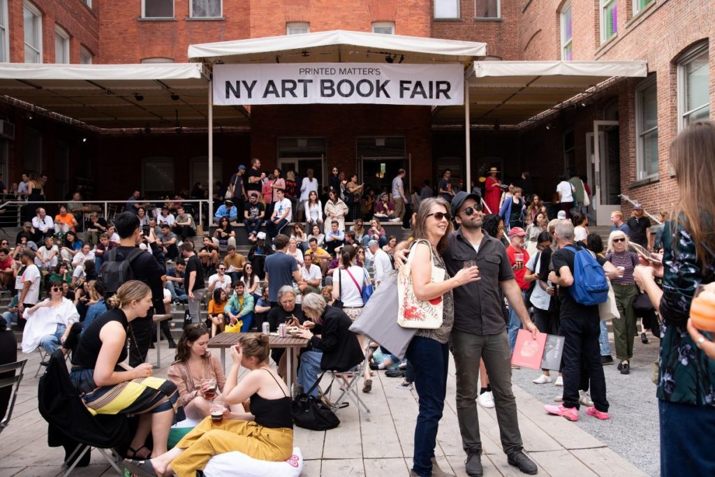
Scene outside of PS1 during the book fair

Regardless of the various digital reading products in the market, such as Amazon Kindle, the population of reading printed books has been descending year by year. Even textbooks are gradually going paperless nowadays. Also, among the teenagers in the 21st century, fewer and fewer teenagers are willing to read printed books. On the one hand, the price of books is always high, which is not friendly to book-lovers. On the other hand, a printed book is harder to carry around than a simple reading tablet.

This year, the Printed Matter event held over 350 booths. It’s a spectacular parade of art, fashion, zines, culture, subculture, color, sound, food, and various performance. At first, this extravaganza made me feel a little overwhelmed because of the dazzling booths. It’s really hard to find the specific exhibitor, ranging from artist collectives to antiquarian booksellers, offering unique publications. In the place of the Fair, there were visitors from different age groups and with different skin colors, but people who purchased the issues, the works, and the books mostly looked older and more knowledgeable. Younger people or teenagers were more thinking of the book fair as a weekend entertained event. 

After finishing browsing most of the booths, I entered a booth with name “The Classroom”. The name was attracted me to walk into the space since I wondered what I might learn from this so-called “The Classroom.” This space is presented by a dutch artist, Ruth van Beek. She walked around and elaborated on her thoughts behind her practice in “The Classroom” to the visitors. The exhibit was a dedicated space that provided reading, screening, informal lectures, and other activities by artists, writers and designers. The program highlighted exciting new releases at the Fair and fosters dialogue around important themes for contemporary art publishing and the broader community. ‘That foster dialogue around important themes for contemporary art publishing and the broader community.’ Ruth described bookmaking as an inverse to creating an exhibition. “Making a book is more democratic. They’re for everyone.” After the talk, one of the audience asked a question that I was about to ask, “Will you ever considered making a digital book?”. Then the response from Ruth really touched my heart. “No”, she replied, “It’s the tactility of the book object.”

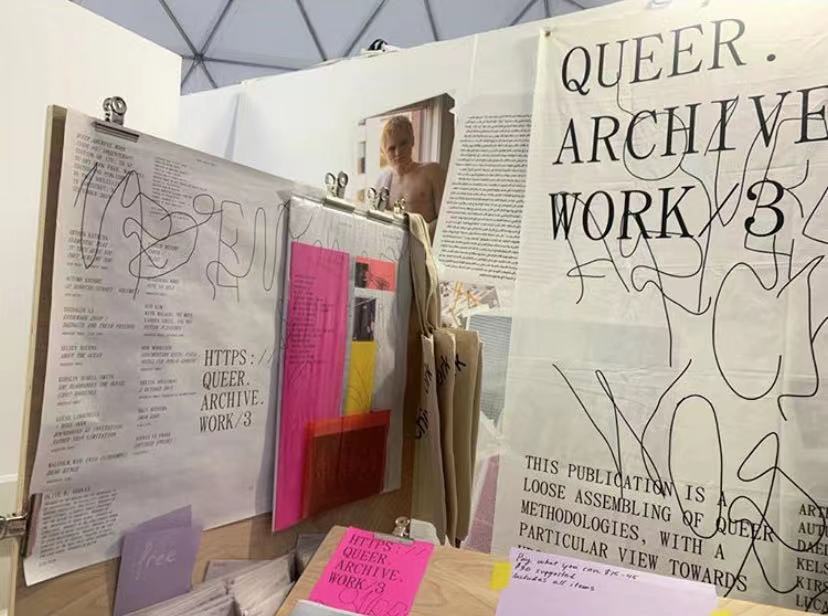
“Tactile” is a very appropriate word to describe the fair, and visitors were always encouraged to touch, interact and communicate with makers and exhibitors. After I walked out of “The Classroom”, my attention was attracted by a booth, “Queer, Archive, Work”, with slogans on the banner “This publication is a loose assembling of queer methodologies, with a particular view towards network culture, failure, and refutation.” The keywords, Queer and Archive, made me walk towards the booth. I asked the exhibitors Paul Sollellis who is also the co-publisher of this work, about how does he define “Archive” in his publishes from the view as freelance artists. He told me that archive is a process of gathering and collecting memories from different individuals then putting them together. Paul elaborated the issue he was selling on his booth to me that one package contains works from multiple Queer artists. There are journals, photographs, paintings and collages inside. Following his words, I asked him why he chose to do physical copies instead of a digital one. He gave me a short talk on the philosophy level by saying that this is all about the sense of existence and the weight of things. Everything has its own weight, you will know it only when you feel it. I remembered his face looked very serious, not like a seller who was trying to promote his product. I felt that he really believed that the meaning of existence is all about the feeling, or the “tactility”. 

Paul’s definition of “Archive” reminds me that what make archive so significant to our lives is those archives are always meaningful to someone in the world. Like Archill says in his article, “however we define archives, they have no meaning outside the subjective experience of those individuals who, at a given moment, come to use them.” (Mbembe, 2002) Only the things we are doing contains meaning then there is the significance of existence. So is “Archive” and the printed books. Books have different meanings for different individuals. For Ruth, printed matters because of the facility of the book object. And for Paul, printed matters because the weight of the books is the proof of existence. Then I cannot help but think does printed matter to me and why. This is a question that I haven’t found out the answer.References:

References:

“Paul Soulellis, Editor – QUEER.ARCHIVE.WORK.” Printed Matter. Accessed November 3, 2019. https://www.printedmatter.org/catalog/53190/.

Mbembe, Achille. “The Power of the Archive and Its Limits.” Refiguring the Archive, 2002, 19–27. https://doi.org/10.1007/978-94-010-0570-8_2.

Human Interaction With Audio Tour Guides

As technologies and their capabilities continue to be further developed every day, it is important to observe the ways in which they become integrated with existing forms of and institutions for different types of information. Museums are among the institutions that preserve information and provide the public with access to it, whether art, history, culture, etc.. According to Bates, information can be thought of as, “an objectively existing phenomenon in the universe, which is also constructed, stored, and acted upon by living beings in countless different subjective ways, each way distinctive to the individual animal having the experience” (Bates, 2006). Audio tour guides have been utilized in these spaces for a long time, serving to both provide information, and maintain the integrity of a silent shared space. However, the information that typically makes up the contents of audio tours follows the museum in a single direction, providing all consumers with the same information in the same progression. I see this as an opportunity to use UX design to improve upon an existing way in which information is transmitted in these spaces, and to make museum goer’s experiences more customized to their interests with the use of more specified user interface design and AI technologies.  

To gain more of an understanding of other people’s experiences with audio tours, I conducted an interview with an avid museum goer, Suzanne. Suzanne, who loves consuming information about art and history in many different forms, explained to me that the main issues she has with following audio tours are: a.) an abundance of information, not all of which is interesting b.) a predetermined path through the museum space c.) a pre established pacing based on the length it takes to transfer the predetermined information. From her experience, her critiques can be broken down into dissatisfaction with the current “affordances” of the existing technology into issues of content, use of and transmission through space, and time (Sengers, 2000). For Suzanne, the perfect audio tour would be one in which she could autonomously control where in the museum she would like to be, which pieces she would like to hear information about, and the duration spent at each piece. This idealized vision is similar to what Senger calls the “AI Dream”, or the hope that, with the use of artificial intelligence, technology will be able to take on some human characteristics and make things much more enjoyable and personalized for the consumer, learning what they like and dislike through continuous use and data collection (Senger, 2000). However, when applying Bates’ definition of information as “some pattern of organization of matter and energy given meaning by a living being (or a component thereof)”, how does this conception allow for the “semiosis”, or linking of different components of information, with AI and other technologies that also take on life like characteristics (Bates, 2006)? It is a question for which the answer unfolds as these technologies are applied in real time. 

            For this reason, it is important to look at Yvonne Rogers’ detailed work in theoretical approaches to Human- Computer Interaction. Rogers highlights the fact that many people who are at the forefront of developing technologies, although they are aware of and wish to apply certain theories, often are competing with the race to be the next innovation, and do not always have the ability to develop a technology completely theoretically before it is demanded on the market (Rogers, 2004). Rogers concludes her in depth account of theories with a call for those developing technologies, particularly user interface design, to discuss and research which theories to apply and why. By doing such work, Rogers hopes a more universal language for developers will be created in order to be able to use and integrate these ideas into technology as it is being developed, instead of conceptualizing the effects after users are already engaging with it. After a theoretical framework is established, different decisions can be made to expand and refine the affordances of technologies in relation to what users need and want from said technologies (Rogers, 2004). I believe this is pivotal in order to create user interface designs that are useful and specified to the desires of the user. It is through interviews, like with Suzanne, that developers on all levels of technology can get a better understanding of what people want, where technology can improve, and inspiration for where new technologies should be aiming. In order to more fully develop how audio tours could be improved and what consumers are looking for, it would be very useful to conduct more interviews in museum spaces and work to create a version that takes into consideration all variables that are considered important, and make an audio experience that is catered specifically to each individual user. I hope to be able to continue exploring theoretical approaches to human computer interaction. 

We Are Brooklyn Event Blog

As fall comes, two things turn my mind towards the idea of immigration. One is a Thanksgiving tradition of my aunt having a few too many glasses of wine and tearfully recounting the story of how my great grandparents ended up in New York from Ireland (if it is as she tells it, it is a good story, with my great grandfather running from the British because he drunkenly signed up for the IRA and being told by my great grandmother that men were after him and he had to flee the country, and then rescuing her when her fiance refused to sponsor her through Ellis Island a year later because he had fallen in love with another woman) while we all nod along. The second is a much less charming reason- fall means elections, and elections mean debates about immigration, especially immigration from countries in South America and the strife our current administration seems to be intent on putting them through, as well as the scare mongering about these same people some political entities drums up for their own gain in election and legislative or monetary support.

With these two things in mind, I spent an afternoon in the New York City Hall of Records, checking out the “We Are Brooklyn: Immigrant Voices” exhibit that they originally premiered at Guttman Community College, put together by the Brooklyn College Listening Project. It was smaller than I had expected, but the information was denser than I had expected as well. The posters generally told either pieces of legislative history of immigration reform or the stories of individual immigrants, and there were QR codes that people could use to listen to full interviews online. There was also a board where you could put pins in a map to show where your family had emigrated from, and what year range they came to America, which was a fun bit of interaction with the visitors. I would love to visit the display closer to the end of it’s run and see what some of the demographics that were visiting the exhibit were, and try and see what information can be found from that. This brought to mind our discussions our class had at the very beginning of the school year, about how people interacting with a text or with a set of information changes the set of information itself. 

Because I went on a weekend and spent a while there listening to the multimedia presentations, I ran into a few more people who were also attending the exhibit. On the whole, most of the people there were not first generation immigrants themselves, which I found interesting. I was not extremely talkative with them (this was not a space conducive to lengthy conversation), but it seemed was primarily a group of people who were curious about hearing others speak (or reading summaries of the stories that other people gave, more on that in a minute) on things they had never experienced. It seems to be reaching a small group of people who are interested in local history and immigrant stories, which is not particularly unsurprising. 

       This exhibit really made me think of both the idea of archiving immigrant experiences and how that is best done, as well as the idea that there is no true neutrality that we have been discussing in class. I thought it was interesting that the main exhibition pieces were 6 foot tall boards with stories printed on them that were not the story of each person’s immigration as they said it. They were instead written in a third person narrative form, each following a fairly clear line and ending with the person living happily in Brooklyn to this day. These posters had some quotes from the interviewees sprinkled in, and they were a purely text based experience unless you went through the extra step of scanning the QR code and listening or visiting the website after the exhibit. This was obviously not done with malice, but I wonder how much that changed the story being told. It is rare that someone’s story is that open and shut or that narratively satisfying, and I wonder how much was left out in order to make the story fit both the narrative and the posterboard. The interviews are short but go into more depth, they feel a little less like a story and a little more real, but again, fewer people are going to go through the extra steps to listen to them. I wonder how much conscious choice went into that, the making of these experiences into neat little written stories. Is it in order to package them for people who are not direct immigrants and who grew up on stories of family histories of moving to America like my family (and many families like us) did? Is there a desire from the people being interviewed themselves to make their own narrative fit into the molds of the accepted immigration stories that are passed down in a lot of european households? Was the purpose of this exhibit simply to document stories, to act as a snapshot of an archive of more recent immigrant experiences? Or was there a political agenda as well. 

There has been much discussion in our class through almost the whole semester about the fact that there is no real neutrality. In archiving, in organizing, in the management of information, there are always biases and there are almost certainly individual or group motivations that are not always stated. The last few posters in this exhibit talked directly about this presidential administrations’ acts against immigrants from South American countries, specifically. In that space, there was no attempt to be neutral or to try and defend the heinous actions of the administration, just a statement of what had been done as facts and what the consequences of those legislative moves have been for immigrants and migrants (and some US citizens who have been detained or threatened). The lack of an attempt at neutrality here, I think, is both the greatest strength of the exhibit while also being what will keep many people away. Stating the facts here is not neutral, putting a face to and humanizing what some are calling the “migrant threat” in order to justify what is happening to them is not neutral, but it is something that needs to be done. Not many people know about this project, it is not particularly well advertised. Those who may need to see it are in some ways the least likely to go to see it, precisely because it is not interested in playing both sides and maintaining an idea of neutrality by masking facts. 

User Studies, Harm Reduction, and Queer Resilience

By Lillian Gooden
Looking at the Margins: Incorporating Harm Reduction Into Tech
Presented by Norman Shamas and Afsaneh Rigot of Article 19
Radical Networks Conference, October 2019
Hosted at Prime Produce, NYC

I attended the Radical Networks 2019 conference on a rainy October afternoon. This conference, which centers marginalized and oppressed groups, gathers artists, experimenters, and researchers, and invites them to exchange radical ideas on technology and telecommunications. Conference participants are radical thinkers who want to use technology to help their communities while resisting systems of control and surveillance. 

The sessions that initially drew me to this conference were titled “Media Infrastructures and Racialized Territorial Formations: Perspectives from the South” and “Everything Has A Resonant Frequency: On Crystals, Networks, and Crystal Networks.”

These bore a relation to my term paper, which (as of now) seeks to explore the physical aspects and environmental tolls of the Web’s infrastructure. I came to hear the work of a researcher looking into issues of access for the largely indigenous populations in the warmer, tropical, most remote regions of Colombia in “Media Infrastructures.” I came to hear the insights of another researcher and journalist interested in the supply chain of the minerals that power our communications, from World War II-era radios to smartphones in “Resonant Frequency.” 

Harm Reduction is Radical

But my attention was captivated by Shamas and Rigot’s presentation on harm reduction, entitled “Looking at the Margins.” To set the context, Norman Shamas began with a definition of harm reduction. Harm reduction consists of practices that ensure one’s survival and aim to minimize harm from certain activities, typically those that are illegal. With the aid of a tweet by @ReyBee10 (2018), they frame it as a term that was “was started by sex workers, queer & trans PoC, people who use drugs, people in the streets saving their own lives and all the intersections thereof—not by public health folks.” 

They presented a few examples of community harm reduction practives such as needle exchanges and safer sex education. Central to the idea of harm reduction is the acceptance of pleasure being a normal part of human life. Taking an abstinence-only approach harms by withholding potentially life-saving information. Shamas and Rigot might argue that harm reduction is design justice in motion, as it involves those most affected by structures of domination design their own solutions (Costanza-Chock, 2015).

In addition, Shamas highlighted humanitarian assistance for migrants crossing the desert in the form of providing food and water. Those providing assistance, they said, act in awareness and opposition to structural oppression in that they believe that migrants crossing the border deserve to live. If we are invested in reducing harm, we must shun stigmatization and judgement and work to mitigate risks instead. Harm reduction is inherently radical. 

Harm reduction in tech matters because we currently lack a way to bring in systemic support for people that are being harmed while engaging in certain activities—without stigmatizing them. The presenters brought up two case studies to demonstrate methods of designing harm reduction measures and show their effectiveness. My focus is on the first of the two.

Case Study: Queer Dating Apps in Hostile Societies

Afsaneh Rigot, the second presenter, introduced a case study involving queer dating apps in Egypt, Lebanon, and Iran. In all of these countries, queer people are targets of persecution by government officials and fellow citizens alike. Of course, criminalizing sexuality has never prevented queer people from seeking and enjoying love. They have endured despite the risk of arrest and abuse. 

The team at Article 19 sought to learn about queer dating app users, their needs, and design harm reduction solutions around these needs. Taking a design justice approach, they worked with local groups in Egypt, Lebanon, and Iran to get a sense of the environment on the ground. As they embarked on their research, the team understood that “the full inclusion of people with direct lived experience of the conditions [they were] trying to change” was crucial, to use Costanza-Chock’s words from “Design Justice.”

User Interviews Yield Revelatory Findings

It was established early on that participants in these countries had no interest in quitting their dating apps despite the risks, so proposed solutions had to support continued app use. Rigot pointed out that elsewhere, trainings around risky issues tend to be prescriptive, talk down to users, and fail to meet them where they are. Proposed solutions produced by these sessions fail their users by misunderstanding them and their needs.

For example, the discussion around safety on queer dating apps typically centers on privacy and geolocation. It is often recommended that users disable this feature in order to protect themselves. This advice seems reasonable enough, doesn’t it? 

However, in talking to queer communities in this study, Rigot and Shamas found that surprisingly, geolocation was one of the features that made users feel most secure when chatting with other GPS-located users on dating apps. Many respondents brought up that knowing that the person they were engaging with was someone who lived in their town made them feel safer!

This revelation underscores the importance of learning locally desired applications or service—one of the ethical guidelines for fieldwork laid out by PERCS at Elon University. It is crucial to tailor any solution that you are designing to the specific needs of your user, and to uncover those needs through dialogue and direct engagement. 

The Article 19 team found that devoting energy to developing geolocation solutions would not have been the best use of their time and resources, especially as many users already employed tactics such as GPS spoofing to preserve their anonymity on queer dating apps. Instead, users expressed that they would find it beneficial to have legal resources embedded in the apps they use in the event that they found themselves a target of government surveillance or other abuse. 

In their findings, the Article 19 team also identified a desire for app icon cloaking. Suspected “deviants” in the countries surveyed sometimes found their property, including the information on their phones, subject to search. A queer dating app discovered by a government official could be grounds for penal action. By cloaking their app icons, users might be able to keep themselves safe(r) by disguising, say, Grindr, as something so innocuous as a calendar or calculator app.

Perhaps this reality seems distant from a US perspective, as we live in a country where a queer person can legally adopt children, marry their beloved, and even run for president. However, the reality is that despite our tenuous legal protections, many queer Americans live in daily fear of persecution, discrimination, and violence. Solutions like the above can still be of use even to those who do not live in such overtly hostile environments. Designing solutions for the most  marginalized in society will yield applications that can protect all users. 

Works Referenced:

Costanza-Chock, Sasha. (2018). “Design Justice: Towards an Intersectional Feminist Framework for Design Theory and Practice.” Proceedings of the Design Research Society 2018. https://ssrn.com/abstract=3189696.

PERCS: The Program for Ethnographic Research & Community Studies. “The ethics of fieldwork.” Elon University. http://www.elon.edu/docs/e-web/org/percs/EthicsModuleforWeb.pdf.

ReyBee10. (2018, Oct 10). “#HarmReduction was started by sex workers, queer & trans PoC, people who use drugs, people in the streets saving their own lives and all the intersections thereof— not by public health folks….respect the origins and beware co-optation..to paraphrase @HarmReduction #HarmRed18” [Twitter post]. Retrieved from https://twitter.com/ReyBee10/status/1052975455748452352.

Observation at The Met Fifth Avenue: How is the museum tour guide in including different kinds of visitors.

The Metropolitan Museum of Art is the largest art museum in US and the third most visited art museum in the world. The main building in Manhattan’s Upper East Side in one of the world’s largest art galleries. As was posted on January 4, 2019 that 1,659,647 visitors were attracted to The Met Fifth Avenue and The Met Cloisters from May 10, 2018 to October 8, 2018. Based on the data from Wikipedia and MET official website, with such large number of visitors from all over the world, I began to curious how the visit guide provided by the museum service did well in considering different kinds of visitors.

According to what I learnt from Design Justice, the tour guide designed by MET should aim to ensure a more equitable distribution of the benefits and in this case, the museum tour guide should also consider non-English speakers, people with disabled, etc.

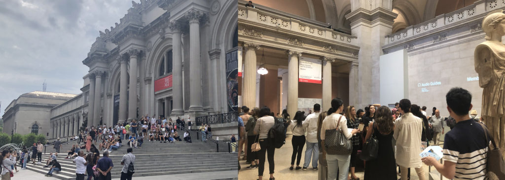
I went to The Met Fifth Avenue on 27th, Sep. to directly observe as a visitor and my goal was to see whether different kinds of visitors were guided friendly and effectively in visiting the museum. It was a cloudy afternoon with crowded visitors, and I waited for 10 minutes in line to get my ticket.

1 Manual Guide

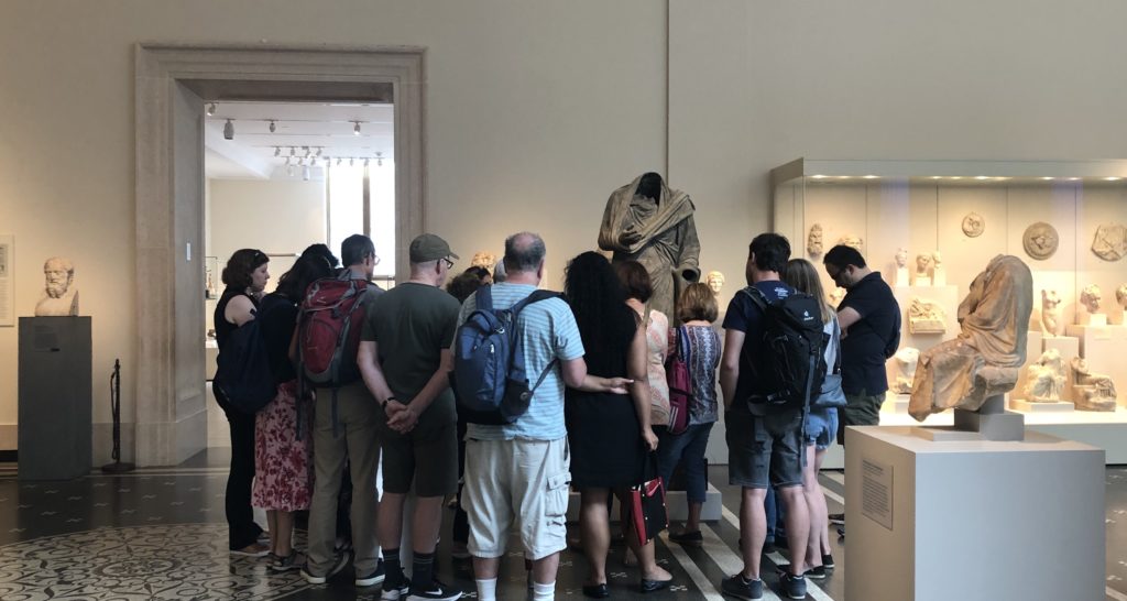
I saw several cicerones surrounded by a small number of visitors. I joined them for free. Some visitors followed by cicerones carried backpacks and not seemed like locals. The good thing for getting a manual guide is that you could directly ask questions and get answers, especially for history or art fanatics who are always filled with questions.

But this method is not that feasible for visitors who prefer to get through the museum quickly and are not fluently English speakers. Since you are guided by a certain route and listening to deep explanations of the exhibits really takes time. In this period, I found some of visitors would only follow a few minutes then left the group to visit by themselves.

2 Audio Guide Rent Onsite

These days the most commonly used tour guide in museum is audio guide. At the museum lobby visitors could easily find the words “Audio Guide”, and the return place was also obvious to find. During my observation period, I found no more than 50% visitors were using audio guide and I guess it was because the audio guide in MET was not free, or some were not first-time visitors or some just preferred to quickly visit the whole museum without deep explanations.

2.1 Whether considering non-English speakers.

Yes. The audio guide provided by MET contains 10 different languages, which is especially considerable for foreign visitors. When I visited the museum, I found a lot of Asian visitors renting audio guide and listening to the guide frequently. It’s much effective for them to get the explanations in their mother language.

2.2 Whether considering visitors with disabilities.

During my observation period, I did not find disabled visitors. But I found some information on the MET website that the museum offered assistive listening devices and real-time captioning for visitors with hearing loss.

2.3 Whether considering aged visitors.

I found an old woman who seemed uneasy to input numbers into the audio guide to get the explanations. And some visitors seemed tired to hold the guide near their ears to listen all the time and they needed to find a place to sit or change to another hand to hold the guide. I think the interaction method between visitors and audio guides is not that friendly especially for aged visitors. Manually inputting numbers could waste time. Besides, the guide is not that easy and convenient while the MET is large, and most visitors would stay more than 2 hours.

I guess it’s better to add automatic induction function to the audio guide and visitors don’t need to input numbers themselves but only to answer yes or no to listen the guide. In addition, always holding the guide near ear to listen is not convenient. Why not provide earphones to aged visitors together with audio guide? Or support the visitors using their own earphones.

2.4 Whether considering visitors who prefer quickly visiting the whole museum.

I did find a visitor hanging the audio guide around her neck, but she didn’t use it during the whole process. And some only listened a few seconds then gave it up. I guess the contents provided in audio guide were too long and they only wanted to get a concise version. They came to the museum to get something new but not preferred to get that deep understanding towards a single exhibit. In that case, perhaps better to provide different versions for visitors to choose from. For instance, a quick 1-minute explanation together with a detailed 5-minute version.

3 The MET App

There is an App called The MET which also provides travel guides and even augmented reality function. The good thing is you could use it offline, while the bad thing is that you have to download it beforehand. How many visitors would take trouble to download an App to help them visit the museum? I guess better to develop a Web App for visitors who just want to visit temporarily.

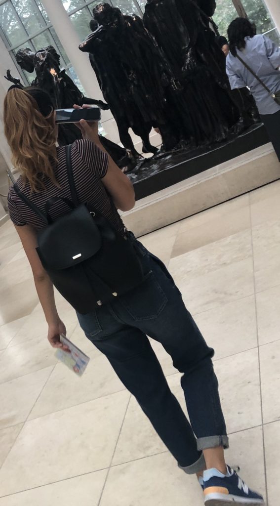
During my observation period, I only saw a young woman using her iPhone to get the audio guide. Generally speaking, not a large number of visitors choose to get a guide on App. I believed one of the problems was not enough contents on App, compared to the audio guide you rent onsite.

Conclusion

In 2015, the MET did a thorough research on how to improve the audio guide and during the research they did find 40% visitors were foreigners and the importance of reducing the complexity of using audio guide. However, just like what Norman said, “The world is not neat and tidy and things not always work as planned.” All the tour guides provided by MET are roughly satisfied but still have space to improve. Perhaps reconsidering different visitors’ needs could help better the overall experience.

Reference

1 Wikipedia: Metropolitan Museum of Art: https://en.wikipedia.org/wiki/Metropolitan_Museum_of_Art

2 Met Welcomes Nearly 7.4 Million Visitors in 2018:

https://www.metmuseum.org/press/news/2019/2018-calendar-year-attendance

3 Improving the Audio Guide: A Look at Our Visitors:

https://www.metmuseum.org/blogs/digital-underground/2015/improving-the-audio-guide-a-look-at-our-visitors

4 Norman, D. A. (1998). The Invisible Computer: Why Good Products Can Fail, the Personal Computer is So Complex, and Information Appliances are the Solution. MIT Press. Chapter 7: Being Analog http://www.jnd.org/dn.mss/being_analog.html.

5 Costanza-Chock, “Design Justice: Towards an Intersectional Feminist Framework for Design Theory and Practice”