By: Michelle Kung
INFO 601-02 Assignment 3 Event Attendance
What is it
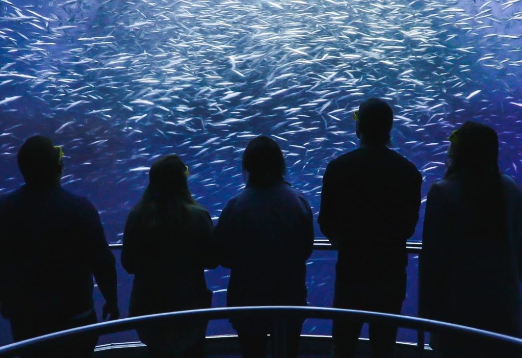
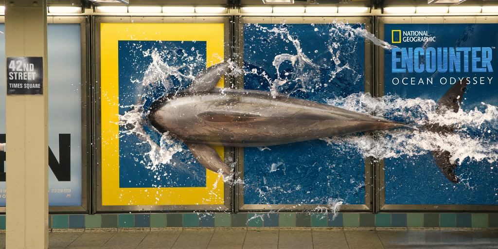
National Geographic’s Ocean Odyssey is an exhibition about marine biology and conservation that promises visitors an interactive and immersive experience. Visitors get to see, hear, and feel what ocean life is like for different sea creatures. A member of staff guides small groups of visitors through the interactive spaces and encourages everyone to explore every part of each space. The Ocean Odyssey starts in the shallows of the Pacific Ocean and takes visitors all the way to the Californian coast.
I visited the Ocean Odyssey in March, 2019 had found this experience to both be a lot of fun and highly educational. The new technology used gave the exhibition a lot of affordances that visitors were not familiar with. And the guide, acting as mediator, served as the signifier to ensure that visitors’ experiences were pleasurable and not frustrating.
Immersive environments created by audio visual elements
Effective use of audio and visual elements made interaction with information truly immersive and entirely effortless.
Visual
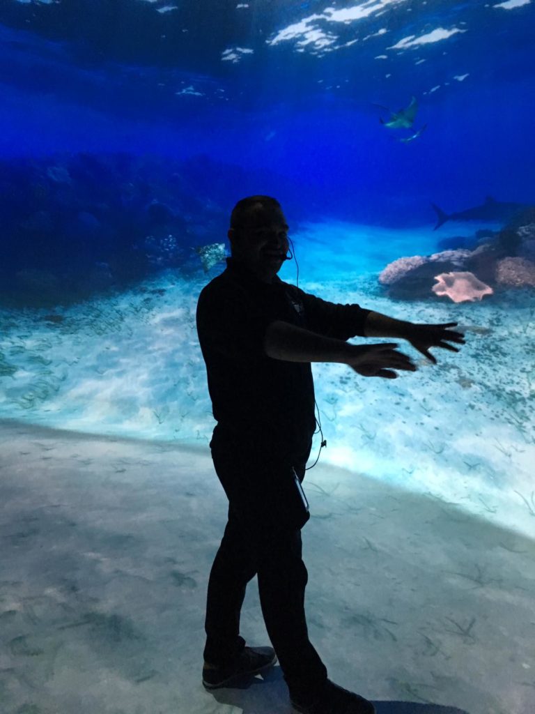
The Ocean Odyssey experience featured multiple audio-visual displays. But unlike conventional single screen-based information, these experiences were highly immersive. Users were invited to enter rooms in which every surface was a screen, including the ceiling and sometimes even the floor. Many rooms had curved walls that surrounded groups of visitors. Our guide encouraged us to “swim” into the rooms, adding to the immersive experience. Many users attempted to interact with different visual elements, by pointing at them, stepping on them, and following them. Sometimes, digital elements responded to users’ physical movements but sometimes there was no digital/ physical connection. On the whole, visitors seemed delighted when interaction was possible and not at all disappointed when it wasn’t. Perhaps users haven’t developed an expectation to be able to interact with any digital element yet.
One of the most spectacular exhibits was a 3D video of a life size humpback whale displayed in a room on a curved wall that surrounded visitors. Visitors were invited to wear 3D glasses to improve their experiences. The video showed how humpback whales feed on krill by opening its gigantic mouth. Users were so mesmerised and immersed in the video that a user screamed out loud in fear when the photorealistic whale swam towards the screen with its mouth wide open! Such rich visual information elicited emotional responses in users.
Audio
Buttressing the vibrant visuals were rich and realistic audio elements. Effective
use of sound allowed users to be immersed in the underwater environment created
by the Ocean Odyssey. In an exhibit showing what the ocean is like in the night
time, sound was the main medium. Users sat in a small auditorium completely
devoid of light, listening to the sounds of whales, dolphins, and other sea
creatures. Users were passive receptors of audio information.
Interactive videos enraptured users
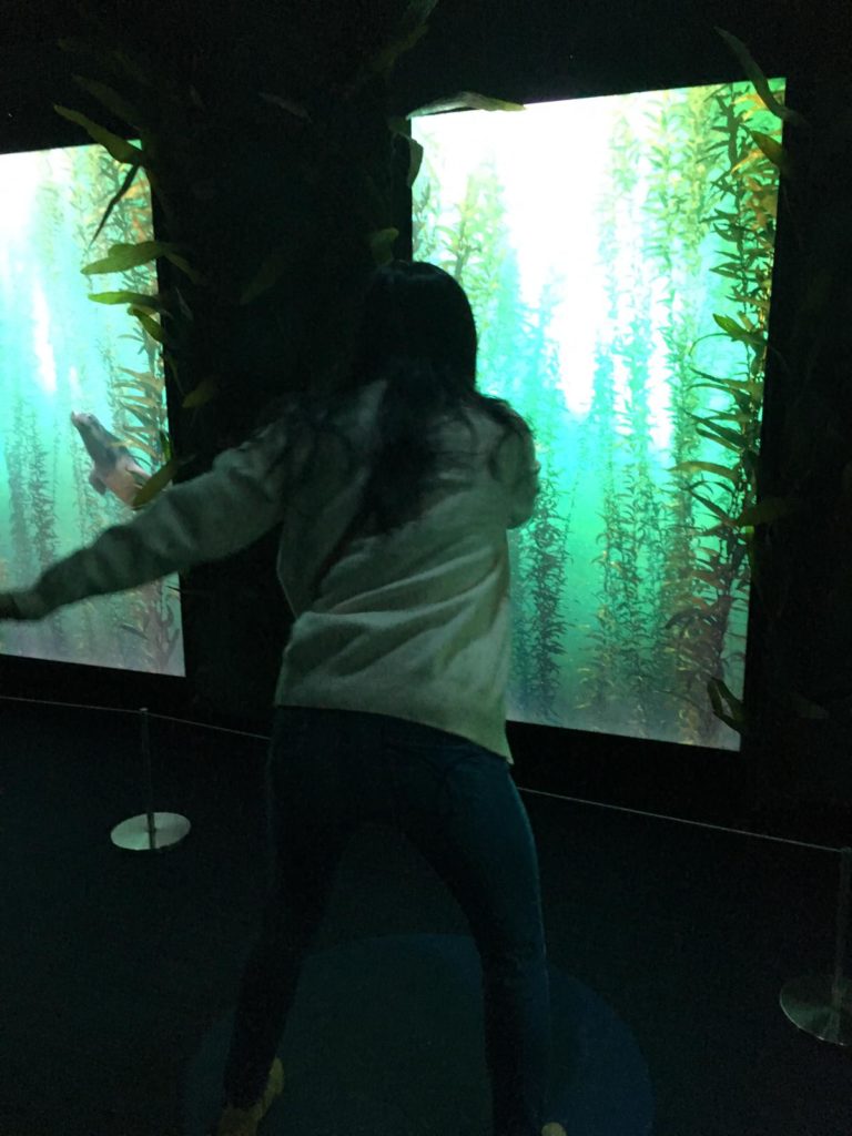
The Ocean Odyssey also featured gesture controlled interactive video elements to teach users about the behaviour of sea lions and about bio luminescence.
Our guide explained what bio luminescence was as users moved their arms in front of a screen. The screen detected motion and displayed corresponding lights, representing bioluminescent bacteria. Users were encouraged to interact tactilely with all elements of the bioluminescent exhibit. This hands-on approach allowed users to learn about an otherwise abstract part of the ocean that they have probably never heard of or thought about.
In the sea lion exhibit, our guide demonstrated using the screens to learn about sea lions. Individual users stood in front of individual screens, waving their arms and watching the sea lion swim in corresponding movements.
Traditional displays sadly forgotten
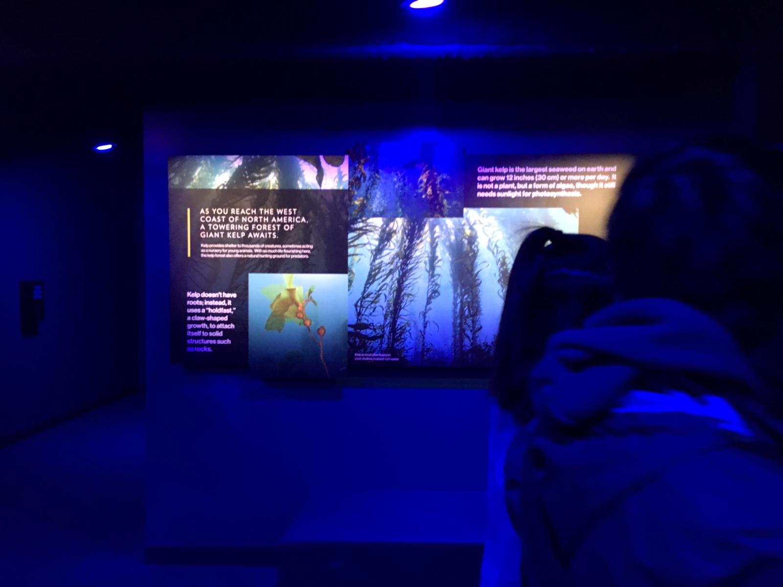
Unlike a traditional museum environment where static images and text are the bulk of the information, in this experience, they were peripheral. Unless the guide purposefully drew users’ attentions to non-digital image and text, they were largely ignored.
Perhaps a better designed information environment would make a more seamless transition between information that is digital presented to users, and traditional forms of information like posters and displays. Compared to interactive and immersive digital elements, traditional static visual graphics were much less interesting to users.
Quizzes and games
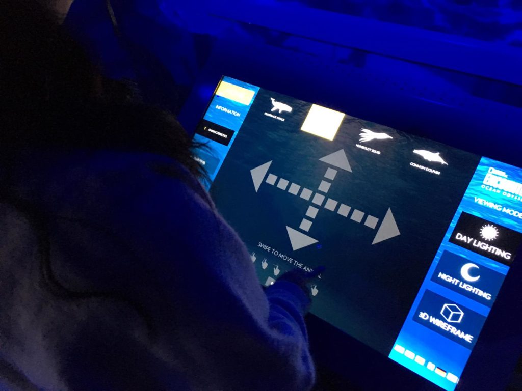
At the end of the exhibit, our guide led users into a room with many different games and quizzes on ocean ecology and conservation and allowed us to interact with them independently. Most of these activities were screen based, apart from colouring sheets which no users used.
Users interacted with different screens equipped with pressure, laser, and gesture sensors, making each game interesting and different. Adults and children alike were captivated.
Reflection
I think the Ocean Odyssey experience was a really well designed information environment which allowed users to experience information in a fun, experiential, and dynamic way. It proves that learning doesn’t have to just be cognitive and challenges traditional approaches to learning by allowing users to engage with information physically and emotionally. I think this kind of experience, when curated as well as the Ocean Odyssey, can have great impact on education and edutainment.
But I’m not sure whether or not the information environment was designed with affordances in mind. Users were guided by a trained guide throughout, and were given instructions on how exactly to interact with each aspect of the experience. Of course, interactive experiences that blends digital with the physical are still very new so there isn’t as yet an established semiotic system that can allow users to know exactly how to interact with exhibits without a guide. I can imagine, in future, when more experiences incorporate interactive digital elements in physical spaces, there will be a need for the design of a standardised semiotic system that is well understood by the user to act as navigation.
References
Norman, Don. The Design of Everyday Things. New York: Basic Books, 2013.