Field Report: MoMA PS1 Printed Matter New York Art Book Fair

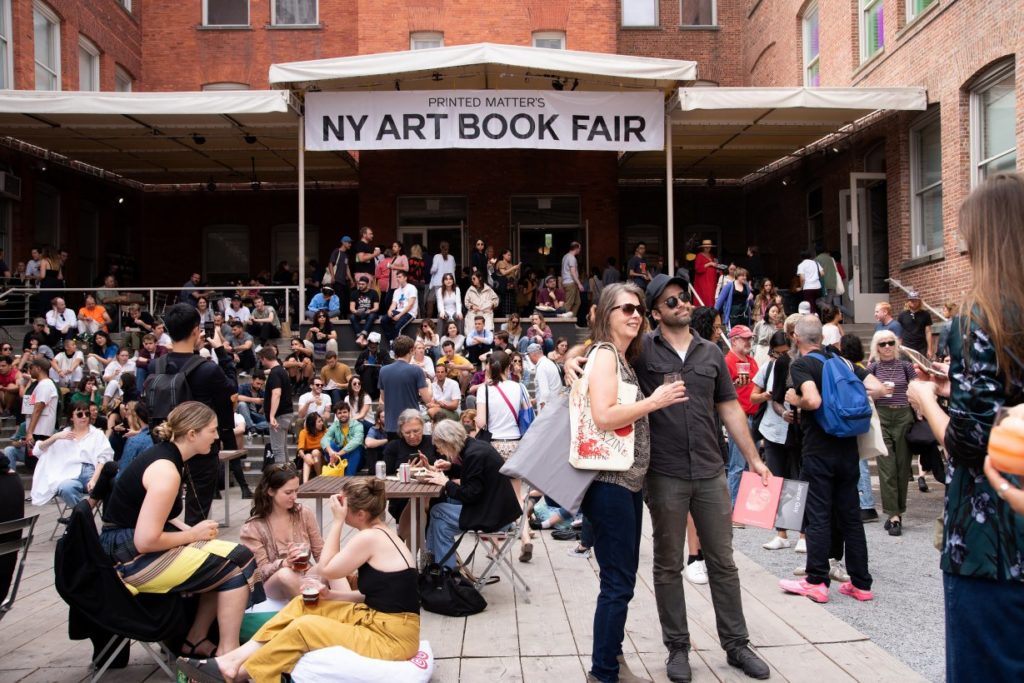
Moma PS1 is one of the oldest and largest nonprofit contemporary institutions in the United States. It regularly organized an event to promote the museum. In this fall, MoMa PS1 hosted the New York annual Book Fair — Printed Matter. The event was held at MoMA PS1 sprawling campus from September 21 to 22. Printed matter’s is one of the biggest book fair of each year, which is a leading international gathering of artists’ books, celebrating the full breadth of the art publishing community. This annual book fair event draws thousands of book lovers, collectors, artists, and art world professionals. This year is the fourteenth year for Printed Matter to present the NYC art book fair. 

Before I went to the event, I had several questions in my mind, which requires me to find the answer. 

  • Why printed matters?
  • What is the age range of people who go to the book fair?
  • How the exhibitors profit from their issues?
  • What is the reason for people choosing to issue printed books over digital books?
  • How they define “Archive”?
Scene outside of PS1 during the book fair

Regardless of the various digital reading products in the market, such as Amazon Kindle, the population of reading printed books has been descending year by year. Even textbooks are gradually going paperless nowadays. Also, among the teenagers in the 21st century, fewer and fewer teenagers are willing to read printed books. On the one hand, the price of books is always high, which is not friendly to book-lovers. On the other hand, a printed book is harder to carry around than a simple reading tablet.

This year, the Printed Matter event held over 350 booths. It’s a spectacular parade of art, fashion, zines, culture, subculture, color, sound, food, and various performance. At first, this extravaganza made me feel a little overwhelmed because of the dazzling booths. It’s really hard to find the specific exhibitor, ranging from artist collectives to antiquarian booksellers, offering unique publications. In the place of the Fair, there were visitors from different age groups and with different skin colors, but people who purchased the issues, the works, and the books mostly looked older and more knowledgeable. Younger people or teenagers were more thinking of the book fair as a weekend entertained event. 
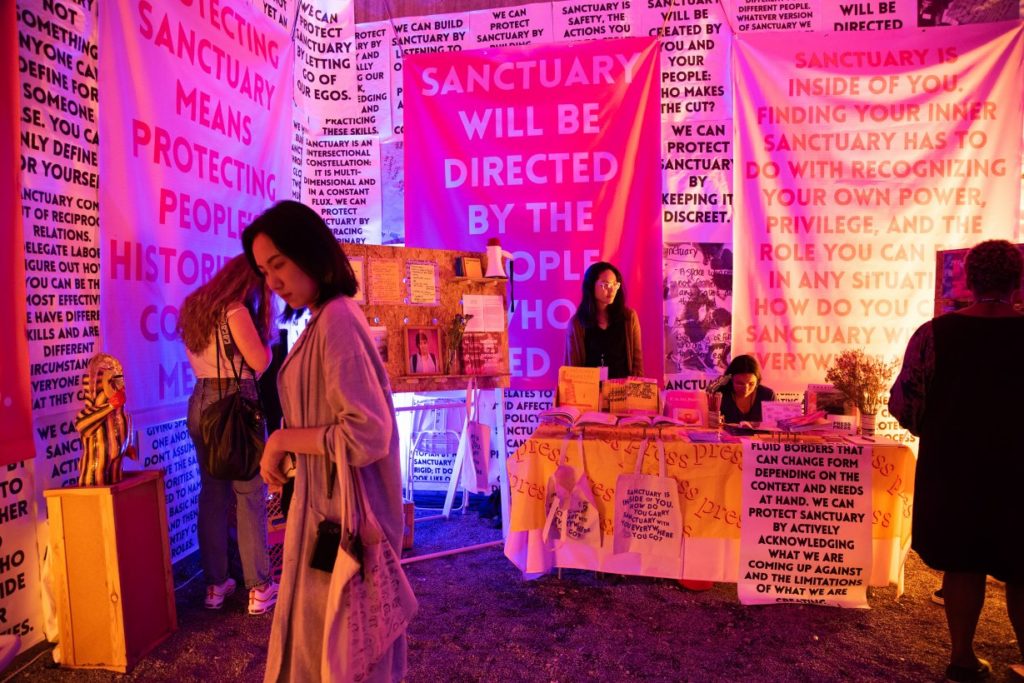
After finishing browsing most of the booths, I entered a booth with name “The Classroom”. The name was attracted me to walk into the space since I wondered what I might learn from this so-called “The Classroom.” This space is presented by a dutch artist, Ruth van Beek. She walked around and elaborated on her thoughts behind her practice in “The Classroom” to the visitors. The exhibit was a dedicated space that provided reading, screening, informal lectures, and other activities by artists, writers and designers. The program highlighted exciting new releases at the Fair and fosters dialogue around important themes for contemporary art publishing and the broader community. ‘That foster dialogue around important themes for contemporary art publishing and the broader community.’ Ruth described bookmaking as an inverse to creating an exhibition. “Making a book is more democratic. They’re for everyone.” After the talk, one of the audience asked a question that I was about to ask, “Will you ever considered making a digital book?”. Then the response from Ruth really touched my heart. “No”, she replied, “It’s the tactility of the book object.”

“Tactile” is a very appropriate word to describe the fair, and visitors were always encouraged to touch, interact and communicate with makers and exhibitors. After I walked out of “The Classroom”, my attention was attracted by a booth, “Queer, Archive, Work”, with slogans on the banner “This publication is a loose assembling of queer methodologies, with a particular view towards network culture, failure, and refutation.” The keywords, Queer and Archive, made me walk towards the booth. I asked the exhibitors Paul Sollellis who is also the co-publisher of this work, about how does he define “Archive” in his publishes from the view as freelance artists. He told me that archive is a process of gathering and collecting memories from different individuals then putting them together. Paul elaborated the issue he was selling on his booth to me that one package contains works from multiple Queer artists. There are journals, photographs, paintings and collages inside. Following his words, I asked him why he chose to do physical copies instead of a digital one. He gave me a short talk on the philosophy level by saying that this is all about the sense of existence and the weight of things. Everything has its own weight, you will know it only when you feel it. I remembered his face looked very serious, not like a seller who was trying to promote his product. I felt that he really believed that the meaning of existence is all about the feeling, or the “tactility”. 
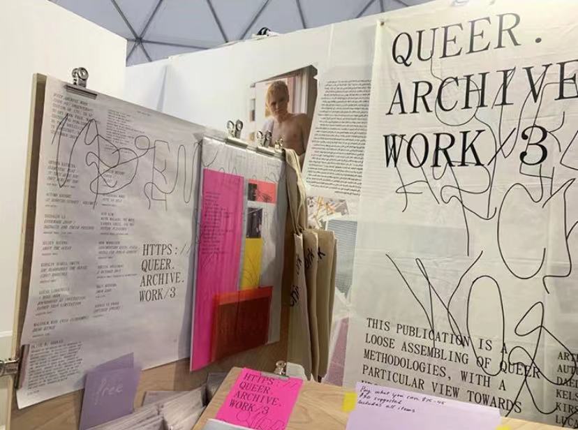
Paul’s definition of “Archive” reminds me that what make archive so significant to our lives is those archives are always meaningful to someone in the world. Like Archill says in his article, “however we define archives, they have no meaning outside the subjective experience of those individuals who, at a given moment, come to use them.” (Mbembe, 2002) Only the things we are doing contains meaning then there is the significance of existence. So is “Archive” and the printed books. Books have different meanings for different individuals. For Ruth, printed matters because of the facility of the book object. And for Paul, printed matters because the weight of the books is the proof of existence. Then I cannot help but think does printed matter to me and why. This is a question that I haven’t found out the answer.References:

References:

“Paul Soulellis, Editor – QUEER.ARCHIVE.WORK.” Printed Matter. Accessed November 3, 2019. https://www.printedmatter.org/catalog/53190/.

Mbembe, Achille. “The Power of the Archive and Its Limits.” Refiguring the Archive, 2002, 19–27. https://doi.org/10.1007/978-94-010-0570-8_2.
Event Review: REcon 2019 UI/UX Conference in Bloomberg. LP

“REcon” is a yearly free conference for user researchers, and this event is an excellent opportunity to learn from industry leaders, share ideas, expand the connection, and discuss all things user research. The event was hosted on Oct. 5th and located at Bloomberg LLP. I was so excited to have this opportunity to join ‘REcon’ event. The event has all senior and above UX designers on-site to give speeches of sharing their experiences. 

Audiences checked in around 8 am and had a short social time in the breakfast session. Most of the people I chatted with are from UI/UX design industry or have the intention to transfer into this industry. We exchanged our ideas about how we started to think about working as UI/UX designer. I met a guy who currently works as a UX researcher in Instagram with a very different background. He majored in gender studies when he was in college. He began to think of pursuing his career as a UX researcher when he worked on his graduate project. His topic was about porn culture and focused on human needs. He told me that when he worked on his project, he has done tons of interviews about why people watch porn. The result made him realize that the success of a product is all about meeting customers’ needs, and he found he would like to dig deeper into UX research field and design a product that matches customers’ needs. After having a small conversation with this interesting guy. The event was about to start. 

The first guest speaker is Rachel Carpenter, the head of Design Strategy in Citi. She talked about why sometimes clients don’t care about the research and the result, but they still want researchers to do about it. She elaborated on what a researcher or designer should do when faces this situation. The first thing to do is to pitch the result and design ideas to the clients. During the process, give the clients multiple options to choose from, and interact with clients so that clients will have the sense of participant during the whole process. Thus, clients will have more interest in learning more about your research because they feel they are part of it. She also gave some suggestions and ideas about how to present your talent among your colleagues. 

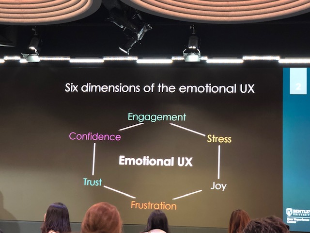
After Rachel, two more guest speakers who are from Bentley University, gave a speech about ‘A case study in measuring emotional engagement of customers using a virtual dressing room on an e-commerce website.’ They presented the research about users are most likely having the suspicious, ‘Is that really me?’ The key challenges they had were to accurately measure a potentially wide range of customer emotions, including engagement, joy, frustration, trust, surprise, and disgust. Their presentation shares the results from a case study that focused on measuring customer emotions while using different virtual dressing rooms using e-commerce websites. Biometric data from users, such as eye-tracking, facial expressions, and galvanic skin response (GSR), show a complete picture of the emotional customer experience which would otherwise be difficult to detect using analytics, market research, or traditional user research methods. This was a really interesting case study, which made me realize how widely the usability knowledge can practice in our world. 

The dimensions of the emotional UX

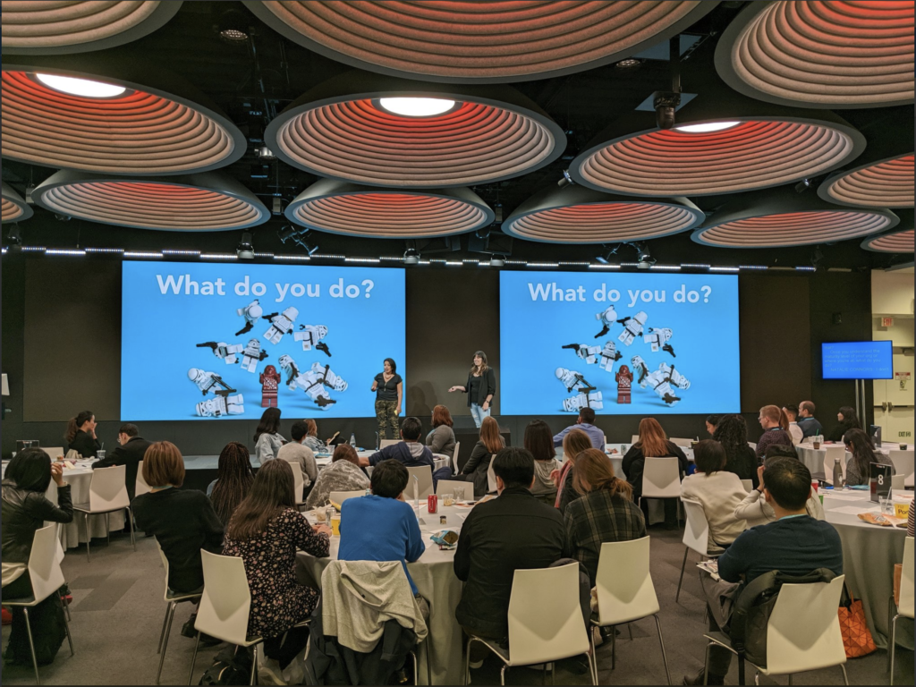
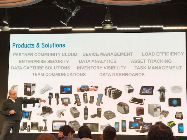
Next, we had Graham Marshall who from Zebra Technologies presents his talk about ‘Service design methodology for enterprise operations.’ He said that this methodology is often used to track the journey of a consumer through a thoughtfully designed retail environment or a citizen participating in a community service. This methodology is mainly used to analyze the dynamics of enterprise operations. At last, he stated that the practice of this methodology help to be able to communicate the interconnected complexities of the challenge and demonstrate where we might take it had been the most significant benefit of service design methodology. 

Graham was talking about the how to practice his methodology in the real world

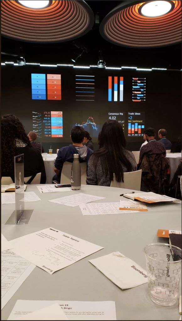
After Graham’s great speech, we had a lunch session in Bloomberg building. Staff from Bloomberg showed us around the building and the design department. Though Bloomberg is known as a finance company, the design department is more like an art corner which is full of creative decorates and structure. Bloomberg held a great lunch session, and they gave each table a topic to discuss during lunchtime to help people better interact and connect with each other. They even hand out some small games like ‘usability term bingo’ to make lunch more interesting. 

In the afternoon, the first speech was presented by two Bloomberg user experience designer, Jaris Oshiro, and Hala Shih. The topic they talked about is color accessibility. They elaborated on what they would design for color vision deficiencies in the financial industry with their Bloomberg Terminal as an example. The presentation enlightens me that UI design should consider people from different groups, such as people with color vision deficiencies. Also, it reminded me of Norman’s design thinking regarding the culture constraints that ‘ Each culture has a set of allowable actions for social situation’ (Norman, 2015). If the culture is not able to be changed, then the change should be made on design. Every industry should not discriminate against those people having an abnormal part. 

Hala Shih showed the color vision deficiencies design on Bloomberg terminal

The last speech was presented by Natalie Connors and Tiffany walker, who is a director of design and strategy department and senior UX researcher JP Morgan Chase. Their speech was the one that I can relate most since they gave the idea about how to do the essential work in UX research. They shared some case they have done with Cognitive Walkthrough, Heuristic Evaluation and Usability Testing, which are the three topics that I am learning in this semester. Moreover, they also shared the tricks when they are doing the research, they will research about clients’ behavior at first. For better future service, it’s essential to know more about their clients’ preference. From Natalie’s talking, I was thinking of Wilson says ‘ the origins of human information study is seeking behavior research’ (Wilson, 2000).

Natalie and Tiffany present what we should do in daily UX research work

In general, I had a great experience in this ‘REcon’ event. I met and talked to lots of interesting people. From the conversation with them, I realized I have a long way to go and feel like I have hidden passion in this industry. I believe what I have learned in this event would help me with my career in the future.

References:

Norman, Donald A. The Design of Everyday Things. MIT Press, 2013
Wilson, T. D. (2000). “Human Information behavior.” Informing science 3(2): 49-56