Person: Grumpy Cat
In late September 2012, a cat photo was posted on the internet. This happens every single day. But this cat photo was different; it was the first internet appearance of Grumpy Cat. More than likely, you know exactly which cat I am referencing. How can this be? In 2015, CNN estimated that there were over 6.5 billion cat photos on the internet. With seemingly endless cat photos, how can you and I both know Grumpy Cat?
There is no denying Grumpy Cat’s internet fame. In fact, it is a photo of Grumpy Cat (real name Tardar Sauce) that appears at the top of the Wikipedia page, “Cats and the Internet”. But how did we get here? This is too brief a writing to discuss the many specific mechanics that create internet fame. However, we can certainly say that internet fame is impossible without sharing information.

The first photo of Grumpy Cat was posted on Reddit, where users edited it into memes almost instantly. With each new iteration, a new audience was exposed to Tarder Sauce, growing her online presence. From there, it became a phenomenon. Grumpy Cat memes exploded to other parts of the internet.
The internet allows for rapid sharing of information; whether it is the sharing of current events, personal anecdotes, or cat photos. We are able to learn, research, and share faster and easier than ever before.
It is arguable that images and memes in particular are shared more than anything else online! Some only reach specific audiences, remaining within the network of its creator. Many are impossible to track the image’s source, such is their rapid spread. However, once in a while, an image or concept emerges that identifies with all, much like Grumpy Cat.
Place: Shopping Malls
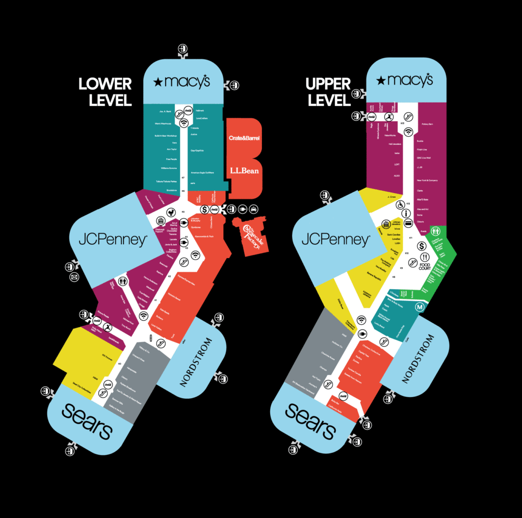
Shopping malls, the ultimate retail destinations of America. Most are arranged in a similar fashion: with large “anchor” stores at each end, with smaller stores in aisles, and often a food court in between. Many malls, particularly the largest, have multiple levels. With such large interior spaces, wayfinding in shopping malls is extremely important. Shoppers need to know not only the location of each store, but the location of bathrooms, food, escalators, and exits.

How this information is communicated to the shopper can make or break one’s experience at the mall. The shopping mall wishes to encompass every retail desire one may need, but facilitating the ability to find it is necessary. All malls employ some sort of directory; most look like a simplified floor plan displaying the location of each store and amenity.
Some directories separate stores into categories, ie. Women’s Clothing, Men’s Clothing, Gifts, Kiosks, Food. Others choose to list stores alphabetically, or break down locations by zone. Signage in the aisles usually centers around the anchor stores, and therefore requires knowledge of the general direction you are heading.
In my own experience, directory signage is often few and far between, requiring the shopper to retain the information presented to them. Thinking back to the suburban mall my friends and I used to frequent in high school, the signage was sparse, and escalators were tucked away such that you could only use them if you had prior knowledge of their location.
Given this, one must consider: are malls intentionally making wayfinding difficult for shoppers? By wandering around a mall looking for a specific store, one is more likely than not to enter other stores along the way, adding additional purchasing opportunities. All this wandering will likely make you hungry, requiring you to purchase food at the mall. And god forbid you forget where you’ve parked!
Thing: IKEA Assembly Instructions
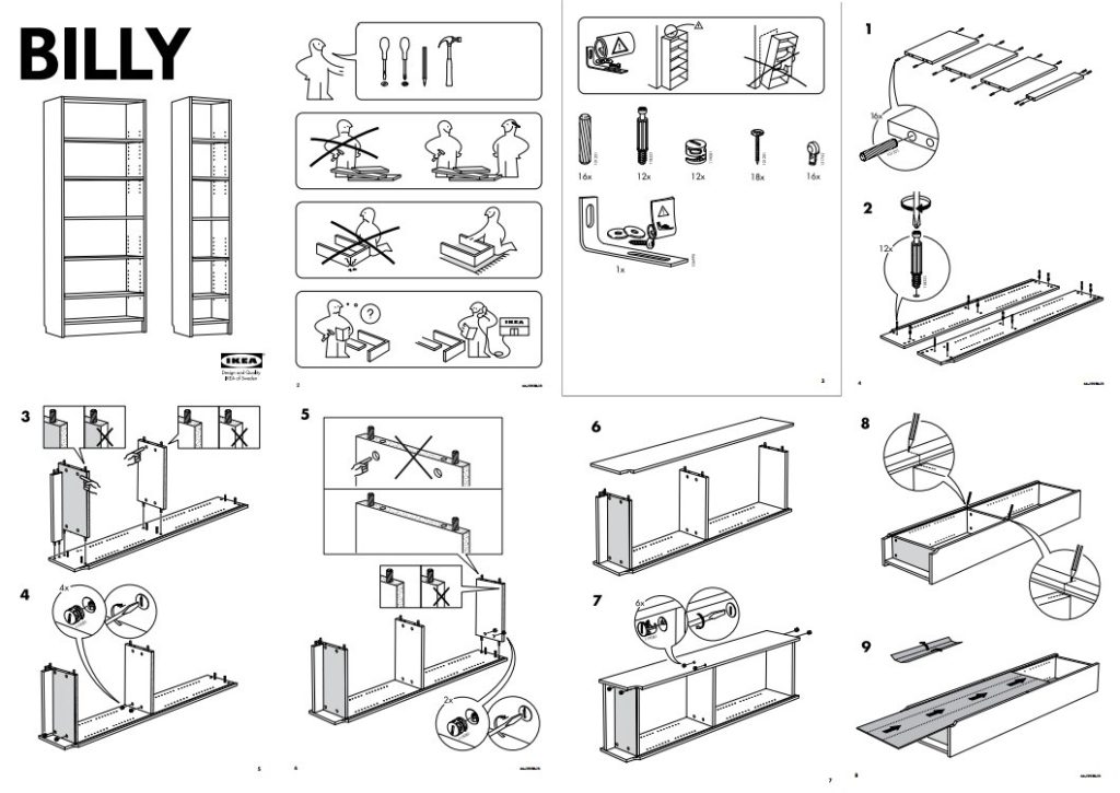
If you’ve ever purchased furniture from IKEA, you may know all too well that IKEA assembly instructions can be difficult to decipher. IKEA is infamous for requiring their customer to assemble their purchase; in a bid to reduce costs, most furniture comes flat packed, with assembly instructions explaining the process.

These illustrations precisely outline assembly steps with accurate scale drawings of the pieces and hardware necessary for each step of the task. The consumer must correctly identify each part and utilize it in the correct way at the correct time. Given this complexity, there is no doubt that these illustrations are highly designed, tested, and optimized before released to the public. In fact, IKEA dubs its instruction designers who are responsible for distilling product assembly into its most basic steps “Communicators”.
IKEA communicators take care to not overwhelm the consumer by making the installation instructions only as detailed as necessary. However, by relying on the customer’s observation and interpretation skills alone, it is possible that mistakes will be made. Of course, if all else fails, there is always the option to pay an additional fee for IKEA’s assembly services!
Now, why – if IKEA furniture requires assembly by the average person – do the instructions use only graphics to convey the necessary information? IKEA’s products are sold in 38 countries across the world. Creating installation instructions graphically eliminates the need for translation. In their mind, the information literacy of the consumer is the only barrier to successful assembly. For some, this is a skill in need of practice.
IKEA’s corporate youtube account revolves around design inspiration and product announcements, inferring that the company’s communicators believe their instructions to be sufficient without tutorial videos. However, countless third-party youtube videos exist explaining assembly for nearly any IKEA product imaginable, with individuals sharing their own experiences, tips and tricks. Through this dissemination of information, individuals help to fill in what they perceive to be an information gap – space that IKEA has left.