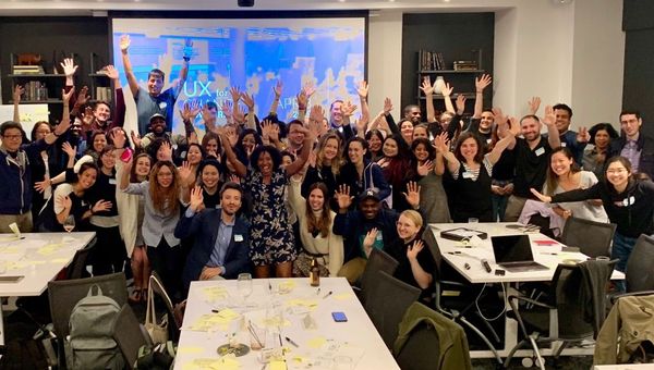
On Monday, April 8, 2019 from 6 to 9 PM about 70 participants attended a workshop aimed to redesign how immigrants and advocates connect on immigrationlawhelp.org. The workshop was organized on MeetUp by the New York Chapter of UX for Change and was hosted by Convene (101 Greenwich St.). Additionally, members from The Six, an innovation and strategy consultancy, were present as well as team members from the client organization, The Immigrant Advocate Network.
According to the event invite, “One of their primary platforms, Immigration Law Help (www.immigrationlawhelp.org), strives to connect individuals with legal resources and advocates based on specific parameters such as detention centers served, type of immigration legal services, zip code, etc. While ImmigrationLawHelp.Org maintains the only national directory of its kind, there are opportunities to improve the current user experience and functionality. The vision is to provide a marketplace to connect users with legal providers leveraging dynamic content based on user-specific parameters.”
My intentions for attending the event was to learn more about how UX hackathon-type events are run and to observe the following:
- Structure of the event – Background, agenda, facilitators, participants, space, etc.
- Background research – Who did the research for requirements? What methods were used? How will designs be tested to ensure success with defined audience? Generally, how participatory was the target demographic engaged to gather requirements for improvements?
- How were teams divided and what tools were employed for the process?
- How were ideas/proposals generated within the group(s)?
- How were ideas presented?
- What was the level of success of the event and by what measure?
Upon arrival to the event, I was impressed how nice the space was and how many people were already there. Many attendees were talking and there was food and drinks so the atmosphere was very lively. The work tables had Post-Its, Sharpies, and stickers for each seat and a large projector screen displayed a PowerPoint presentation while portable whiteboards were scattered around the perimeter. There were some materials about current immigration issues posted in a couple places as a means, I assume, to generate empathy for the target users of the site we would be analyzing.
Our host, Kandis O’Brien, who co-organized the event spoke a bit about the mission of UX for Change, which “connects non-profit organizations with the UX community to raise awareness of how the discipline of User Experience Design can contribute to the goals of any organization.” Then she introduced a representative from the Immigrant Advocates Network (IAN) to speak a bit about their mission, products, and services, and to introduce the website for which there were seeking design help. Rodrigo Camarena, the Director of IAN, described how individuals who classify as DACA, people under temporary protective status, and asylum seekers are currently threatened by our current political climate and how IAN is a non-profit, legal, tech organization that seeks to connect their network of over 8,000 national members with immigrants who need legal and other types of help.
The website, immigrationlawhelp.org was created in 2011 and is not responsive, does not fully support all languages, does not meet accessibility standards, and is text heavy. IAN are pursuing a re-design that helps to increase empowerment and engagement among the immigrant site visitors and families who have a variety of languages and backgrounds. Rodrigo mentioned that, based on site analytics, it is mostly visited during business hours—with peaks during times of crisis, which signals that legal and non-legal advocates may be the primary users of the site.
After the introductions, each table of participants operated as a group and we began with created Lean Personas based on the information we received from the client. From that, we created “How Might We” Post-Its to try to narrow in on the key problem our group should aim to solve through design. Then we used the whiteboards to create a User Journey that might address the problem based on our Persona and HMW’s.
After the team work, we individually began a “Crazy 8’s” sketch session to ideate eight ideas for the translation of the User Journey into an interface. With that exercise complete, we each chose one of our ideas to then extend into three interfaces as a more developed feature. In our groups once more, we all voted with our stickers to decide which solution (or combination of interfaces) we would present as a group. We loaded images of our solutions into a Google Slide document and each group presented on their thought process and outcomes.
I was surprised at how similar each group’s solutions were given that we all had different personas (i.e. ‘immigrant’, ‘family member of immigrant’, ‘service organization’, or ‘legal advocate’). The client team members expressed gratitude for the help and seemed genuinely interested in the solutions that were presented. The organization was open to continuing the conversation after the event if anyone was interested in volunteering.
From a UX student perspective, I was encouraged that all of the activities we completed were mentioned (in some form) of Jentery Sayers’ “Before You Make a Thing” including: personas, user stories/journeys, wireframes, and paper prototypes. And the mission of IAN seems in line with the point about “resisting oppression” through engaging directly with the power of technology and to examine the “default settings” and for whom and by whom technologies were built.
Personally, I was impressed not just with how organized the entire event was, but also how diverse the UX participants were, which is encouraging in terms of how important participatory models for design should be in the field, as discussed in Sasha Costanza-Chock’s “Design Justice: towards an intersectional feminist framework for design theory and practice.” Having groups that are vested in helping non-profit organizations who have limited budgets while also helping students and other new to the UX field get experience and connect for future volunteer opportunities is a mutually beneficial situation and I’m glad for the experience.
References
Costanza-Chock, Sasha. (2018). “Design Justice: Towards an Intersectional Feminist Framework for Design Theory and Practice.” Proceedings of the Design Research Society 2018. https://ssrn.com/abstract=3189696.
Sayers, Jentery. (2018). “Before You Make a Thing: Some Tips for Approaching Technology and Society.” Retrieved from https://jentery.github.io/ts200v2/notes.html.

