When purchasing admission tickets to The Cooper Hewitt Museum, I was asked “would you like the Pen?” To which I was a little confused having not visited the museum before. The ticketing agent was kind to demonstrate the use and functionality of the Pen and left me with a greeting “happy exploring!”
The concept for the interactive Pen originated from Local Projects working with Diller Scofidio + Renfro and was designed to enhance the Cooper Hewitt experience by allowing visitors to “collect” objects from around their galleries. All visitors receive a Pen with their admission ticket containing a dedicated web address corresponding to their visit where they can access all the objects they have collected from their visit. Visitors may press the flat end of their pen to a ‘+’ icon on the museum labels to collect objects and explore them in more detail at interactive tables situated around the museum. The Pen combines two technologies where its interface with interactive tables employ conductive materials common to touchscreen styli and its interface with museum labels employ near-field communication technology. The interactive tables, designed by Ideum, allows visitors to explore and manipulate the objects they have collected, discover related objects, retrieve contextual information, learn more about the designers, design processes and materials, watch and share videos and even sketch their own designs.
According to Jake Barton, principal and founder of Local Projects, “[f]inding the right balance between digital and physical was really an iterative process developed over time together. Here is the Pen, it’s going to make visitors active, it’s going to reinvent the museum experience and turn audiences into participants, but it won’t do it at the expense of the traditional galleries, which will remain artefact-based and without digital technology” (Wright, 2017, p. 123).
In thinking of employing the digital in museums, it is important to consider what the right balance of the physical and the digital would be for the institution. Where can digital technologies be employed, and where it should not be? What level of comfort do different aspects of the museum have in delivering a digital experience? And, most importantly, what is the nature of such digital experiences?
With regards to the Cooper Hewitt, the Pen has become synonymous to their museum experience as it is interwoven into most aspects of the institution. The ticketing agents spontaneously encouraged visitors to use the Pen, even personally showing young children and elderly visitors how the Pen is used. The Pen encourages discovery, has a low barrier to entry, part of the ecosystem of the museum and is an important tool to accessing information in the museum (Bove, Crow, & Husney, 2014, p. 17). The Pen also seeks to ensure a ‘look up’ experience where visitors can be compelled enough to engage with the exhibits without need to use their mobile devices to take photos with. During my visit, I observed only a handful of visitors were taking photos, though not often, and promptly putting their phones away to continue with their use of the Pen. Having become a ubiquitous part of a visit to the Cooper Hewitt, the Pen is unlike the mobile apps / guides of other museums that visitors might be unlikely to adopt and cannot achieve large-scale transformation to a digital experience.
The interactive tables offered visitors an opportunity to “play designer” where they could view their collected objects, were prompted “what will you design” and “what will inspire you” where they could then draw, manipulate and explore the museum’s collection to their liking. There was ease to the use of the interactive table however it seemed intimidating too. I observed visitors hesitant to use it at first but were encourage by museum staff to simply discover the functionalities of the interactive table.
As I returned my Pen to leave the museum, I was reminded once again that I could revisit all the objects I have collected on the Cooper Hewitt website. Having accessed the website with my designated code, I found some objects to lack the images and metadata I had seen on the interactive table. This was a little disappointing as I was hoping to show my family overseas what I had seen in the museum. According to Chan, new loan forms and donor agreements were negotiated and by the time objects began to arrive for installation at the museum in 2014, all but a handful of lenders had agreed to have a metadata and image record of their object’s presence in the museum (2015). As such, these constraints do limit the post-visit experience of using the Pen.
Considering some of Norman’s design principles (2013, p. 72),
- Discoverability — The Pen’s flat side has the same ‘+’ symbol as those on the museum labels. As such, it is possible to determine its possible actions however not explicitly obvious, aided by guidance from museum staff.
- Feedback — When saving an object with the Pen, it lights up and vibrates when the action is complete, proving immediate feedback when an action is executed.
- Affordances — The Pen afford holding like any regular pen and is helped with a wristband to prevent visitors from dropping it.
- Constraints — The Pen is limited to 2 actions—saving objects and drawing on the interactive tables. Its design allows ease for this interpretation.
Recommendations / Reflections
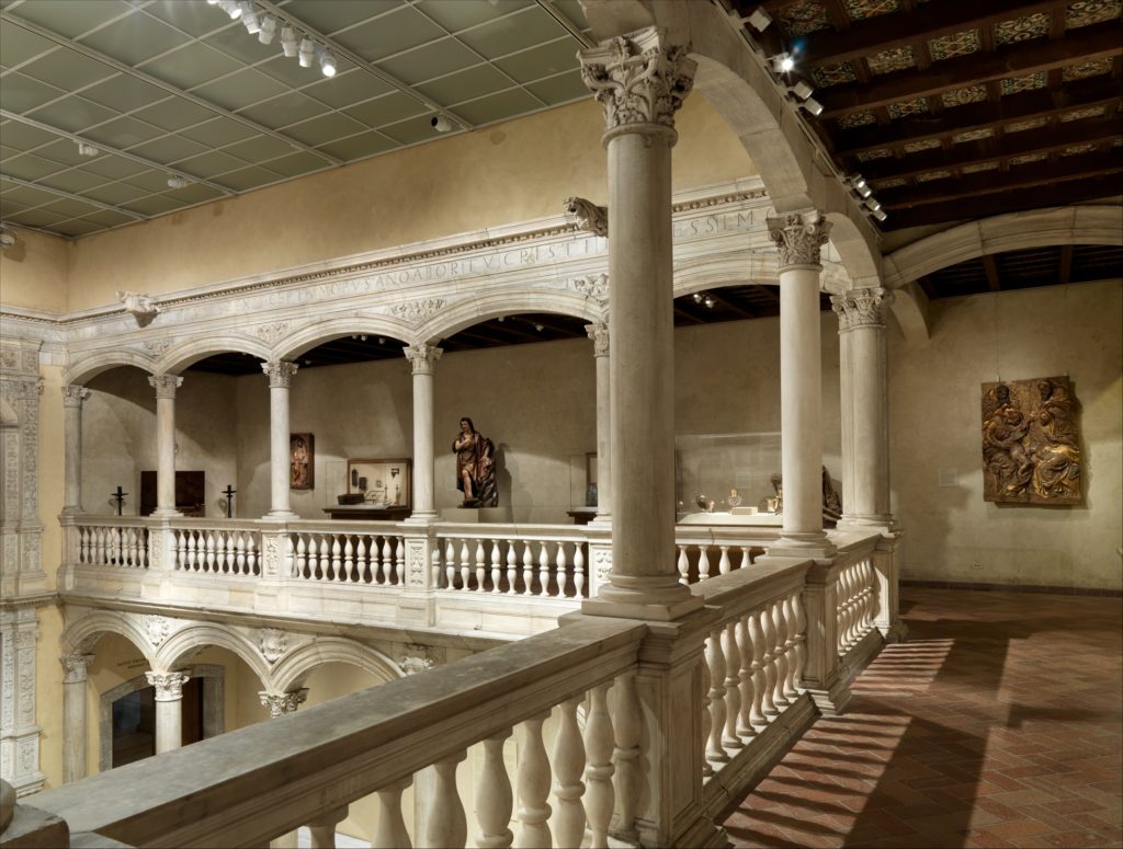
Though I found the overall experience of using the Pen throughout the museum to be positive, the layout of the museum was confusing and did inhibit my discovery of exhibits. No doubt the Carnegie Mansion is a beautiful setting for the museum but the narrow doorways and lack of signages made it difficult to navigate. The only indication of what exhibitions were showing was located in the stairwell. The museum could consider adding a map to the interactive table to aid in navigation.
While using the Pen, I thought of accessibility issues as the use of the Pen requires sightedness and is not user-friendly to those who are not. The museum had many other accessibility services available like assistive listening devices, reduced rate tickets, passenger elevator and large-print labels. However, I found it a shame that the technology vital to the Cooper Hewitt experience was not accessible to all.
Overall, the Cooper Hewitt provided a successful example of how digital technology can be employed by museums to enhance visitor experience and their exhibitions where at every stage and aspect, the Pen is interwoven into how the museum is operated.
References
Bove, J., Crow, A., & Husney, J. (2014). The Pen Process. Design Journal. November 2014, 15-17.
Chan, S. (2015). Strategies against architecture: Interactive media and transformative technology at Cooper Hewitt. Retrieved from https://mw2015.museumsandtheweb.com/paper/strategies-against-architecture-interactive-media-and-transformative-technology-at-cooper-hewitt/
Norman, D. A. (2013). The design of everyday things. New York, NY: Basic Books.
Wright, L. (2017). New frontiers in the visitor experience. In A. Hossaini & N. Blankenberg (Eds.), Manual of digital museum planning (109-130). Lanham, MD: Rowman & Littlefield.
INFO 601-02 (Assignment 3 / Observation) – Jamie Teo


