Event Review: NYC Media Lab Summit

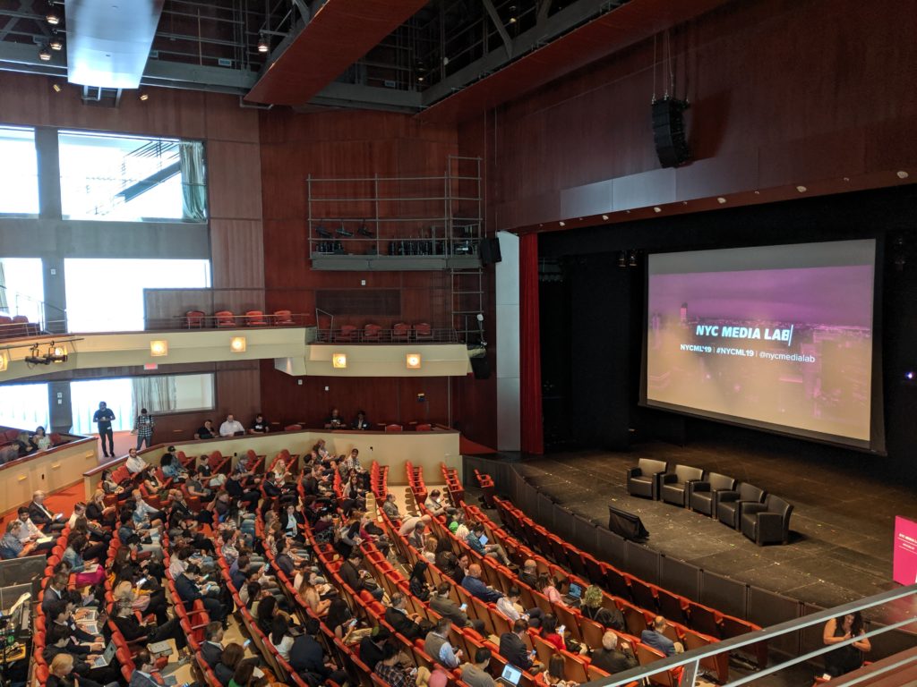
On September 26, 2019, I attended the NYC Media Lab Summit held in downtown Brooklyn. The mainstage program took place at the New York City College of Technology (City Tech CUNY) for the first half of the day. The second half of the day was dedicated to interactive demos and workshops and took place at both City Tech and the New York University (NYU) Tandon School of Engineering.

NYC Media Lab describes itself as dedicated to “driving innovation and job growth in media and technology by facilitating collaboration between the City’s universities and its companies” (About – NYC Media Lab, n.d.) Pratt Institute is part of NYC Media Lab’s consortium with goals “to generate research and development, knowledge transfer, and talent across all of the city’s campuses” (About – NYC Media Lab, n.d.), which also includes The New School, School of Visual Arts, Columbia University, NYU, CUNY, IESE, and the New York City Economic Development Corporation. Member companies of NYC Media Lab include Bloomberg LP, Verizon, The New York Times, and NBCUniversal, to name a few.

The Media Lab Summit held itself like a typical conference, where you check in to receive your name badge upon arrival and are treated to coffee and pastries. Then everyone takes their seats before the main program begins in the auditorium where the Executive Director of the program, Justin Hendrix, makes his welcome address and does introductions.
Innovation Panel discussion

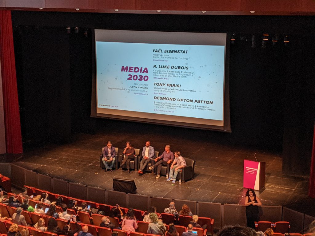
Up first was the Innovation Panel, which featured speakers Yael Eisenstat, R. Luke Dubois, Desmond Patton, and Tony Parisi. The panel featured a mix of academics and professionals who all addressed the topic of artificial intelligence, or AI. It was interesting to hear that everyone agreed that AI is the future but that they all held concerns about whether it will be accessible to all. Another potential issue that was brought up in relation to AI is what seems like our current overdependence on data. One panelist raised serious concerns about this overdependence and worried whether this could lead to the complete disregard of an innate human characteristic, which is critical thinking. All panelists agreed that critical thinking is essential and sees it playing a key role throughout the use of AI and other technological advancements.

What I ultimately took away from this Innovation Panel was that critical thinking is needed now more than ever. I think we have always understood that critical thinking is crucial as it is what keeps us human. AI is capable of making decisions for us, but the ability to be able to critically think about the potential impacts of our decisions and asses our judgments remains entirely human. This emphasis on critical thinking reminded me of the Phoebe Sengers reading in which she also discusses machine culture but stresses that science and the humanities need “to be combined into hybrid forms” as “neither is sufficient alone” (Practices for Machine Culture, n.d.). Like the panelists, Sengers recognizes the strengths in both and how each can complement the other, especially in AI.

Next up were the showcases. The showcases were meant to present and demonstrate projects, prototypes, and startups created by students and faculty from NYC Media Lab programs. Two of the showcases that stood out to me the most were a subway accessibility app for the blind and a retina technology startup.
Access to Places presentation

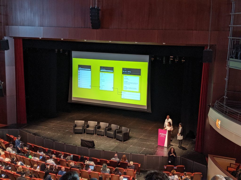
Students from NYU’s Interactive Telecommunications Program created an app called Access to Places with the goal to make subway stations much more accessible for the blind. The app utilizes iOS’ text-to-speech voiceover technology to provide information such the location of entrances and exits, service delays or changes, and arrival and departure times. Notifications also help the blind to navigate around station layouts.
Retina Technologies presentation

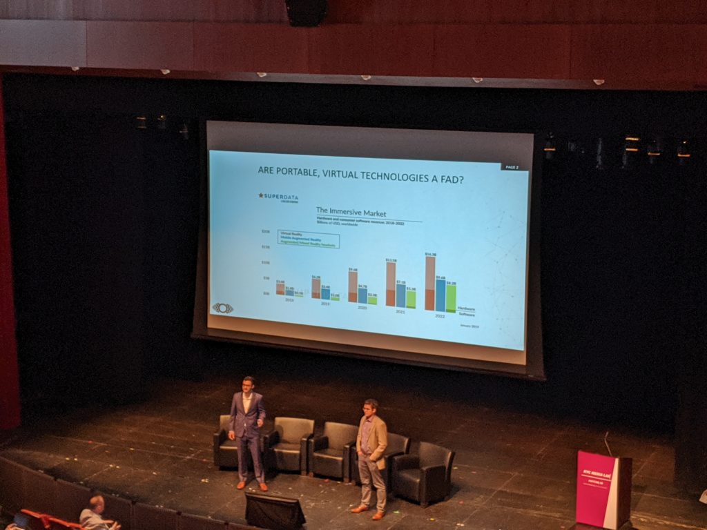
Retina Technologies was formed by medical students at the Icahn School of Medicine at Mount Sinai. The startup aims to change the way people access ophthalmologists in both urban and rural areas. Through the use of virtual reality headsets, the startup hopes to increase access to ophthalmologists for those who cannot easily visit one in rural areas while also improving the patient experience for those in urban areas.

Access to Places and Retina Technologies both stood out to me the most because of the users that they were designing for. Instead of creating a product that catered to the majority of the population, they reached out to those with specific needs that often get neglected in the startup and tech conversations. I immediately thought of the Sasha Costanza-Chock paper on “Design Justice” and the discussion on who designers are actually designing for. The majority of startups and apps tend to assume the average user is able to access or use a product without any accommodations, much like how Costanza-Chock discusses that designers “assume” that “a user has access to a number of very powerful privileges” (2018). Visiting an ophthalmologist or getting onto the subway without any trouble are privileges that most designers tend to assume users have. Access to Places and Retina Technologies decided to instead focus on the needs of these specific user groups rather than create another app or startup that assumed they were just like every other user.

Many innovative and creative projects were demonstrated, and I was in awe over it all, but it was the discussions that were held that enlightened me. What I took to be the overall theme of the Media Lab Summit was accessibility and the continued mission to make this collaboration between media and technology available to all. I still believe that technology has this amazing potential to change and impact lives, but we must make it available to everyone to see it happen. The Media Lab Summit and our class discussions and readings only continue to highlight this necessity and how we as information professionals cannot simply ignore it as technology advances.

References:

About – NYC Media Lab. (n.d.). Retrieved from https://nycmedialab.org/about.

Costanza-Chock, S. (2018). Design Justice: towards an intersectional feminist framework for design theory and practice. DRS2018: Catalyst. doi: 10.21606/drs.2018.679

Sengers, P. (n.d.). Practices for Machine Culture: A Case Study of Integrating Cultural Theory and Artificial Intelligence. Retrieved from http://www.cs.cmu.edu/afs/cs/usr/phoebe/mosaic/work/papers/surfaces99/sengers.practices-machine-culture.html.

Person, Place, and Thing: An Architect, an Airport, and a Tesla

Person: Richard Saul Wurman

Although formally trained in architecture, Richad Saul Wurman has been credited with the term “information architecture” as he applied his architectural background to help shape the field.

Wurman initially never thought of himself as an information architect or even thought that his ideas would contribute significantly to the field. Instead, he simply saw a problem with the increasing amount of information that was available and wanted to find a way to organize it. The following excerpt from Resmini and Rosati’s (2011) article captures the parallels he saw between architecture and information architecture:

Wurman’s maintained that as much as architects are expected to create structure and order in the world through planning and building, information architects were expected to draw lines and derive some kind of order in dataspace, their primary task being to make this information simpler, more direct, and ultimately more comprehensible.

He addresses the problem of increasing information by proposing design solutions. Because of his background and the angle that he approached information architecture, much of what Wurman presented mainly concerns the visual aspects of presenting large amounts of information. Nevertheless, his contributions are significant as his perspective has changed the way information professionals view, manage, and present information.

Indeed, Wurman’s most significant contribution to the information profession is that he introduced principles of information design and how all aspects of the field can implement design solutions. As Wurman was concerned with “deriving some kind of order in dataspace,” the aesthetics and visual impact of information is just as important as, say, a database itself. The information within it needs to be easily accessible, understandable and effective. Thus, many information professionals now also consider this approach when designing new systems and databases, or when presenting any form of information. As the amount of available information continues to increase, Wurman’s approach to information architecture seems very much necessary to create structure, order, and comprehension.

Place: Changi Airport

The Changi Airport in Singapore is consistently ranked as one of the best airports in the world. With world-class dining, shopping, gardens, and art installations, it’s an attraction in it of itself rather than a mere layover. The amenities and layout of the airport truly make it an exceptional experience and is an example of what happens when user-centered research and design is utilized in a public space.

In designing the airport, the placement of chairs was an important factor. Kenneth Ho, Senior Manager of Airport Facilities, explains that in providing a comfortable and luxurious experience, “single seaters spaced far apart are available for travellers seeking solitude, while clusters of comfortable lounge seats are designed for bigger groups like families” (Changi Journeys, 2016). “Snooze chairs” are also provided with outlets so flyers can charge their devices while resting comfortably (Changi Journeys, 2016).

In addition to providing comfortable seating, the airport also recognized the importance of its layout and how it can influence human behavior. For example, high-traffic areas have no seats to ensure a clear passageway while chairs in public areas “have arm rests to deter people from lying across it” (Changi Journeys, 2016). It is often the little things, like arm rests on chairs, that most people often overlook but can make a big difference.

This idea of strategically placing and designing chairs reminded me of Don Norman’s (1988) discussion of doors in his book, The Design of Everyday Things. A well-designed door is one that you automatically know how to use. A poorly designed door is one where you end up trying to push it open when you should be pulling it open. Ultimately, good design is something that you don’t notice because you don’t need instructions telling you how to conduct something because it has been designed with the user in mind.

Just as user-centered design can help with the flow of airport foot traffic, it can also help in crafting a better information experience. The application of user-centered design may be even more imperative now as information is rapidly becoming digitized and people now have numerous options to consume it. While doors and airports may seem completely unrelated to the field of information, the goal remains the same, which is to provide a better and improved experience for the user.

Thing: Tesla Vehicles

Some say Tesla has revived and revolutionized the electric vehicle industry. Surely, the vehicles arrived at a prime time when climate change is a pressing topic for politicians and more renewable energy options are available, but environmental consciousness is not the only reason for crediting Telsa with revolutionizing an industry.

Sit down in a Tesla and the first thing you notice is the absence of buttons, knobs, dials, and other gadgets that are usually associated with a vehicle’s dashboard. Instead, a large touchscreen sits in the middle, where such buttons and dials would have been. This touchscreen essentially controls everything in the car, from air conditioning to music. What’s even more noticeable about this touchscreen is that it can be customizable. You can input your name and then create settings to your preference so whenever you get in the car and tap on your name, the car is catered towards your experience. This idea of creating a catered experience for the user is closely related to Heidi Cooley’s discussion of the iPhone in Finding Augusta: Habits of Mobility and Governance in the Digital Era. In referring to Lev Manovich’s note about “playing the iPhone,” Cooley states that this marks a shift from “the principally utilitarian functionality attributable to jog knobs, buttons, and keys that defined earlier mobile devices” (Cooley, 2014, p. 32) What Tesla did for electric vehicles is similar to what Apple did for smartphones in that both companies rejected traditional, or “utilitarian,” views of what their products should look like and instead reimagined how it could be.

By replacing the traditional dashboard with a touchscreen, Tesla achieves a more fluid interaction between driver and vehicle. Cooley even goes on to state how “this idea of human-device interaction as skin-on-skin contact discloses something profound about ourselves as well as our devices” (Cooley, 2014, p. 36). Perhaps this “skin-on-skin contact” that is evident in both the iPhone and now a Tesla is necessary for facilitating such a unique user experience. Ultimately, Tesla revolutionized the electric vehicle industry by reimagining the user experience of the automobile. There has not been a car like a Tesla before and it certainly is the first luxury electric vehicle of its kind.

References:

Cooley, H. R. (2014). Finding augusta: Habits of mobility and governance in the digital era. Hanover: Dartmouth College Press.

Designing the changi experience. (2016). Changi Journeys. Retrieved from http://www.changiairport.com/corporate/media-centre/resources/publication/issue-2/designing-the-changi-experience.html

Resmini, A. & Rosati, L. (2012). A brief history of information architecture. Journal of Information Architecture. Vol. 3, No. 2. Retrieved from http://journalofia.org/volume3/issue2/03-resmini/