
Evaluation Story: Friends of Materials for the Arts – Website
May 11, 2020 - All

Introduction
MFTA raises funds to support educational programs, outreach opportunities and infrastructure improvements for Materials for the Arts. This public-private partnership brings both organizations together for the betterment of NYC. The main audience that MFTA hopes to reach are educators, students, and enthusiasts in the arts and environment fields.
We were four moderators – Yolanda Tian, Adalyn Hui, Karishma Mehta and myself, who worked together to point out the usability and user experience issues encountered through the Remote User Testing and bring up creative solutions to tackle them.
Process
Our process was well defined and structured to give us both quantitative and qualitative results.
- Client Meeting – to understand the brand/ company, their target audience and important features of their website.
- Preparation – developing tasks, questionnaires and brainstorm recruitment techniques.
- Conduct Pilot tests – we conducted 4 pilot tests
- Reframing tasks – we modified our tasks slightly based on our findings from the pilot tests.
- Conduct User tests – we conducted our 8 user tests
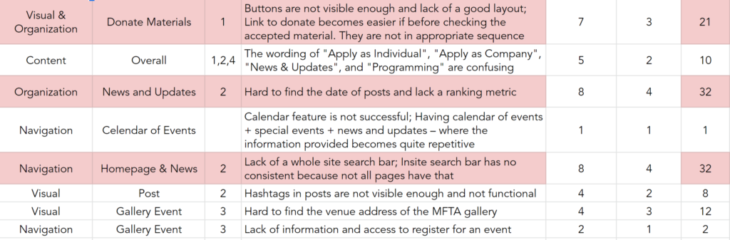
- Results – we listed out our findings and shortlisted 4 major issues through severity rating.
- Recommendations – we developed mockups to recommend design changes to solve the issues
- Client Meeting – with our initial meeting with the client we tried to gather information about the – brand/ company, important features of the website which are donation, courses, news & updates and MFTA Gallery and also learn about their target audience which are educators, students and individuals interested in arts and environment.
- Preparation – at this level we began preparing our tasks around the important features as mentioned by the client. We also started preparing scripts, consent form and questionnaires: screening questionnaire – to filter out the participants for the user test to closely align with those of the MFTA’s target audience, Pre-test questionnaire – to analyze the recruited participant’s familiarity with the website, Post task questionnaire – to analyze the participant’s ease or difficulty in completing each task, Post test questionnaire – to analyze the participant’s overall usage of the MFTA website.
- Conduct Pilot Tests – we conducted 4 remote pilot tests along with the prepared questionnaires through the Zoom software. This helped us practice in conducting the final user tests by learning to use the Zoom software for both recording and conducting the tests, also for analyzing the tasks’ effectiveness.
- Reframing Tasks – based on our results from the pilot tests conducted, we brought up issues with the users’ understanding of the tasks and brainstormed methods on how we can best resolve them to make them more intuitive.
- Conduct User Tests – after reframing the tasks we followed with our user testing through the Zoom platform by sharing the user screen. We also recorded these sessions to more closely analyze the users’ journey through the website.
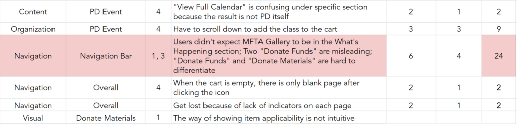
- Results – we as a team came together to bring in issues or problems faced by our users, list them out and analyze them through a combination of severity rating and the number of users faced them. Finally, shortlisting 4 major issues; Issue 1 – Buttons are not visible enough and the layout is not appropriate, Issue 2 – Users cannot find the date of the post or a ranking metric by their choice, Issue 3 – The website lacks a whole site search feature and is inconsistent for the search bar within each page and Issue 4 – Navigation bar is not clear and misleading sometimes.
7. Recommendations – we created recommendations as mockups to show our client how we solve the issues found in step 6.
The recommendations that were created by me were for Issue 3 – The website lacks a whole site search feature and is inconsistent for the search bar within each page. I created mockups showing the solution to tackle this issue:

– the space to enter information to search for appears as an open window, right below the navigation bar.
– “search” icon is modified to a “close” icon to close the open window to type in.
Here is a link to our report if you would like to learn more about our process and recommendation
Conclusions
If I were to continue working on this project I would also create mockups for the not so major issues we found out during our testing. We would also do more user testing to find issues in other features on the website.
Overall, it was a great experience working with MFTA to make their website more user friendly. They also appreciated our valuable work by mentioning how these major issues were always overlooked.