Design Story: Hoptale (Travel App)
May 10, 2020 - All
Introduction
Hoptale is an app that connects travelers to discover new destinations and share their experiences by documenting the details of their trip through itinerary and journals filled with photos and words. It is Hoptale’s mission to foster a dynamic yet connect a community of global travelers, one hop at a time!
We were a team of three – Armon Burton, Umang Arora, and myself, who worked with Hoptale to help achieve their mission more effectively by offering their users a better experience through their application.
Problem
The objectives we were provided with initially were the following:
- Make the user interface of creating and documenting a trip more intuitive and easy to use
- Make the whole experience of the app more fun and rewarding
- Build a cohesive connection between the two main tasks of planning a trip and documenting a trip
However, as we reached midterm, our objectives were modified to look into more specific and impactful features or sections of the application due to the limitations in time and technicality. However, they helped us in getting closer to the initial objectives of the project.
Process
The process we followed was slightly different than the usual but yet helpful and result oriented.
Our process was pretty structured out by the client herself since she had strong ideas about her product and her requirements. Our process was divided into two sections:
Section 1: A less structured process.
Client meeting, User Research (Interviews, observations of users using the current app, questionnaires), and MVP low fidelity prototypes for the “Plan a trip” part
1. Client meeting
For our initial client meeting, we tried to gather data on the brand/ company, their mission and their requirements.
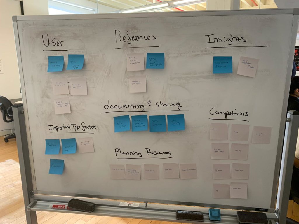
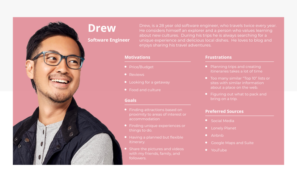
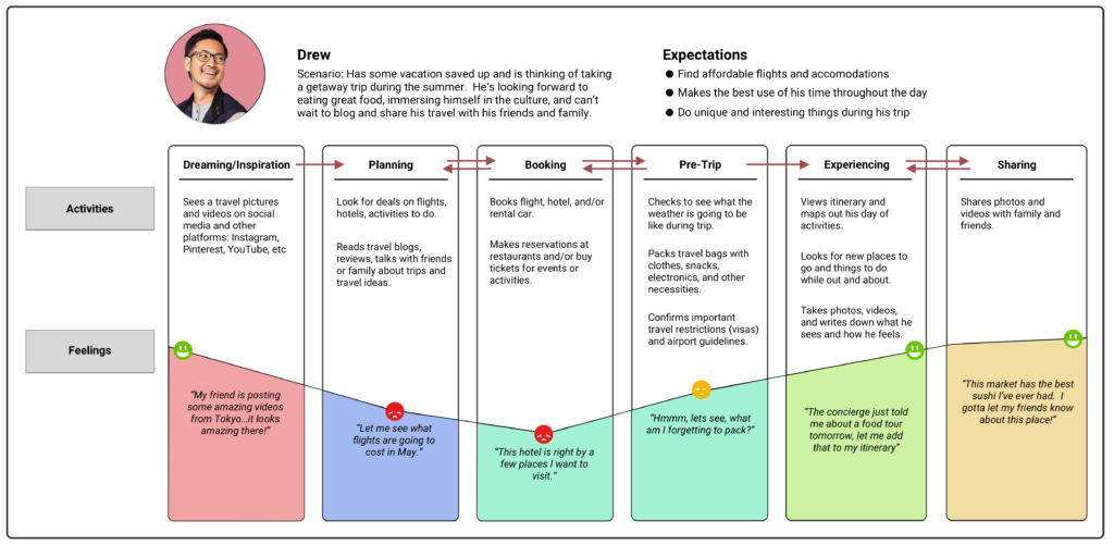
2. User Research
The information gathered from the user research was analyzed and sorted into the categories:
- User type
- Preferences
- Insights
- Important Trip Factors
- The competitors
- Planning resources
- Documenting & Sharing

3. MVP (low fidelity prototypes)
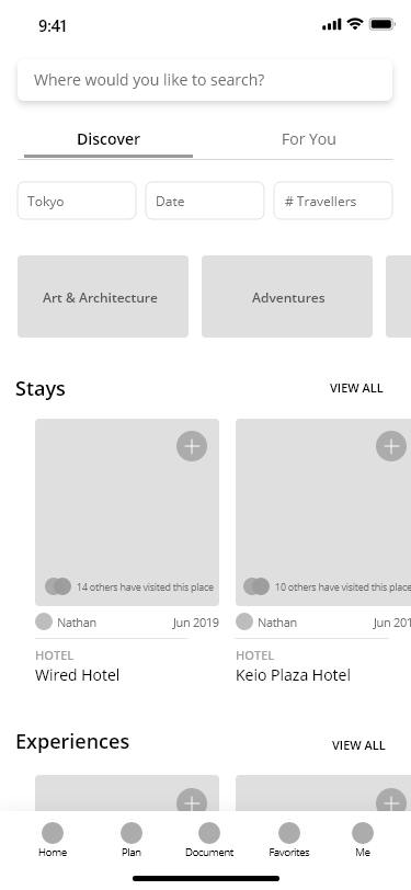
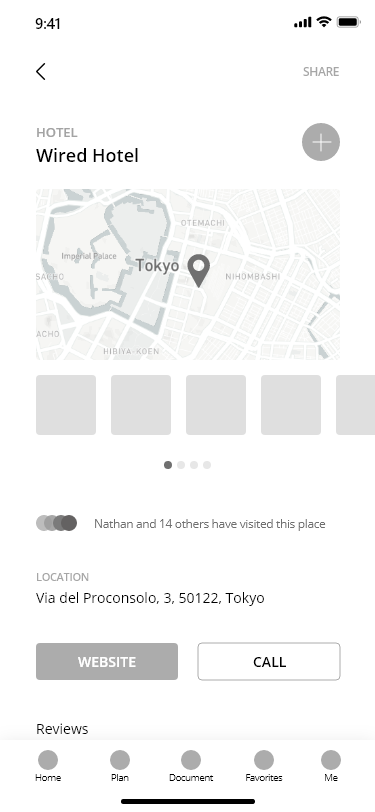
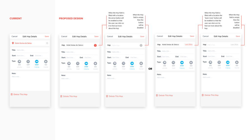
The location of the hotel or the activity added already in the itinerary will be highlighted.
From here the user can add any activity or stay to their personal itinerary
Section 2: A more structured and systematic process aligned closely with the client’s requirements.
Weekly check-in meetings with the client to give an update on the tasks – to look into both “Plan a trip” and “Document a trip” parts with initial thoughts/ ideas about the experience and then based on its impact or technical capabilities as shortlisted by the client we continue to prototype only the particular ideas /thoughts.
My team has provided our client with recommendations to the “Plan a trip” phase and also to the “Document a trip” phase of the app.
The following are the “Document a trip” recommendations provided by me
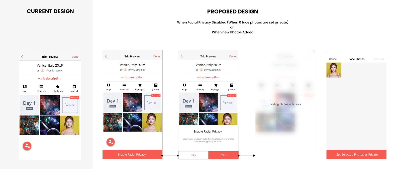
Proposed design #1: Facial recognition button was changed from a floating button to a bottom sticky button in order to keep the design both consistent and let the users understand better what the button does.
The following are the “Plan a trip” recommendations provided by me
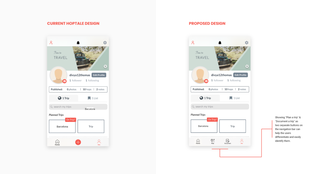
Proposed Design #1: The “Plan a trip” and “Document a trip” buttons are laid out separately instead of a single “Add” button that leads to two sections.
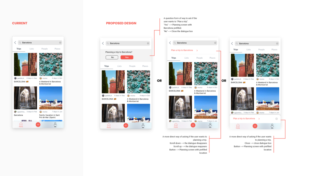
Proposed Design #2: This design showcases the method to connect the user from the “Search” screen to the “Plan a trip” screen.
Proposed Design #3: This design showcases the method to connect the user from the “Search” screen to the “Plan a trip” screen.
Conclusion
Overall, Hoptale is a pretty well-designed application with a few user experience issues. As this is my first travel app project, I can say I have learned a lot through this different process of problem-solving. Having an exposure to working with a real client on a project has been a great experience for me.