
Usability Study: Cooper Hewitt Website
December 15, 2019 - All
ABOUT THE PROJECT
Cooper Hewitt is America’s design museum. Inclusive, innovative, and experimental, the Smithsonian museum’s dynamic exhibitions, education programs, master’s program, publications and online resources inspire, educate and empower people through design.
Cooper Hewitt is embarking on a website redesign but wants to learn more about how their users use the website. The goal of this study was to assess the usability of the museum’s current website. We aimed to find out if the website successfully inspires users to visit the museum and whether the website clearly communicates the museum’s mission and vision.
TEAM & ROLES
Our team of five usability experts worked together to design and conduct a usability study. We analyzed the results of the user tests to provide key findings and recommendations that would improve the website’s usability and overall user experience in a report to Cooper Hewitt.
MY ROLE
- Planning and conducting the usability study
- Writing the moderator script
- Preparing materials for the user tests (pre and post-test questionnaires)
- Test moderator
- Analyzing the user test results to identify key insights and usability issues
- Co-writing/editing the usability report
- Creating/designing the report and presentation to client
DESIGNING THE STUDY
THE SCOPE
Before we planned the usability test, we talked to Cooper Hewitt’s Digital Product Manager to focus the scope of the study. Overall, the goal of the study was to gain insights on how users were discovering and understanding information about the museum and its offerings. Thus, we chose to focus the study on three key features of Cooper Hewitt’s website—its home page, its events page and its collections feature.
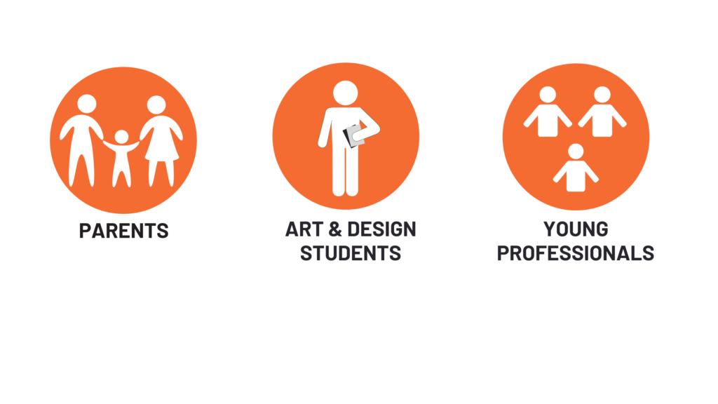
THE PARTICIPANTS
The target user profile for the study was characterized as museumgoers. We purposefully sought out 10 participants from various backgrounds who have a general interest in art/design and/or in visiting museums. Interestingly enough, the pre-test questionnaire revealed that more than half of them were familiar with Cooper Hewitt while a third had visited the museum prior to the study.
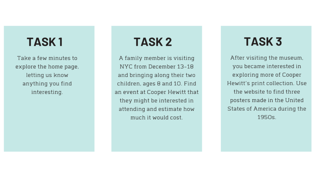
CREATING SCENARIO- BASED USER TASKS
The first task was meant to be exploratory, since we wanted to gain insights on users’ overall impression of Cooper Hewitt from its home page. The second and third tasks were scenario-based. They were designed to evaluate how users navigate the website to find information about an event and its cost as well as to find artifacts from Cooper Hewitt’s extensive design collection under a specific criteria.
USER TASKS:
USER TESTING
The user test sessions were completed in-person with the participant and at least one moderator in various controlled settings. Before beginning the test, each participant read and signed a consent form. During the test, participants were asked to “think aloud” their thought process while performing each task.
By utilizing the “Think Aloud” method with the addition of a post-test questionnaire, our team gained valuable feedback about participants’ issues navigating the website. We then analyzed our observations, notes and results of the questionnaires to make five recommendations on improving the usability of Cooper Hewitt’s website.
INSIGHTS & RECOMMENDATIONS
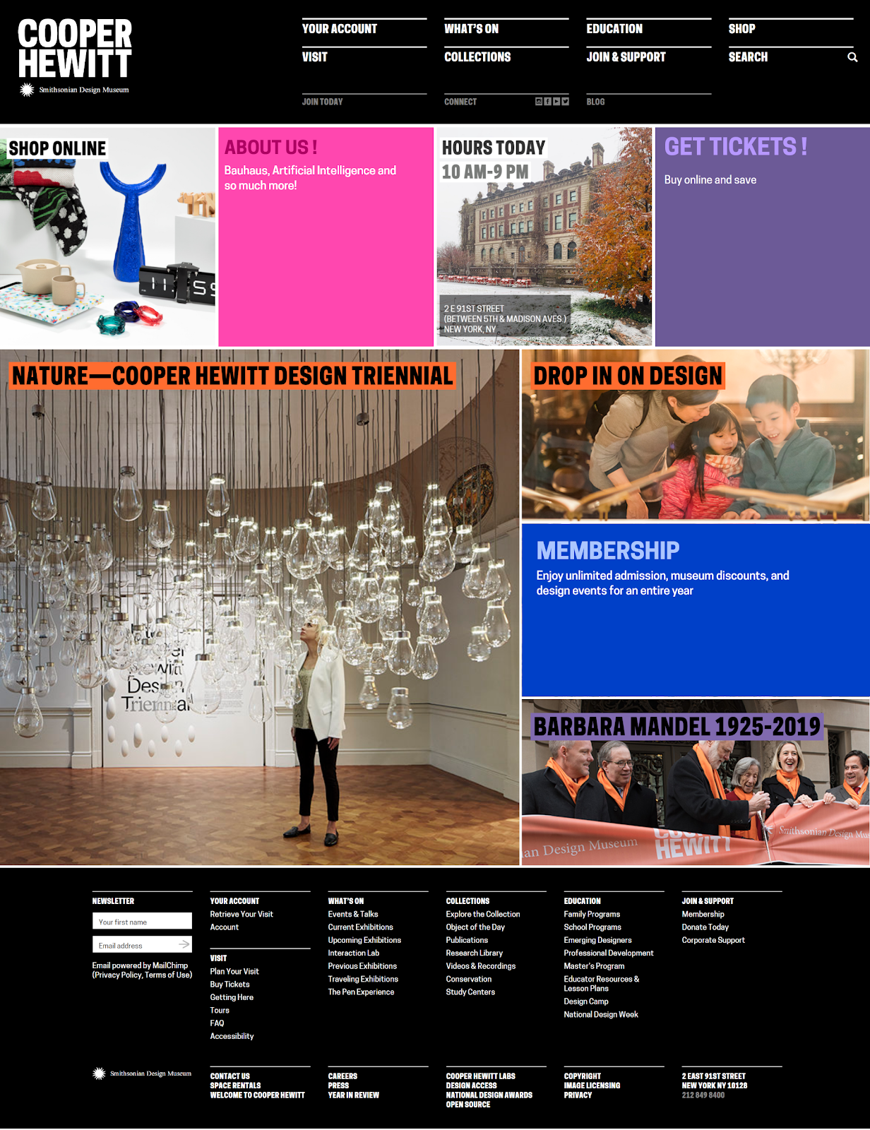
Users like the vivid colors and imagery. Overall, participants had a positive impression of Cooper Hewitt due to the use of bold, vivid colors and imagery on the home page. One participant described the museum as “modern” and “super artsy.”
Users had trouble seeking out visiting information
Recommendation: Prioritize ticketing information at the top of the home page along with other visiting information like exhibitions or events. Participants found it difficult to find key information about visiting, so prioritizing this would help users find what they are looking for easily.
Users were visually overwhelmed
Recommendation: Despite having an overall positive reaction to the home page, participants were visually overwhelmed by the lack of white space and the heavy use of images. One participant even commented that some photos were a bit misleading as it didn’t add any sort of context of what the content is about. Adding colored blocks by eliminating some images would help reduce visual overload for users.
Users don’t really know what Cooper Hewitt is
Recommendation: A key part of the Cooper Hewitt’s identity is that it’s part of the Smithsonian Institution. The history of Cooper Hewitt as a design museum is very enlightening but many participants did not understand that Cooper Hewitt is a design—not an art—museum. Therefore, adding an ‘About Us’ section and bringing the Smithsonian Design Museum logo to the top of the home page would help users gain information about the museum’s background.
Users had trouble getting an overview of current events
Recommendation: Adding a calendar with each month’s events at the top of the events landing page would help participants choose an event easily.

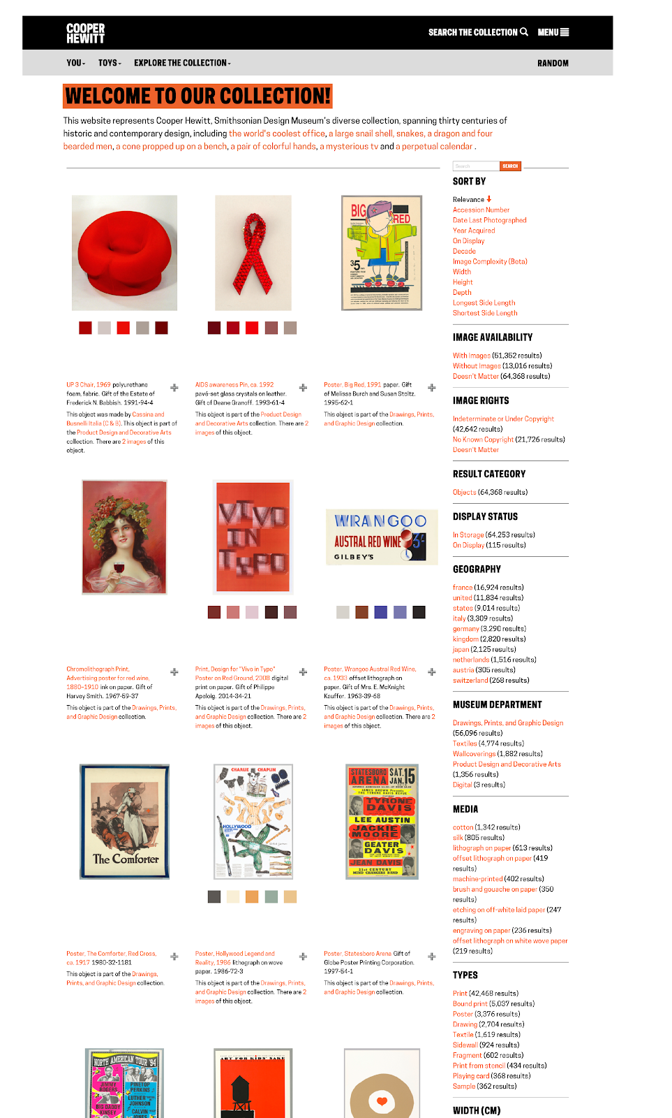
Users found the Collections feature difficult to navigate
Recommendation: Participants had trouble finding artifacts in Cooper Hewitt’s collection because of the unintuitive filters and the use of extraneous pages. When users click on “Explore the collection” in the menu, they should be taken straight to the search page that shows more of the collection at once.
Future & Considerations
The usability study was successful in that it helped reveal users’ pain points and issues when navigating the Cooper Hewitt website. These recommendations are simple to implement for the client and would help improve user interaction and experience. For the future, since Cooper Hewitt will be going through a website redesign, conducting a digital analytics study about their actual users and on user engagement would help the museum identify which features to prioritize on the website.