Evaluation Story: Testing Engagement for the Innocence Project
December 15, 2019 - All
In fall 2019, as part of our final project for Usability Theory and Practice, I and three others carried out user testing for the Innocence Project, a nonprofit which seeks to free wrongly convicted criminals through DNA testing and advance criminal justice reform. Our evaluation used in-person user testing, resulting in a detailed report and presentation of the results to the client. My teammates on the project were Michelle Kung, Shradha Shree, and Yisha Su. I was involved in all aspects of the project, including client communications, developing the test plan, and writing parts of the report and presentation.
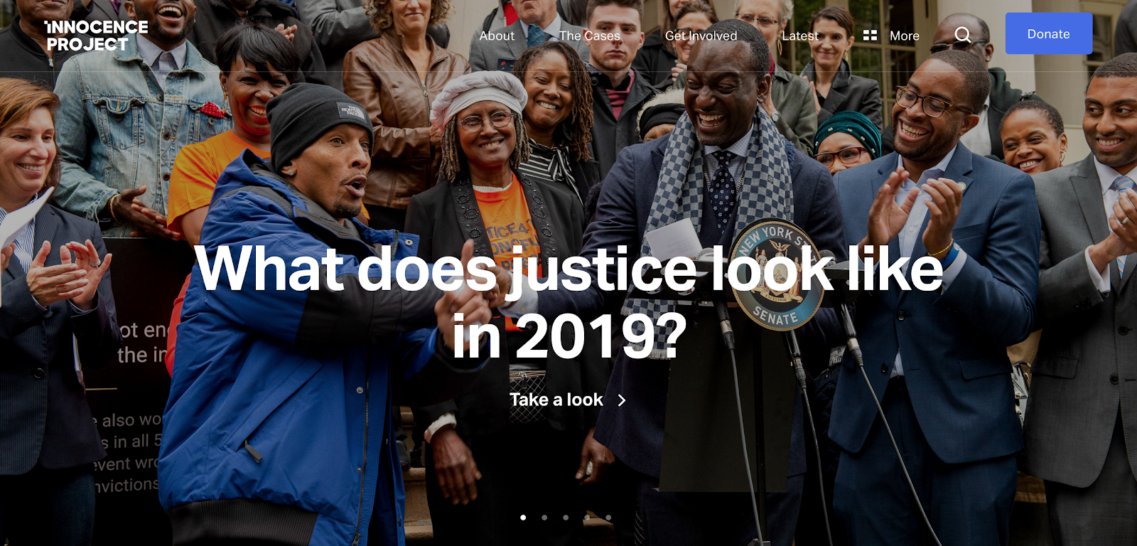
The Innocence Project homepage on desktop
The Challenge
The Innocence Project had not undertaken a project like this before, and so in the opening of our first meeting, we made sure to explain what usability evaluation involves, what it is well-suited to evaluating, and the need to agree on a specific scope that would be doable and focus our time on their highest priorities. This initial framing made for a successful first meeting.
The central challenge of the project was understanding what the client was interested in and designing an evaluation that could reveal insights in this area. In the initial meeting, it was clear that the client wanted to focus on engaging new users, particularly young users arriving at the mobile site for the first time, although it was not immediately clear where to focus within this topic and how to design evaluation tasks to measure these aspects of the website.
Process
After reflecting on our first meeting, we met as a team and came up with a plan for evaluating how well the mobile website engaged new users coming from social media and how easily those users were able to take action and learn about the organization. We developed draft tasks that included signing a petition, sharing on social media, learning about the Innocence Project through the homepage, donating, and finding other ways to take action. We shared this approach with the client and they liked it, agreeing that it addressed their priorities.
After some back and forth with the client and our professor as well as a pilot test, we finalized the tasks and drafted a moderator script that included a consent form, the tasks, notes and follow up questions for each task, and pre- and post-test questions.
Our next step was to recruit test participants. We developed a screener questionnaire which the Innocence Project shared on their social accounts, although in the end most participants came from our own personal networks.
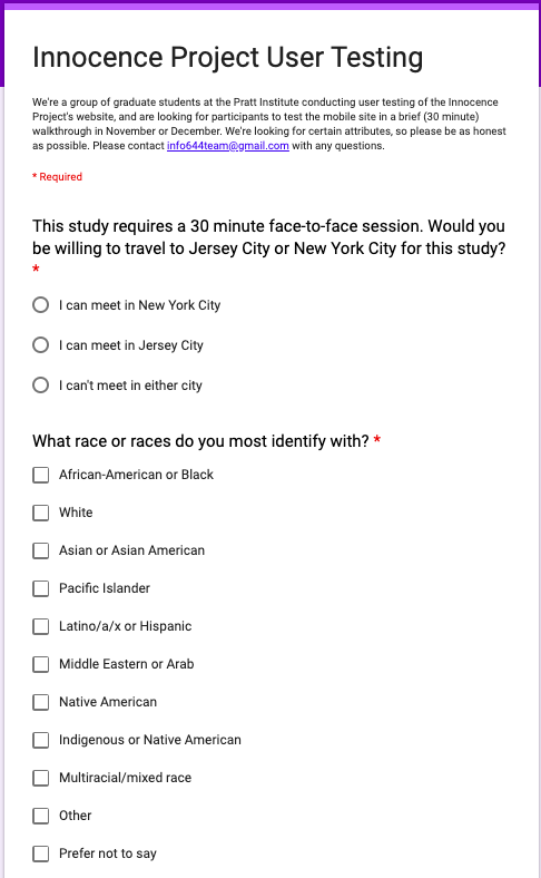
Part of the screener questionnaire
One key decision we made was to target young people with an interest in criminal justice reform and supporting nonprofits, which we realized would be helpful for ensuring that test participants resembled the real target users of the site as much as possible. In recruiting from our personal networks, we prioritized interest in these areas and included questions about this in our pre-test.
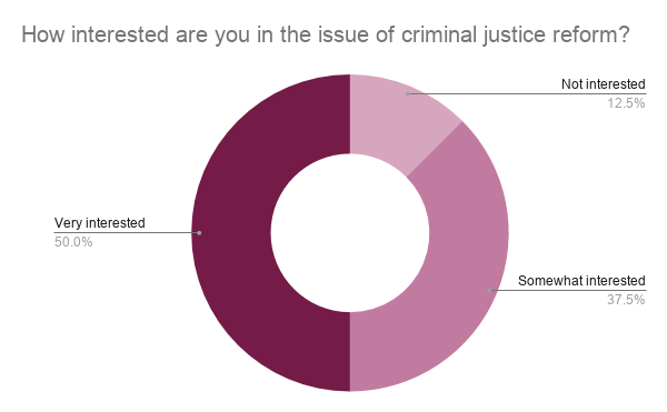
Eight participants were ultimately part of the evaluation. Importantly, nearly all were interested in criminal justice reform:
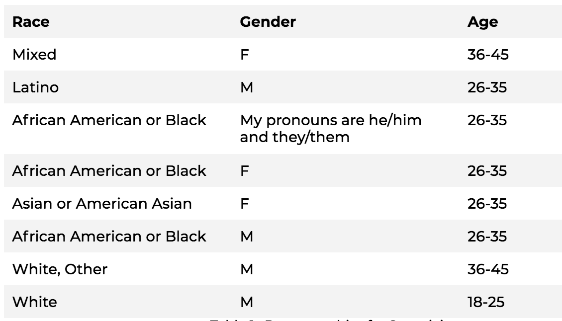
We also collected data on racial and gender identity showing that we were testing with a diverse group of young people:
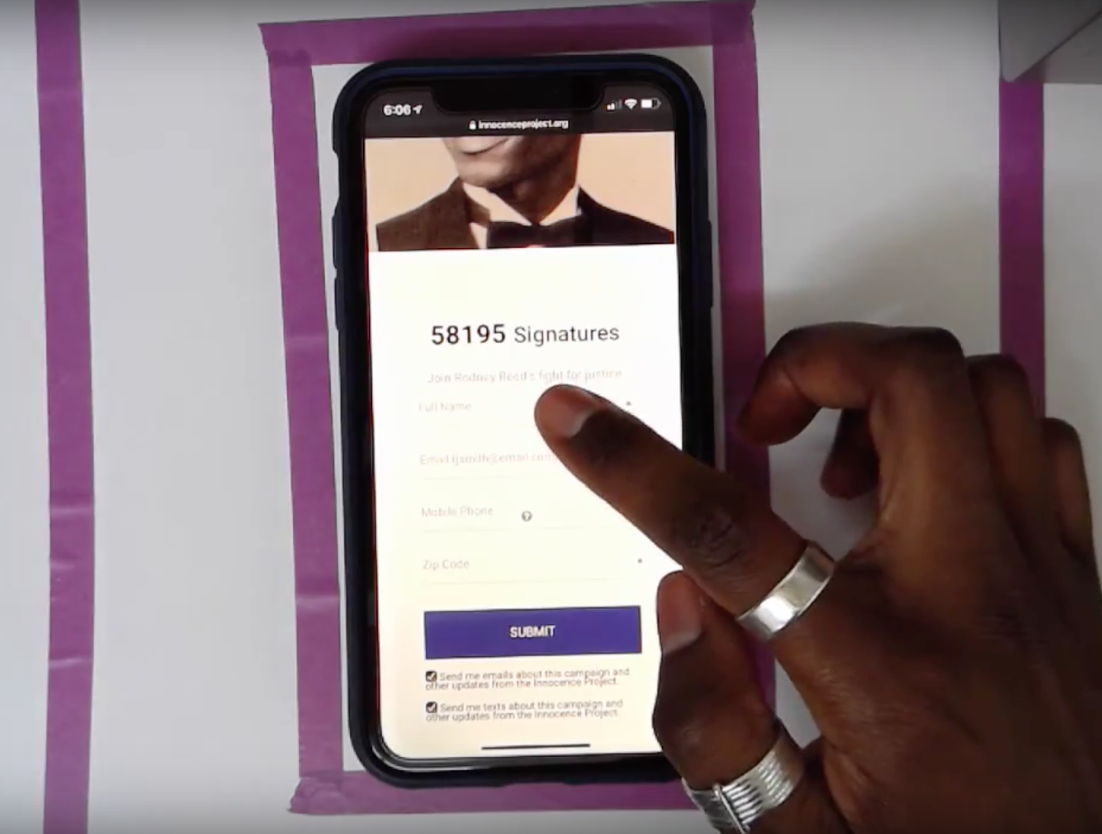
Each evaluator used slightly different methods, although all conducted two in-person user tests, recording the sessions for later analysis. My tests used a camera designed to capture mobile use as well as audio:
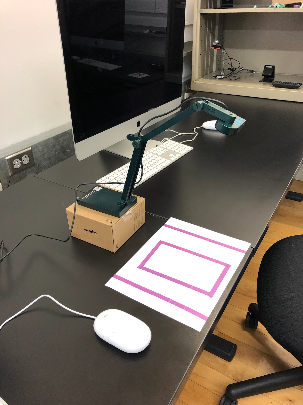
The result was recordings that allowed for analyzing what the user was doing at each stage:
We asked users to “think aloud” as they were performing the tasks. During the tests, I used my judgment about when to prompt for additional information and how to do so without biasing the test results, and when to go off-script.
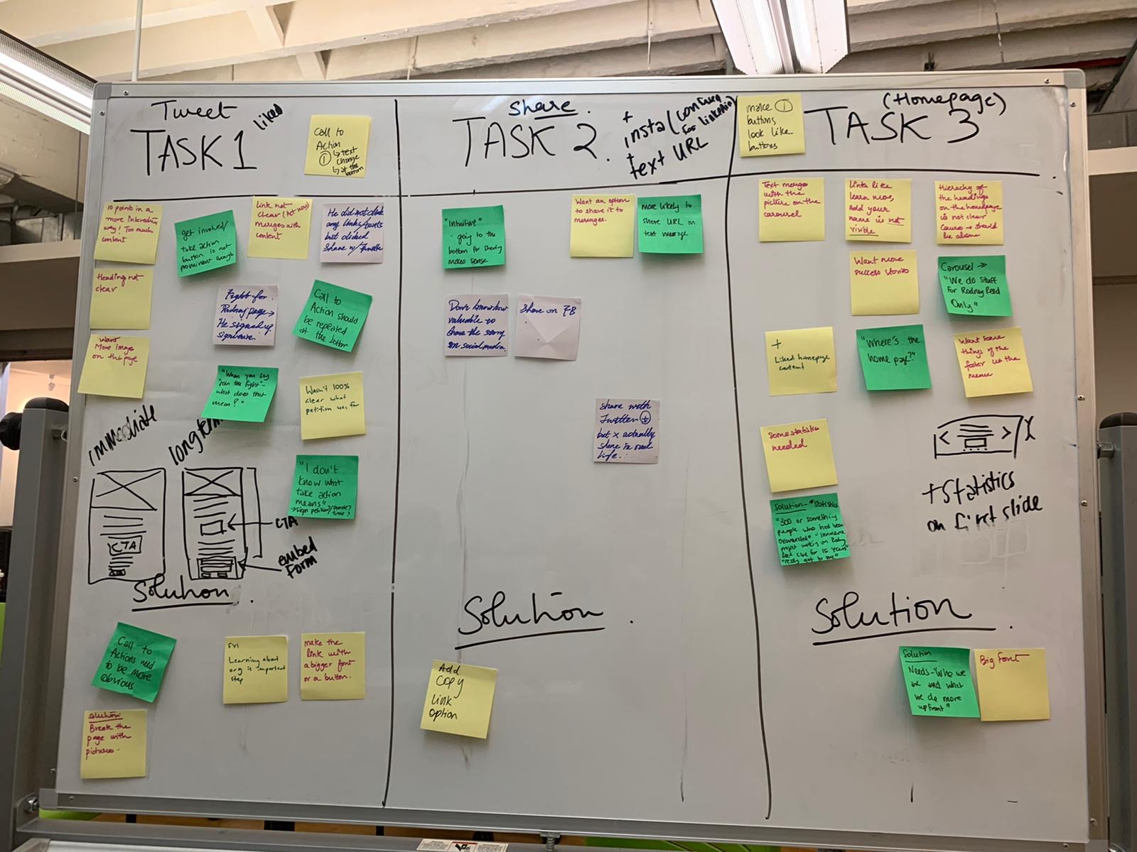
Following the tests, we each wrote up notes of what we found, and aggregated them using affinity mapping:
Results
Overall, our evaluation found that the Innocence Project’s mobile website does a good job of engaging new users. We did find areas for improvement, mainly in making labels, buttons, and forms clearer or more prominent so that users fully understand the opportunities for action and learning. We developed three specific recommendations to accomplish this:
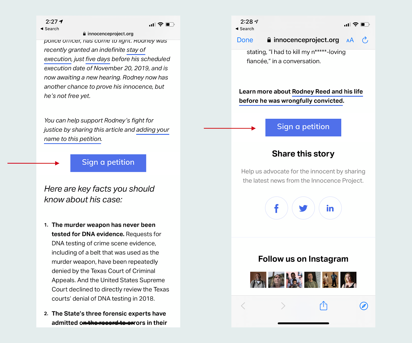
Recommendation 1: Provide Understandable and Findable Calls to Action Within Stories
Call to Action links were not descriptive or distinctive enough. Users could not find them and when they did find them, did not understand what they meant. We suggested creating simple but prominent buttons instead:
BEFORE:
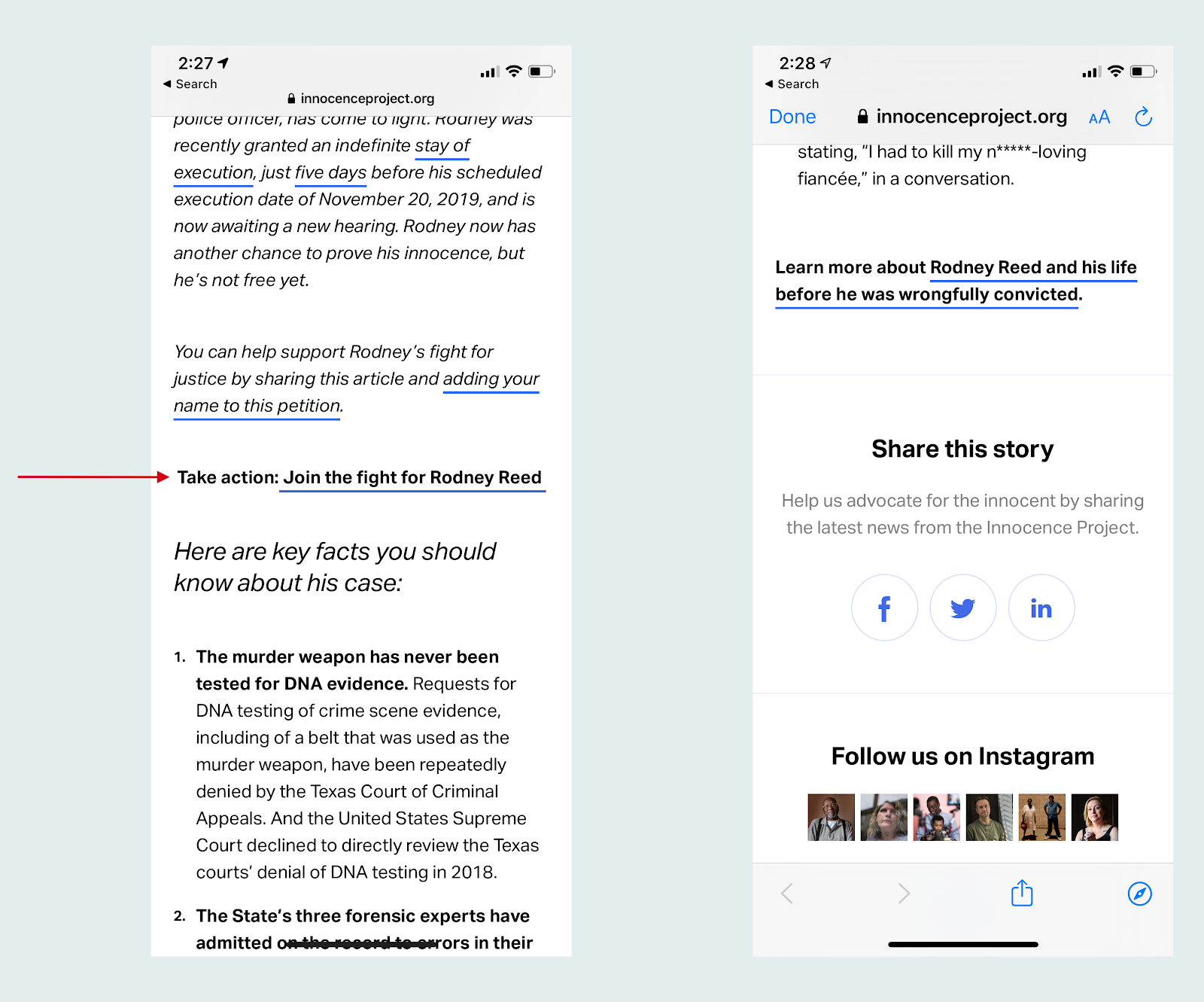
AFTER:
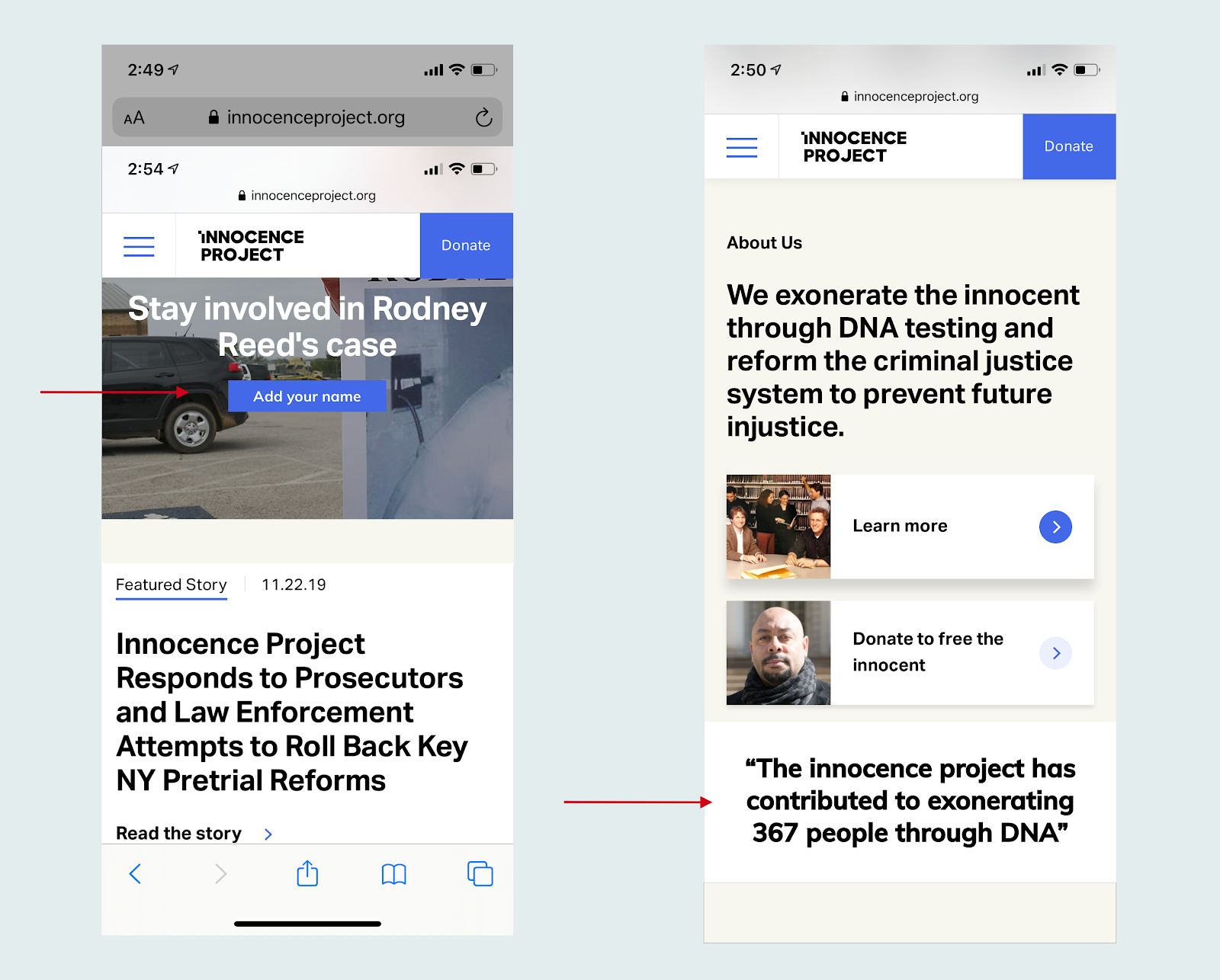
Recommendation 2: Make Buttons Look More Clickable & Add Statistics on Homepage
Some users wanted to see statistics or numbers with success stories conveying the impact of the Innocence Project’s work. Additionally, clearer buttons on the homepage would make the homepage links more useful:
BEFORE:

AFTER:
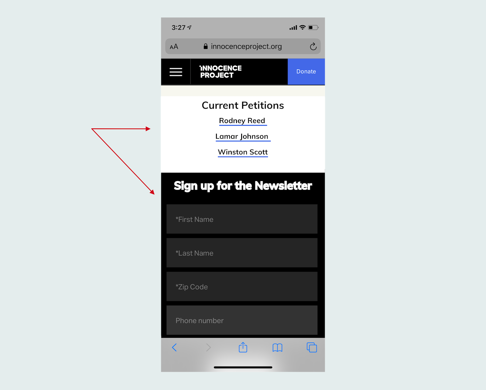
Recommendation 3: Clarify Opportunities on Get Involved Page
If digital advocacy is a priority, then petitions and other action opportunities could be presented in a “Current Petitions” section at the top of the page. Additionally, the newsletter form could be more clearly labeled, and potentially consolidated with the digital advocacy signup form:
BEFORE:
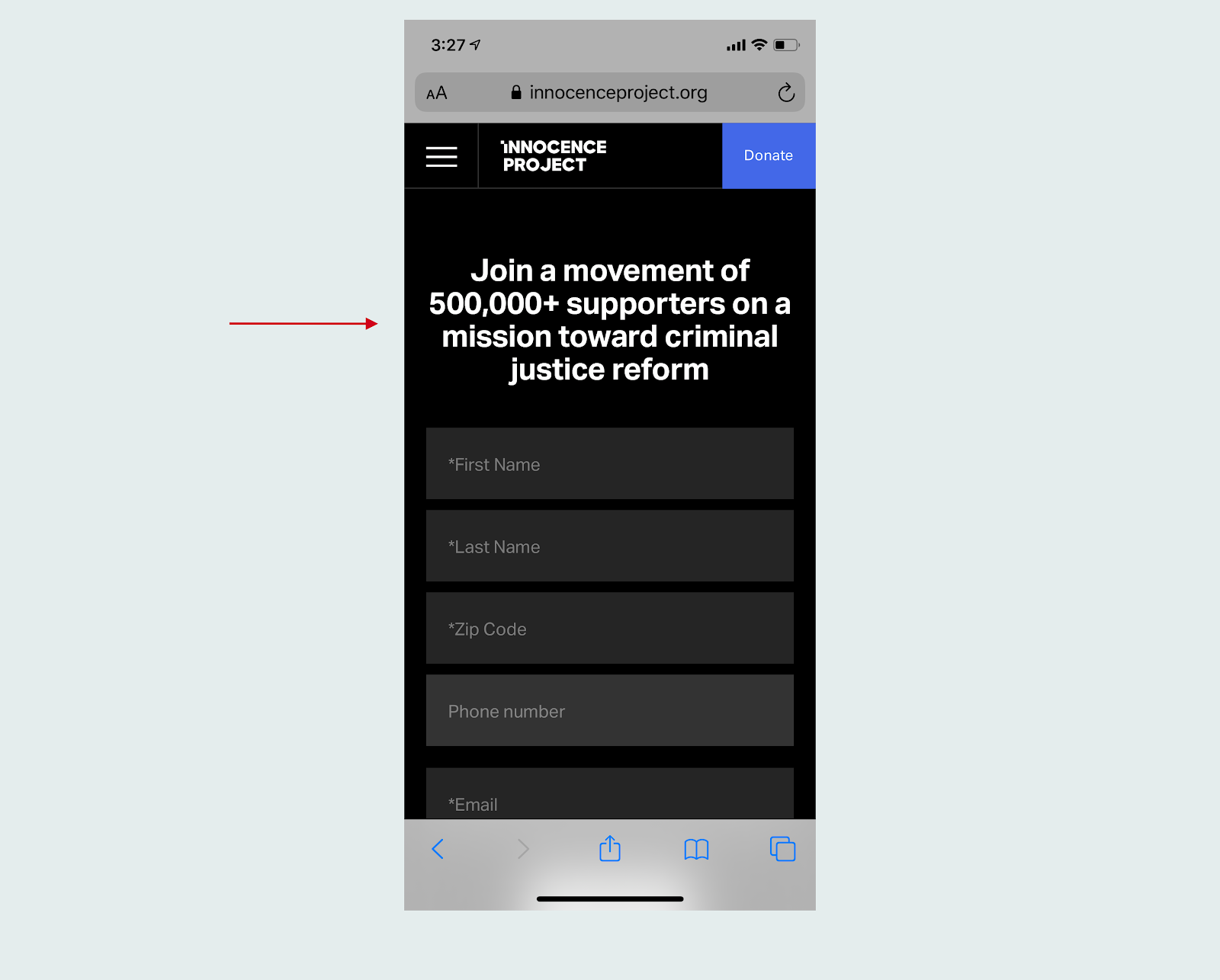
AFTER:
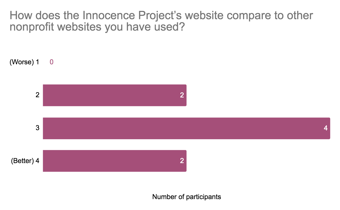
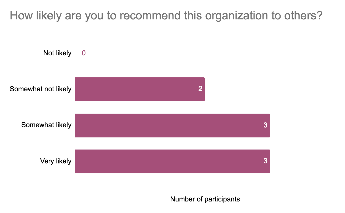
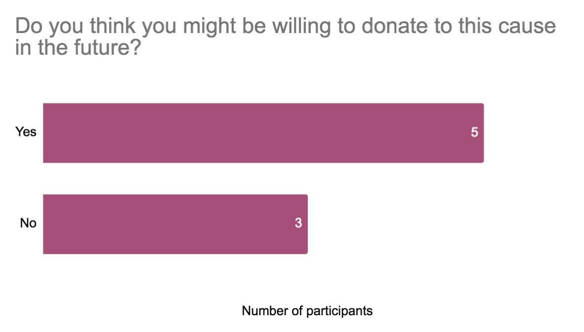
We also collected data in post-test questions showing that the participants generally had positive impressions of the website and the organization:
For a full explanation of findings, see the full report or presentation slides.
Conclusion
We delivered the results to the client in a brief in-person presentation followed by a longer meeting where the client had the chance to ask additional questions. Our impression was that the client was very happy with the evaluation, and their follow up questions indicated they intend to act on the information.
One of my major takeaways from the project was the importance of testing with a sufficient number of users. Both of my participants had similar experiences on the site (perhaps because I recruited both of them), but some of the other participants had very different experiences and priorities. Another takeaway was that opportunities for learning and exploration on nonprofit websites are useful. Nonprofits often include a large amount of information about their work, but it was clear from at least some of our users that this information does get used by interested parties.
Finally, this evaluation confirmed for me the importance of initial scope and task design – determining what to evaluate and how to evaluate it was perhaps the most important decision we made during the process, and ultimately ensured the evaluation addressed the client’s priorities.
Further evaluations of the site could focus more on user experience, perhaps focusing specifically on the multiple forms on the site, or on visual design. It would also be useful to compare the site to other nonprofits who are particularly good at engaging new users, or to look for best practices for engaging users to provide context for our findings.