Enhancing The Pratt Institute Libraries Experience – UX Research and Recommendations
August 22, 2019 - All

ABOUT THE PRATT INSTITUTE LIBRARIES
The Pratt Institute Libraries is an academic library institution serving three campuses in the New York area. The Libraries’ main building is located on Pratt’s Brooklyn campus with collections and services that focus on the visual arts, architecture, design, creative writing, and related fields.
The mission of the Pratt Institute Libraries is to provide outstanding service and access to a resource-rich environment that facilitates critical thinking and creative teaching and learning in the Pratt community. – PRATT INSTITUTE LIBRARIES MISSION STATEMENT
THE CHALLENGE
Given that Pratt Institute Libraries serves a variety of users within the Pratt community, understanding the behaviors, attitudes, and expectations of users in and around the library and its services is integral. This case study focuses on the physical space aspect of the project, enhancing the user experience within the library through seamless wayfinding and a harmonious atmosphere with appropriate resources.
MY ROLE: I primarily worked on UX Research, designing and conducting surveys and interviews, as well as the creation of our research deliverables (personas and journey map). I later worked with a team focused on the in-library experience which consisted of physical space recommendations and a companion mobile app. Within this team, my main role was in leading the physical space recommendations.
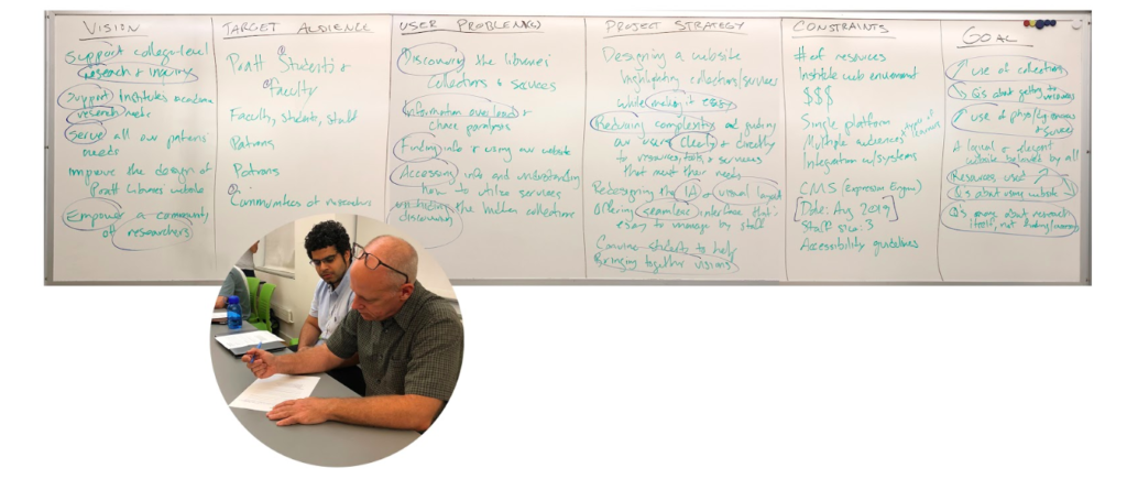
UNDERSTANDING STAKEHOLDERS – KICK-OFF MEETING
Our initial client meeting with library stakeholders helped us understand what their main concerns were in terms how well the Pratt Institute Libraries was meeting their goals and mission and where they’d like to improve. Our key takeaways:
- Support the research needs of Pratt students and faculty
- Reduce complexity and guide users clearly and directly to resources, tools, and services
- Updating the website to improve and streamline access to library resources and services
UNDERSTANDING USERS – UX RESEARCH
With the goal of discovering library users’ expectations, perceptions, likes and dislikes, and level of awareness of library space and services, my team conducted user research in the form of surveys, and interviews.
Data was gathered from 150 survey responses which were obtained digitally via email as well as in-person at Pratt Institute campuses.
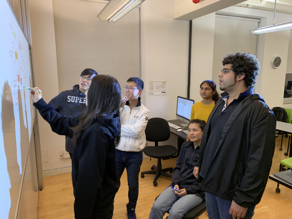
Semi-structured interviews were conducted with a variety of members within the Pratt community: students (both graduate and undergraduate), faculty, and library employees. Out of the 30 total interview participants, some interviews were scheduled, a couple were collected via email through a questionnaire format, but most were conducted guerilla-style on the Pratt Institute Brooklyn campus.
Research specifically focused on the physical space was conducted by another team through six on-site observations using the POEMS Method which calls for data collection on People, Objects, Environments, Messages, and Services.
KEY FINDINGS
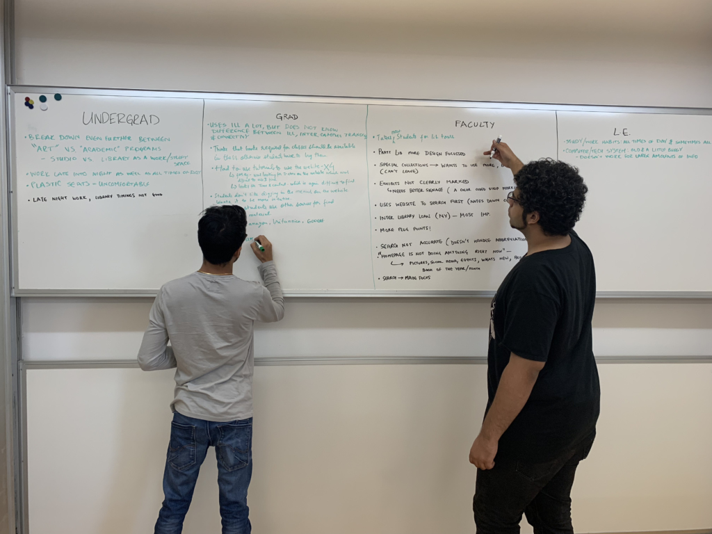
After collecting data, our team brainstormed and were able to define five specific user groups which we categorized according to level of library use:
- Level 1: Non-User
- Level 2: Casual Library-Goer
- Level 3: Light/Casual Researcher
- Level 4: Intermediate Researcher
- Level 5: Advanced Researcher
From this we developed personas which aided both our in-library experience team as well as other teams that handled the website redesign project.
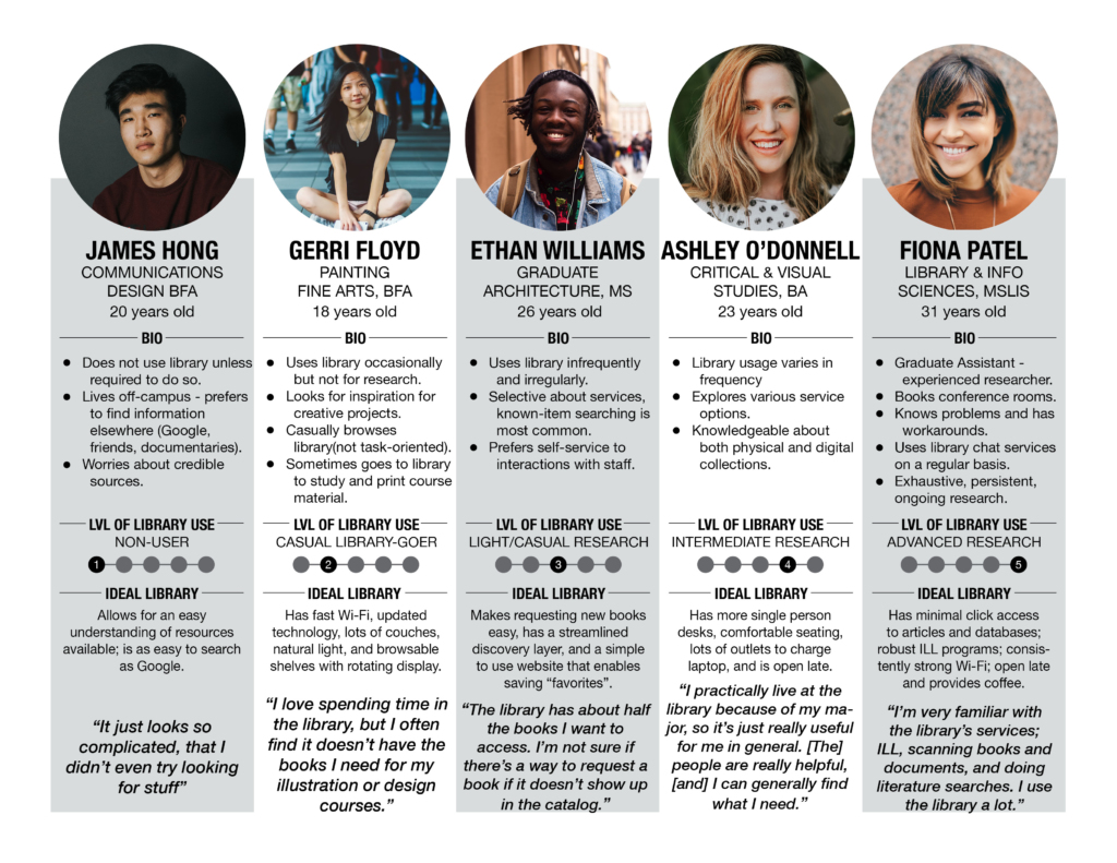
It’s important to note that although our personas depict students, we defined the main categories to break away from the student vs. staff vs. faculty mentality. These personas should serve as guidance on the attitudes and goals of the Pratt community as a whole.
From the observation team, here is what we learned:
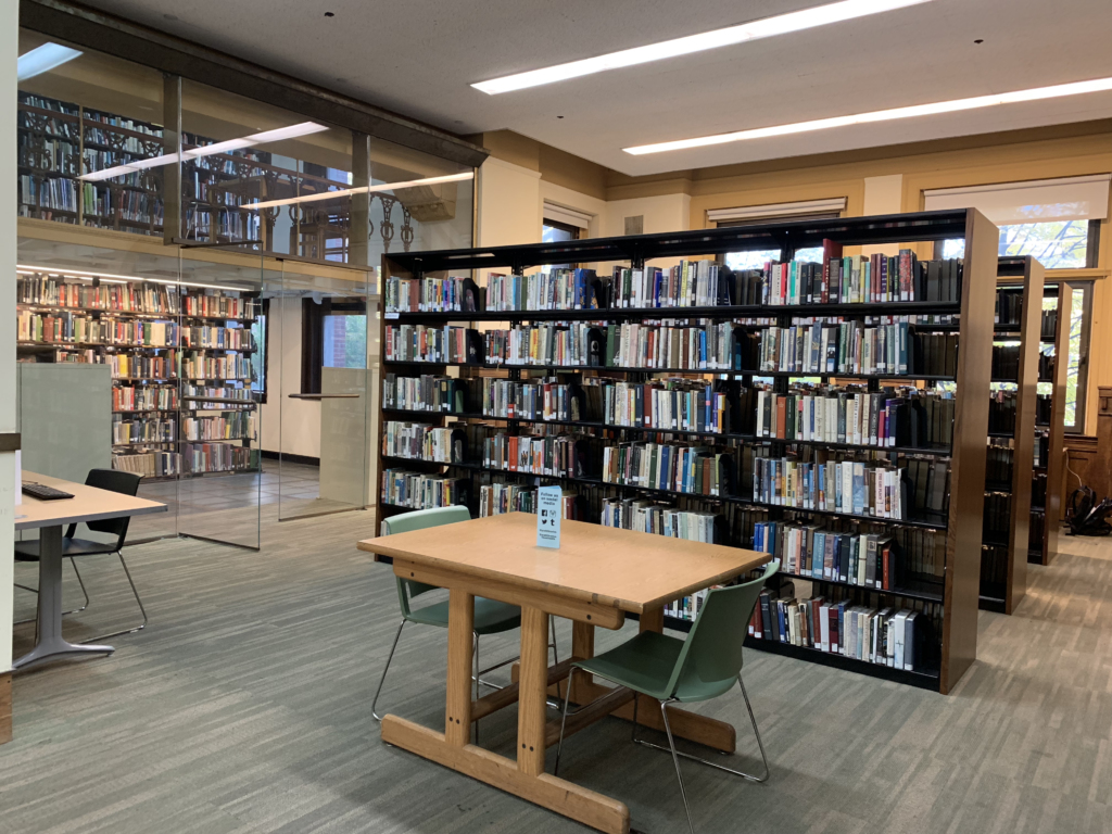
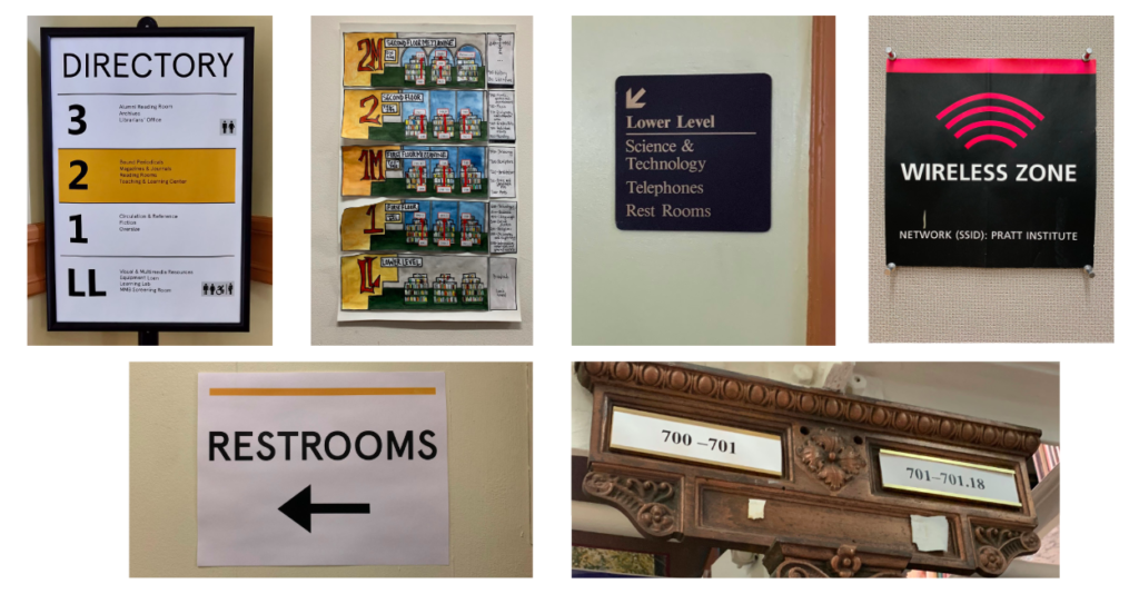
- General wayfinding is a challenge due to poor signage system
- Relevant information on services and library policies are difficult to find
- Locating books and general navigation of the stacks can be frustrating due to missing labels and unintuitive placement of stacks guide
- Not enough power outlets to charge personal devices
- Students enjoy comfortable couches and de-stress coloring table. An apparent desire for a place to relax
HONING OUR FOCUS
After our teams collaborated on research findings, we shifted gears and broke into another set of groups to undertake various proposals to enhance the library experience. I led the the physical space recommendations proposal.
Taking what we learned about users’ experiences within the physical space, our team visited the library two more times focusing on the library’s signage system and areas for improvement.
To help inform our recommendations for the Pratt Libraries physical space, we developed a user journey map based off of our cumulative research findings, employing real user scenarios and quotes.
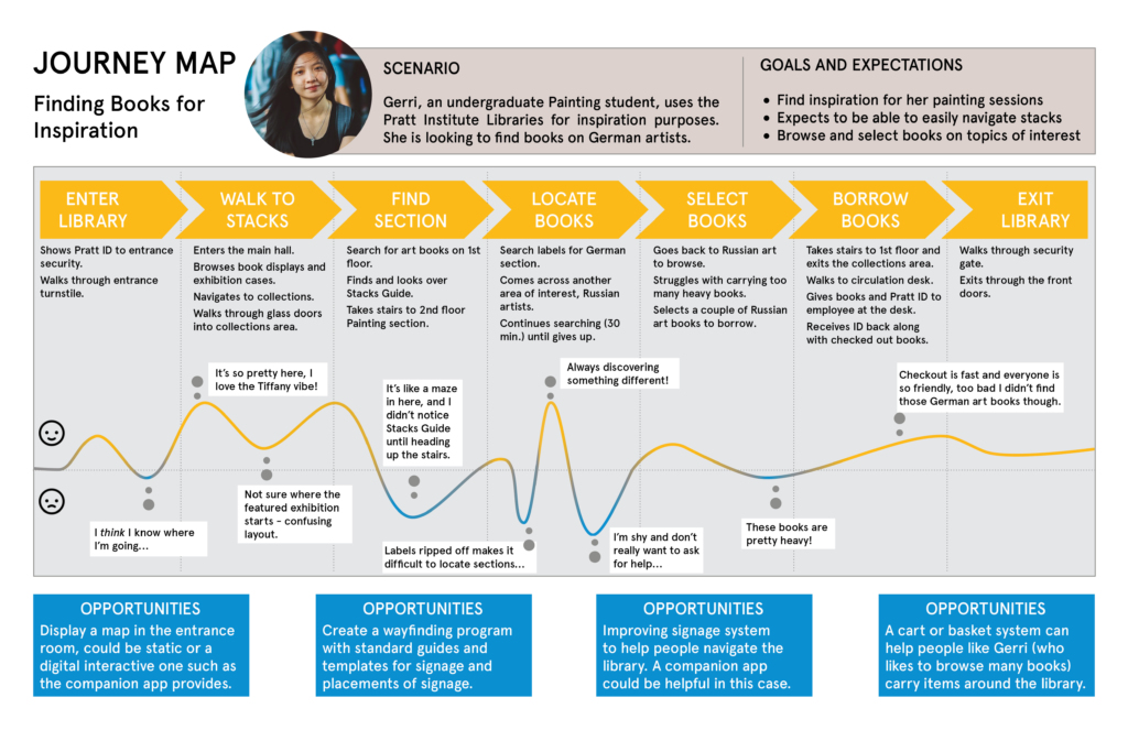
The opportunities highlighted along the journey map place an emphasis on improving the library’s signage and wayfinding system as well as offering tools to help library visitors along their journey, such as carrying baskets to lug heavy books around.
RECOMMENDATIONS AND DESIGN PROPOSALS
Creating a Signage System
We developed guidelines for best practices in creation of a signage and wayfinding system. Outlined below is summary of our guidelines:
KNOW YOUR SIGN TYPES AND DISTINCTION BETWEEN THEM
- Take stock of current signage (this can be done through a signage audit) and categorizing signs by purpose (Directional, Informational, Regulatory, etc.). Sign types should be visually distinct from one another which will help users know what kind of information a sign is providing with just a quick glance.
DESIGN TEMPLATES AND USE CONSISTENT VISUAL LANGUAGE
- Templates can help structure and provide a cohesive style while also enabling consistent and appropriate use of visual elements such as color, typography, and logo. These should adhere to the Visual Strategy Guidelines to ensure consistency across digital and static visual displays.
USE A POLITE AND FRIENDLY TONE
- Ensure an all-around positive experience by communicating information in a welcoming manner (especially important for regulatory signs).
AVOID SIGNAGE OVERLOAD AND KEEP PLACEMENT PROFESSIONAL
- Consider which signs you may not need and that can be handled in person (e.g. “no smoking” signs), as too many signs can decrease the effectiveness of a signage program. Ensure that signage reflects the professional standards and attitudes of the environment, avoiding paper signs taped to walls, doors, desks, etc. as they tend to wear out after a short period of time.
Because the Pratt Institute Libraries serve the Pratt community as a whole and provides space for other organizations within Pratt to share their voice in various flyers and informational posters, it is all the more important for the library to have its own signage program, establishing the unique voice, personality, and brand of The Libraries.
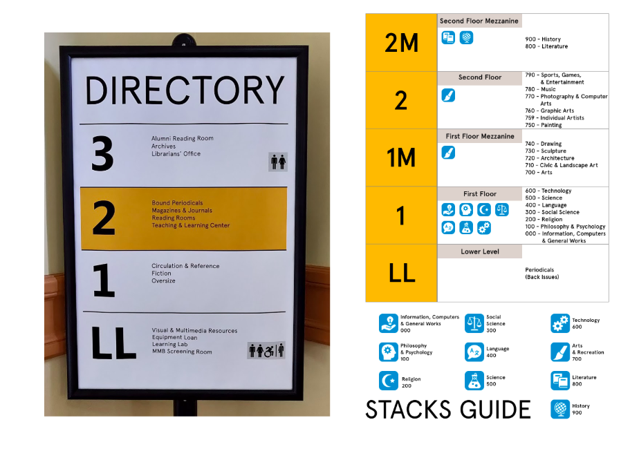
We designed an example concept for the Guide to the Stacks that employs similar visual language to the Directory, using color and typography from the Visual Strategy Guidelines and icons to help distinguish between subject areas. A further step would be varying icons by color, but color accessibility must be considered when doing so.
Further Recommendations
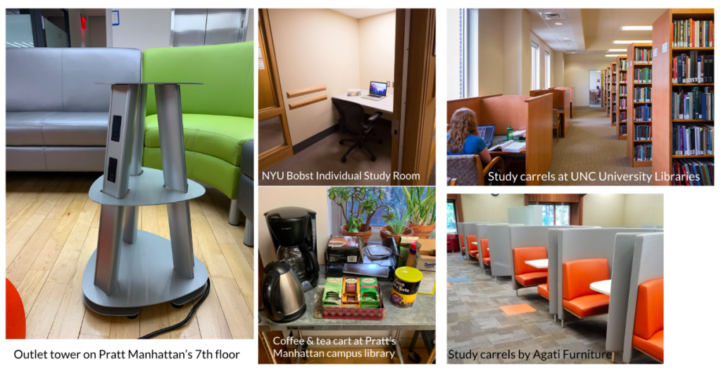
We provided basic further recommendations drawing on direct user quotes on what they’d like to see more of in the library space. These include:
- Coffee/tea station (the most common request)
- Single-person study desks (study carrels)
- Item baskets
- More outlets
- Comfortable seating (users complained about spending hours in uncomfortable plastic chairs)
DELIVERY
A goal for our final client meeting was not only to present our findings, designs, and recommendations, but to also provide our stakeholders with insight into our research and design process. We hoped for them to come away with an understanding of how to carry out this research in the future so that the librarians themselves could implement UX practices, consistently enhancing the Pratt Institute Libraries experience over time.
FINAL THOUGHTS
This case study focuses on just a portion of the Pratt Institute Libraries project, as other teams worked on designs for an updated website, content strategy, and an in-library mobile companion app. From our analysis of user research it was clear that library users have a lot to say about the physical space, which is why we gave it it’s own documentation in our deliverables.
Sometimes it’s the foundational aspects that are forgotten and become neglected. In the case of Pratt Libraries, it seemed that they were primarily focused with a website redesign that when we presented physical space recommendations it was like a veil had been lifted and they were seeing their everyday environment anew. As one librarian exclaimed “Baskets! Why didn’t we think of that!” This is the power of placing user research at the forefront of design decisions.
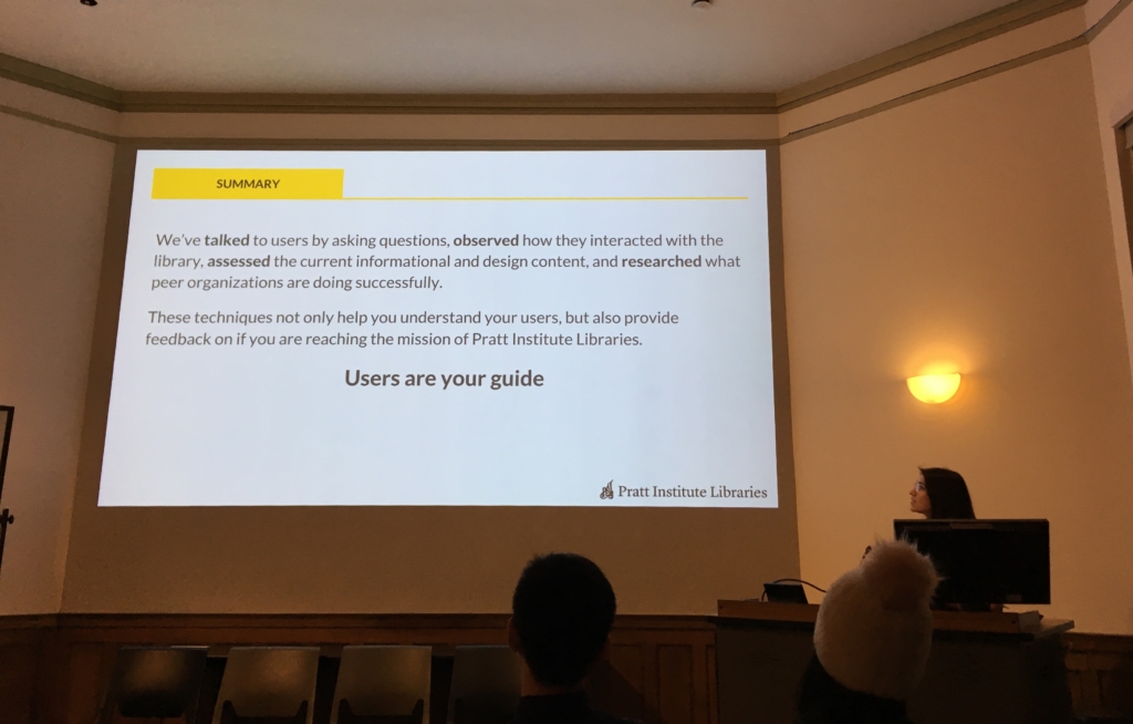
UX research techniques will not only help stakeholders understand their users, but also provide feedback on whether or not they are reaching their goals and mission.