Alexander Street Landing Page Redesign (Design Story)
August 22, 2019 - All
Project Brief:
The goal of this project was to ensure that the users of Alexander Street Press, a video and primary source archive for educational programming, were met with the highest possible satisfactory landing page. One that would aide in sign-up statistics and let the users know what it is that Alexander Street has that no one else does.
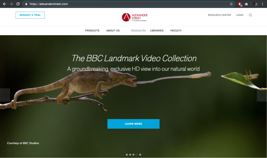
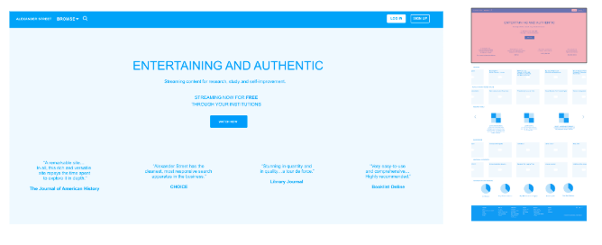
The Current Site:
Our Opportunity:
How might the Alexander Street marketing landing page serve our users better?
The Process:
User Research:

We had 4 main thoughts that we carried with us through our entire redesign process. Those being:
- Understand what drives people to seek out cultural or educational programming
- Discover which channels people use to watch video and how frequently
- Understand how people define educational programming versus entertainment
- Learn how much of priority self-improvement is for people in general
We conducted user research to try and find some answers to these questions. In trying to solve for these we implemented a number of different user tests and insight gaining methods.
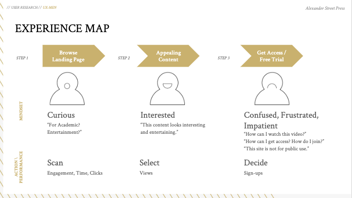
We created personas to try and get into the mind set of what a typical and an atypical user of the site might encounter while viewing the page. The use of a user journey map was also helpful when trying to get into the mindset of an Alexander Street User. 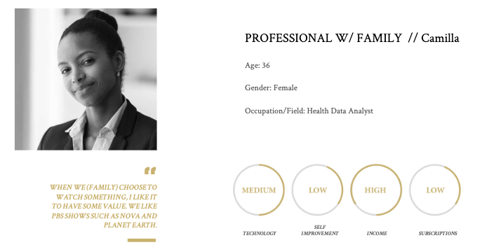
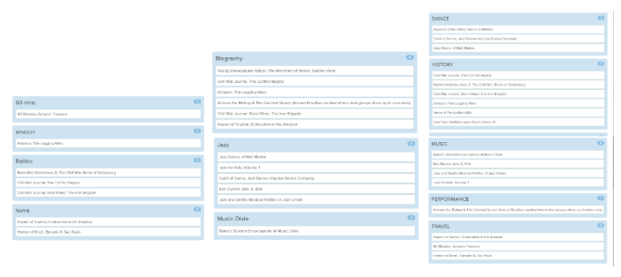
Card Sorting was done in order to see which content was most intriguing and most useful to the visitors of Alexander Street.
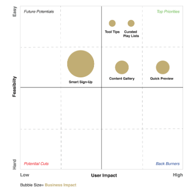
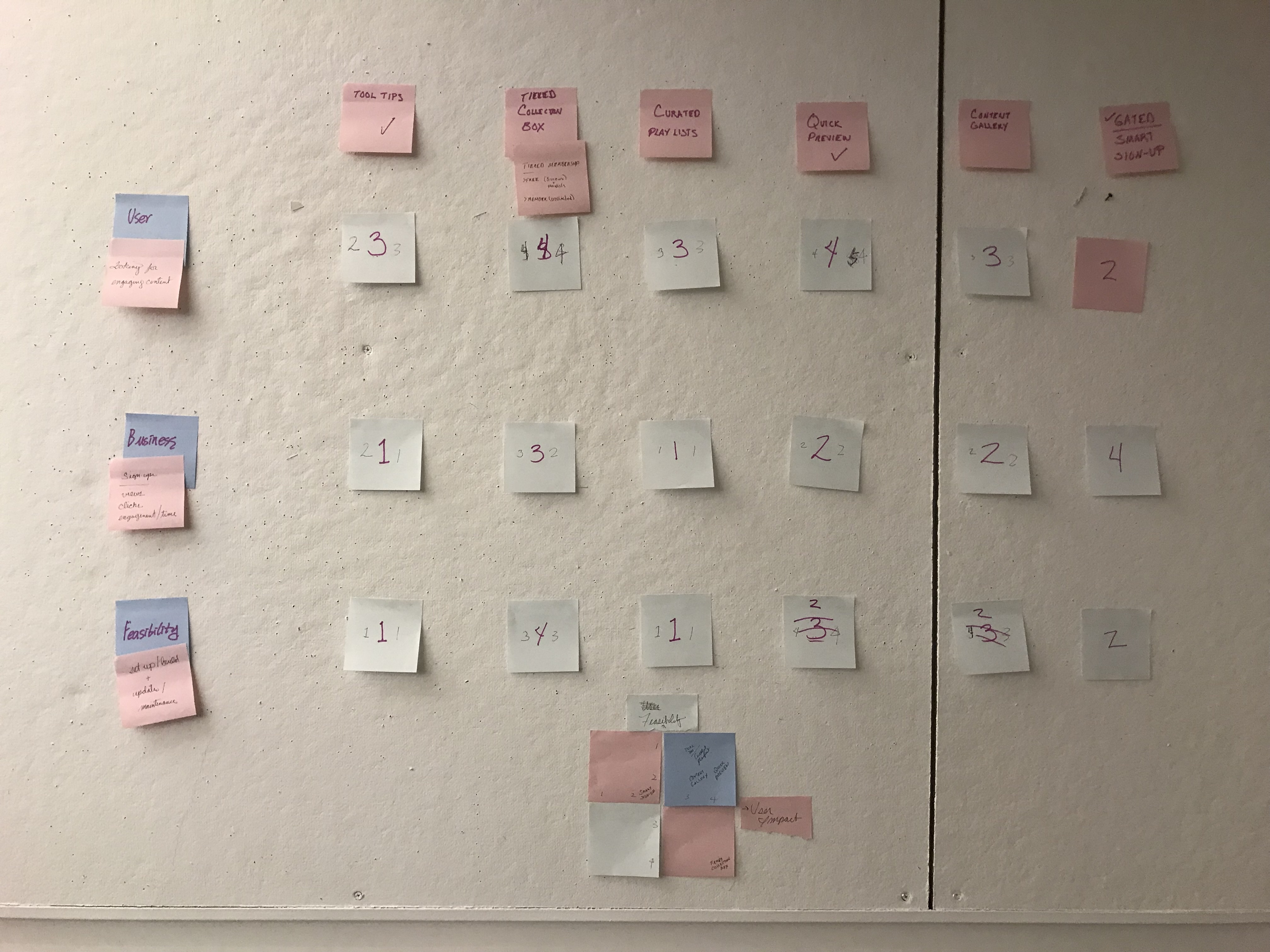
Through all of this we found a number of different features we saw could be implemented into the Alexander Street Site to make it more impactful for users.
From all of this we gathered a few key insights into our users.
- People often feel that self-improvement is a priority but don’t take action towards that goal.
- People have strong preconceptions regarding functionality for searching and playing videos.
- Users like engaging content, but can be turned off by packaging.
- People associate videos with unwinding and relaxing rather than an opportunity to educate themselves.
Content Structuring:
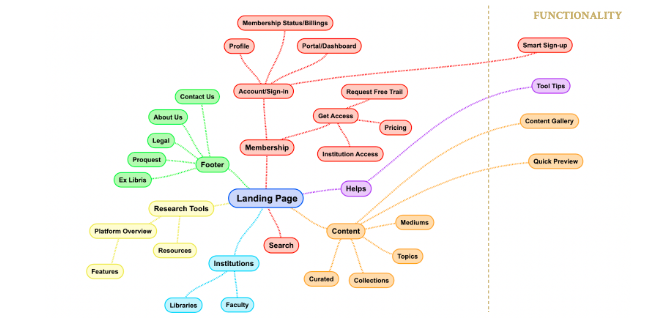
We developed an organizing principle for the content on the landing page.
The three main areas are:
- Membership
- Content
- Research Tools and Resources
We also have “Institutions” as an item for visitors from Libraries or Faculty because this site is currently geared towards them. We felt giving their messaging within the page a prominent position may confuse general visitors.
Competitive Analysis:
Through a competitive analysis we looked to other video services that had a similar layout to what we wanted, but the tone of each selected competitor was different from site to site. Our big three inspirations for login inputs and layout specs were Netflix, Kanopy, and TED.
Some Insights we gained:
- Having a visible and easy to locate account area of the page provides a clear signal to users that there is a membership component to the site.
- Breaking down the sign-in process into parts can be helpful if there are choices.
- It’s beneficial to provide a few different paths to browsing content. Some curation is particularly important if some users are not be familiar with a genre or topic.
Wireframe:
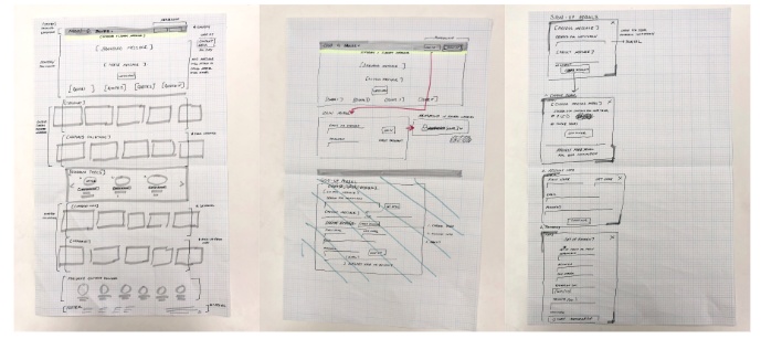
The start of our prototyping process began with a paper prototype, where we came up with general guidelines for all of the content that we wanted to appear on the page. Further into the process we refined the proportions and put in copy to reflect the tone that we wanted Alexander Street to express.
Final Design:
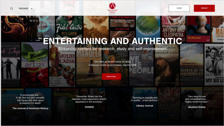
The final Design Proposal incorporates all of our features; curated playlists to show off the content, a smooth sign in process, and a streamlined explanation of some of the advanced features that Alexander Street has to offer.
Conclusion:
The entire design process is about constant push and pull. Iteration in every step of the process makes a small victory seem monumental. This in turn makes the process so fulfilling.