
Visualizing Violence Against Philippine Civilians in 2018
December 16, 2018 - All
About the Philippine War on Drugs
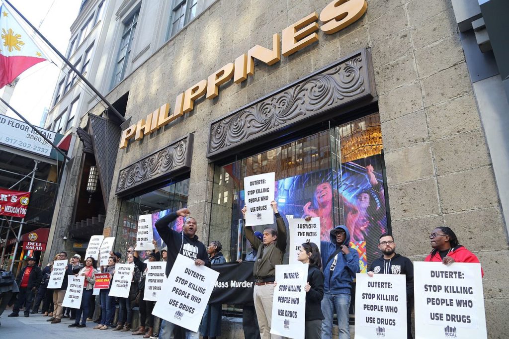
Since the instatement of current Philippine president Rodrigo Duterte in 2016, the country has been in a state of unrest. The large-scale drug war waging for the course of Duterte’s term is marked by state-sanctioned extrajudicial killings and threats of martial law (fig. 1). Governmental disinterest in transparency persists as human rights violations taking place in the Philippines continue to gain international attention.
The Duterte administration employs unsubstantiated statistics to support the president’s war on drugs, citing one million self-surrenders by drug dealers and users by the end of 2016 to evidence the “success” of the anti-drug campaign.2 Fallacious claims of facts-based, statistical support for the war on drugs in the Philippines are a persuasive tool, able to bolster the faith and support of those citizens most desperate for relief. Misinformation, no matter how unfounded, is powerful.
Well-founded information is, however, that much more powerful by contrast.
Inspiration and Goals
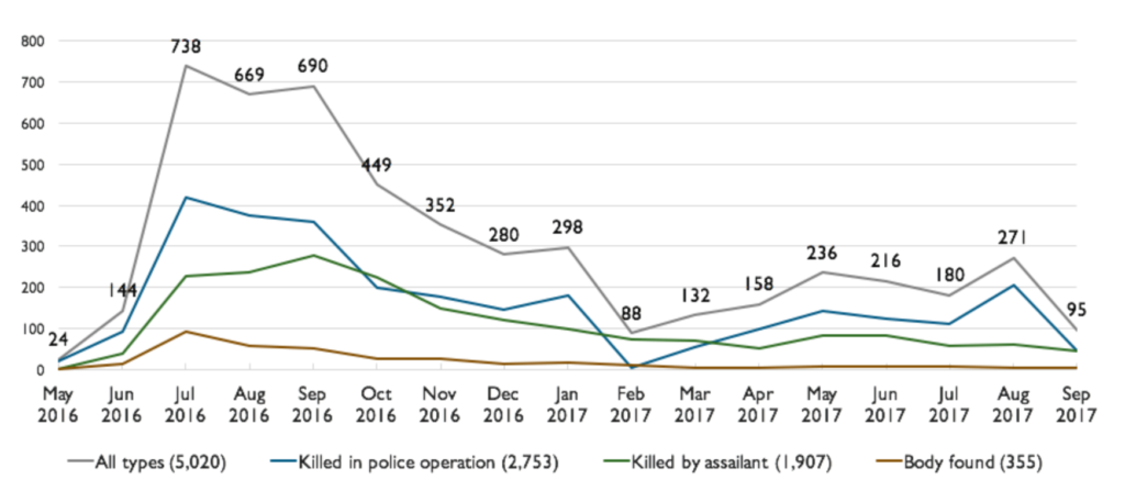
Groups like the Armed Conflict Location & Event Data Project (ACLED) and The Drug Archive work to document and share accurate information about conflict and human rights violations.3 While ACLED researches, maps, and provides data about conflict worldwide, the Philippine-based Drug Archive research team focuses specifically on Philippine issues. They are currently assembling a dataset regarding Duterte’s anti-drug campaign, which will be made publicly available in the future. In the meantime, they continue to disseminate information and findings through reports and visualizations (figs. 2, 3).
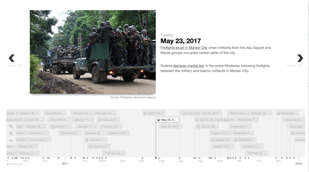
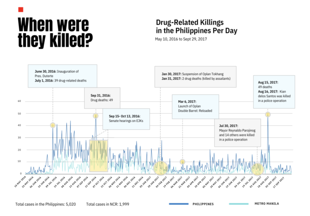
The visualizations available from The Drug Archive are mostly drawn from information between 2016 and 2017. Drawing inspiration from The Drug Archive and with data from ACLED’s publicly available conflict dataset generator, I sought to create a visualization to explore crisis data for the 2018 year.
Planning, Tools, and Resources
ACLED’s event data has geospatial fields, so mapping the locations of incidents of armed violence against Philippine civilians on Carto DB was an appropriate choice.
Tools |
|
| Type | Name and Source |
| Plain-text editor | Sublime Text |
| Integrated Development Environment (IDE) | R Studio |
| Spreadsheet Software | Microsoft Excel |
| Visualization Software | Carto DB |
Datasets and Resources |
|||
| Agency / Individual | Source | Dataset / Resource | File type |
| Ralph Quirequire | Davao City Dabbler | Philippine Regional Boundaries | .zip (.cpg, .dbf, .shp, .shx) |
| Armed Conflict Location and Event Data Projects | Armed Conflict Location and Event Data Project Dataset Generator | Anti-Civilian Violence in the Philippines (2018) — mined from media coverage | .csv |
| ACLED General Guides | ACLED Codebook | ||
Preparing and Visualizing the Data
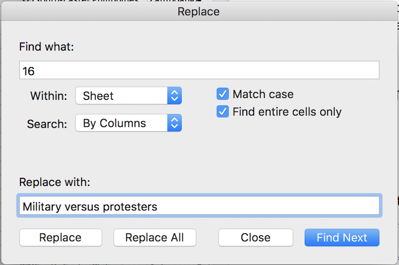
To generate my dataset, I limited the event range to 2018. This would provide a manageable amount of data while still spanning enough time to recognize broad patterns. Numeric codes had to be replaced with strings that I could quickly understand while organizing the data into a file to import into Carto (fig. 4). I grouped some data together for simplicity (e.g. combining current government employees with former government employees as having “government affiliation”).
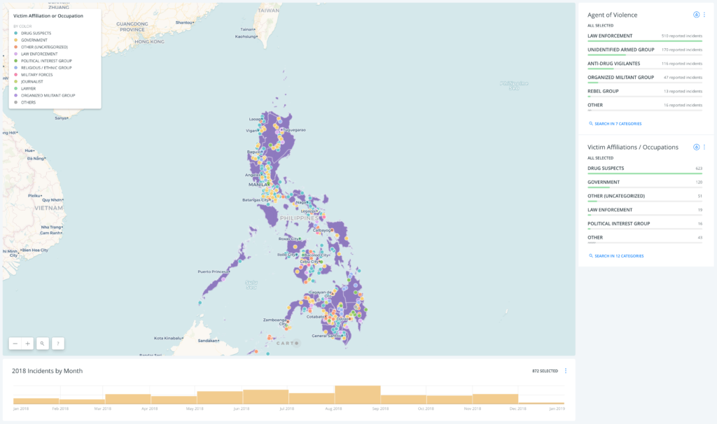
As this was intended to be an exploratory visualization, I wanted to avoid getting lost in the weeds with more information than was needed, keeping the Carto map to two layers, three filtering options, and at least initially sticking to automatically generated key colors (fig. 5). A tooltip feature was added to contain descriptions of events selected by point.
Outliers and Insights
The amount of data points was sufficient to identify clusters, patterns, and trends. The concentration of encounters with “drug suspects” near Manila , a massive urban center, was expected. Some outliers were discovered, however, when focusing on filtering conflicts by less represented agents.
When the events are filtered by the acting agent of anti-drug vigilantes, victims are narrowed to only two types — drug suspects (which was expected), and one lawyer (which was not expected) (fig. 6).
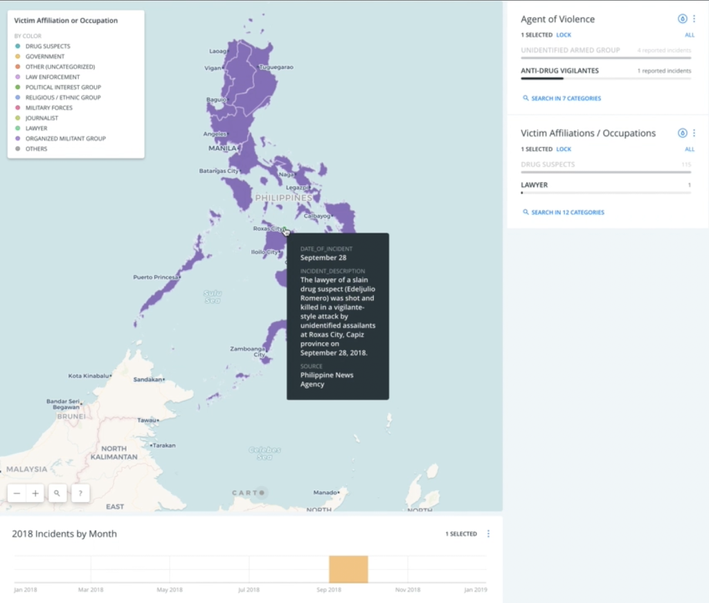
“The lawyer of a slain drug suspect (Edeljulio Romero) was shot and killed in a vigilante-style attack by unidentified assailants at Roxas City, Capiz province on September 28, 2018.”
— Philippine News Agency, September 28
Outliers like this demonstrate how important it is to continue building and interpreting data surrounding political conflict.
Revisions and Future Development
Ideas for expanding this project seem straightforward: incorporate a broader date range of data, find related datasets for relevant layers, and provide more context and sorting ability through widgets that provide context or identify crisis indicators.
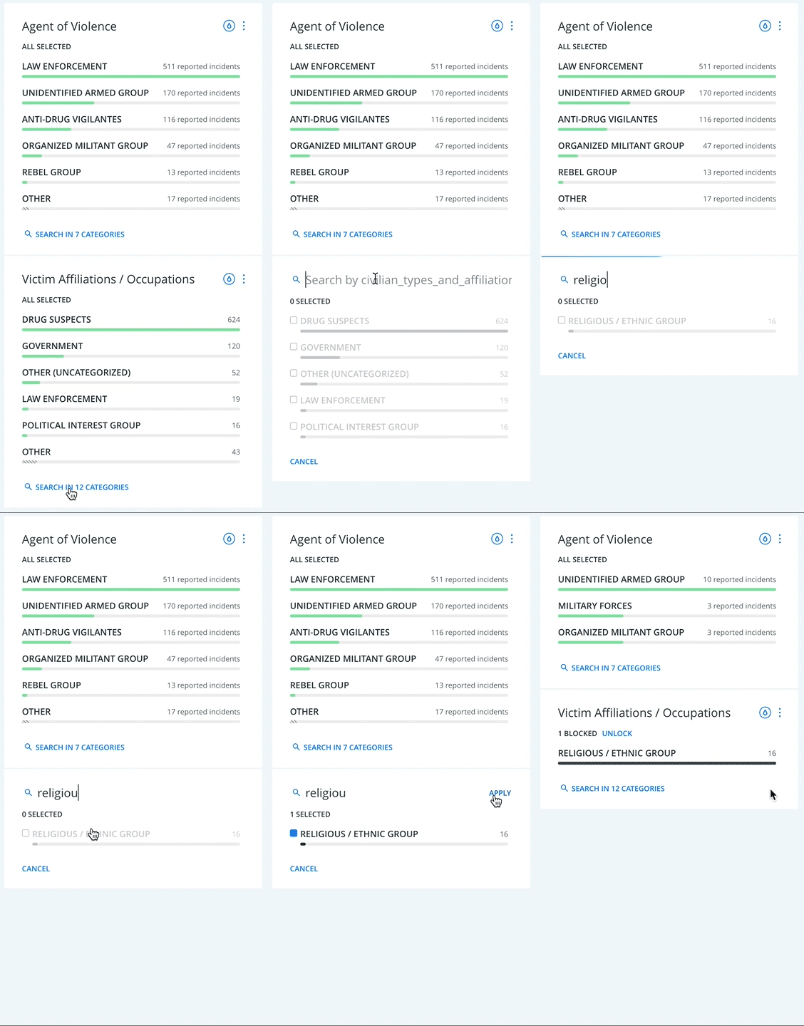
However, even with the small dataset used for this exploratory visualization, there were too many types of actors to be aware of them all at once. For example, even if it were more clear that additional filters exist, one would have to know what they are looking for to search for them (fig. 7).
Other similar issues, such as the legend items being difficult to see and differentiate from one another, risk compounding significantly upon adding additional information.
Executing creative design solutions for these issues will require additional learning and experimentation with Carto’s developer tools and resources (which is my intention).
View the interactive visualization here.
Additional Reading and Sources
1. David, Clarissa C. et. al. Building a dataset of publicly available information on killings associated with the antidrug campaign. The Drug Archive. Retrieved from https://drugarchive.ph/post/14-antidrug-dataset-public-info-killings.
2. Philstar. “Drug war surrenderers breach 1M mark,” January 1, 2017. Retrieved from https://web.archive.org/web/20171211174837/http://www.philstar.com/headlines/2017/01/01/1658665/drug-war-surrenderers-breach-1m-mark.
The post Visualizing Violence Against Philippine Civilians in 2018 appeared first on Information Visualization.