
Visualizing the World of Pokemon: A Tableau Project
December 16, 2018 - All
Introduction
The Idea
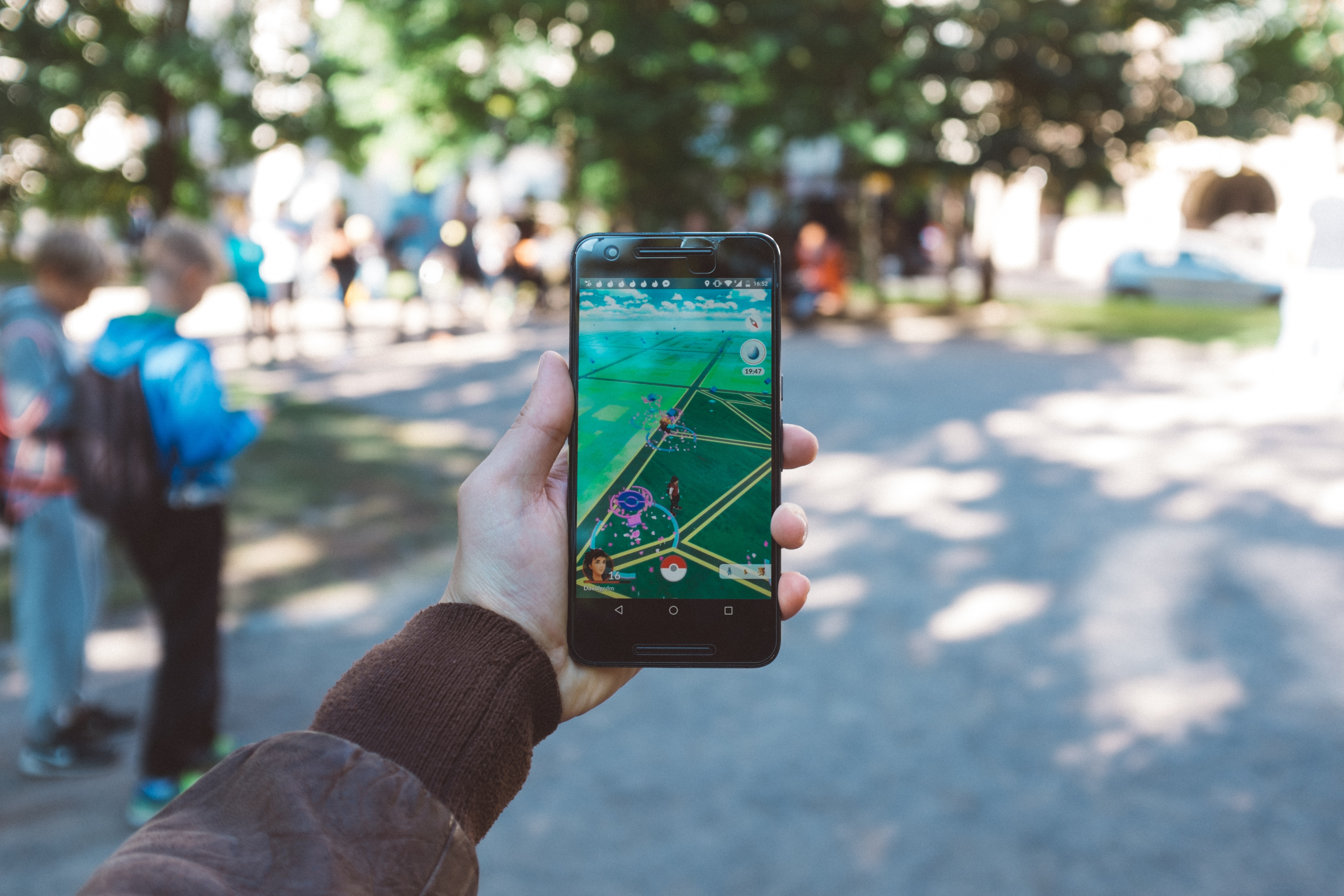
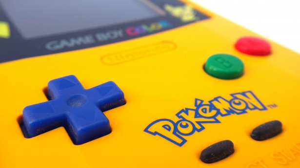
Growing up in the late 90s, we, Sanchit and Naman, were exposed to the wonderful world of Pokemon, when it first came out in black and white on the Nintendo Gameboy. The graphics were terrible we both admit, but the concept was so alluring that it started a whole revolution. Soon, there were Pokemon trading cards, plush toys, stickers, you name it! So powerful was this revolution and so intense was the fandom, that even today, 22 years after the first game, people are still absolutely head over heels for it, with no signs of these positive emotions diminishing. This December of 2018, shortly after the release of ‘Pokemon Let’s Go Pikachu/Eevee’, the new games for the Nintendo Switch, we were in a very ‘Pokemon’ mood this winter, and were quite enthusiastic about working on a project displaying some powerful data visualizations to help Pokemon fans geek out completely and asses their arsenal of Pokemon versus their rivals. So then we began our journey looking for a good dataset consisting of 7 generations of Pokemon and their statistics.
Goals
The main goal for our ‘Poke-project’ was to provide Pokemon fans, both novice, and advanced, a powerful array of dashboards that would help them quickly visualize important stats such as ‘Attack’, ‘Defense’, ‘Special Attack’, ‘Special Defense’, ‘Speed’ and ‘HP’ and analyze them or compare them across various Pokemon, their various types or their generation. Our aim was to create dashboards that not only advanced Pokemon fans, but even complete novices would easily understand and use for their benefit and become stronger Pokemon trainers in their respective journeys. To ensure achieving our goals, we utilized User Experience methods to assess the usability of our dashboards by obtaining feedback from actual users, which we will detail out in the sections to follow. We also selected the ‘Tableau’ tool for our project as it is the industry standard and it has excellent features that can help create and customize visualizations.

Materials
Tools
- OpenRefine – A tool for working with messy data: cleaning it; transforming it from one format into another, and extending it with web services and external data.
- Tableau Public – A free software that can allow anyone to connect to a spreadsheet or file and create interactive data visualizations for the web.
- Microsoft Excel – A spreadsheet software by Microsoft, part of the MS Office suite.
- Kaggle – It is an online community of data scientists and machine learners, owned by Google Inc.
Dataset
Pokemon Dataset – This dataset contains information on all 802 Pokemon from all Seven Generations of Pokemon. We downloaded this dataset from Kaggle.
Process
Selecting the Data Set
After brainstorming together and going through a lot of free data source websites online, we both found a dataset that was of our interest. The dataset we found contained information on all 802 Pokemon across all 7 Generations. This dataset was available in a Comma-Separated Value (CSV) format.
Refining the Data Set
After we downloaded and analyzed the dataset, we found that it required some cleaning. This is where we decided to use Google’s OpenRefine, which is a great data cleanup tool. Firstly, we removed some columns from the dataset that we did not need for our visualizations. Another finding was that the fields for Pokemon stats, such as HP, speed, attack, defense, etc., were of ‘String’ data type. We, therefore, changed their data types to ‘Numbers’. This completed our first step of data cleanup and prepared us for our next steps.
While we were planning our story of visualizations, we wanted to make two dashboards that focused on average Pokemon stats by type (‘Fire’, ‘Water’, ‘Grass’ etc.) and average stats by generation (1 through 7). This is where we realized that we need to restructure the raw dataset in order to create the necessary visualizations. To perform the restructuring, we transposed all stats like speed, special attack, special defense, etc. for each Pokemon, using the ‘transpose cells across columns’ feature of OpenRefine. Once the restructuring was complete, we imported the newly created dataset in Tableau to create our visualizations.
Creating Visualization Using Tableau Public
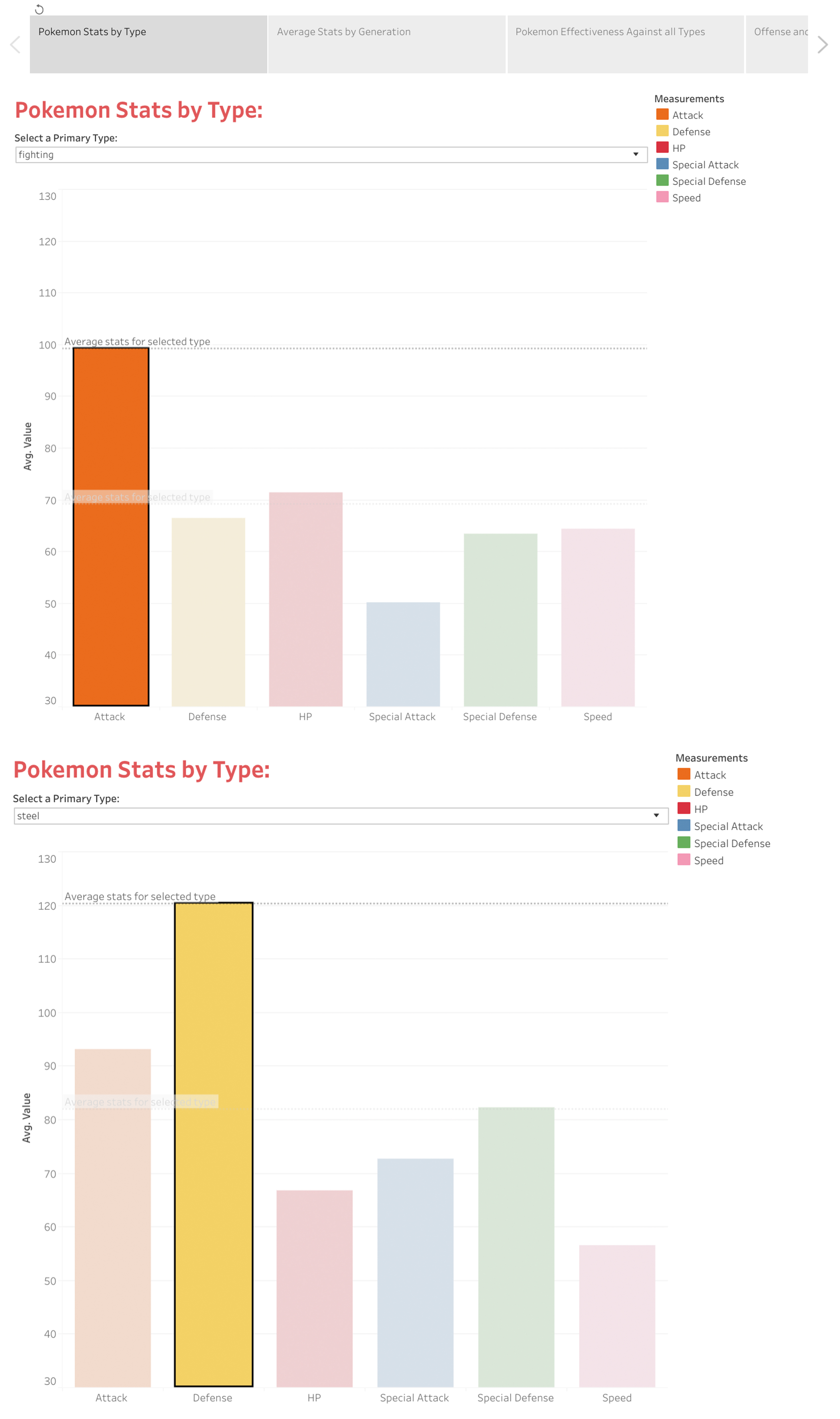
Since the beginning of this step, we had a clear picture of how our final output should look like and what all types of visualizations we will include in our dashboard/story. At first, we made a visualization which focused on Pokemon stats by type. This visualization had a bar graph where the users could see the average stats like speed, special attack, HP, etc. of all Pokemon types. For making this visualization, we had to use the transposed dataset that we had created earlier. We also added an average trend line from the ‘Analytics’ tab in this visualization that displayed the average of all the 6 stats of the selected type.
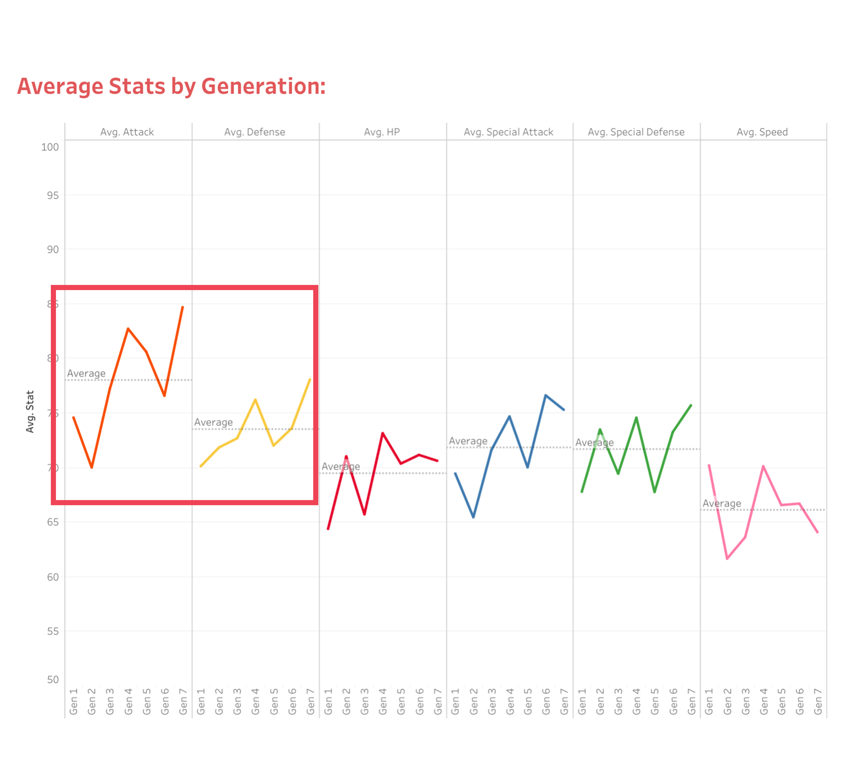
After this, we moved to our second visualization which showed the average stats by generation. This visualization also required the use of the transposed dataset. This visualization was a line graph which displayed the average stats of all the Pokemon across 7 generations. We chose line graphs for this visualization because we thought that rise and fall of lines would clearly show how the Pokemon have evolved over the 7 generations. In order to show the average of all stats, we added an average trend line from the ‘Analytics’ tab.
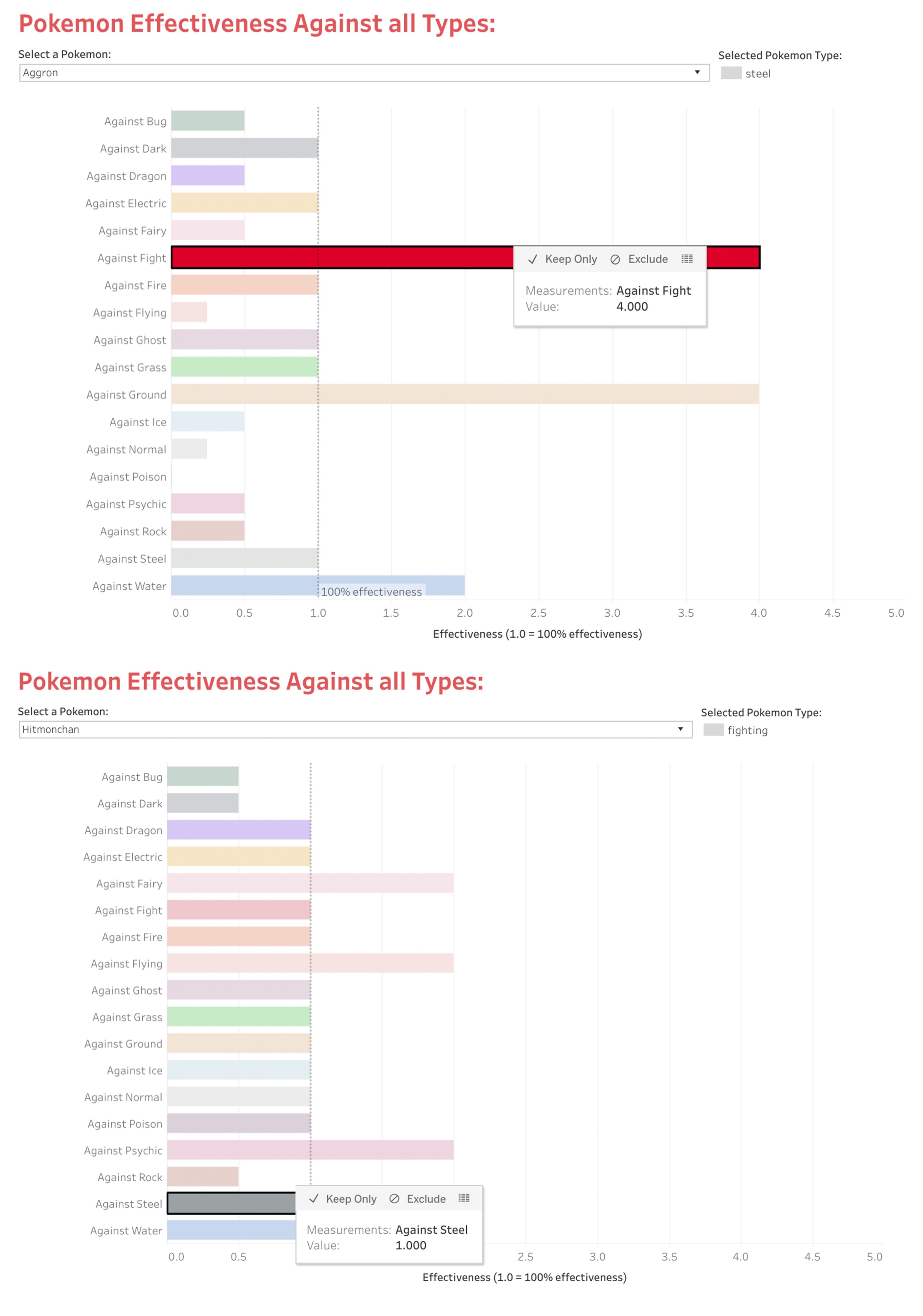
Next in line was the third visualization which was related to the Pokemon effectiveness against all types. This is where we used the dataset that we created in the first round of cleanup. We thought that Pokemon fans might want to see how effective a particular Pokemon will be against other types of Pokemon. So to help them out in making the right decision, we created a visualization using bar graphs where they can select a Pokemon and see how effective it will be when it is in a battle against a Pokemon for another type. The selection dropdown had a list of 802 Pokemon across 7 generations. In order to make the visualization more usable and understandable, we added a trend line passing across the value 1.0 on the x-axis, which represented a 100% effectiveness. This would help users easily understand super-effectiveness (> 1.0) or ineffectiveness (<1.0).
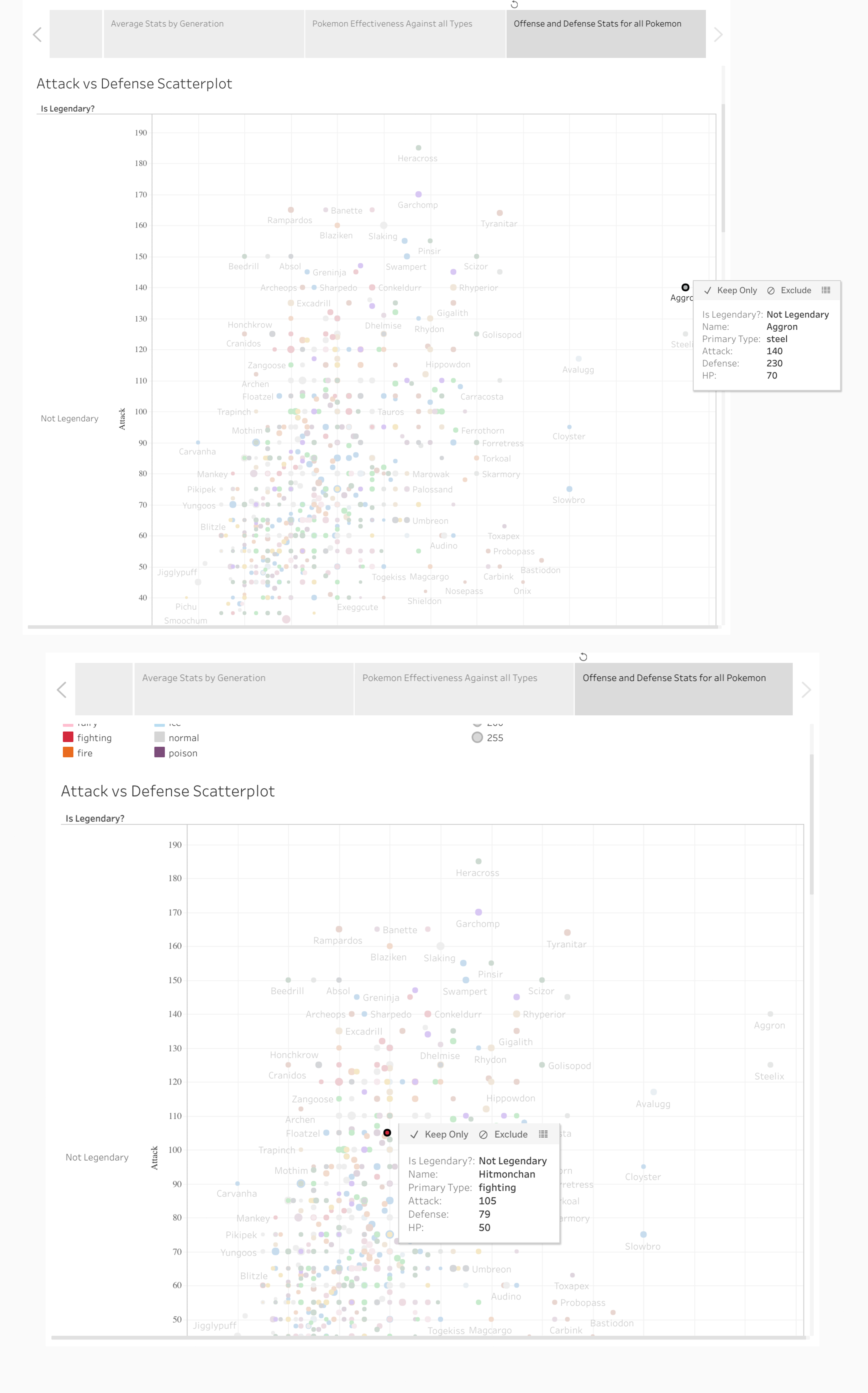
Moving on to the last visualization, we decided to showcase a scatterplot consisting of offensive and defensive stats of all Pokemon. In this visualization, we made two different scatterplots, one focusing on attack vs defense stats and the other one focusing on special attack vs special defense. We combined these two scatterplots into one single dashboard. The dots on the scatterplot were color-coded by the primary type color pattern. Also, the size of the dots varied according to the HP of the Pokemon – Higher the HP, bigger the dot size. In the end, we separated the scatterplots into two different Pokemon categorizes – legendary and not legendary because 802 Pokemon were too many to display on one plot. Splitting into these categories helped lower the number of plots to an acceptable amount.
We followed a similar color pattern for all the visualizations that we created for this project. Those color patterns were taken from Bulbapedia – community-driven Pokémon encyclopedia – a favorite of the Pokemon fanbase. After all the visualizations were ready, we gave them all proper labeling and improved the visual aesthetic. Once everything was in place, we mapped out the visualizations in a way we thought would be the best to represent this data. We made a story having 4 different tabs, each consisting of a dashboard from the above-mentioned list.
UX Research
Methodology
We leveraged User Experience techniques to assess the usability of our dashboards in order to obtain feedback from actual users. We selected a combination of In-Person & Remote User Testing as the method of choice and used the Think-Aloud protocol, which involves users speaking out their thoughts while performing tasks on the given interface. A total of 6 users were recruited for the tests, and we conducted two rounds of user testing with 3 participants each.
Since the goal of our visualization was to aid Pokemon fans in their journey, regardless of whether they were advanced or novice trainers, our recruitment strategy involved screening for participants that were:
- Aware of the Pokemon and what it is all about
- Aware of how Pokemon are categorized (not necessary to know all categories)
- Interested in starting or already pursuing a Pokemon journey in one or more of the several Pokemon games offered by Nintendo.
To make sure we got the right people to test our visualizations with, we created a screening questionnaire and floated it around our social media for recruitment.
As per our plan, the first round’s user feedback was to be used to uncover usability issues and make improvements and changes to the dashboards. The second round was organized to validate the first set of changes and uncover any additional usability issues that the dashboards suffered from, followed by the second iteration of improvements.
Tasks
For the user tests, we carefully crafted 9 tasks for users to perform on our visualizations. The tasks that we defined for our study are as follows –
Tab 1 – Pokemon Stats by Type
- Task 1: Take a few moments to look at the ‘Pokemon Stats by Type’ dashboard. What do you think the visualization is about?
- Task 2: Use the visualization to compare ‘Ghost’ type and ‘Normal’ Type. Which do you think is more powerful overall?
Tab 2 – Average Stats by Generation
- Task 1: Take a few moments to look at the ‘Average Stats by Generation’ dashboard. What do you think the visualization is about?
- Task 2: Use the visualization to determine which generation of Pokemon had the best speed stat.
Tab 3 – Pokemon Effectiveness Against all Types
- Task 1: Take a few moments to look at the ‘Pokemon Effectiveness Against all Types’ dashboard. What do you think the visualization is about?
- Task 2: Use the visualization to find out which Pokemon is more likely to emerge as the victor in a battle out of ‘Dragonite’ and ‘Articuno’
Tab 4 – Offense and Defense Stats for all Pokemon
- Task 1: Take a few moments to look at the ‘Offense and Defense Stats for all Pokemon’ dashboard. What do you think the visualization is about?
- Task 2: Use the visualization to determine which Legendary Pokemon has a very low Attack, but a very high Defense.
- Task 3: Use the visualization to determine which non-legendary Pokemon has the highest Special Attack.
Findings & Improvements
First Iteration:
The absolute first feedback point we received was with respect to the header of the Tableau story. We had titled all the dashboards within the story very carefully and aptly, but we had overlooked the title of the story as a whole. To remedy this, we asked the users for recommendations and came to our final title – “Visualizing the World of Pokemon” (Fig 1).
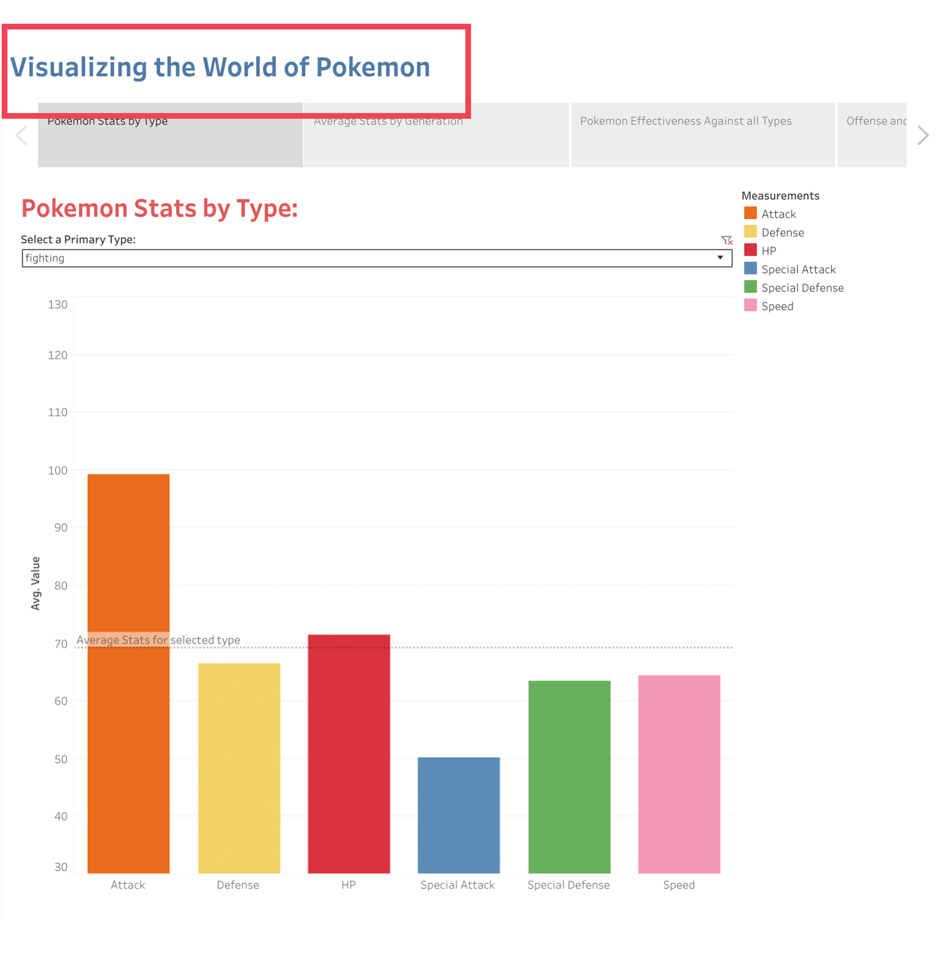
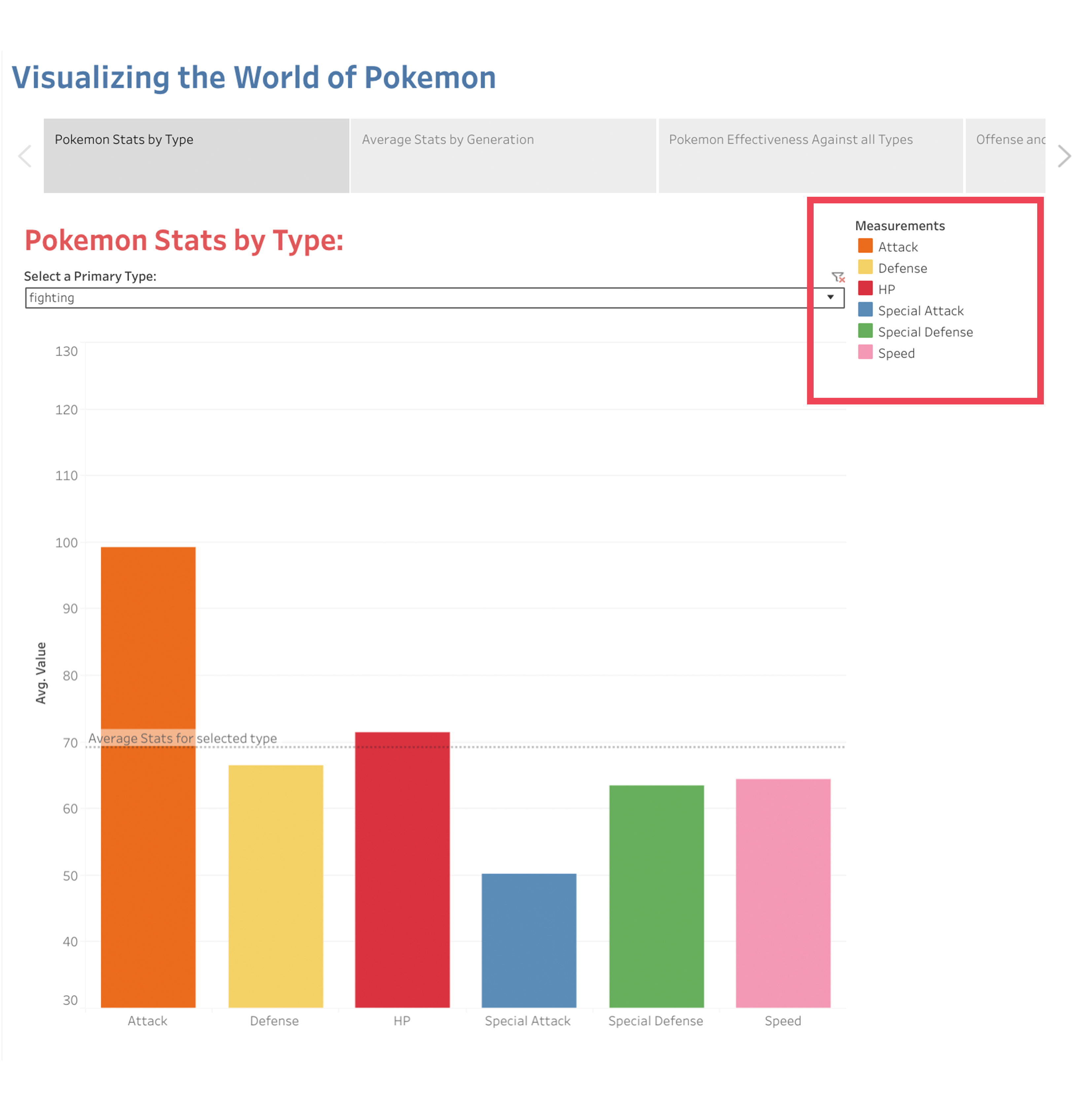
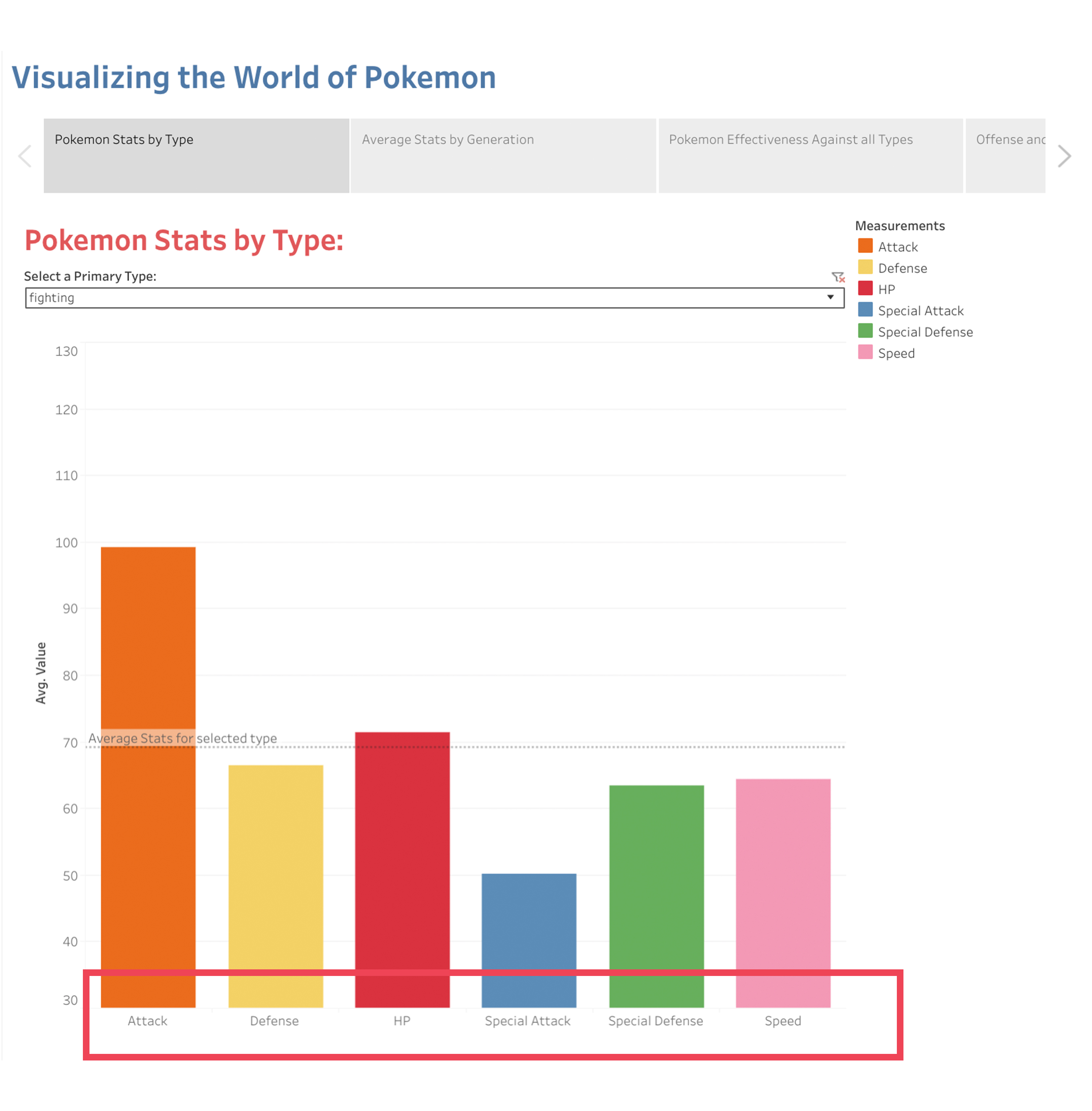
Another finding from the first round of user testing was that the users felt the need for a legend for the ‘Pokemon Stats by Type’ dashboard. Since the visualization consisted of long vertical bars, kept intentionally so as to showcase the numeric value associated with each, the x-axis would go below the fold. Two users did not scroll down and asked us what the colors of the bars represented. Therefore, to improve the usability of this visualization, we deemed it fit to include a legend that would indicate what each color represented, for example, Red was the Pokemon’s HP, Orange was the Attack etc. (Fig 2).
For the ‘Pokemon Stats by Type’ dashboard, we also found that users were confused by the sudden change in the order of stats every time they made a new selection. This was happening due to the fact that Tableau was automatically sorting the stats on the x-axis in descending order of magnitude. We fixed this problem by adding a permanent Alphabetical sort order of the stats on the x-axis so that even if users would select a different type, the order of stats would remain unchanged (Fig 3).
When users were looking at the third tab in our story, which consisted of the dashboard – “Pokemon Effectiveness against all Types”, some of them pointed out that the presence of a legend was making the visualization too cluttered. Furthermore, due to the horizontal bar chart layout of the visualization, the users could clearly see the y-axis labels. There was hence, no benefit for having a legend and it only added to the visual load for users. The best way to tackle this was to remove the legend and make the visualization cleaner and hence, easier to process.
Second Iteration:
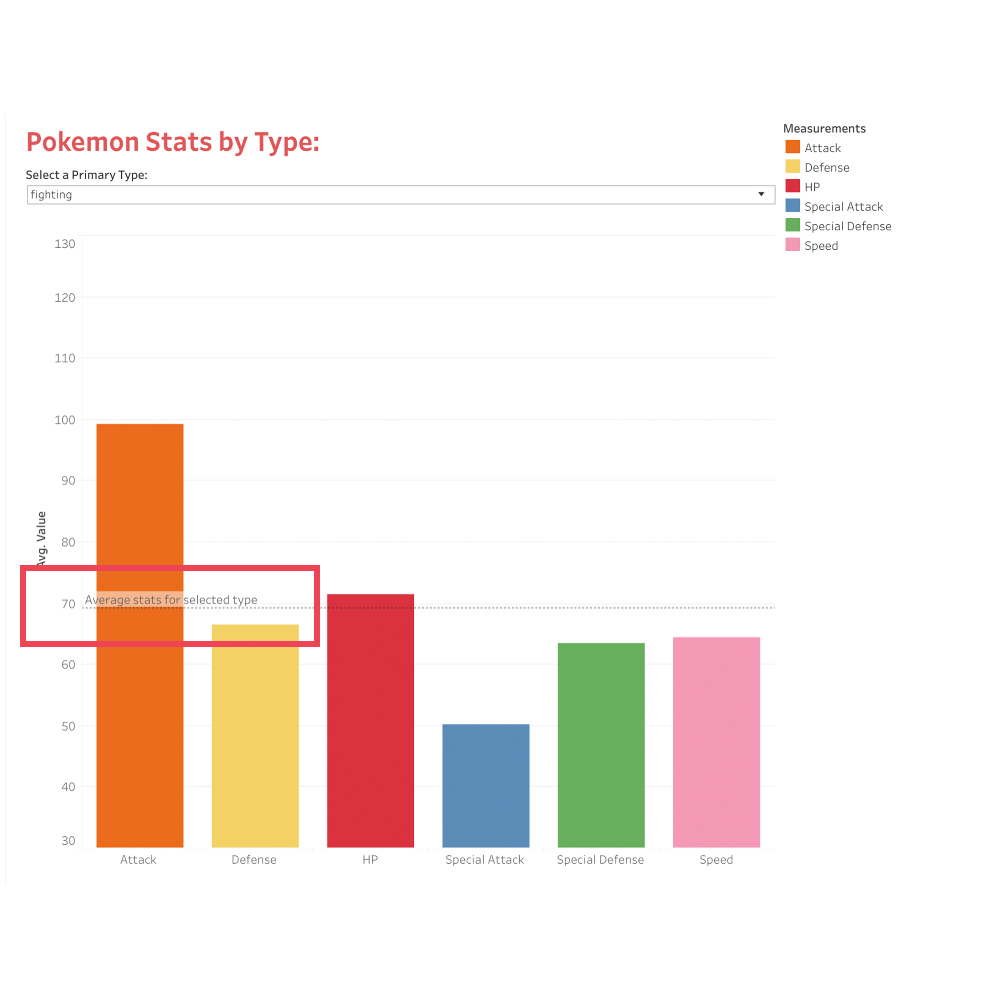
Once we had made improvements to our visualization after our first round of user testing, we proceeded with another round, to validate our changes and to uncover any further usability issues. We first found that users did not understand what the label ‘Average’ meant for the trend line within the ‘Pokemon Stats by Type’ dashboard. Our intention was to display the average of all the average stats (HP, Attack, Defense etc.) for the selected type, but the users were a little confused and seemed to think that it was depicting the average across all types. Therefore, we decided to rename the label to ‘Average Stats for Selected Type’ to eliminate any confusion (Fig 4).
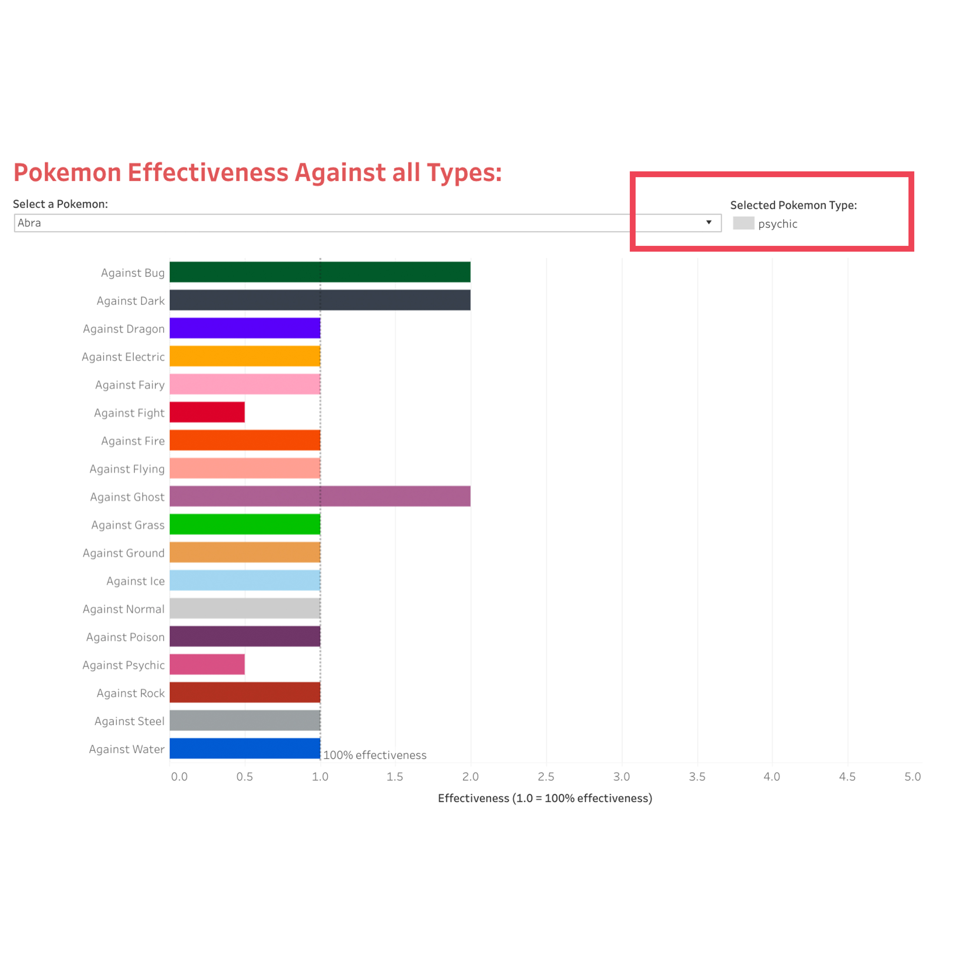
Under the ‘Pokemon Effectiveness Against all Types’ dashboard, we discovered that all three users felt the need to also know the type of the selected Pokemon, apart from the effectiveness values. To meet the users’ needs, we included a legend in the visualization that displayed the selected Pokemon’s type and would auto-update every time the user changed the selection (Fig 5).
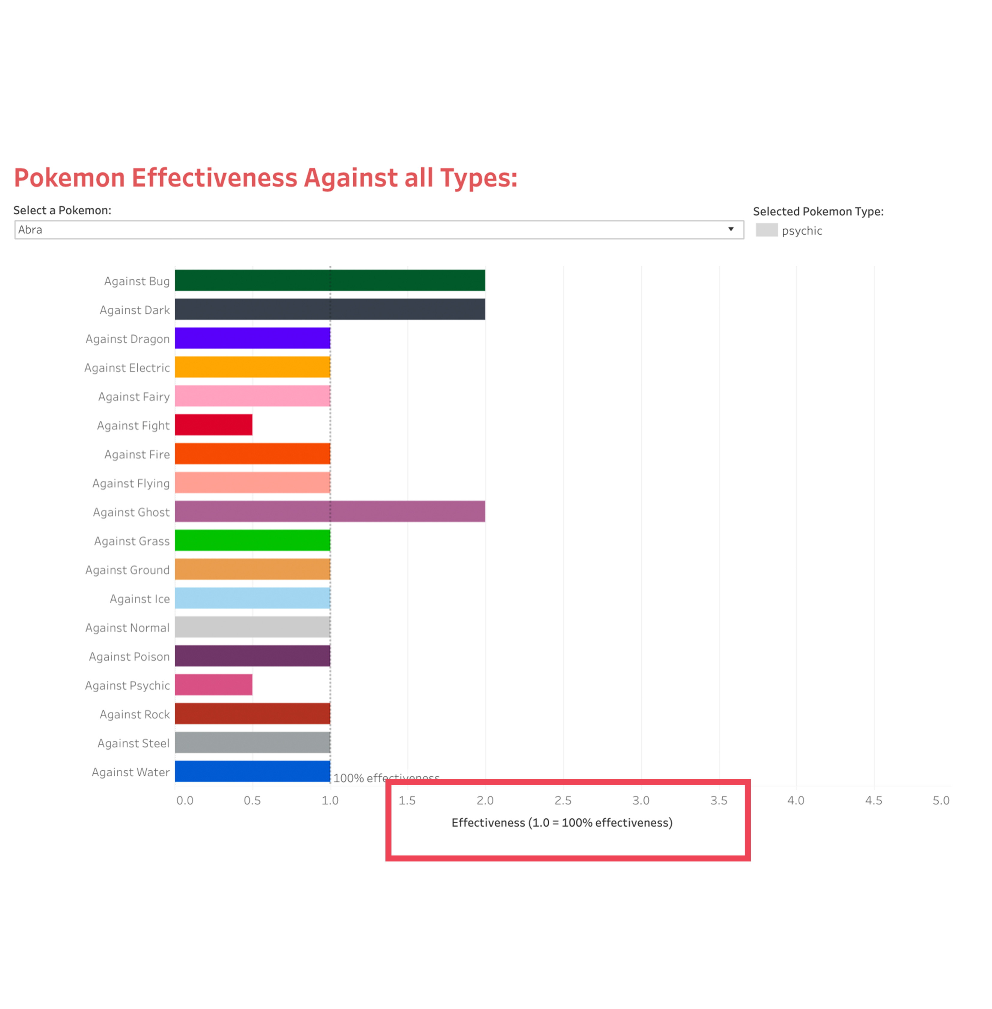
Finally, we found that for the ‘Pokemon Effectiveness Against all Types’ tab, users felt that the x-axis label was not intuitive. We, therefore, renamed it to ‘Effectiveness’ and also gave an example of what the x-axis values meant – ‘1.0 = 100% effectiveness’.
User Testing Conclusion
We concluded our UX Research after the two iterations of user testing with three users each and we incorporated all the necessary changes with respect to the findings into our final visualization. This process significantly boosted our confidence in our final product, the details of which are described in the following section.
The Visualization
View our project in action: Visualizing the World of Pokemon
Overall, it is interesting to see how a complex sheet of data got converted into a usable and understandable visualization. Talking about the first visualization in our story that focuses on ‘Pokemon stats by type’, it is surprising to see how each type is so different than the other. Taking the example of two Pokemon types – fighting and steel, the former has a higher attack as compared to the latter, but in terms of defense, the latter is more powerful than the former. So this can help users predict that if a fighting type Pokemon attacks a steel type Pokemon, it won’t affect the steel type Pokemon much because of high defense levels (Fig 7).
Jumping on to the third visualization ‘Pokemon Effectiveness Against all Types’ which measures a Pokemon effectiveness against all types. Let us again take the same example of a fighting type vs steel type Pokemon. For fighting type, take Hitmonchan and for steel type, select Aggron. When we select Hitmonchan (fighting type), we can see that its effectiveness against steel Pokemon is 1.0, which means that it is 100% effective. On the other hand, Aggron (steel type) has a 4.0 effectiveness against fighting type Pokemon. So this implies that Aggron or any steel type Pokemon will be more powerful when it battles against Hitmonchan or any other fighting type Pokemon, provided the attack made is a standard attack instead of a special attack (Fig 8).
Moving on to the fourth visualization and analyzing the ‘offense and defense stats for all Pokemon’, let us again look for Aggron and Hitmonchan within the scatter. It can be clearly seen that Aggron is on the extreme right of the scatterplot, implying that it has a higher defense. But when it comes to Hitmonchan it is somewhere around the middle of the scatterplot which means that it has a relatively lower defense as compared to Aggron. This direct comparison can help users easily determine which Pokemon would be more likely to succeed in battle (Fig 9).
Taking the Aggron and Hitmonchan example further, let us now analyze the second dashboard – ‘Average Stats by Generation’. Aggron is a generation 3 Pokemon and Hitmonchan is a generation 1 Pokemon, so when we compare the average attack and defense of these generations against each other, it can be clearly seen that generation 3 is more powerful than generation 1. This sort of reinforces our initial findings of Aggron being more likely to succeed in a battle against Hitmonchan (Fig 10).
Conclusion
The world of Pokemon is extremely large and is constantly growing as generations pass by, bringing along new Pokemon with new abilities and varying stats. Our deep passion for Pokemon that developed in the late 90s has also been growing through the years, and hopefully, it is reflected in our work. Even for the most advanced level of Pokemon trainers, 802 Pokemon is quite a handful and it is difficult to remember every Pokemon’s stats, types, and abilities. Novice users especially require extra hand-holding when they commence their Pokemon journey. We, therefore, made it our goal to create something that is extremely helpful for users of any level of expertise in becoming amazing trainers in their respective journeys.
Tableau, our tool of choice, was very easy to use overall and helped us deliver neatly organized visualizations that were improved through two iterations of improvements brought along by our UX Research. Due to Tableau’s drag and drop features, we were able to swiftly accomplish these improvements, making everything easier for our project overall. UX Research truly helped us uncover flaws in our dashboards which we had overlooked. It helped us understand that even though people might be Pokemon fans, they have varying ways of thinking, processing and understanding Pokemon. Overall, the UX Research brought us to a much better shape and we are now much more confident about our final visualizations. With the help of our dashboards, Pokemon trainers can view average Pokemon stats by type, view how Pokemon have varied across generations, find out how effective a Pokemon is against various types and also compare all Pokemon together to gauge their Attack, Defense, Special Attack, Special Defense and HP together.
Even though Pokemon fans today, around the time of publishing this report, might find our array of visualizations helpful for their journey, there is surely going to be a need for additional information soon. Based on Nintendo’s previous release schedule, there is bound to be an upcoming new generation of Pokemon and therefore, users would also want to see data pertaining to new Pokemon in our visualizations. We would love to work on a future project to have a streamlined way to keep the database up to date with the latest world of Pokemon.
The post Visualizing the World of Pokemon: A Tableau Project appeared first on Information Visualization.