
NYC Wi-Fi Hotspots Interactive Visualization
December 14, 2018 - All
Click to see the finalized NYC Wi-Fi hotspots interactive visualization in Tableau Public.
INTRODUCTION
The project is to visualize the WiFi hotspots in New York City, which is the extension from my fourth lab project. Public WiFi hotspots are physical locations where people can obtain Internet access. They usually created by a business for public use, often found at airports, libraries, train stations, etc. The public can access the wireless connection by using a laptop or other suitable portable device, which is really beneficial that public like budget-tight students can gain tremendously from it. Even though public WiFi hotspots cannot guarantee the reliability and have some risks such as low security and low speed, they become more and more important in the modern society since the internet has become the basic amenities for the modern public.
For this project, based on the dataset—NYC WiFi Hotspot Locations from NYC Open Data, I aim to create an interactive visualization that can inform people of the exact locations of the WiFi hotspots in New York City, supported by analyses of the properties and configuration of the hotspots. By using Tableau Public, I intend to build a useful tool that people can search a specific WiFi hotspot and know its properties that may be helpful for them to plan to go.
VISUALIZATION PROCESS
1. Exploring deeply the dataset and deciding the design directions for the visualizations.
I first tried to find the data that have some degrees of relationship in between and may deliver useful information. For example, I found the data “postcode” and “number of records” may help to advise the number of hotspots in a region; I can use “location type” and “provider” to tell what the WiFi location type the provider supports. Ultimately, I decided to use the five primary data—”provider”, “location”, “location types”, “connection types”, “number of records”, and “postcode” to form the four design directions:
- The providers’ hotspot locations
- The number of WiFi hotspots in a region
- WiFi connection types supported by providers
- WiFi location types and their connection types
2. Grouping the data that is trivial
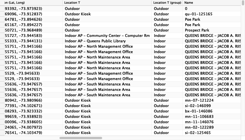
Before I started visualizing, I found the data “location type” contains some insignificant information that may not be useful or too trivial for people to know when searching a specific WiFi hotspot. For example, in the following picture, the data “indoor ap – community center – computer rm” includes too much minor details. Therefore, by using the internal grouping function from Tableau, I grouped them into four big categories and created another column for the new location types—indoor, outdoor, library, and subway station.
3. Creating the visualizations respectively based on the four directions
A. The providers’ hotspot locations
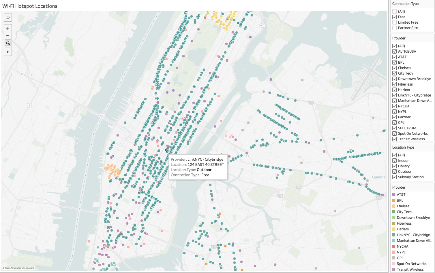
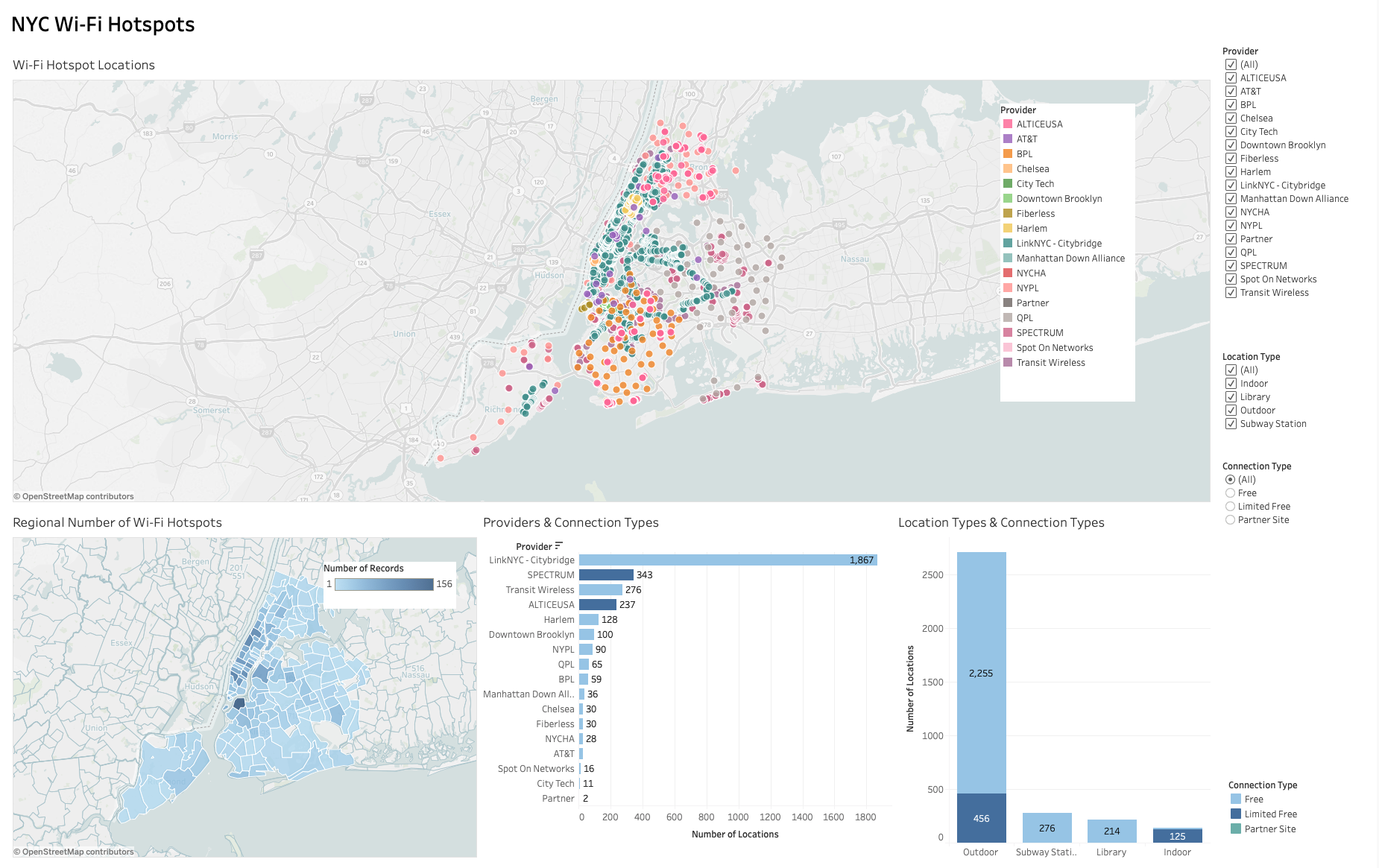
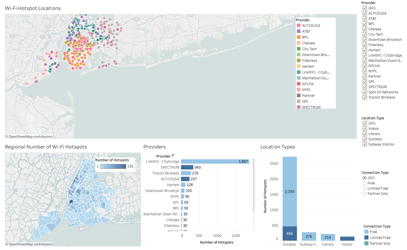
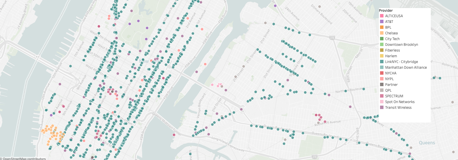
This is the main visualization for people. People can use it as a tool to locate a specific WiFi hotspot, knowing its provider, connection type, and location type. To best inform the locations, I created a dot map. Each dot is a WiFi hotspot location, and people can know the exact address of each hotspot with the tooltip when hovering over the dot. Also, I applied different colors with the color legend to differentiate the providers. In addition, to enhance the usability, I added the three filters—connection type, provider, and location type, so that people can quickly locate the WiFi hotspots they want by using these filters.
B. The number of WiFi hotspots in a region
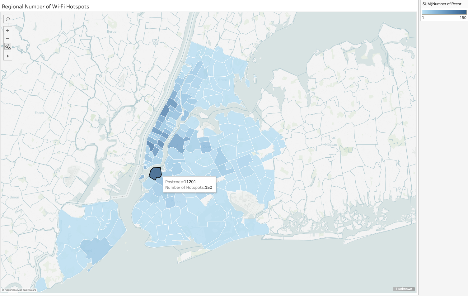
I used the postcode to create a choropleth map that reveals the average values of the regional number of WiFi hotspots with the hue progression. The darker color means the more numbers of WiFi hotspots in the region. When hovering over a region, people can know the postcode and number of hotspots in the region with the tooltip. I think people may get a sense of how WiFi hotspots distribute in New York City through this map.
C. WiFi connection types supported by providers
I think the bar chart is the best way that people can compare different values at a glance. Providers are on the vertical y-axis, and the x-axis is the number of hotspots. Besides, I used different colors to represent different connection types that the provider supports. From this bar chart, people can know that most of the providers set up free connections and LinkNYC has the most numbers of free WiFi hotspots. I also created a connection type filter for people if they would like to see only one type of connection in a one time on the bar chart.

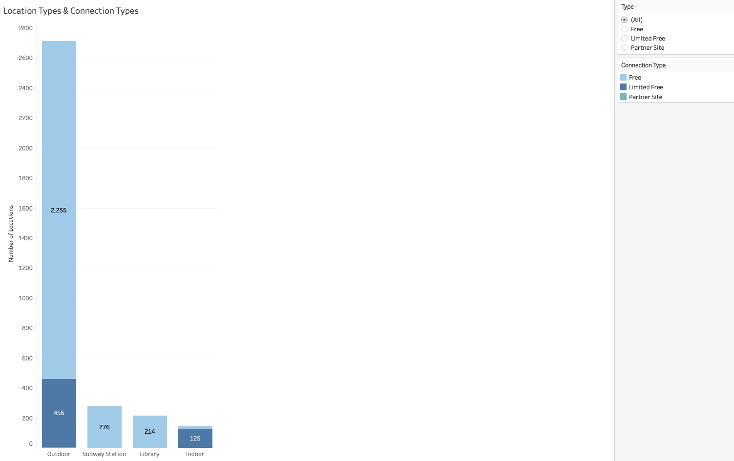
D. WiFi location types and their connection types
I think location type is also an important point that people may concern when seeking WiFi hotspots. Same as the above, I also used a bar chart with connection type category to compare the four types of locations. The result uncovers that most of the WiFi hotspots are outdoor and over half of them are free.
4. Integrating the four graphs
I integrated the four graphs in the Tableau dashboard together and made the main three filters—provider, location type, and connection type applied to the four graphs that use these three data sources so that these four will vary at the same time when people apply the filters. With this way, I think people can gain more comprehensive information when interacting with the visualization.
USABILITY TESTING
1. Methodologies
After the interactive visualization was ready, I would like to know how ease of use of the interactive visualization was, so I started to prepare the usability testing and would like to see how people would interact with it.
For the testing, I built two versions of the interactive visualizations. One was with normal three main filters; another was to use the two bar charts as filters.
The aimed audience of the visualization can be anyone who seeks WiFi hotspots near his place or the target place. Therefore, I recruited three students to participate the usability testing and prepared to ask them to do the following tasks based on the two versions of visualizations—
A. Take a moment to explore the visualization and let me know what do you learn from each graph.
B. You are seeking AT&T WiFi outdoor free hotspots only and would like to know which region has the most number of this hotspots.
C. You are a commuter, seeking WiFi hotspots in subway stations. How many numbers of the subway hotspots in New York City? What’s the connection type of the subway hotspots?
After the participants achieved these tasks, I asked them the following post-task questions—
A. How easy is the visualization to understand? (Rating from 1 to 5, 1 = difficult, 5 = pretty easy)
B. Any frustration that can be further improved?
2. Findings and improvements
Participants all think that the interactive visualization version A is easy to use and straightforward to comprehend the information from the four graphs, while the version B with two bar charts as filters is problematic even though the layout looks nicer and cleaner than the version A. Participants didn’t know that the two bar charts are filters at the first glance and didn’t realize how to return back once they clicked a specific bar in the graph. That means the usability of version B is pretty low. Participants even could not complete the tasks, so I decided to choose version A as the final visualization and some details can be further improved.
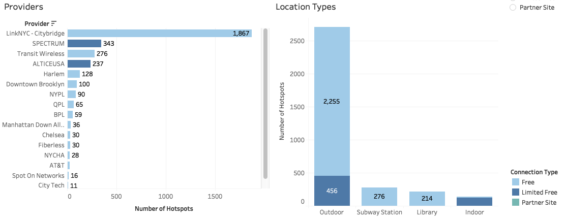
A. The title of each graph should be general to tell the main information.
One of the participants was confused about the titles for the two bar charts because he could not differentiate the main information of these two bar charts if he just looked at the title. For example, the title, location types and connection types, is not clear for him to know what the main information of the graph is.

Therefore, I renamed the title to only one main information that I would like to deliver to the audience, so I changed “providers and connection types” to “providers”, and “location types and connection types” to ” location types”. The connection types on these bar charts are the supplement and secondary information.
B. The application of the filters should be obvious
According to the feedback from the participants, they originally thought that the filters were only for the dot map, so they feel surprised that the filters actually can be applied to the four graphs. I think it is maybe because the filters are all clustered next to the dot map.
To make the application of the filters more distinct, I tried to make each filter separated from each other, having gaps between them. In this way, I think it would be better to understand that the filters are for controlling the four graphs.
C. Keeping color consistency is good but should care about not to mislead.
I kept the same colors for the choropleth map and the two bar charts. It looks nice but it actually would cause the misunderstanding. One of the participants thought that the color in the choropleth map had the same meaning as the bar charts, stating the dark blue means the region has more limited free WiFi hotspots.

Thus, I changed the color progression to green in the choropleth map, hoping it won’t be mixed up with the meaning of the colors in the two bar charts.

D. The visualization should be more prominent than the unnecessary blank space.
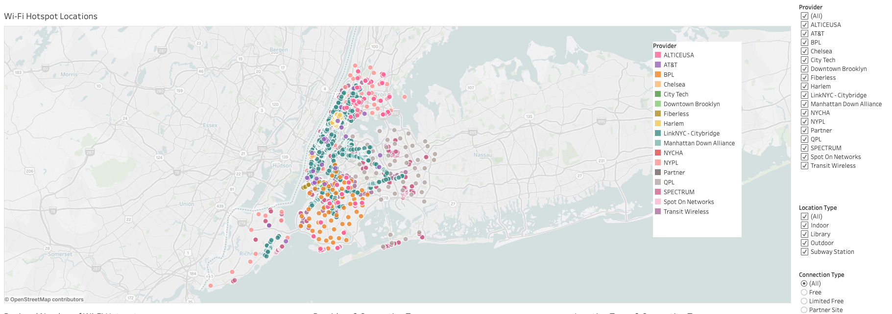
One of the feedback I got is about the unnecessary blank in the dot map, which occupies too much space. Participants needed to zoom in then just saw the locations clearly.
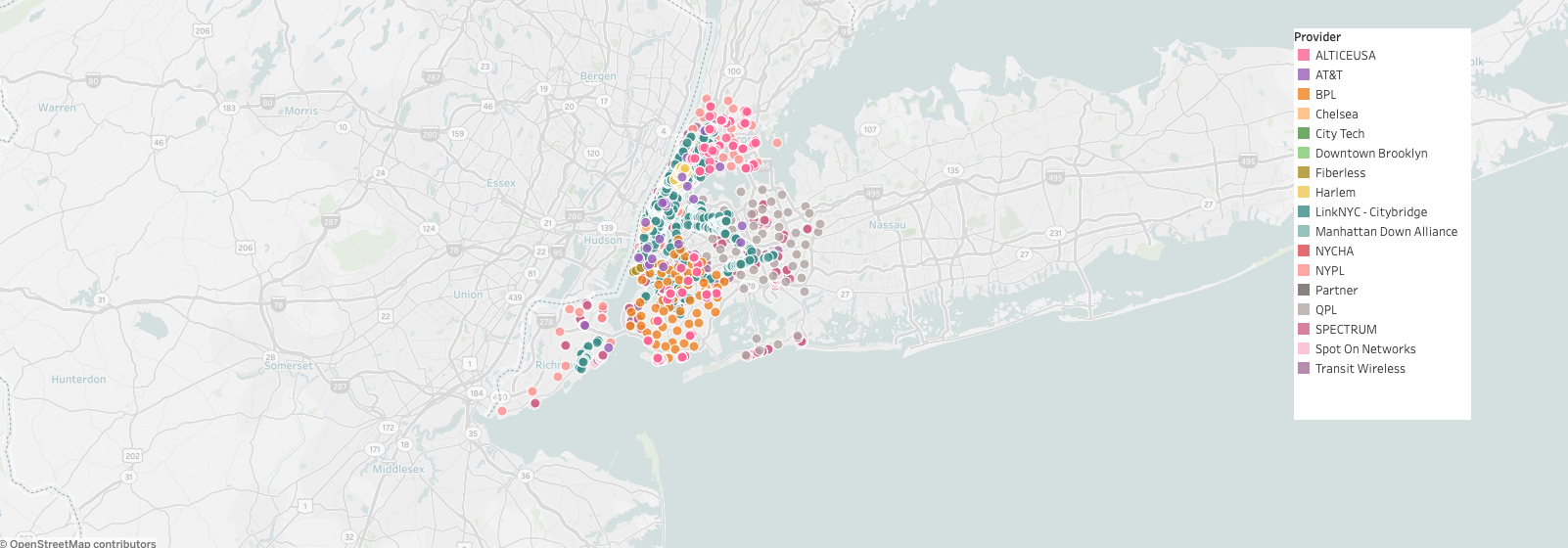
Accordingly, I made the dot map more conspicuous and bigger. I think this change allows to quickly find the target location without zooming in. Also, the visualization looks more balanced with the space.
REFLECTIONS
The post NYC Wi-Fi Hotspots Interactive Visualization appeared first on Information Visualization.