Personal Citibike Usage
December 4, 2018 - All

Introduction:
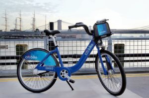
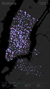
Citibike is the shared bike service that covers most of Manhattan and northern Brooklyn in New York City. For me, it is used primarily for local short transit, as I use my own bike for longer rides. This visualization captures starting and ending points over a three month period of my personal Citibike usage. These services have been an important effort for NYC as well as cities around the world to minimize taxi and ride share applications, decreasing congestion and curbing emissions. Perhaps even more importantly, they have been part of a citywide push to improve the bike lane network.
Inspiration:
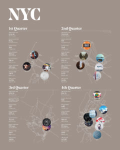
This project is spawned out of the work of data diary projects, with a particular interest in some of the work by Nicholas Felton. It is a section of a longer data project I am collecting for. It will be particularly interesting when different circles appear depending on transit mode, i.e. the Citibike use with be the smallest circle, personal bike perhaps the next, subway, bus, plane, etc. Here are a couple of his visualizations.
Materials:
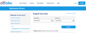
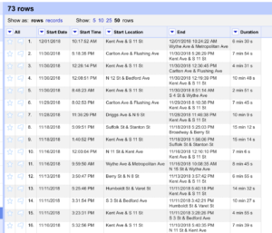
Citibike– by logging into your account, you can access your personal data between dates
Openrefine– used to parse data into appropriate columns from text file from Citibike
LongLat.net– used to get coordinates of Citibike locations (not included in original dataset)
Carto– mapping program used to build visualization
Illustrator– postproduction layout work
Methods:
After deciding the lithium water concentration correlated to suicide project did not have nearly enough data to make any significant points, I changed over to look at my Citibike personal data. As mentioned in the Inspiration section, the work of Nicholas Felton figured heavily into this visualization.
Looking at the last 3 months of personal Citibike data was enough to show trends but also reasonable to geolocate using the tools currently known and available. OpenRefine was critical to change over the text file into a readable version for Carto.
Using different layers in Carto I was able to assign color and opacity to different columns in the data (i.e. date and use). The final work in Illustrator was just to play with layout to give the visualization context and a key which I thought was more readable than what I was finding in the Carto legend section.
Results:
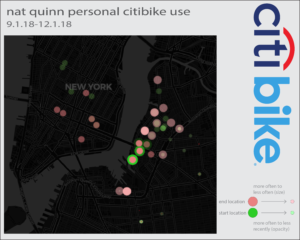
The visualization shows my Citibike usage habits over the past three months. It is clear I typically use the service in one direction, taking a bike from near my apartment, and riding it to a location. Furthermore, locations I ride to more often are shown by a larger circle. What is lost in the way the visualization is shown however is time through opacity. For example, it is not clear if a opaque large circle has been used only often and recently, or consistently and throughout. These two scenarios are shown similarly and requires a different graphical representation method to create a unique look for each scenario. The paths were left out of the visualization because they were distracting and appeared “as the crow flies”, which in showing bike route data, is not particularly helpful.
Future Thoughts:
In order to show time, I believe a system of “stacking” circles may be better, so the most recent use (i.e. full opacity) does not block the underlying data, and like mentioned above, differentiates locations used consistently and locations used heavily recently.
Further use of a similar technique for personal bike use, subways, walking, buses, etc. could be very interesting to show on the same map to view the circles of transportation modes used for various distances and parts of the city. This would be a more interesting study to understand both personal habits, and habits in general, in regards to efficient transportation options.
The post Personal Citibike Usage appeared first on Information Visualization.