Mapping NYC Libraries Impacted by Rising Sea Levels
December 1, 2018 - All

INTRODUCTION
Although New York City is home to hundreds of cultural institutions, this study will focus specifically on NYC’s public library systems (New York Public Library, Brooklyn Public Library, and Queens Library), which include over 200 locations. Conservation of the (nearly) 53 million items housed in the NYPL system alone is under continuous discussion, especially when considering storm or flood damage. After recently coming across maps predicting rising sea levels developed by FEMA and the New York City Panel on Climate Change (2013), I started to question if any library locations are within predicted flood-risk zones. This led me to exploring how rising sea levels may affect some of the country’s most important public library systems.
This study seeks to answer questions of what is and what may happen:
- What is the current mapping of NYC library locations?
- Which libraries along the NYC coastline will be affected by a rising sea level?
INSPIRATION
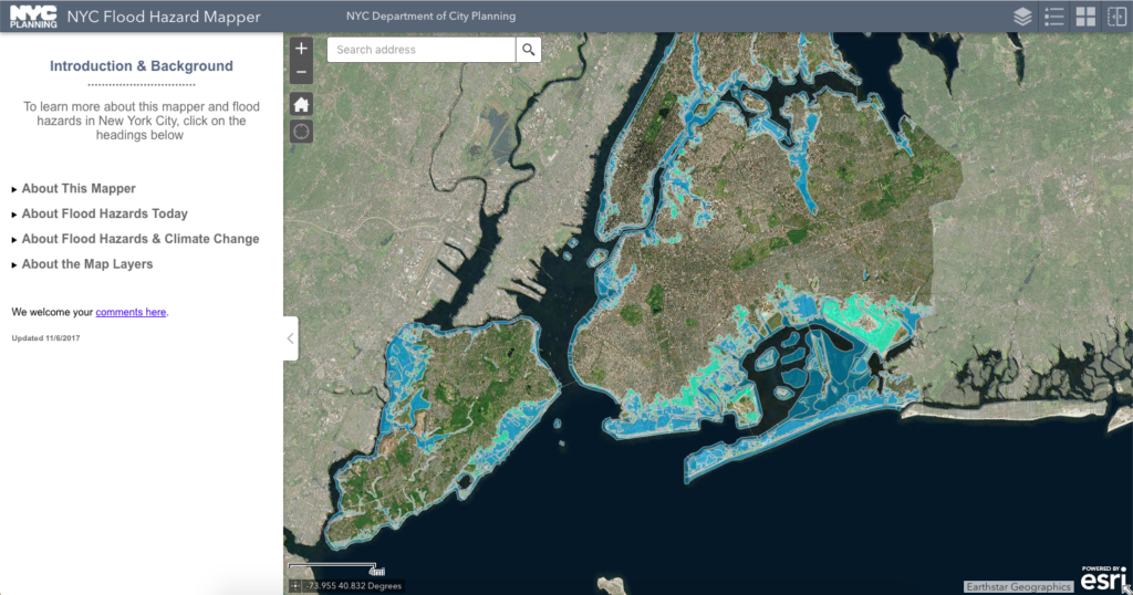
The visualization for this project was inspired by the NYC Flood Hazard Mapper, produced by the New York City Department of City Planning, as well as Justin Grimes’s Carto dot distribution map of public library outlets in the U.S. (2010).

While each map is effective in communicating their individual topics, my goal was to combine the two into a bivariate map to discover if any overlap exists between NYC libraries and a rising sea level. Ideally results may help inform future decisions for NYC’s libraries and other important cultural institutions.
MATERIALS
Datasets were downloaded in GeoJSON file format from NYC Open Data.
Visualization was created in Carto, an SaaS platform that enables location data analysis and visualization through Location Intelligence tools.
METHODOLOGY
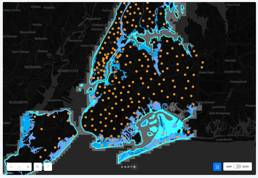
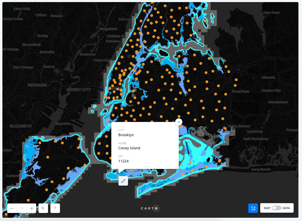
I started by connecting my datasets to the Carto dashboard, and chose to first explore the Library data. I played with different versions of aggregation, but decided to keep in alignment with the dot distribution theme through points. I adjusted the style of the points by size (8.5) and stroke (0.5), as well color to strengthen contrast. I added the clickable pop-up feature that showed information for each point, such as: city (borough), library name, and zip code. An inconsistency in pop-ups was found later in that those for Queens Library locations provide city description as the specific area of Queens (Long Island City, Rego Park, Flushing, etc.), whereas the rest use borough name (Bronx, New York, Brooklyn, Staten Island).
Next I added the Sea Level Rise Maps dataset as a new layer, moving it below the Library layer so as not to hide any point details. I adjusted the polygons style by categorizing polygon color by fld_zone (flood zone) value, changing the color scheme to blue/green to represent the sea, bringing stroke size down to zero (to remove distraction), and changing the blending to color-dodge to enhance color vibrancy.
Lastly I adjusted the basemap style to Dark Matter to enhance the distinction between datasets, and published the visualization to be publicly shared.
RESULTS AND INTERPRETATIONS
Public Libraries Affected by Rising Sea Level – click here for link to interactive Carto visualization.

The visualization shows that 16 libraries are located within the predicted flood zones, mainly on the southern coast along Brooklyn and the Rockaways, but also Battery Park City Library, Hamilton Fish Park, and Aguilar in Manhattan. These 16 libraries may be affected by the predicted 11-inch rise in sea levels within the 100-year plan, but because the visualization is based off of a prediction there is no certain answer for if/when areas will be affected. However, we are able to follow the story provided by the visualization that land will indeed be under water in our not-so-distant future. This may help inform public libraries to take these predictions into consideration, while also helping to inform the public that cultural institutions will be impacted by rising waters, therefore calling into action preventative measures.
REFLECTIONS AND FUTURE DIRECTIONS
Visualizing the impact of rising sea levels on public institutions places a lot of weight on trying to understand the human race’s relationship with the planet. Seeing the overlap between datasets makes these concerns more real and they must be addressed in order to preserve important places of our country’s culture.
To take this project further, I would include more than just libraries, mapping museums and historic sites as well. Carto makes combining and analyzing geospatial data relatively easy, and from a beginner’s perspective, I felt the spark of excitement when seeing datasets communicated in a way that I could understand and find meaning in. This project may lead to more questions about what communities value, how they are in danger of being negatively impacted, and how to limit (or slowdown) effects of global issues like climate change.
The post Mapping NYC Libraries Impacted by Rising Sea Levels appeared first on Information Visualization.