Schools Under Construction in NYC
November 30, 2018 - All
Introduction
We use maps to display information in a way that is meaningful and geographically related. Usually, maps need to be precise, since people use maps to search and locate destinations. This project is about mapping active school projects under construction using Carto.
Inspiration
When we think of engineering projects, we know that there is massive work going on while engineers are powerful to schedule procedures under control. As a student with degree in Civil Engineering, I understand that new construction means development of an area and schools are vital on driving the price up. I am excited on mapping this dataset of new school projects (Capacity) and Capital Improvement Projects (CIP) currently under Construction.
Material
“CARTO is the platform to build powerful location Intelligence apps with the best data streams available.”
“Location Intelligence turns location data into efficient delivery and service routes, optimized sales territories, streamlined city management, and strategic site planning. Businesses everywhere use LI to make decisions that increase revenue and drive business performance.” the above description are excerpts from Carto.
Dataset: this dataset from NYC Open data
This dataset is about new school projects (Capacity) and Capital Improvement Projects (CIP) currently under Construction.
Methods
Tips of Choosing a Dataset
- Carto is a location intelligence program, so the data should be csv file with data of location specific such as longitude and latitude or a shape file.
- for more exploration of carto, the data set should have several columns to investigate.
Procedures of creating map through Carto
- Go to carto.com.
- Log in to the account I created with pratt email, which is a paid education account.
- After logged in, landed on the dashboard page, click NEW MAP
- Connect dataset, which means import dataset, or choose dataset provided or shared by others. I connected this dataset from NYC Open data.
- Click CREATE MAP, a direct display of points on a NYC map appears.
Interpretation
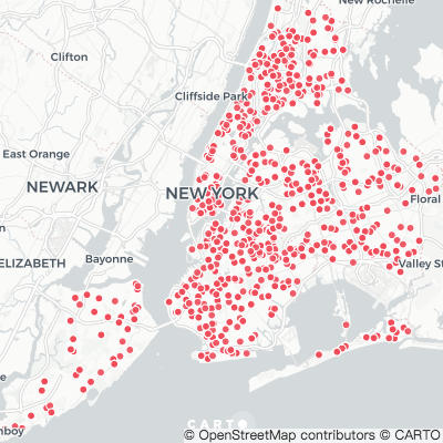
- By default, Carto will present a visualization of the connected dataset, as the figure below. It can be seen that, there are many projects going on most places around new york city. However, there is no detail or attribute presented and I decided to look for some comparison first.
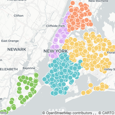
2. I started by styling the points: first I changed the size of points, then I changed the points color by value of “boroughcode”, so projects of different borough will have respective colors, which creates a clear comparison. But, the points are crowded and I want to see the density.
3. I created an analysis, choose Intersect and Aggregate, Choose a target layer, then measured by count, hit apply then style the point size by value of density of 3-30. This leads to a shortlisted display of points, which give a brief indication of places where there are under high density of construction.
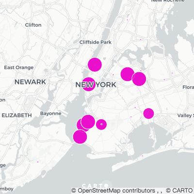
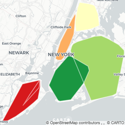
4. But I still want to see the distribution among borough, I used another analysis: Create Polygons from Points, grouped by “city”, measured by count and then style by value of counts. It can be seen from the above figure that, the polygon covers all the points, but not necessarily cover every acre of the borough.
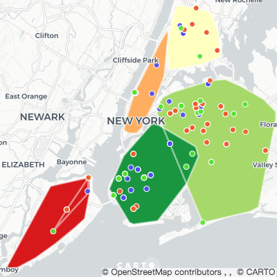
5. I tried another analysis tool: filter by Column Value.In the figure above, the green points stands for new projects, orange points stands for addition projects, blue points stands for lease projects. I found that, this function is similar to what ai stated in No.2.
Reflection
Maybe I should publish early, I first chose to map about NYC WIFI from LINKNYC, then I found that there is another published blog about the same dataset, thus I move to another dataset for mapping.
I feel that the name of the dataset is not clear enough, without looking at the description, it would be easily to mistake by perceiving “active_projects_under_construction” projects not specific to schools.
There are multi ways of reaching the same display of mapping, since there are limited layers (8/8), analysis is preferred but layers can be disabled.
Click here for the link of visualization.
The post Schools Under Construction in NYC appeared first on Information Visualization.

