
Visualizing Earthquakes Near The Indian Subcontinent From 2000 to 2018 Using Carto
November 29, 2018 - All
Introduction
Seventeen Years after the killer 2001 quake measuring 7.7 on Richter scale shook the northwestern state of India, a resilient Gujarat rose against all odds to limp back to life. This earthquake was the most powerful to strike India since 15 August 1950. It was also the most destructive in terms of lives lost and property damage. Research claims that the energy released was equivalent to 400 atomic bombs thrown over Nagasaki exploding 23 km below the earth’s surface.
While reading more about the Gujarat Earthquake, I came across an open dataset which had data related to earthquakes in the Indian subcontinent from 2000 to 2018. In order to do a full analysis of the data set, I used Carto.

Some of the information that I wanted to explore from the dataset was:
- Which area near the Indian subcontinent constantly had earthquakes?
- Which area had the least amount of earthquakes in India?
Inspiration/Critique
To come up with a good visualization, I decided to explore various Carto examples available online. It helped me in making a better and understandable visualization. Some of the examples that I liked:
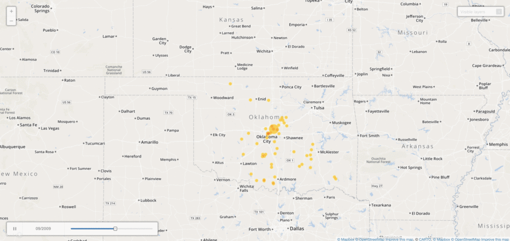
This visualization is about the earthquakes in the Oklahoma state. This map incorporates every 2.5-magnitude or greater between Jan. 2004 and June 2014. The most interesting part of this visualization was the timeline that is no the bottom left. I think it clearly shows the year and the month.
2. United States Sanctions Tracker
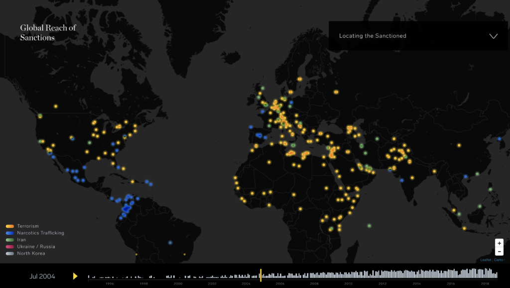
Enigma’s Sanctions Tracker, which monitors U. S. sanctions from 1994 to the present and updates each day, is one of the first resources to map this data despite the inherent spatial aspect of sanctions. The tracker uses time-series analysis to show the rise in sanctions across four different presidencies, and its interactive design allows viewers to click on animated dots to learn more about the specific type of offense being sanctioned. The most amazing part of this visualization is the way it looks visually. I think the color combination makes it look very good and easy to understand.
Material
- Carto – It is a software as a service cloud computing platform that provides GIS and web mapping tools for display in a web browser.
- Kaggle – It is an online community of data scientists and machine learners, owned by Google Inc.
- Earthquakes in Indian Subcontinent Dataset – This dataset contains data on events of the earthquake in Indian Subcontinent of 18 years.
- Microsoft Excel – Microsoft Excel is a spreadsheet developed by Microsoft for Windows, macOS, Android, and iOS. It features calculation, graphing tools, pivot tables, and a macro programming language called Visual Basic for Applications.
- OpenRefine – A tool for working with messy data: cleaning it; transforming it from one format into another, and extending it with web services and external data.
Method to Create This Visualization
1. Selecting the Data Set
Finding the right dataset has never been an easy task for me. With so much free data online, I always get confused as to which dataset would be the best for me. This time I decided to explore a new website for datasets – Kaggle. It had a variety of datasets for Carto. After going through 10 to 15 datasets, I finally found the perfect dataset which was on earthquakes in the Indian subcontinent. It not only had the latitude and longitude but also the magnitude and the year of occurrence.
2. Refining the Data Set
After I downloaded the CSV file of the dataset, I analyzed that the magnitude column had a multiple type of measurements. In order to streamline that column, I decided to apply a filter in Excel where I could just see the ‘mb’ measurement values. I chose to move forward with just the ‘mb’ values because it was the majority among all the values. After filtering the values in Excel, I moved to OpenRefine. Here I applied a text facet to the magnitude column and found that there was a formatting issue like extra spacing with some data. After solving that spacing problem of the data, my data set was ready for the next step.
3. Data Visualization Using Carto
After refining the data set, I imported the CSV file to Carto. This was my first interaction with this software. It took me a while to get used to it and understand it’s functionality. While exploring the software, I came across a couple of aggregations under styling options. This is where I decided to make two different visualizations using ‘Points’ and ‘Animated’ aggregations. While I was working on the first visualization, I came across the ‘Data’ tab under the layer options. Using this option I could add some widgets to my visualizations. I added a timeline widget that would showcase the earthquakes as per quarter (from 2000 to 2018). At first, the widget didn’t display the years and the number of earthquakes. To fix this problem, I had to open my dataset in Carto and change the data type of the ‘Time’ column from string to date. I added this widget to both the visualizations. On further exploration, I changed the point size style from fixed to ‘by value’ in the ‘Points’ aggregation visualization. This helped me in differentiating the earthquakes based on the magnitude level. I also added a legend in this visualization to show the magnitude level by color and size of the circle. Once everything was in place, I finally decided to play around with the colors and basemap options.
Findings
Here are the links to my Carto visualizations:
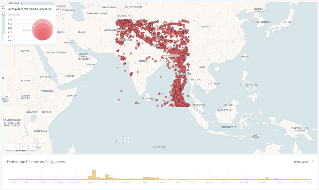
Firstly talking about the first visualization that is with the ‘Points’ aggregation style. It can be clearly seen from the timeline that quarter 1 of 2005 had the maximum number of earthquakes. Majority of them occurred around the Andaman Sea and Andaman and Nicobar Island region. From the overall visualization, one thing to note is that India as a whole has not faced many earthquakes over the past 18 years as compared to it’s neighboring countries – Pakistan, Nepal, Bhutan, Bangladesh, and Myanmar. Within India also, the southernmost part of India and central India have almost never faced any quakes over the past 18 years.
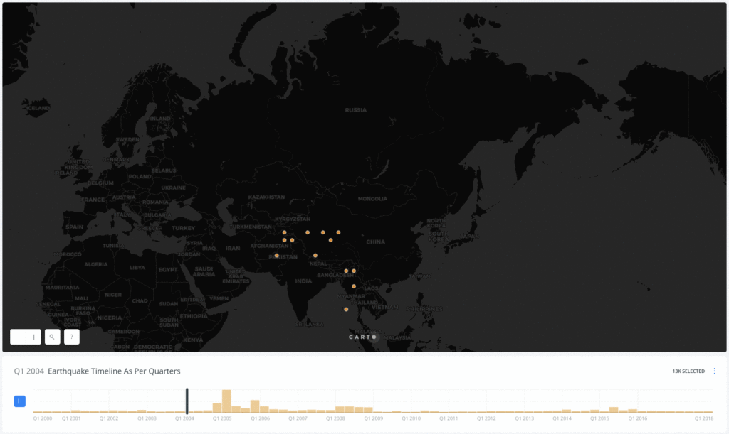
Moving on to the animated visualization, the analysis was kind of similar to what I learned from the points visualization but there was one new learning from this visualization. Throughout the animation, there was one region which constantly had a dot on it and it was the northeastern part of Afghanistan. This implies that the northeastern part of Afghanistan constantly got earthquakes over the past 18 years.
Reflections
In my opinion, Carto is a very powerful tool for making geo-spacial data visualizations. I totally love its functionality and it’s easy to use interface.
After using it for a while I became familiar with the software and I could use it more efficiently. One drawback that I feel about this software is that it takes a while for the users to understand all the features. So if someone is looking for a quick data visualization, this software is not for them.
Overall, this project helped me in getting a good idea of how to map out geo-special data.
The post Visualizing Earthquakes Near The Indian Subcontinent From 2000 to 2018 Using Carto appeared first on Information Visualization.