Mapping the World of Earthquakes using Carto
November 27, 2018 - All

Introduction
Every year there are numerous amount of natural disasters that occur around the world: Earthquakes, hurricanes, tsunamis, tornados, wild fires and more. I wanted to focus on one natural disaster so I decided on earthquakes. Earthquakes happen because tectonic plates under the earth’s crust shifts on top of each other. This causes stored energy in the Earth’s crust to release shockwaves to the surface. A magnitude of 6.0 and above is considered a strong earthquake that can cause a lot of damage in populated areas according to an intensity scale on USGS science for a changing world.
With earthquakes causing so much destruction around the world, I was mostly curious about:
Where does the earthquake occur the most?
Which year had the most earthquakes?
How many earthquakes occurred in certain magnitudes?
Inspiration
Mapping how the United States generates its electricity

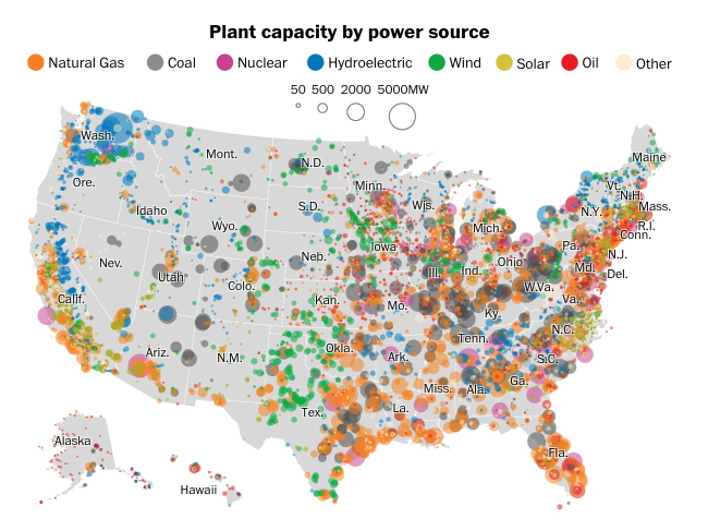
This is a visualization about how the United States generate electricity. I loved the use of 8 very different colors to represent each power source. At first glance, I could tell that Seattle has the most Hydroelectric production, whereas natural gas is almost everywhere. There is also a small legend right above the map that represents the size of the circles. Depending on how big the circles were, the more power they produce. One thing could be improved on this visual is the labeling of each state. There are some states that took a long time for me to read. Other than that, I really liked the clarity of the visual.
Materials
- Kaggle Data Sets – A website with public datasets
- Carto Software – A paid platform to build powerful location and map based
Methods
-
Search Dataset
I wasn’t sure what and where to find a dataset for Carto in the beginning. I looked at all the dataset websites from before but I could not find anything that caught my eye. So I decided to choose a topic that could be related to mapping first and then started to search online for the dataset. Once I decided on earthquakes, it did not take too long for me to find a dataset with earthquakes around the world. I stumbled upon this website called Kaggle, which had so many different datasets. The dataset I found not only had the latitude and longitude I needed, but also the year it happened and magnitude.
-
Visualization Inspiration
I went online looking for some map visualizations. I could not find much that was related to my topic or similar. But I did manage to find a visual that maps how the United States generate its electricity. It was interesting looking and reading about map visualization.
-
Visualizing Data
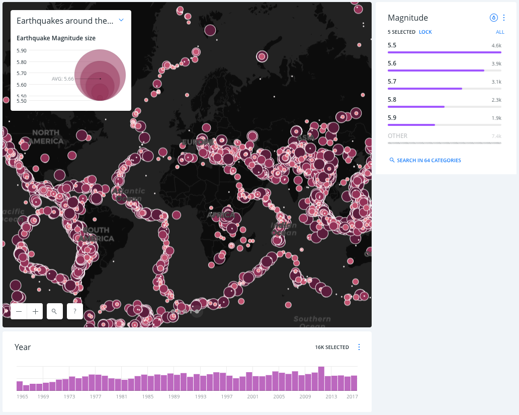
Carto did not seem as intimidating as I thought it would be. When I first imported the .csv file, I clicked around, trying out new visuals, changing colors and more. The dataset I found about earthquakes had over 2000+ rows, but I did not do much cleaning to it. There was one thing I did have to do on Carto to the dataset. While I was working on the visualization, I had a widget that was supposed to show the year and there would be a sort of graphical layout to show how many earthquakes occurred in that particular year. However, the years would not show and numbers would appear. To fix this problem, I had to go into my dataset from Carto and realized my widget was displaying the index number. I had to configure my value and choose my column to be date instead. I also had to change the datatype of date from string to date to display the year. I was glad this was an easy fix. Once that was settled, I went ahead and made a visual with a style called points. This basically shows dots on each location. On this visualization, I decided to add a legend that shows the magnitude size by color and size of the circle. I also added two widgets where the user could click on the year to see all the earthquakes that occurred in that year. The second widget is the earthquakes magnitude. When the user clicks on the magnitude, the map will only show the earthquake in that magnitude. Another visualization I made was animated. The earthquakes would move by year. What’s interesting about the animated one is that it is more interactive. Sometimes the user would see a certain area that would constantly have an earthquake, which is pretty scary. Let’s have a look at the results below.
Results

This is a point layout mapping visualization of the earthquakes around the world. At first glance, it looks like there is something spreading all over the world. But this represents all past earthquakes that happened. The legend on the top represents the size of the circle depending on the magnitude size. Bigger the circle, higher the magnitude, smaller the circle, lower the magnitude. The widget on the right is also magnitude size, but the user is able to select the magnitude individually if they want to see where the stronger earthquakes happened. It is clear that 5.5 magnitude earthquakes occur most frequently. Thank god not many 6+ magnitudes happen. The bottom widget is the years. The user can select certain years to see where the earthquakes occurred at a certain time. By looking at the graph, it is clear that 2012 had the most earthquakes. This map tells me where the tectonic plates are as well. It also tells me I do not want to live in the area where there are a lot of purple dots!
You can access the online visualization here.

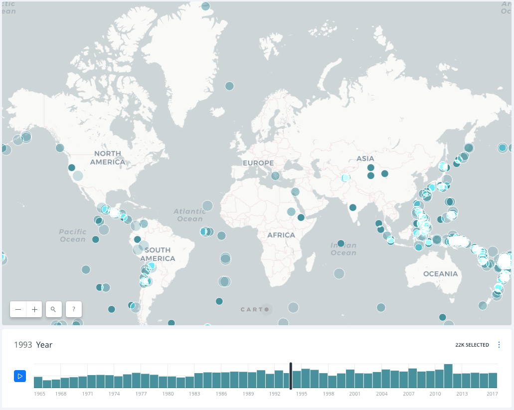
This is an animated map of the earthquakes around the world over the years. When you play the visualization, many blue dots appear and disappear over time. It’s interesting to see where the earthquakes occur constantly and where in the world is less frequent. The part where Indonesia, Philippines and Japan are seemed to not have a break from the earthquakes. Its frequency amazes me and also gets me curious to how the earth still has land there to shift its tectonic plates. I like this animated map better than the still ones.
You can access the online visualization here.
Reflection
Using Carto was fun, especially creating the animated version of the map. I find it highly interactive and it is crazy how some parts of the world have no earthquakes at all while the places that does have earthquakes make me wonder how the lands are still above water. I would be so scared to live in an earthquake prone place.
While Carto can be fun to use, I could also tell there are some limitations to it too. If I were to improve on these visualizations, the one option I could like is the personalization of the use of color. I realized the legend color and the color on the map does not match in some cases. I had to choose the closest color possible to show that the legend is representing the thing it should be. I would use this software to do animated visualizations because I feel like that displays the information better than still images.
The post Mapping the World of Earthquakes using Carto appeared first on Information Visualization.