NYC WiFi Hotspots
November 26, 2018 - All

Introduction
The dataset I found is about WiFi hotspots locations in NYC from NYC Open Data website. It intrigues my interest a lot because WiFi nowadays is the crucial infrastructure in daily life. I always try to find a free WiFi when I work outside with my computer. Therefore, it would be helpful if I could know the WiFi hotspot locations. Based on this dataset, I think it could help to answer the following questions:
- Where has the highest density of the WiFi hotspot?
- What is the exact location of the WiFi hotspot?
- Which provider hosts the most WiFi hotspot locations?
- Is the WiFi hotspot is free, limited free, or other?
Inspiration
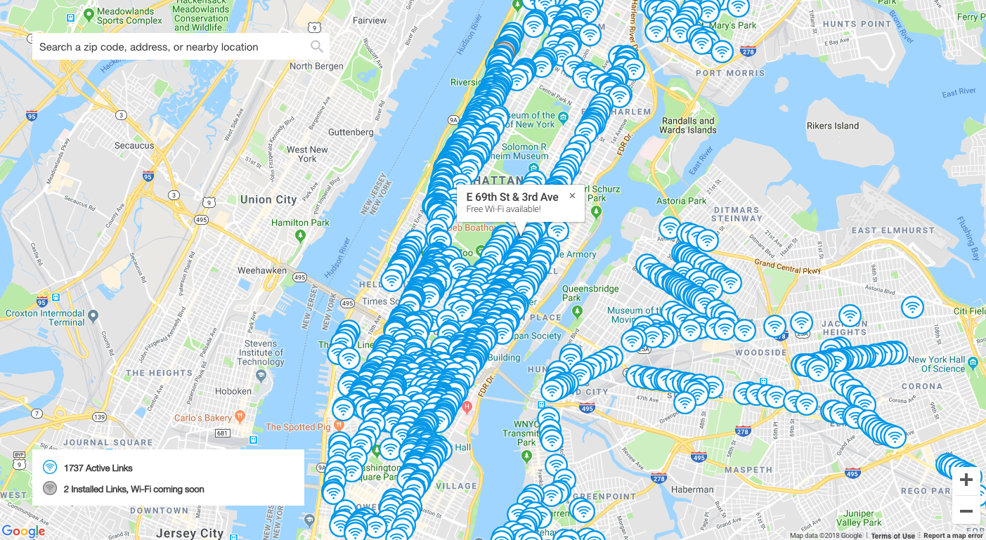
I searched the keyword—NYC hotspot location map on the Internet. Then, I found the following map, which is from LinkNYC. From this map, I can clearly know the exact location of the free wifi, and I can see where has the highest density of the free internet. Besides, it also uses the legend to explain what the symbols on the map are about. I could quickly understand and catch the content of the map in a second. Therefore, I’m going to imitate the map for my visualization work.
Materials
- NYC Open Data— an open dataset resource where I found the dataset, NYC WiFi hotspots locations.
- Carto— a platform, specifically for building maps or location-based visualizations.
Methods
1. Understood the dataset
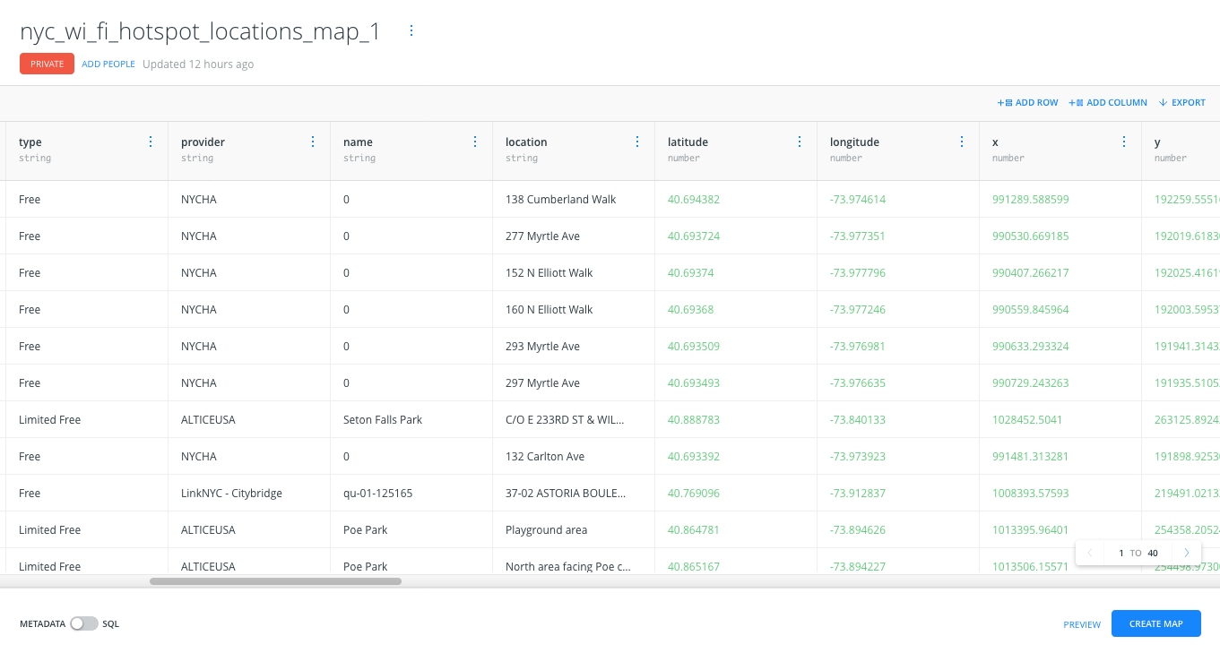
Once I found the dataset, I tried to understand the content of the dataset. Then, I found I could use the data, such as type, provider, and location to form my visualization. The type is about whether the WiFi is free, limited free, or other. The provider is simply the WiFi provider and location is the address of the WiFi hotspots. Based on the data I focused on, I defined the above four questions/topics.
2. Visualized the dataset and created different layers to fulfill my above questions
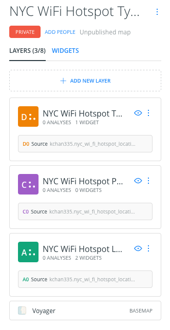
I tried to mimic the visualization I found from LinkNYC and to answer my above questions. However, instead of using one map to answer all the questions, I think it is better to create different layers to demonstrate the different topics; otherwise, it would be hard to understand what information I would like to deliver to the audience.
Results
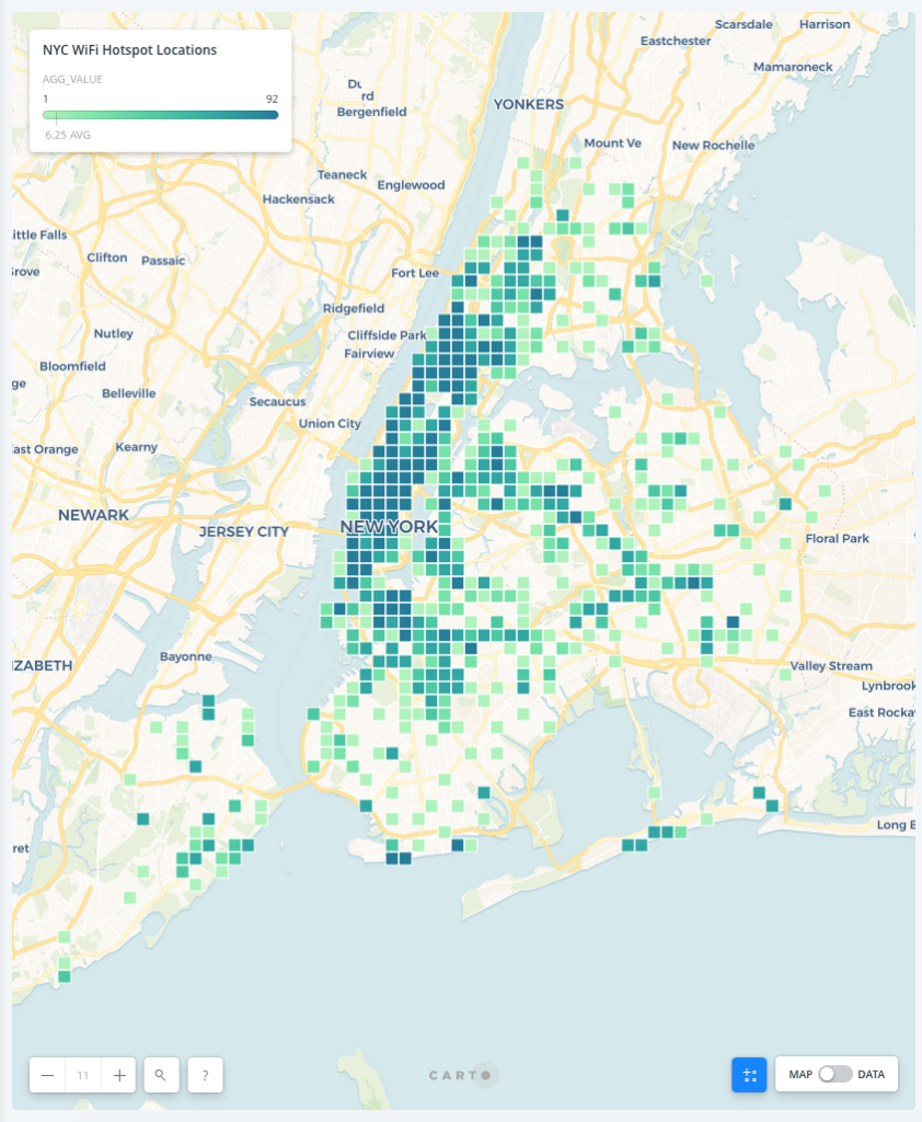
By using squares to visualize the aggregation and the legend to illustrate the meaning of light green to dark green, I could realize where has the highest density of the WiFi hotspots. From the visualization, we could know that the mid-town and lower in Manhattan have the highest density of the WiFi hotspots since there have the most amount of dark green squares.

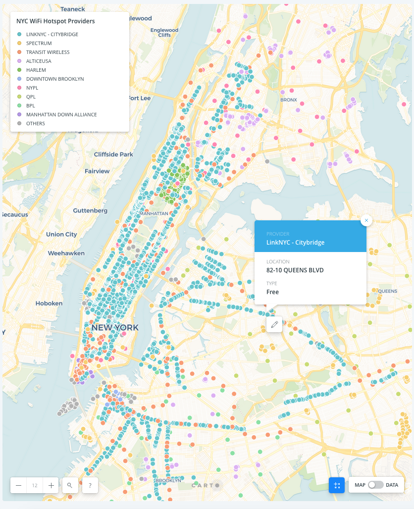
I used different colors to point out different providers with the legend to illustrate the color for each provider. From the dots on the map, we could see that LinkNYC-CityBridge has the most WiFi hotspots. Furthermore, I also utilized the pop-ups to indicate further information like the address of the hotspots and whether they are free, limited free, or other. For example, by clicking the dot as the following picture, we could know the WiFi hotspot is located at 82-10 Queens Boulevard and it is free.
Reflection
From the lab, I realized that understanding your dataset is super important. I first tried to analyze the content of my dataset, to see what I can do, then just to decide my topics/questions. It turns out the steps are super helpful to me. Besides, I also found that a map should be straightforward to understand, meaning messages on a map should have the hierarchies. Thus, users could know what the main message the map would like to tell us, and what additional information we could further explore. For example, the main message of one of the visualizations I made is to deliver which provider has the most WiFi hotspots; and the pop-ups serve as the secondary message if users would like to know further details like the exact address, free or not.
The post NYC WiFi Hotspots appeared first on Information Visualization.