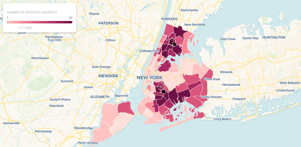
NYC Shooting Incident Visualization
November 24, 2018 - All
Introduction
For this lab I wanted to revisit an earlier project I had done using 2016-17 park crime data in New York City. However, the dataset I intended to use was not geocoded and soon realized that it would be better to use a different dataset altogether. Keeping with the theme of NYC crime data, I found a dataset of NYC shooting incidents for the first 6 months of 2018. This data allowed me to create an interactive and animated visualization.
Inspiration
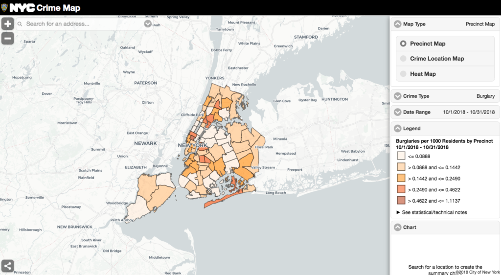
My inspiration for the visualization I created comes from the NYC Crime Map. I really like the level of interactivity that his map provides to users and is fairly easy to use. I’m not very fond of the colors used throughout the maps, but for the most part they’re not horrible. The main issue with this map is that the large amount of options (filters, pop-outs, map views) can be overwhelming at times. Otherwise, this map provides users with a wealth of information.
Materials
- Police Precincts Boundaries: shape file of NYC precincts
- NYPD Shooting Incident Data: this dataset only contains incident data for January-June 2018
- Carto: visualization software used specifically to create maps or location-based visualizations
Methods
To start, I had to find two datasets that I could work with in Carto. Specifically, I needed a shape file (Police Precincts Boundaries) that would represent the police precincts and then a second dataset that was geocoded and contained some other type of data. The NYPD shooting data contained a wide range of data including shooting location, date/time, and perpetrator/victim demographics among many other things. Additionally, I had to ensure that these two datasets had at least one common variable (data column) in common so that I could link and use them together in Carto. Luckily these files both contained precinct numbers which made for an almost effortless linking process.
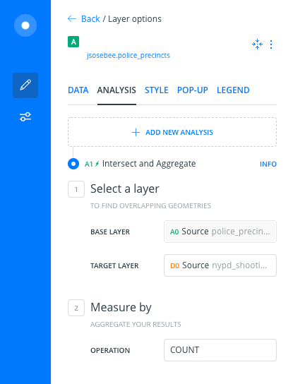
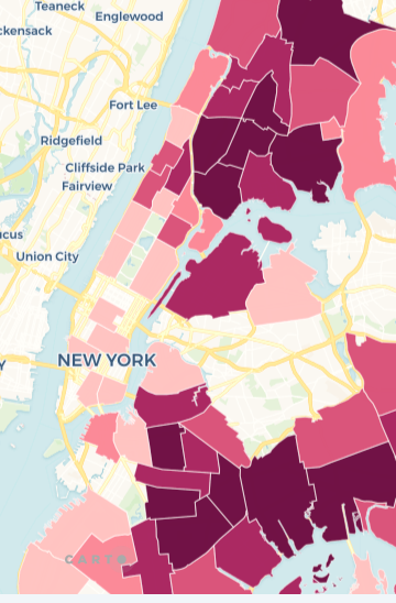
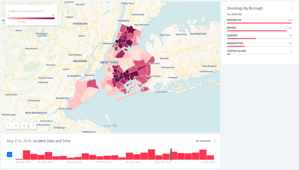
After uploading both datasets into Carto I linked them together by using the ‘intersect’ function under the analysis tab. For my specific inputs for this analysis refer to figure 2. This allowed me to create the color-coded (by number of shooting incidents) map of the police precincts across all 5 boroughs. At this point I ran into my first issue, the precincts that had no incidents would have no color and would show the base map. Besides creating an aesthetically “off” look to the map, it almost suggested that these areas weren’t NYPD precincts despite being clearly located within NYC (figure 3). To resolve this, I added a new layer that contained just the precinct boundaries and under the style tab I colored the polygons (precinct shapes) with a very light and nearly transparent pink that worked well with the color scheme of the precincts with shooting incidents.
The next thing I needed to do was add some widgets to tell a more interesting story about the data. When I was looking over my shooting incident data I noticed that each incident came with a date and location. Knowing that Carto can animate data via the time-series widget, I thought it would be a really interesting way to demonstrate where and how often shooting incidents occur. To do this I had to use SQL to manipulate the data in my shooting incidents dataset so that it would be in a form Carto could use to create the animation. The steps I took are as follows:
- Create a new column which I labeled date_time
- Combine the contents of the occur_date and occur_time columns using a concatenate and substring function:
update nypd_shooting_incident_data_year_to_date_
set date_time = concat (substring (occur_date, 1, 11) , occur_time)
I was then able to show the incidents as they occurred through time and by location. The incidents were represented as black circular points with a white outline for definition. I adjusted the duration and steps of the animation to the highest setting and left the trail at a low setting of 2 so that the animation cycled through more slowly. Because there is such a high number of incidents a faster animation would be overwhelming and difficult for users to see what is going on. In addition to displaying animation on the map, the time-series widget also has an option that lets users pause the animation and choose a specific date they’d like to see the incident data for (figure 4).

Finally, I added a widget that displayed a bar graph the total number of incidents by borough and would allow the user to choose one (or all) borough to specifically display on the map.
Results
Reflection
I really enjoyed this lab and look forward to working in Carto more to create even more interesting visualizations. The most difficult part of the lab was finding data that I could use, but afterwards it was fairly easy to create the widgets and visuals. The richness of the shooting incident dataset probably made the biggest difference in my ability to create and tell a relatively interesting story. In the future, I think I would like to add more layers that have information about different crime incidents and somehow represent the various demographics of perpetrators/victims. Just looking at the data itself I could see the beginnings of an interesting pattern when it comes to who is a perpetrator versus victim.
The post NYC Shooting Incident Visualization appeared first on Information Visualization.
