Mapping Narcotics Possession, Solicitation, and Manufacture/Delivery in Chicago (2017-Current)
November 24, 2018 - All
INTERACTIVE LINK:
https://savi.carto.com/u/seth-crider/builder/bbc9a9fc-ad6a-458b-bc4e-6abb85205219/embed
Introduction:
In this map based visualization I was able to secure the same dataset I explored in an earlier network visualization. This dataset is a regularly updated record of crime occurrences in the City of Chicago from the Chicago Police Department’s CLEAR (Citizen Law Enforcement Analysis and Reporting) program. The data is very rich with numerous categories, consistency of records, and pretty expansive geolocation coordinates perfect for the merits of a mapping program like CARTO. Having previously worked with Chemical Dependency Data in New York City I thought this would be an engaging opportunity to represent the darker industry of drug trade in another heavily affected metropolitan area. Could Narcotics use in Chicago be dissected into facets of front, and back end industry practice? Are there hubs of this activity residents, should be aware of?
Goals:
Provide a rich map for residents of Chicago to locate their neighborhoods and corresponding activity
Rank normalized scale of activity as it pertains to wards, and find out which area’s are worse off
Locate particular hotbeds of possession, delivery, and solicitation if they exist
Inspiration:
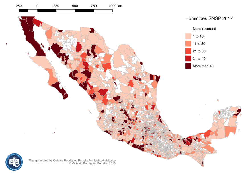
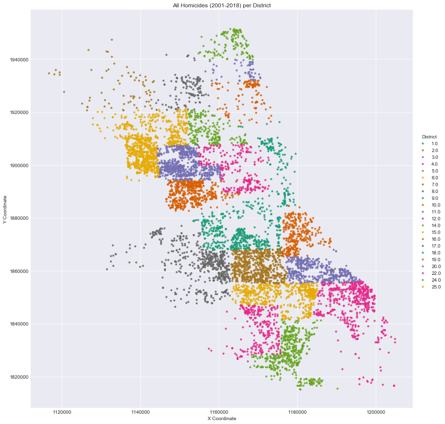
The first visualization is a super simple heat-map of activity that is clear for interpretation but not succinct enough in details. I couldn’t interpret if the murders are normalized for population, or if the top distance key is even needed to translate the effect on geographic regions. However the idea of severity correlated with darker values makes sense and is efficient in showing a sort of ranking. The second visualization strikes me as a creative way of attaching specific points to districts or statehoods. Its method is unconventional in that it allows the points to create shapes of districts by assigning them a unique identifier. More points in an area means that districts emerge as more complete map references.
I like both approaches but recognize their weaknesses in transparency of qualitative treatment. I assume points overlap in the second visualization (it is an 18 year span) and that just reduces cases or makes them unclear. I believe this is an unintended hinderance on a potential important functionality–giving Chicago natives the opportunity to locate where they reside within its context—they are, after all living the burden of these problems. Conclusively both visuals generally lack more tooth for serious research indicators or exploration.
Materials:
CARTO
Open-Refine
Excel
C.L.E.A.R Dataset
Chicago Ward Shape File
Methods:
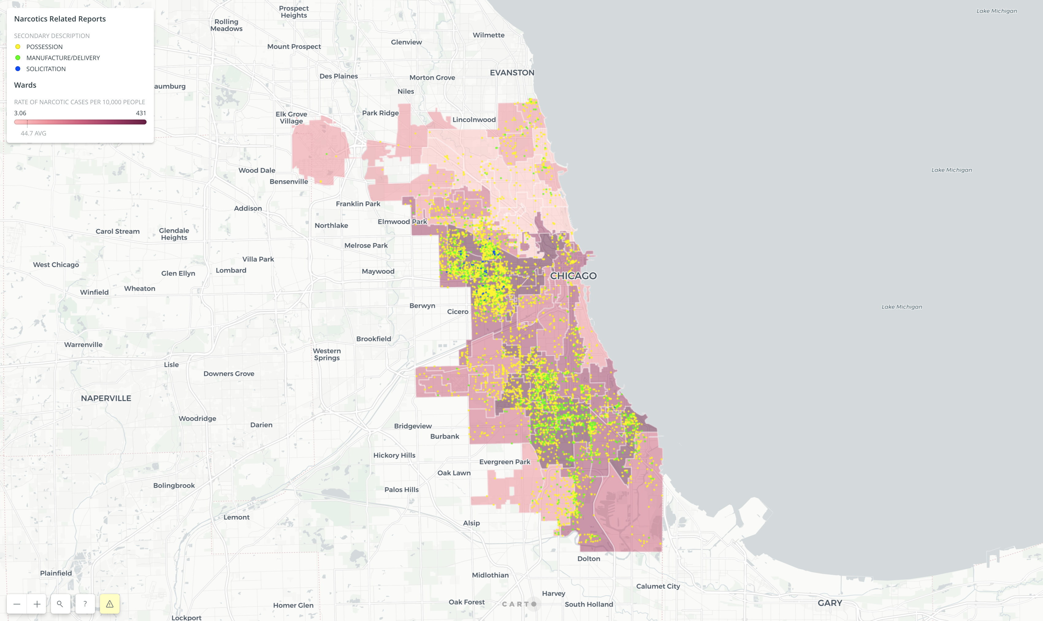
To hone in on narcotics use I specifically selected all narcotics related cases as it was one of 29 primary descriptions. After using open refine to secure the data within the text facet I then looked at the distribution of narcotics cases within each ward.
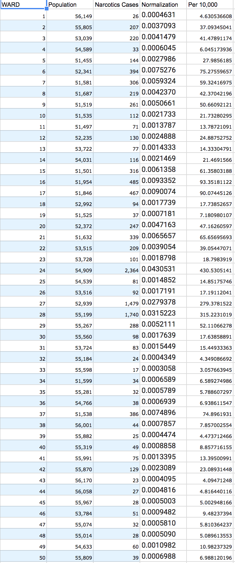
From those numbers I created a separate spreadsheet of narcotics occurrences within each ward, including columns with population from 2010 census data. Using excels algorithm application I normalized the severity of narcotics cases by dividing cases by the population for each ward and multiplying it by 10,000 for a (per 10,000) people rate as seen in the picture below.
From there I was able to apply the sheet to the Ward Shape layer in CARTO by addending their shared columns (WARD). Then I created a normalized value map of the worst afflicted wards. This became the base layer.
For the set goals of this project I needed to Isolate possession, manu/delivery, and solicitation from the secondary descriptions located in each narcotics record in order to represent individual cases as a second layer on-top of a value map. I hoped with this format to evaluate correlation, and detailed case occurrences for residents. Luckily the categories were relatively clear with unique headings for charges under POSS (possession), and MANU/DEL (Delivery/Manufacture) and SOL (Solicitation). I then grouped all crack, heroin, meth, synthetic, and marijuana cases into those three bins resulting in the data facets shown below.
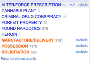
The left over categories could not be condensed into these bins as they didn’t pertain to the specific areas I wanted to overlay on the value map. At this point point I was able upload all data points within the three bins as specific points in CARTO and color code them based on category.
Interpretation:
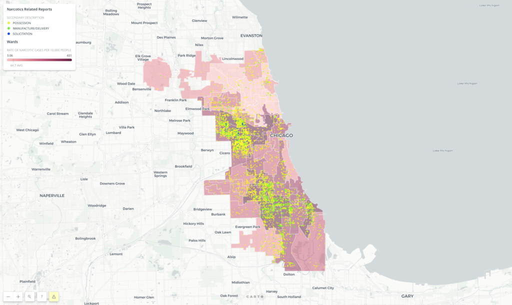
It seems that the distribution of narcotics related crime is concentrated in two main hubs. The first northernmost hub seems to be located on top of the Eisenhower expressway. The second is located to the west of the Chicago skyway.
Ward 28, 24, 27, and 37 is alarmingly packed with cases that lead in the normalized category but also are littered with individual cases on almost every street corner as well. Also it seems that possession is the leading find in narcotics cases with more than twice the amount of manufacturing/delivery records.
It also looks like activity radiates outward from wards with higher rates.
Solicitation is a bit more intermixed throughout.
Reflection:
The current situation for Chicago seems dire in neighborhoods were every street is a hotbed of activity, especially in wards where the normalized rate is also high. For instance North Lawndale is a neighborhood with great activity located in the 24th ward.
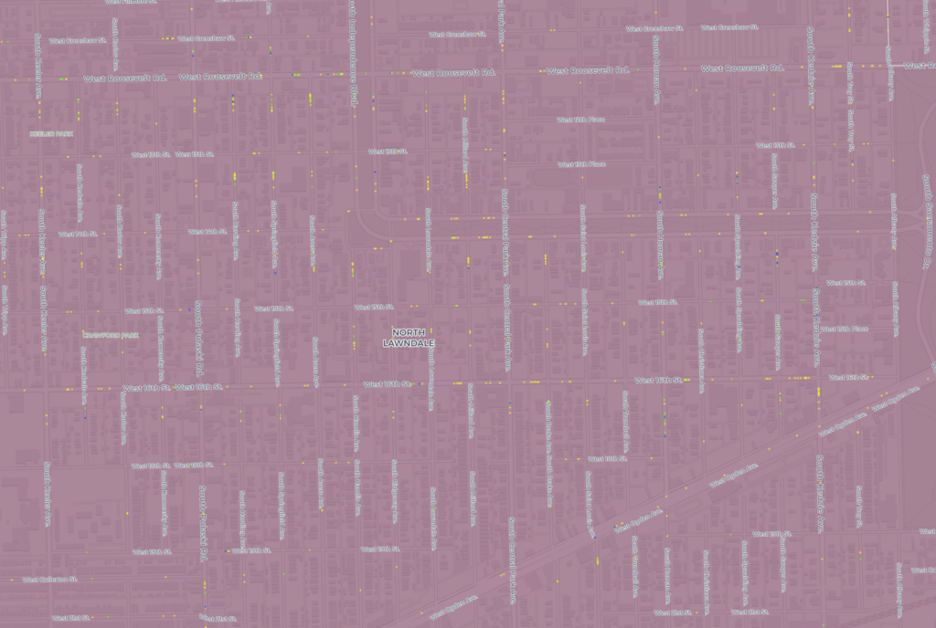
This study could help in addressing those neighborhoods, building profiles for the environment that is reproducing the activity, or networks of individuals who have criminal relationships. the product could address possible hierarchies of the industry.
Another new direction could be to extend the analysis to border states to see if a possible flow or correlation can be made between major travel routes and arrested individuals. Included in the benefits of illustrating drug related cases is the ability to run potential hypothesis for its growth. Class, domestic situations, opportunity, and education are interchangeable bases for normalized heat maps underneath the points of the actual cases.
I am not sold on the color combinations, or the map design itself. I think those should change depending on what is being illustrated. Simplified maps could be better for flow, or regional comparisons. The red monochromatic scale in this study displayed an intuitive aesthetic (Dark bad…Light good). With more time isolating points that are listed as “true” arrests against cases where no arrests are made will give the user an understanding of where, and which category law enforcement is making arrests.
I could also be beneficial to focus on a specific drug like heroin, especially for fentanyl outbreaks that lead to overdoses. Tracing a supply will help provide options for reducing death or warning addicts of bad batches.
The post Mapping Narcotics Possession, Solicitation, and Manufacture/Delivery in Chicago (2017-Current) appeared first on Information Visualization.
