Exploring the correlation between fracking and seismic activity
November 19, 2018 - All
Introduction
On September 3rd, 2016, a 5.8 magnitude earthquake rattled north-central Oklahoma, making it the largest quake to hit the state in its recorded history. Like most of the midwest and the south, the region is not particularly prone to seismic activity, but it had been experiencing a rise for the past several years. As the tremors increased from 2009 to 2015, so too did the use of hydraulic fracturing – known as “fracking” – in much of the state’s oil and gas sites during approximately the same time period due to the the fracking boom.
The process for finding natural gas produces wastewater and other hazardous, non-usable chemicals, so oil companies drill deep underground to store this waste in underground injection wells. While any form of oil and gas procurement produces this type of waste, fracking produces much more and requires the production of more underground injection wells. This process, monitored by the EPA as Underground Injection Control (UIC), has since been linked to an increase in seismic activity. In Oklahoma, regulators had to eventually step in as the earthquakes increased.
My original question – Does fracking increase seismic activity? – was mostly answered by this research, but I also wanted to see if this could be seen through the use of mapping. While Oklahoma isn’t the only state where this correlation between drilling and earthquakes was occurring, it had the most data available for oil well waste disposal injection site locations and is a clear example of this relationship.
Inspiration
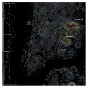
This map shown in the GIS lecture for class inspired the color scheme for my map, leading me to choose to go with a darker background:

Most of my inspiration for this topic came from living in Texas, a state whose economy leans heavily on oil and gas production, and doing advocacy work at the Texas Legislature. In 2014, Denton, TX passed a local ban on the use of fracking because of fears of pollution and the potential for earthquakes, a measure that the Legislature eventually overturned.
Materials
Aside from the datasets used (outlined below), Carto was the main tool utilized in this visualization as well as some sources for background research that are hyperlinked throughout this report. Other materials used were OpenRefine and Excel to do some light editing to the spreadsheets as well as this gradient tool to get hex codes for coloring earthquake magnitudes and the corresponding legend.
Methods
The datasets
The first layer of my map was the state outline of Oklahoma, which I found through a search for state layers in Carto. I then used a dataset of UIC wells in Oklahoma from FrackingData.org to map out the location of these wells across the state. My third and final data layer came from the US Geological Survey in order to show where the earthquakes occurred.
Data cleanup
Both datasets used were already in pretty good shape. For the purposes of my visualization, I deleted any data in both tables that were older than 1999 in order to reflect that date range in Carto, and then used OpenRefine to take out any stray earthquake data that I didn’t want to show in the visualization (mainly earthquakes that occurred way outside of any of the oil wells). After realizing both of my tables were too big to use in Google Sheets, I opened them in Excel to delete a few more stray rows.
Creating the map
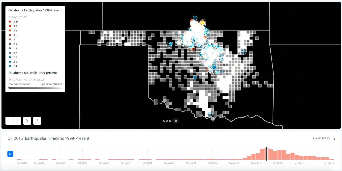
I’d originally planned to use regular points to show where each injection well had been drilled and then considered color coding these points to show which companies owned which wells, but then I decided it would be more interesting to simply show how many wells were in one area. I then got the idea to use squares from Professor Sula in order to aggregate the locations to show concentration/distribution of well locations across the state with a color gradient. After uploading the earthquake data as my third layer, I then animated this data to show earthquake occurrence over time, color coding each point by the earthquake’s magnitude. I also found it much easier to edit colors using CSS rather than Carto’s regular map editor.
Results and Interpretations

The immediate interpretations that comes from this visualization are that underground injection wells do cause seismic activity. This is especially apparent toward the end of the animation, when we can see the uptick of earthquakes that coincides with the uptick in fracking that occurred in the state. While many of these earthquakes were small enough that most people didn’t feel them, the increase in seismic activity overall also led to an increase in magnitude. The distribution also shows that seismic activity began to decrease around the same time that regulators from the Oklahoma Corporation Commission made cuts to how much wastewater oil companies could inject underground.
Reflections for the future
Overall, I think this was my favorite lab so far. When I decided to pursue this topic, I didn’t think the interpretations would show up as quickly and as clearly as they did. I also found Carto extremely easy to use, though I do wish that I could have animated the production of these underground injection wells over time alongside the earthquake data, something that the software doesn’t allow.
I think Carto will become much more useful for me after I learn SQL. This would make it easier to manipulate data in Carto itself rather than exporting, changing in OpenRefine or Excel, and then re-importing the new dataset again.
The post Exploring the correlation between fracking and seismic activity appeared first on Information Visualization.