
Character Networks Visualization for Les Misérables
November 9, 2018 - All

Introduction
Les Misérables is the first novel in English version I read which assigned by my high school English teacher. It is a monumental French historical novel by Victor Hugo, first published in 1862, and is considered as one of the greatest novels in the 19th century. Les Miserable follows the lives and interactions of 11 major characters and 66 supporting roles, particularly the struggles of ex-convict Jean Valjean and his experience of redemption.
In this data visualization assignment, I try to visual analysis the relationship network between the characters in the book with the dataset created by D. E. Knuth in 1993. Before my visualization, I have two standards for the visualization result:
- Clearly present to the viewers which are the 11 major characters and their networks;
- Shows the network between the supporting roles and major roles, and use different colors to show their connections by groups;
With my diagram, I hope the viewer can generate a clear visual idea about the networks of the characters in Les Misérables.
Inspirations
1. Marvel Cinematic Universe as a 3-D network
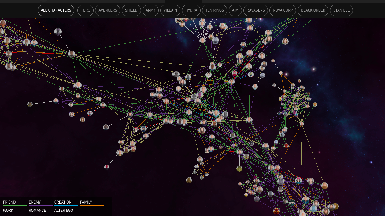
The Straits Times visualized the Marvel Cinematic Universe with a 3-D browsable network. Link colors represent the type of relationship, and proximity naturally represents commonalities between characters.
2. Character social networks in movies
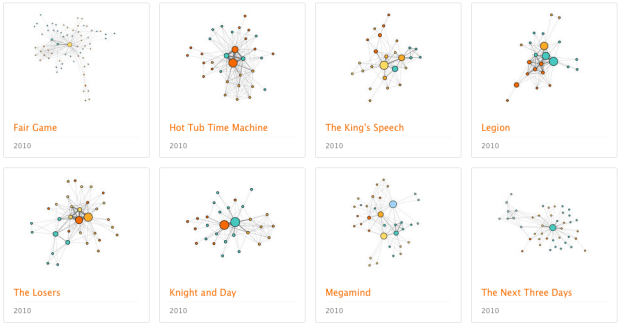
With movie scripts as the data source, Movie Galaxies quickly shows main characters, the extent to which they interact, and hints at a movie’s timeline.
Materials
- Gephi Wiki – Github repository with Gephi datasets
- Gephi 0.9.2 – A free open-source software that allows creating network and graph data
Methods
1. Dataset Searching
Searching for the perfect dataset is always the most difficult part of the assignments. I went to three platforms: CASOS, SNAP and Gephi Wiki. I tried 8 different datasets in Gephi software. Finally, I decided to present the dataset of Les Misérables which created by D. E. Knuth in 1993. The reason I chose this dataset is that the data is very neat that avoid a lot of visual overlaps which makes the network is more clear than the others.
2. Getting Inspirations
In my inspiration research, there are a lot of great network visualization examples. However, I particularly looking for the diagrams which related to character network in movie or book. Therefore, I can learn from the others’ through similar qualities with my dataset. I saw many fancy and aesthetic examples with different layouts. But in my perspective, although the aesthetics of the visualization is important, the suitability between the layout arrangement with the dataset itself is more important than aesthetics.
3. Data Visualizing
I downloaded Les Misérables dataset as a .gml file, which was a graph file. This dataset is a directed graph with 77 Nodes and 254 Edges. I imported this into Gephi 0.9.2 and started to try out different layouts and find the most suitable one. In order to make my visualization meaningful, I ran the statistics which including Average Degree, Network Diameter, Modularity as well as Connected Components.
Results
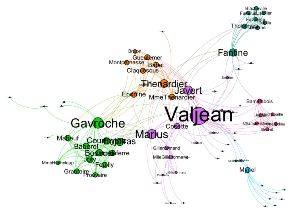
In the Force Atlas Layout, we can see the 6 communities grouped by different colors. Each community has its own major character and following supporting roles. Also, some characters are interacting with two clusters and serve as a bridge. At the same time, we can see the importance of each community depending on the size of the characters’ circle and the number of characters in the community. The size of the circle shows the interaction degree of the characters throughout the whole story.
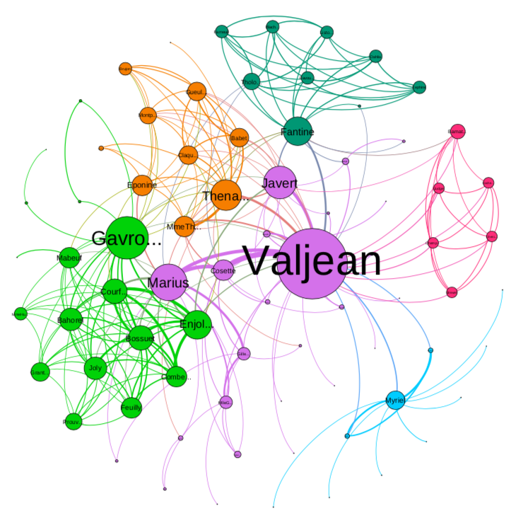
I also created this Fruchterman Reingold layout. In this diagram, we can see the connection degree of different characters depending on the thickness of the lines. At the same time, I reset the gravity in order to show the interaction degree of different groups. For instance, the purple community is interacting more with light green and orange communities rather than pink and blue communities.
Reflections
Gephi is definitely a great network visualization software. I followed the tutorials and learned all the functions. However, Gephi still has its own limits and flaws. I tried to use Sigma Plugin to export the .xml file, but it didn’t show the actual visualization appropriately on both my Safari and Chrome, it only can show in FireFox browser. Therefore, I gave up for the .xml file in my post. Also, another critical problem of Gephi is I can’t draw back my commands. So I wasted a lot of times to reopen the file. Moreover, sometimes the result in the “Overview” is different with the “Preview” result. For instance, my Force Atlas layout can show the thickness of the connection arrow between different characters, but in the preview mode, it can’t show the comparison.
If I have time to further Gephi learning process, I would try looking for another dataset which has 500 to 1000 Nodes, or I will create my own dataset. In my perspective, the small dataset has fewer potentials to create attractive visual effects. On the contrary, if the dataset is too big, it will cause difficulties to run the software on my computer and the information such as labels will overlap with each other too much and hard for the viewers to see clearly.
The post Character Networks Visualization for Les Misérables appeared first on Information Visualization.