
My Experience with Gephi – Visualizing Game of Thrones: A Song of Ice and Fire
November 9, 2018 - All

Introduction
The Idea
It is a well-known fact that Game of Thrones, a series of novels written by George R.R. Martin and its television counterpart, have deeply enticed several fans all over the world. With a plethora of characters and plots, the story is highly intricate and incredibly alluring. As a huge fan myself, having participated in many discussions with friends predicting what’s going to happen next, I thought it was an exciting opportunity for me to perform a Game of Thrones character network analysis using Gephi to figure out who are the main protagonists that emerge and how their interactions have been with others throughout the series of books.
The Inspiration
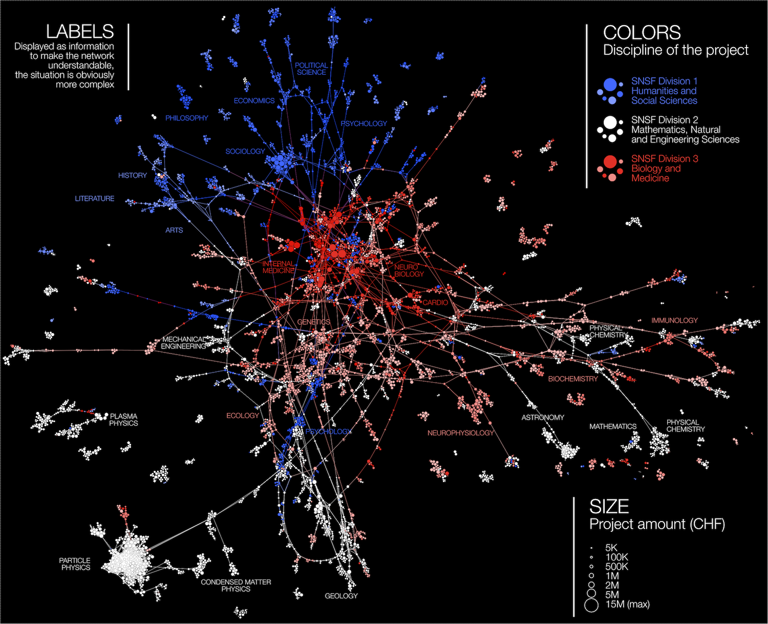
I began my research by searching for articles on network data visualizations, and one of the best sources I could find was Martin Grandjean’s blog. Martin Grandjean is a Researcher in History and Digital Humanities at the University of Lausanne and his blog consists of numerous articles on data analysis and visualization. In one of his posts, ‘Complex network visualization for the history of interdisciplinarity: Mapping research funding in Switzerland‘, Martin analyzed various interdisciplinary Swiss National Science Foundation projects and their funding in Swiss Francs. The result was spectacular and really helped shape my own visualization. I found Martin’s use of a dark background to create excellent visual contrast for a boosted readability of the network highly interesting. The legend added to the visualization also made everything easy to understand. Furthermore, the fact that only significant nodes were labeled created a clutter-free visualization making it more usable.
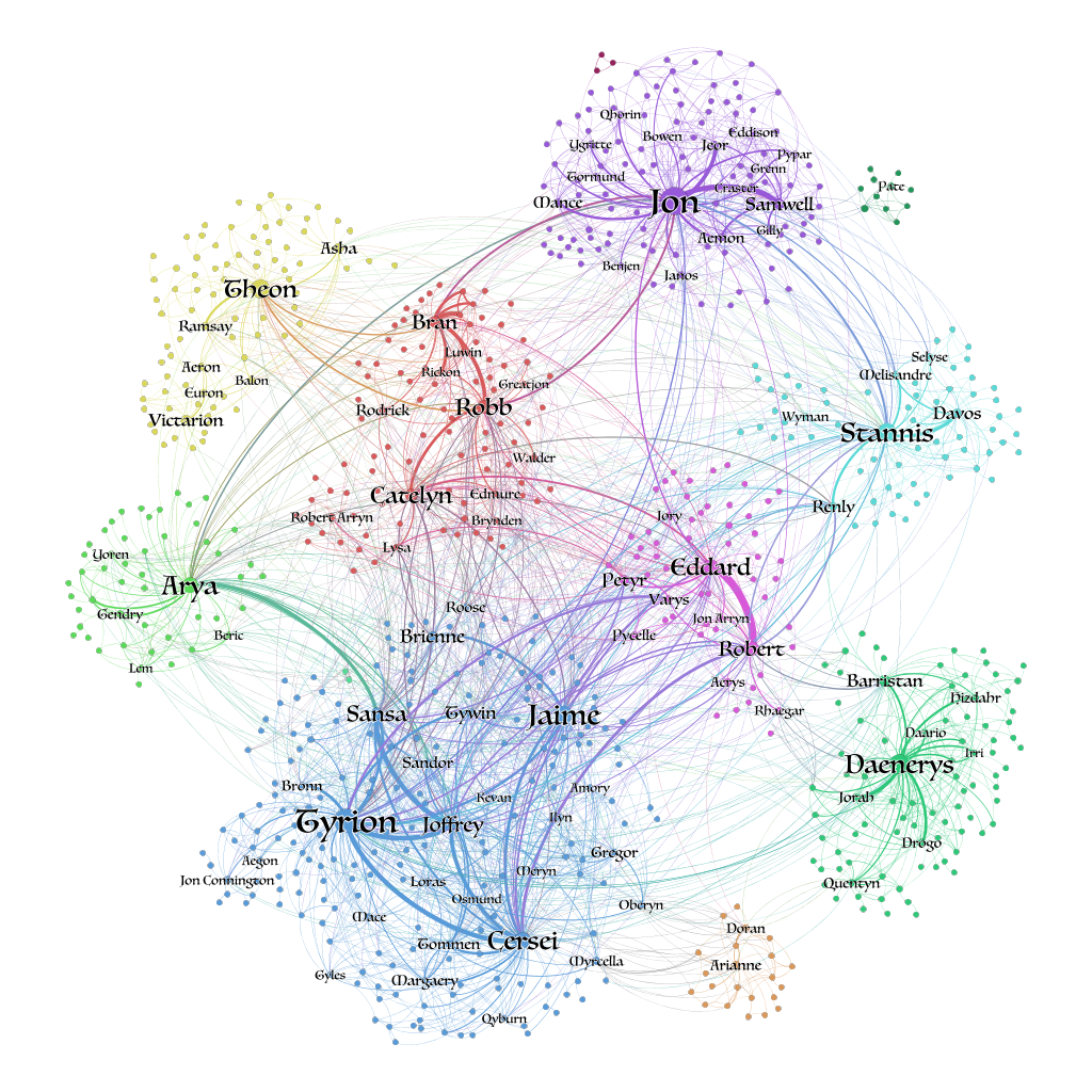
While performing my research on Game of Thrones network data analysis, I came across Network of Thrones – A Song of Math and Westeros, a blog by Andrew Beveridge (Associate Professor at Macalester College). His blog post has the most detailed network analysis of Game of Thrones characters, covering a season-wise analysis of the television series as well as a novel-wise analysis of each of George R. R. Martin’s books. This was a very interesting way to highlight the differences between the novels and the television series. The use of different colors for nodes and edges was also a great way to signify clusters.
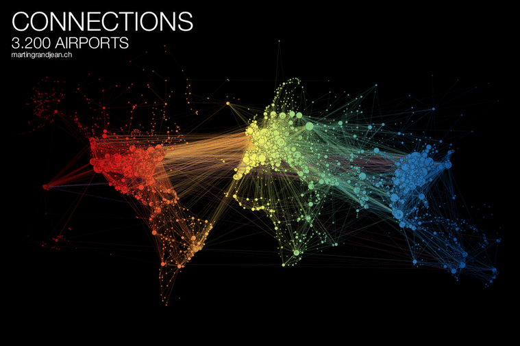
Yet another amazing article I came across was Connected World: Untangling the Air Traffic Network. This was again written by Martin Grandjean where he maps out the connections between all airports around the world by creating a spectacular network visualization. What I found most interesting was the fact that his visualization was very similar to a geographically accurate representation of the dataset. This indicated how clustering in network graphs can be very similar to geographical locations pertaining to the nodes, and I quote Martin Grandjean – “A network, in its very essence, is already a map“.
Materials
Tools –
Gephi (Windows version 0.9.2) – An open-source software for network visualization and analysis. I used this software to create and analyze my network data visualization.
Microsoft Excel – A spreadsheet software by Microsoft, part of the MS Office suite. I used it for viewing the dataset CSV files and understanding them before plugging them into Gephi.
Dataset –
The dataset I used was taken from Andrew Beveridge’s GitHub – A Song of Ice and Fire Page
The dataset was created by connecting two characters whenever their names (or nicknames) appeared within 15 words of one another in the series of “A Song of Ice and Fire” novels (volumes 1 through 5). The edge weights correspond to the number of interactions between these characters. The details of the dataset are –
- Nodes – 796 (Characters in “A Song of Ice and Fire”)
- Edges – 2823 (Undirected interactions between these characters)
Process
Feeding the dataset into Gephi and running some statistics
The first step in my process was understanding the two CSV files consisting of the node table and edges table, which I downloaded from Andrew Beveridge’s GitHub page. Once the dataset made sense to me, I proceeded with importing the nodes and edges tables into Gephi. By default, the tool generated a visualization, but it did not seem to make sense as all the nodes were in one cluttered mess. Therefore, in order to improve the usability, I needed to perform some layout improvements as well as aesthetic improvements.
Improving the layout of the visualization
After this, in order to improve the visualization, I ran the Force Atlas 2 algorithm multiple times, testing out various permutations and combinations of its parameters. I found that checking the ‘Dissuade Hubs’ setting allowed the node clusters to spread out thereby making the whole network appear cleaner. I also tuned the settings to have a scaling factor of 100.0 and ‘prevent overlap’ setting checked, in order to ensure that everything was nicely spread out and there was enough room to accommodate labels and there were no overlaps of the nodes. Furthermore, I also set the ‘gravity’ to 100.0 to bring nodes that were very far apart, closer to the spacialization space. Once the Force Atlas 2 algorithm made the layout a lot better, there was still a huge scope for improvement as the visualization was still quite difficult to understand. To remedy this, I performed the Expansion algorithm several times by a scale factor of 2x each, to reach the right point where the nodes were nicely spread out without making the whole visualization too large. Finally, I also ran the Label Adjust algorithm, to make sure there was enough room for the labels of each of the nodes, without any overlap.
Playing around with colors and weights
Next, I started thinking about how the use of colors and weights could improve the visualization. I applied a color partition on the nodes by ‘modularity class’ and selected an appropriate palette for them. This gave the same color to the nodes that were more densely connected together as compared to the others. I also set the node size ranking on the ‘degree’ to make those nodes larger that had more connections (or a higher degree). I set the labels to grow in proportion to the node size as well so that more prominent nodes were easier to read. As I was inspired by Connected World: Untangling the Air Traffic Network by Martin Grandjean, I made use of a black background for my visualization to create a good contrast. This way, the nodes, and the edges were clearer and were more visually appealing. I gave the labels a standard color of white, which would be easy to read above the node and edge colors as well as the black background. Finally, I also set the color of the edges to be a mix of the colors of each node pairs. This way it was easy to tell just by looking at an edge, whether the node was connected to a node belonging to the same cluster (Based on modularity class) or a different one. The edge weights were also set to vary based on the strength of the connection, which was retrieved from the dataset, which corresponds to the number of interactions between the characters in the book.
Results & Analysis
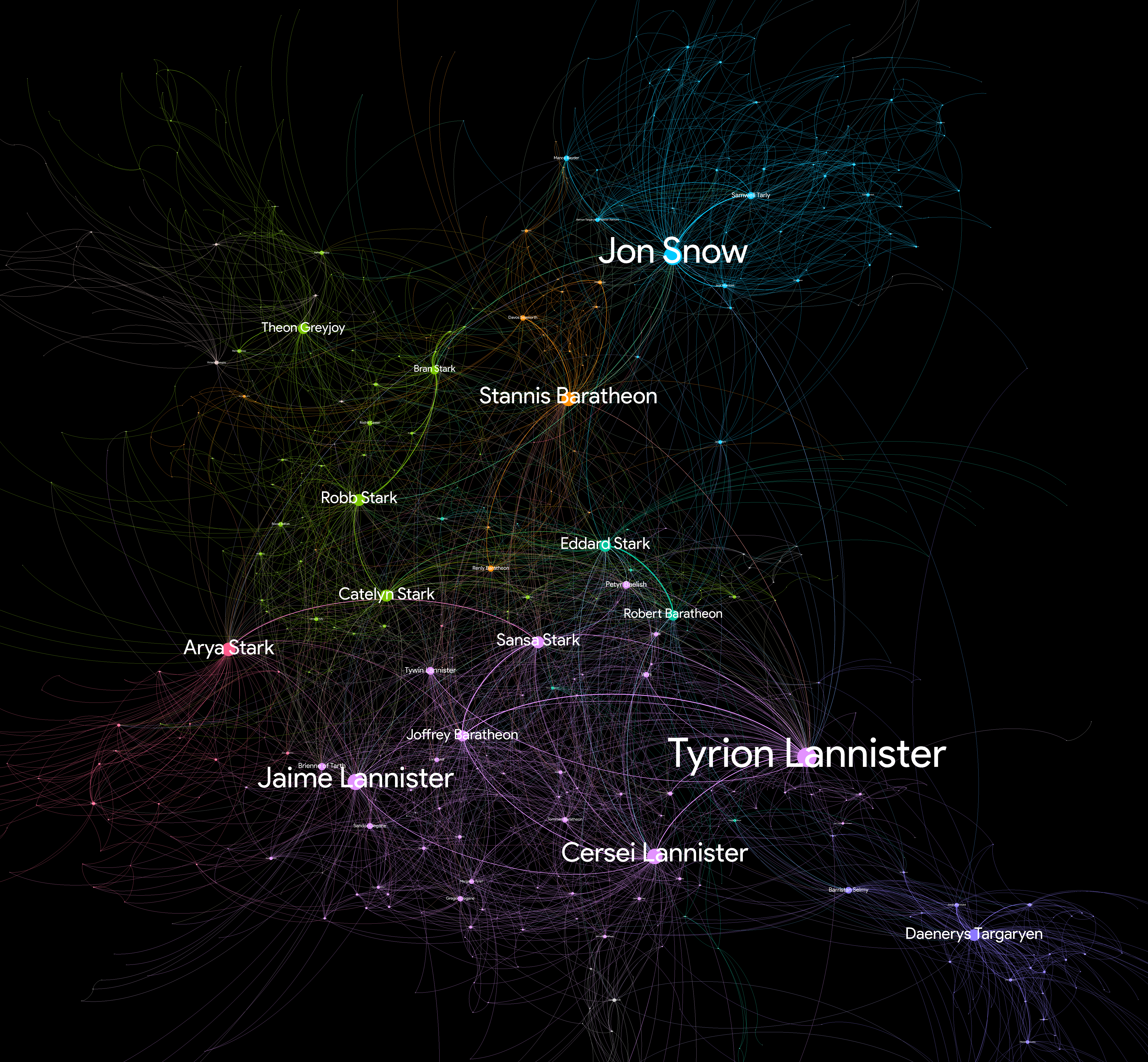
The final visualization rendered on Gephi after the above-mentioned series of steps and tweaks is shown below. You may also download the full resolution visualization to zoom and inspect the intricacies (Note – Please allow it to render as it is a large file).
Some important statistics for my visualization were –
- Average Degree: 7.093
- Average Weighted Degree: 81.982
- Graph Density: 0.009
- Network Diameter: 9
- Modularity: 0.566
By looking at the visualization, I was amazed to find that Tyrion has been the most prominent protagonist throughout the series, closely followed by Jon Snow. Although Jon Snow was quite predictable, I always had a strong feeling that Tyrion would be one of the victors (or should I say survivors) at the end of the story. After seeing these results, I am quite certain that Tyrion is going to do great things in the upcoming season.
Although I had also felt that Daenerys, the Khaleesi herself, might end up on the Iron Throne, her slightly less significant presence in the visualization seems to contradict my prediction. However, it is also true that Khaleesi had been on a different side of the map altogether for a quite significant period of time, reducing her interactions with the other characters deeply involved in the Kings Landing and Winterfell. Her absence from Westeros, therefore, could be one of the reasons behind the slightly smaller node representation of Daenerys.
Another interesting conclusion that can be drawn from the visualization is the fact that the location of the nodes and how they cluster together has a strong connection with where the characters were geographically placed in the land of Westeros and its surrounding regions. For instance, Jon Snow, Samwell Tarly and others are all clustered up, representing the brothers of the Night’s Watch, whereas, Khaleesi, Drogo, and Jorah Mormont are all clustered representing the Essos area, where their story runs in parallel. Also, the Lannisters are clustered up representing their presence in the Kings Landing region and most of the Starks, representing Winterfell.
Finally, it is also amazing to see how Arya Stark is also quite significant in the visualization and her cluster is comprised of lesser-known characters from Braavos, but she still has a strong weighted connection with Sansa Stark, with whom, as per the story, she maintains touch.
Reflection & Future Direction
Gephi is an open source software and I really appreciate its ability to render network visualizations so quickly and effectively, free of cost! However, I still believe that there’s a huge scope for improvement for the overall interface, which is extremely dated and not easy to use. Furthermore, a lack of the well known undo feature was a huge inconvenience. For instance, if I performed an action that was undesirable, I needed to reload the last save point and redo all the steps. This slightly suppressed my desire to explore the tool in depth, as experimentation with various actions was a cumbersome effort.
For this project, I covered a combined dataset of volumes 1 through 5 of the series “A Song of Ice and Fire”. On his GitHub page, Andrew Beveridge had also uploaded datasets for each of the volumes individually. I believe It would be a great future project for me to perform a book-wise analysis of the character network and highlight the changes as the story progresses.
I would also like to find a dataset that covers the television series – Game of Thrones so that I can map the network of characters on a per season basis and analyze it. Furthermore, it would also be very interesting to compare and contrast the novels versus the television series and find out how the two differ.
Finally, a whole new dataset awaits! Game of Thrones season 8 is due to be released in 2019 and I can’t wait to grab the dataset once the entire season is aired. It would be fun to analyze the final season, hopefully not too many characters would die due to the white walkers and I would still have a significant number of nodes to work with!
The post My Experience with Gephi – Visualizing Game of Thrones: A Song of Ice and Fire appeared first on Information Visualization.