Looking at a network of disorders and disease using Gephi
November 6, 2018 - All
Introduction
I’ve always been interested in looking at network data and wondered how they were made. We humans can never be immune to health problems. Many people die from severe illness around the world, and there are still many other diseases that have no cure. I decided to take this opportunity to look at common disorders with links to disease genes.
Some questions I wanted to answer were:
- Which diseases are the more common than others?
- How are certain diseases and disorders linked to each other?
Inspiration
- Air Transportation Network
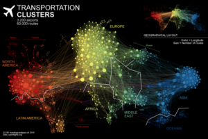
 This air transportation network attracted my attention because of the layout. Not only each color represents different continents, the links are very clear. The best part about this visualization is that it shows rough outline of the world map, which makes it easier for the audience to pin point where in the world the clusters are located.
2. Audience Visualization of people discussing Chatbots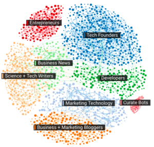
This visualization represents specific group of people talking about chat bots. I love the clarity of tables and colors associated with it and information is easy to grasp. Majority of the people who are talking about chat bots are people in tech!
Materials
- Gephi wiki Data Sets – Github repository with Gephi datasets
- Gephi Software – A free open-source software that allows creating network and graph data
Methods
-
Search Dataset
Searching for the right dataset always takes a lot of time. I mainly explored two different website: Casos and Gephi wiki. There were some really interesting datasets. Initially, I was looking into the Marvel Universe, however the dataset was so large that it would stop Gephi from running. So I decided to go for my secondary option with a biological network, Diseasome: a network of disorders and disease genes.
-
Visualization Inspiration
I went online looking for some awesome network visualizations. There were many that were simple and some really good visual representations of different type of datasets. I definitely looked for visualizations that were clean, neat and well laid out. I also considered the aesthetics of the visualization.
-
Visualizing Data
The Diseasome dataset came as a .gexf file, which was a graph file. I imported this into Gephi and started trying out different options with the visuals. I was confused in the beginning because there were so many options. But after a little while, I understood what I was doing. In the overview tab, I could choose the type of layout I wanted. I finally chose to do a Fruchterman Reingold layout. This turns the visual in a circle, and places the related network around the same area. From here I went to statics to do a modularity run using weights, which detects the community. To make the colors consistent by community, I went to appearance > partition by modularity and changed the colors accordingly. This made my visualization more colorful and was clear where the community were. In the preview, I could do more modifications to the visuals; like labeling, font and color. This was simple to do compared to the overview. I made another network visual, but with a different layout, Force Atlas 2. This basically makes a linear model, that gives distance with different communities. After using Force Atlas2 layout, I took the same steps in appearance to improve the visuals. When all the visualizations were done, I exported the files to svg and saved it as JPEG images.
Results
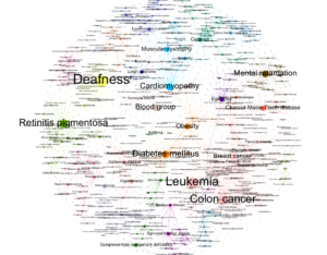
This is the Fruchterman Reingold layout. The different communities are grouped by color. The label size depends on the size of the node. It is clear that cancers are the most dominant disease out of them all. I did not know deafness had a great portion too! There are certain clusters around the layout, like cancer, diabetes, mental health and more. I removed the ‘gene’ labels because they made the visual even more text heavy than it is right now. It looks better with less text. I decided to keep the others because I wanted to represent how dominant some diseases are compared to others.
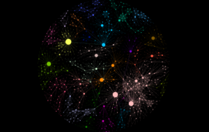
I created this to see how my network would look without the labels on a dark background. It looks like a disease itself. I love how the colors show very vividly on a black canvas and it’s a perfect circle.
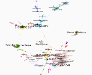
Force Atlas2 made the visualization more clustered compared to Fruchterman Reingold layout. I had to remove a lot of labels that had in-degree of 1-5 because it made the dominant labels hard to read. This way the visual looked cleaner. Like the other layout, this also clearly delivers the message that cancer is one of the most common disease compared to others that exist today.
Reflection
Gephi definitely has a learning curve. Even though there are tutorials that are easy to follow, sometimes the visualization would not come out the way I wanted it too. It is also not the most intuitive software because it does not have an undo functionality. The Gephi file has to be constantly saved each time a new visualization is rendered. Even with so much frustration with the software, I loved trying new visualizations to see how they turn out.
If I were to expand on this project, I would try looking for other layouts, for example circular layout and create a network from there. I would also like to learn how to make the visual cleaner. I did try my best to make it clear in my current visualization, but I would want to improve on it more. I think there is potential. Adding interaction to the map would be an option as well.
The post Looking at a network of disorders and disease using Gephi appeared first on Information Visualization.