
Visualizing Marvel’s The Avengers – Phase One
November 7, 2018 - All
INTRODUCTION
Diving into network analysis and visualizations, I chose to explore the topic of the Marvel Universe using the open-source software, Gephi.
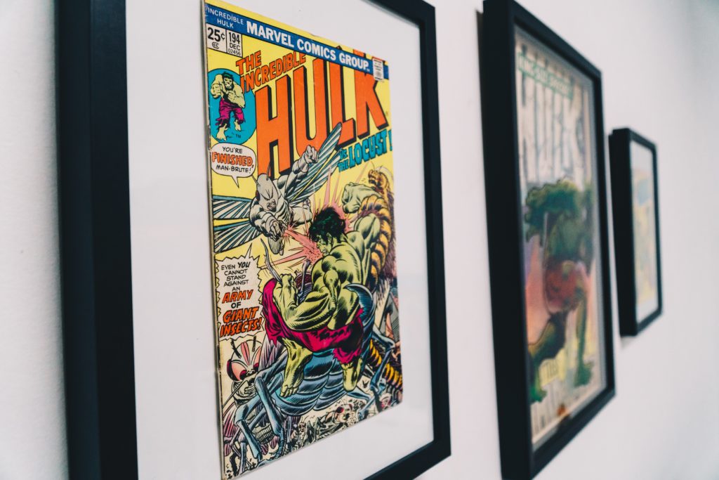
With its roots going back to Timely Publications in 1939 and the Marvel branding in 1961, Marvel Entertainment has expanded beyond the comic book world to movies, tv, video games and more. Phase One of the Marvel Cinematic Universe began ten years ago with Iron Man, and now we are in Phase Three with 20 movies having been released.
As a major fan of the movies, my goal for this project was to analyze the connections between superheroes. The dataset I used is for Phase One and included characters, locations, and objects such as weapons/gadgets. Later in the process, I narrowed down the focus to only include key characters.
INSPIRATION
Drawing inspiration from Marvel’s VP of Web and Application Development, Pete Olson, I was hoping to create something similar (on a much smaller scale) where each node represents a character and each line represents shared appearances of those characters. Aside from the stunning visualizations, I was also fascinated by the four clusters of characters corresponding to the X-Men, the Avengers, Spider-Man and Wolverine, whereas my visualizations focus solely on the Avengers.
Source: Marvel Entertainment Tumblr
MATERIALS
- Dataset created by Netanomics in 2016, downloaded from CASOS (Center for Computational Analysis of Social and Organizational Systems).
- OpenRefine – Free open source tool that enables the cleaning, transforming, and exploring of messy datasets.
- Gephi – A powerful free open source network analysis and visualization software that runs on Windows, Mac, and Linux.
METHODS
Data Selection and Cleaning
After downloading the dataset from CASOS, I opened the xml file into OpenRefine to clean and format the data to fit Gephi’s requirements. To read the data, Gephi requires items to be separated into three columns: Source, Target, and Type. Source data appear as nodes on the network graph, and Target data represents the edges, or connective lines, between the nodes. Type refers to the direction of the relationship between nodes, and in this case I applied Undirected for each record. Once I finished cleaning and organizing the columns, I exported the data as a comma-separated value (csv) file. Later in the process I wanted to include characters only, so I manually removed data on location and objects and exported this as a separate csv file.
Visualization
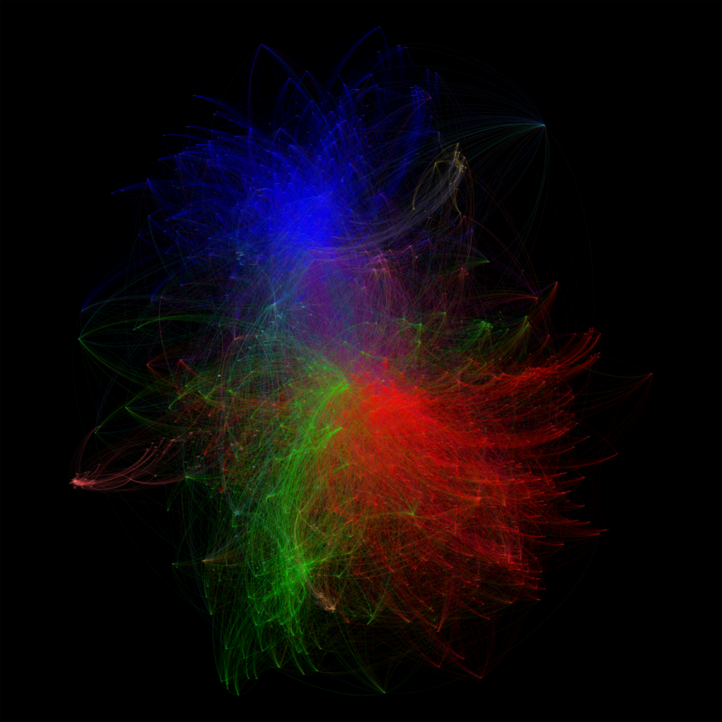
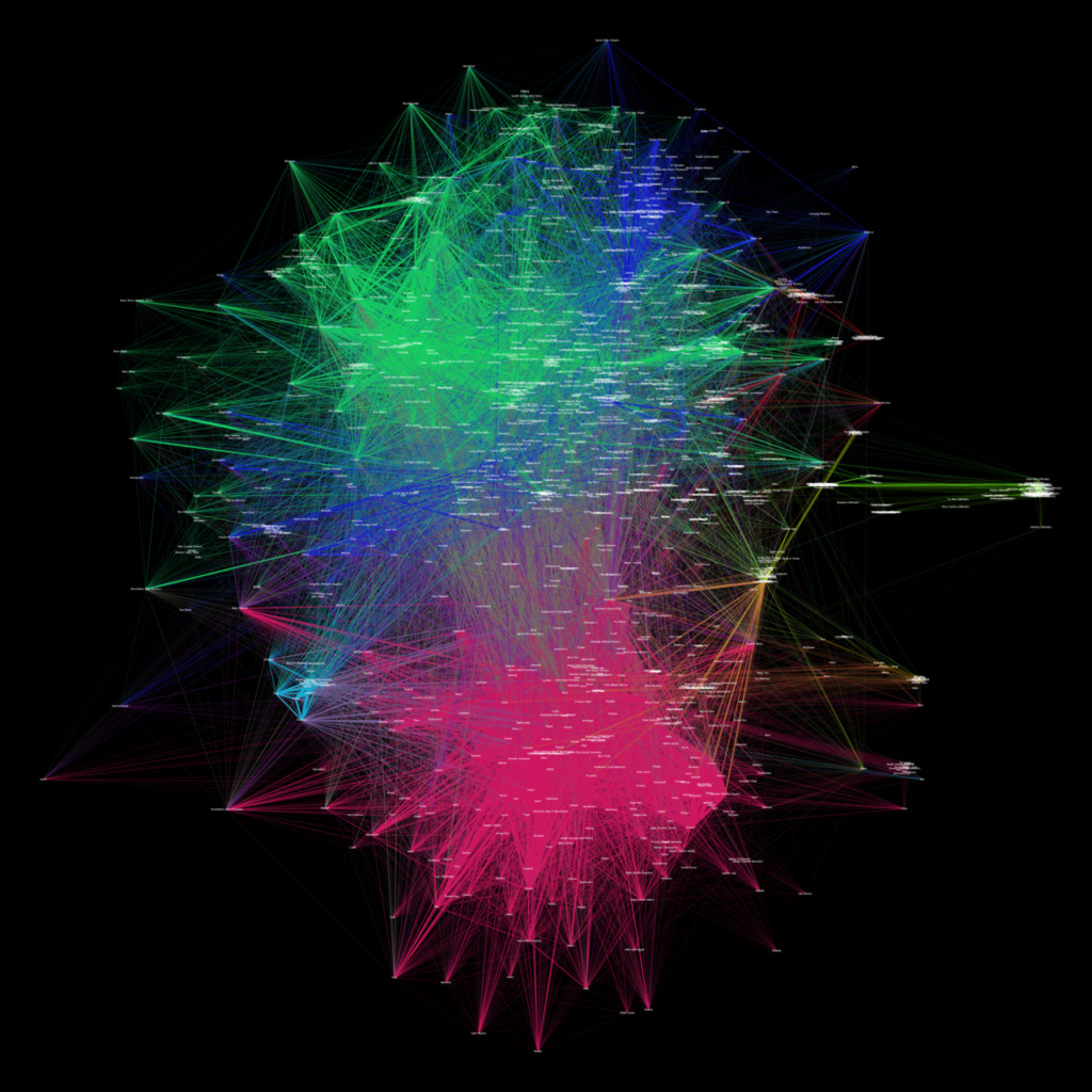
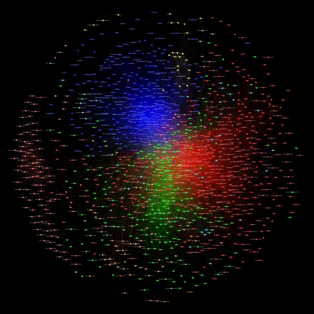
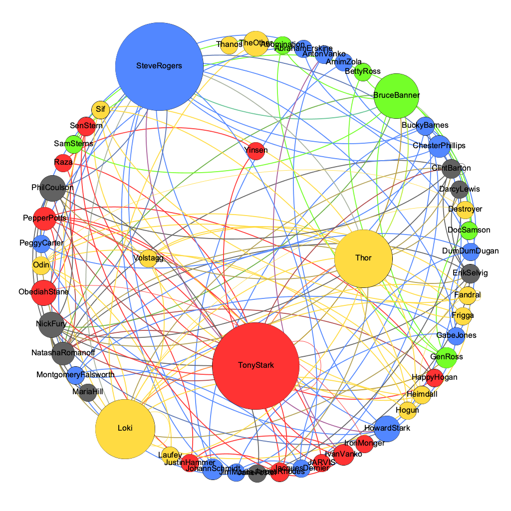
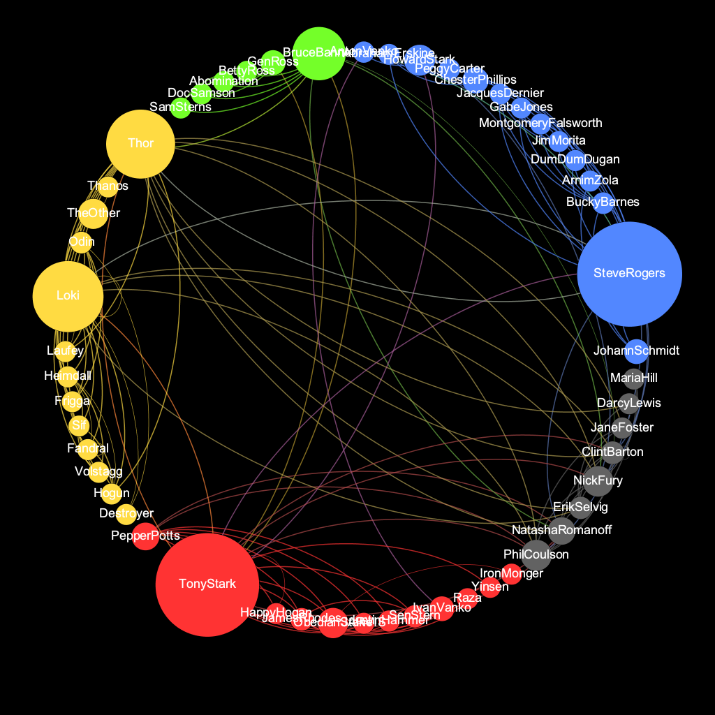
After uploading the first csv file into Gephi, I chose a layout algorithm to get a better look at the data’s shape. The layout I mainly worked in was Force Atlas with minor tweaks to the settings. Other layouts I explored were Circular Layout and Dual Circular Layout. Now that I could see an overall shape, I wanted to gain a better understanding of the connections within the graph. To do that I ran statistics on diameter, density, and modularity. I then formatted my graph to visualize the connections and clusters by adjusting the color and size. I repeated the process with the second csv file containing only character data.
RESULTS AND INTERPRETATION
The final visualizations are provided below.
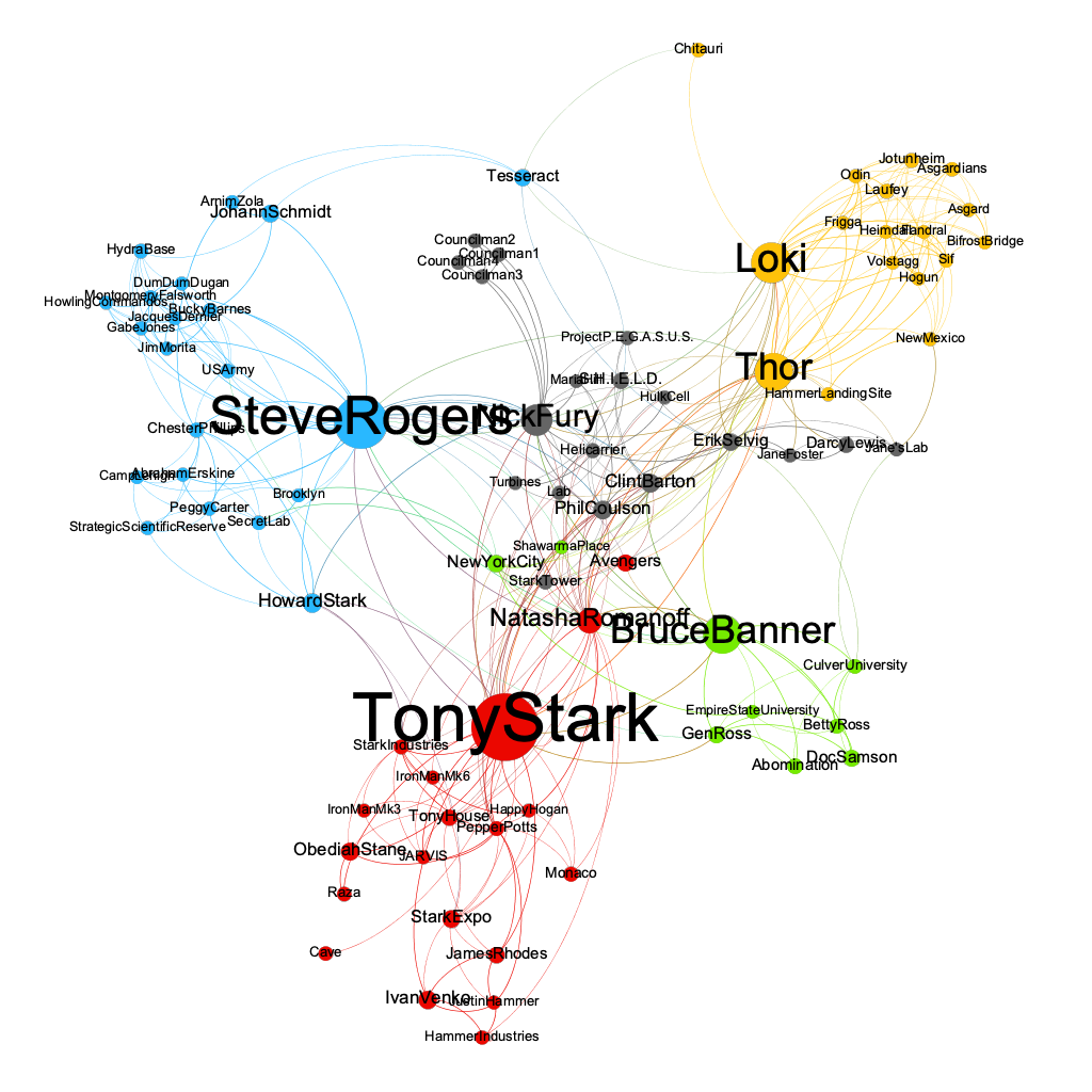
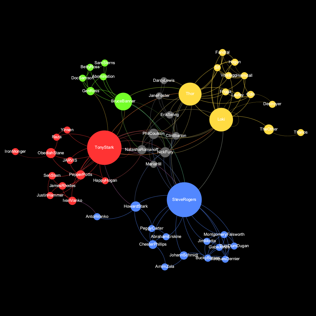
The visualizations that best represent what I had been trying to achieve are the ones created through Force Atlas. The clusters are much clearer as is the hierarchy among character connections. The visualizations allow comparison between the storylines and their importance in the Marvel Universe Phase One, of Tony Stark (Iron Man), Steve Rogers (Captain America), Bruce Banner (Hulk), and Thor and Loki. We can also interpret the role of Nick Fury as being a smaller behind the scenes character, but with many connections to the major story arcs.
REFLECTION AND FUTURE DIRECTIONS
Gephi has proven to be a very powerful tool for network visualizations, but with a similar learning curve to a program like Adobe Photoshop. It offers a range of useful tools and functions, but it takes time to explore and understand them. A major downside of Gephi is that it does not provide an “undo” option, which proves inconvenient if you’re not accustomed to saving files after every change, but it’s overall ability to analyze and visualize the connectivity between networks is outstanding.
I would like to further explore the various tools within Gephi, possibly for a final project. As interesting as it was to work with this dataset of comic book characters, I would like to attempt a project involving the connection of keywords of a specific topic and how they change over time. Now that I have a basic understanding of the layout algorithms I would next like to focus on how distinctions between connections can be made through a stronger design emphasis (color, size, font).
The post Visualizing Marvel’s The Avengers – Phase One appeared first on Information Visualization.