Connecting Crime Categories in 3 Similarly Affected Chicago Wards
November 5, 2018 - All
Introduction:
For the merits of this network visualization I thought it would be an interesting tool in diagnosing crime, and formulating a type of network that could show how similar communities share the burden with one another. I was able to find this dataset which is a regularly updated record of crime occurrences in the City of Chicago from the Chicago Police Department’s CLEAR (Citizen Law Enforcement Analysis and Reporting) program. Inherent in the data were very extensive descriptions of events, dates, approximate locations, and types of crime.
After examining the data I broke down occurrences of crime subject to specific wards and selected 3 that had very similar amounts of crime. I wondered if these wards shared a similar distribution of offenses, or if there may be an imbalance? More importantly, could the differences in distribution help in furthering an understanding of why specific types of misdeeds are happening in certain area’s and what could be done to alleviate communities from damage of these issues.
All of the data presented in this visualization is from our current year, 2018.
Inspiration:
I know criminal networks are really starting to emerge at the forefront of forensics and research. This article I had come across earlier in this project was fascinating to me. Although the strategies listed for specific type of networks aiding investigators are reliant on data not commonly available to the public, I really wanted to find a different way of melding some of the concepts discussed in the write-up. Could a network be used for more available abstract data on crime rather than very personal people to people connections?
Materials:
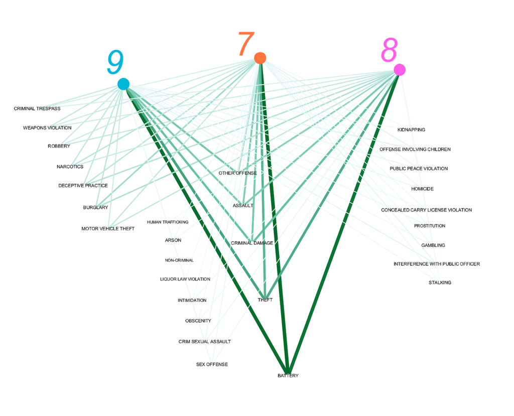
The wards I extrapolated from the data were as follows:
- Ward 7- 6688 records of crime
- Ward 8- 6656 records of crime
- Ward 9- 6992 records of crime
Crime is largely considered to be a symptom of people functioning in a society that has laws, inherent values.etc. So by extracting societies with similar amounts of total crime, and comparing them in categories of offense what would it show? Could the categories they most share be indicative of closely linked societal problems like poverty, job availability, or criminal organizations?
I took all three wards and limited my columns to just the ward the crime happened in, and the classification of the offense giving me a total of 20336 records. They became my edges.
My nodes were all 29 types of offenses, and the three wards.
After putting this information into GEPHI the edges become weighted based off records and the weight between the nodes became the anchor for how I organized the data.
Methods:
A lot of my experience with Gephi during this lab was one of guess and check. Trying to find different ways of thinking about the existing data in terms of source and target was difficult. I started by thinking of this data as an ego network where the focal node would be a ward, and the targets would become the type of offense. The idea of comparing similar wards only came to me after noticing certain wards had very close amounts of crime instances. I think the possibility of connecting these communities to offenses within their jurisdiction was more compelling, and also more of a design challenge especially for a first experience with Gephi.
I used the different pre-set layouts to see how the algorithms could sort the information in designs that made sense, however it just didn’t render enough clarity of of the data. So I hand formatted the nodes by pulling them in groups associated with their edge weight. I think the importance of this visualization is not in the nitty gritty of each category but in a quick and clear rundown on a couple categories that
- Occur the most and are distributed evenly among source edges
or
2. Occur the most and are distributed unevenly align source edges
Results:
I was certain there would be one instance of a strong weighted edge dominating the design landscape not shared by all the wards. However I seemed to get an even dispersal along categories for these wards.
These categories emerged as stronger shared occurrences
Battery – Theft – Criminal Damage – Assault
Interpretation:
This evenness among categories could be the result of proximity as all three wards are essentially side by side and are not far enough away to have imbalanced relationships. These wards may share similar economic situations, environments, and people. Upon further inspection from NBC Chicago’s Get to Know Your Ward they are profiled almost identically:
Ward 7-“Violent, middle and working class”
Ward 8-“Violent, historic, close-knit and working class”
Ward 9-“Historic, working class, up and coming and violent”
Reflection:
I think there is a lot more exploration in how this network is setup. In the future it would be advantageous to select numerous wards and normalize them based off of population to evaluate them in the same categories. You could do this for all the wards in Chicago.
Perhaps one could only evaluate communities with similar profiles to see the distribution. If it is uneven in any area that may elicit questioning of the factors that are occurring in that community leading to a shift in distribution. If the same factors were able to be recreated in other communities would it have the same effect?
Depending on the data available you could ask the same questions based off of non regional populations. For instance, would a working class community in Pennsylvania bear the same burden in those 4 categories? Evaluating these instances further will provide a more dynamic network of illegal offenses and the places where they happen.
The post Connecting Crime Categories in 3 Similarly Affected Chicago Wards appeared first on Information Visualization.