
Analyzing the connectedness of an airline’s routes
November 5, 2018 - All
I’ve always been interested in the infrastructure of the world. The ways in which goods and people move from place to place, and the complexity and scale of this system, is fascinating. It is this interest that lead me to attempt an infrastructure visualization for the networks lab.
There are public datasets available for this topic, including air and sea routes, but I wanted to build a dataset to familiarize myself with the data. To accomplish this, I picked the largest American airline, Delta Airlines, and made force-directed and geolocated network graphs of every location Delta flies from their US hubs to explore how an airline connects cities all over the globe.
Inspiration

Maps of this nature have always been powerful for me, and I always wanted to make one – another reason I pursued this topic. However, before this lab, I didn’t know how to achieve it. This particular map has implied geography, there is no actual geographic layer in the map. To accomplish this, a large dataset would be required. I think this map does a good job of displaying how connected our world is, though it lacks route volume. I wanted to take a first step into exploring this sort of visualization with this lab.
Materials and Methodology
The data for these visualizations was created using Delta Airlines’ website, specifically the ‘Search Destinations’ page. An edge table was created by searching for destinations from each of Delta’s US hubs (Atlanta, Detroit, Los Angeles, Minneapolis, New York JFK, New York LGA, Salt Lake City, and Seattle.) Each edge represents a flight from a hub to a destination, nationally and internationally. Every edge in the table is undirected, representing an assumption that flights run both directions between a pair of cities. Cities function as nodes in the graphs. The edge table is available here. The edge table was imported to Gephi, an open-source network visualization tool, as a CSV. Gephi autogenerated a node table. The edge table contains 580 edges while the node table contains 226 nodes. The edge table additionally has State and Country attributes, while the node table just has Country attributes.
Using the ForceAtlas2 layout in Gephi, a force directed graph of Delta’s routes was generated. Statistics were then run on the force directed graph to calculate the average degree, diameter, density, and modularity. Nodes were sized by degree and colored by the country the city each node represents is in. Edges were colored in a boolean fashion, either domestic or international destinations. Labels for nodes were applied in Gephi. The force directed graph was exported from Gephi as an SVG to Adobe Illustrator. I used Illustrator to fix the coloring and labeling, as well as remove the labeling from destinations that were not Delta’s hubs. All of this styling was done in Illustrator because Gephi’s coloring and styling tools are limited and very difficult to work with.
For the network graph map, I exported the autogenerated node table and added geocoded coordinates for every city in the table. I used QGIS and Open Street Map geocoding to acquire latitude and longitude coordinates. This geocoded node table was imported back to Gephi. Using the Geo Layout plugin, Gephi generated a network graph with geographically accurate locations for every node, in Mercator projection. This graph was exported from Gephi in SVG format and styled in Illustrator. A base map was designed with Mapbox Studio Classic and exported to Photoshop as a PNG. The network graph was added to the base map in Photoshop.
Results and Interpretations
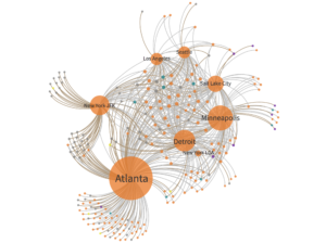
The force directed graph indicates that there are a large number of destinations that are served only by one hub. For Atlanta, most of these are regional locations in the South East United States. For New York’s JFK Airport, they are all international destinations. Nodes are sized by number of connections, indicating that while Delta Airlines considers New York’s Laguardia Airport (LGA) a hub, it has a limited number of flights to other destinations. It’s also obvious from this graph that Atlanta is Delta’s base of operations. The nodes in the center of the graph are mostly major US cities that are not hubs but are served by Delta from multiple hubs.
This network has a density 0.023, a result of the hubs serving regional destinations that are only served by flights from a single hub. Major US cities have flights from multiple hubs, which can elevate this number, but the large number of regional destinations keeps it low. This network has an average degree of 5.133, indicating an integrated network, and probably elevated by the large number of regional connections from Atlanta and other major cities. The diameter is 3, indicating you can fly from any city in Delta’s network to any other in a maximum of 3 flights. Modularity is 0.264, and there are 5 communities.
Geolocated Network
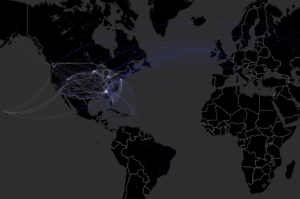
This is the same network, but geolocated and visualized against a world map. I’ve cropped out the Asian (Japan and China) destinations because the edge lines are misleading. Flights to Asia do not fly east from the US, they fly west. This is a potential shortcoming in the plugin used to geolocate the network. Additionally, the edge lines do not represent the exact route an airplay would fly a route. Again, nodes are sized by degree. This visualization does a better job representing the discrete destinations, specifically International destinations, than the force directed graph. The addition of geographic reference from the base map changes the nature of the visualization. Details about connectedness and clustering are lost in favor of improved understanding of the breadth of the network. The connectedness of the US and Europe is exemplified in the number of flights over the Atlantic to European destinations, while the number of direct flights to South America, Africa, and Asia indicate the opposite.

Reflections
I understand this is not exactly hard hitting data, but I’m ok with that for now. The dataset was chosen because it wasn’t publicly available, so I had to build it, allowing me to become more familiar with network data. Additionally, because it had a geo component, I could make a map like the one above, something I had wanted to do for a long time. This network allowed me to learn the basics of Gephi. In the spirit of improving this network, expanding it to include every flight Delta flies from any airport would expand the scope. Additionally, weighting the edges by the volume of flights would be very relevant and a big improvement to the network.
For my next network graph project, I would like to tackle a network with vastly more edges and nodes than are contained in this one. I’m still interested in the connectedness of the world, and there are many topics within that field that are a bit more hard-hitting and potentially informative.
The post Analyzing the connectedness of an airline’s routes appeared first on Information Visualization.