How much influence does the telecom industry have on Congress?
November 4, 2018 - All
Last year, Congress voted on not-so-unusual party lines to dismantle a rule from the Federal Communications Commission (FCC) entitled “Protecting the Privacy of Customers of Broadband and Other Telecommunications Services”. This rule would have prohibited internet service providers (ISPs) from selling browsing history and other kinds of personal consumer data to third-party companies without the consumer’s express permission, much to the chagrin of the telecom companies that run those ISPs. According to Pew, one-quarter of adults in the U.S. spend basically every waking moment online, generating tons of data every second that many companies can sell for advertising and other purposes. As the Center for Responsive Politics puts it:
“The resolution — which was approved by the Senate last week — blocks a [FCC] rule that would bar ISPs from selling customer data, including app usage, browsing history, even Social Security numbers, to marketers and others. Widely praised by privacy and consumer advocates when it was finalized last year, the rule hadn’t yet taken effect. Now — assuming President Trump signs it, as he’s expected to — it won’t.”
President Trump signed the resolution to repeal the online privacy rule on April 3, 2017.
These same telecom companies that wanted this rule repealed also happen to pump millions of dollars toward members of Congress and their leadership PACs every year to, I assume, influence policy outcomes. Using a dataset from the Center for Responsive Politics’ online database, OpenSecrets.org, I decided to explore the possible relationship between the monetary contributions of the three largest telecom companies in the U.S. – Verizon, Comcast, and AT&T – from 1989 to 2017 and Congress’ decision to repeal this important federal rule that would help protect consumers’ privacy online.
Inspiration
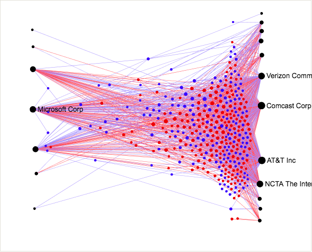
A post on OpenSecrets.org discusses net neutrality, a set of guidelines that require ISPs to let all data on the internet be treated equally, prior to the December 2017 vote from the FCC to get rid of it. In that post is a great network visualization on telecom contributions to Congress:

I was also inspired somewhat aesthetically by The Internet Map:

Materials
The dataset used in this visualization was Contributions from AT&T, Verizon and Comcast to 115th Members from OpenSecrets.org, a database managed by the Center for Responsive Politics. The data was cleaned up using OpenRefine and Google Sheets, then uploaded to Gephi to create the visualization. After finishing the design process, I exported from Gephi using the Sigma js plugin, which produced a set of HTML, CSS, JS, and JSON files that I could use to design an interactive version of my network visualization to publish online. From there, I used Dreamweaver, TextEdit, and a Github repository to do some front-end development, then CyberDuck as an FTP client to upload the files to my personal site as a backup.
Methods
Below are the methods I used to create this visualization, starting from finding and cleaning the dataset to designing the interface for the interactive version of the visualization.
The dataset
The dataset I retrieved from OpenSecrets.org was already very organized, clean, and understandable. After some help from Professor Sula, I was able to wrap my mind around avoiding making this visualization a multimodal network (something that doesn’t work well in Gephi) by grouping the nodes representing telecom companies in with the nodes representing members of Congress, with the telecom companies serving as the source nodes and the amount of their contributions serving as the edges and weights between nodes. This also meant that this entire visualization was directed, with the flow of the relationship only going in one direction: from Verizon, Comcast, and/or AT&T to a member of Congress. It’s important to note here, as the authors of this dataset included in the data table, that contributions counted in this dataset did not come directly from the companies themselves, which would be illegal, but rather “from the organizations’ PAC, their individual members or employees or owners, and those individuals’ immediate families. Organization totals include subsidiaries and affiliates.”
Data cleanup
As said above, this dataset was quite clean as-is, but there were a few things I had to do to adapt the data for how I wanted to use it for this lab, including creating separate node and edge tables to upload separately into Gephi.
To create the nodes table, I removed all empty columns as well as a column that shows each record’s political party and amount of contribution by political party. I also closed other columns that I didn’t need for the initial visualization until I had the Congressperson’s name column, source column, weight column, and some attribute columns. Not knowing if the other columns would import into Gephi correctly or not, I decided to take them out for now and put them back in later after creating the visualization. The same process was used to create the edge table, taking out all columns except for the necessary ones that matched would allow the edges to match between nodes.
Creating the network
In order to indicate the varying amount of contributions between telecom companies to members of Congress, having the nodes representing telecom companies be positioned toward the middle of the graph repelling those congresspeople with little or no contributions outward while pulling those with larger and more frequent contributions inward seemed like the most logical way to show those relationships. In Gephi, this also seemed to be the only network that would work when I ran different types of layout templates over the data. After having the program run “Forceatlas 2” as a layout, I then used “Expansion” to spread the nodes out even further.
After I was satisfied with the initial layout, I started editing the appearance of nodes and edges. Because I wanted to show the relationship between contributions from telecom companies and the votes from members of Congress on the 2017 internet privacy bill, I decided to color the nodes representing congresspeople by their votes (blue for “yea”, red for “nay”, and green for those who didn’t vote) and the three nodes representing telecom companies as white, with a black outline around every node in the graph to help them stand out. For the network edges, I used the weight (or “thickness” of the edges) to indicate the amount of contributions from each company toward each congressperson as well as hue (white for thinner lines, with a gradient to red as the lines become thicker/the contribution amounts go up).
For still images of my visualization, I exported a PNG as well as a PDF with labels included and one without. I knew that the bulk of presenting this visualization would happen by creating a version that was online and interactive, so I installed the Sigma js plugin for Gephi, exported the files needed to build the site, and opened up Dreamweaver.
Building the user interface
While creating a Github repository and uploading the files that I exported from Gephi, I discovered that the Sigma.js plugin only includes edits made in the appearance tab of Gephi, not the preview section. I also noticed that some settings don’t export at all, including node outlines, edge weights, and edge colors. After modifying some of the HTML and CSS to change fonts, text, and background color, I also opened the included JSON file to modify edge weights as well as the visualization description on the left side of the interface. When a user clicks on a congressperson’s profile, I noticed that a lot of information they might not need is in the slide out panel, including modularity, in/out degree, and other information, but I ultimately decided to leave it in. I also re-exported the files from Gephi again after changing the telecom company nodes from white to slightly grey to help differentiate them more in the interface, then replaced the data.json file to update the appearance in Github.
After I was satisfied with the interactive version of this visualization, I used Cyberduck to log into the backend of my own personal website where I transferred the files via FTP to make it go live there. Throughout this post, I will link to my Github repository.
Results and Interpretations

Some of the contribution amounts that congresspeople had received that struck me the most weren’t necessarily the huge amounts that some members got, but rather the much smaller amounts received by a handful of them. For example, Representative Pramila Jayapal received $250 from Verizon and $750 from AT&T, putting the node representing her on the outer reaches of the visualization. Even more curious was Carol Shea-Porter, who according to OpenSecrets.org, received $82 from Comcast, $5 from Verizon, and $12 from AT&T. Of course, as noted above, these smaller contributions didn’t come straight from the telecom companies themselves, and likely didn’t even come from their PACs. Rather, they could have come from an employee, a subsidiary, or another person or thing affiliated with the company but not the actual company itself. Three other interesting outliers were Representatives Warren Davidson, John Sarbanes, and Greg Gianforte, who didn’t receive any contributions at all from 1989-2017, and were therefore furthest out from the center of the graph. Gianforte, famous (or infamous) for body-slamming a reporter the night before he was elected to Congress, was not officially sworn in until June of 2017 and couldn’t have voted on the repeal of the internet privacy rule. Davidson and Sarbanes were both “nay” votes on the repeal.
It’s perhaps not surprising that the overall vote totals almost completely fell on party lines, with only a few Democrats voting “yea” and a few Republicans voting “nay”; that’s how pretty much every vote distribution looks in Congress these days. After looking through the data in the visualization, I’ve ultimately concluded that party affiliation may have been a more powerful factor than just contributions from telecom companies. For example, the contributions over time to John McCain – the late Senator from Arizona who had received a total $794,881 from all three companies – may have helped assist him in his “yea” vote, but Democrat Steny Hoyer has received a total $659,490 in contributions from all three companies in his political career, and he casted a “nay” vote. In total, the three companies donated $20,101,359 and $25,665,737 from 1989-2017 to Democrats and Republicans, respectively, meaning republicans received $5,564,378 more in contributions over time. When we look at the graph overall, the “yea” and “nay” votes seem to be pretty evenly dispersed among members who received the most donations, represented by the clusters in the middle of the graph that are closest to the telecom company nodes.
Lastly, an interesting point discussed by OpenSecrets.org is the Republican votes that came from the House: Republicans who voted to repeal the federal rule had an average contribution amount of $138,000 from telecom companies, while the 15 Republicans who voted to keep the rule had received a relatively small average contribution of $77,000 each, showing a possible correlation between contribution and votes among House Republicans.
Overall, I really enjoyed working with and interpreting this data, and I was actually surprised to find that the telecom industry had less of a clear-cut effect on these votes than I had initially thought they would, with the division between Republicans and Democrats seem to have had a stronger effect. While there is absolutely influence from contributions (the companies probably wouldn’t be donating millions of dollars a year if there wasn’t), it seems to be less of a factor than party divisions.
Reflections for the future
For future network visualizations, I’d like to learn more about the ins and outs of R, as I couldn’t seem to get it to work for what I wanted in this dataset (I ended up using OpenRefine to clean the data). I’d also like to learn more about Gephi, Sigma.js, and how these files can be customized more overall. While I’m able to make edits to HTML, CSS, JS, and JSON files, there were many areas in the interactive visualization that I wanted to edit more but with no apparent place in the exported files where I could make those edits.
One big takeaway from this assignment was that finding a good dataset makes a ton of difference in the entire visualization process overall. I also found that my own predictions about what I’d end up interpreting from this data were actually not as obvious as I thought they’d be, with the data having a deeper story to tell.
The post How much influence does the telecom industry have on Congress? appeared first on Information Visualization.