NYC’s Popular Baby Names 2011-2016
October 17, 2018 - All
Introduction
Deciding on a name for a child, and even a pet, is a common challenge. Hundreds of children are born daily in NYC and choosing a unique name is an important decision. In grade school, kids guess at the popularity of names based on their commonality within the classroom. But what about a city like New York? You’d have to take into account things like culture, ethnicity, and religion. These are some factors that weigh in on how a child is named.
Through an analysis of datasets on popular baby names within a city or region, one can learn more than just the rankings of names by year and gender – one can also gain insight into the various cultures and ethnicities present in that area. Through my research and data analysis, my goal was to identify names that remain popular over a period of time and if there have been any significant changes to the rankings. I was also curious to see how names compared across ethnicity, which is why I chose a dataset that included the mother’s ethnicity as a variable.
Tableau Public was used for this research to help gather insight from the data through visualizations.
Inspiration
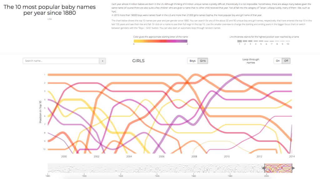
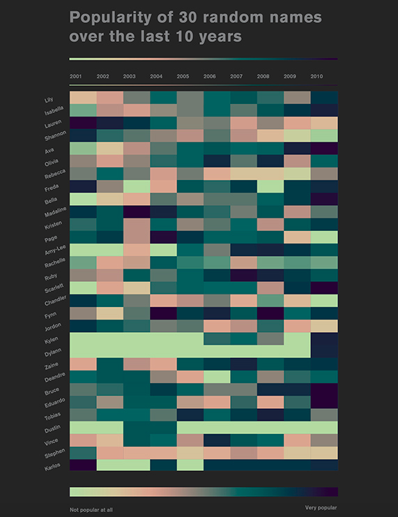
While researching data visualizations on this topic, I started seeing a trend in how the data was being displayed. As opposed to plain charts or graphs, many were visually and aesthetically unique with an emphasis on design. The two visualizations that I gathered from online portfolios provide information through strong use of color and shape.
Something I found particularly interesting about the line chart is the interactivity in how you can single out names either by clicking on one of the lines or by using the search box in order to see their trends over time. Something I wish the chart could enable is the ability to search any name (outside of the top ten provided) to see where it lies in comparison to the top rankings.
INTERACTIVE LINE CHART BY NADIEH BREMER
POPULARITY OF 30 RANDOM NAMES TABLE BY KYLEIGH BEZUIDENHOUT
Materials
- Tableau Public – Free data visualization software that enables online sharing.
- NYC Open Data – Online source for public data generated by a variety of NYC agencies.
- OpenRefine – Free open source tool that enables the cleaning, transforming, and exploring of messy datasets.
Methods
Research and Dataset Selection
My research topic came after exploring various public data sources such as NYC Open Data, Pew Research Center, and the CDC database. I was more drawn to NYC Open Data, finding it easy to explore a variety of topics, and their datasets seemed to be fairly clean. I came across the data on Popular Baby Names by gender and ethnicity (2011-2016). which immediately sparked my interest. I then expanded my search using this topic as a starting point to see if there were any other broader (location-wise) datasets available.
Originally, I had considered finding a dataset that listed popular names across the country, but ultimately chose to keep it narrow to a location I’m more familiar with. Having grown up in NYC, this allowed me to compare the data with my own knowledge and assumptions of the city’s trends. Therefore, I returned to the dataset found on NYC Open Data.
Analysis and Data Cleaning
After downloading the dataset, my first step was to use OpenRefine to view and explore the data, which was fairly clean and well organized. The few changes made are explained below:
- Combined duplicate ethnicity categories where one was only partially spelled out, and the other fully spelled out: “ASIAN AND PACI” and “ASIAN AND PACIFIC ILANDER”; “BLACK NON HISP” and “BLACK NON HISPANIC”; “WHITE NON HISP” and “WHITE NON HISPANIC”. All final categories fully spelled out the ethnicity.
- Child’s first names contained duplicates but with variations in capitalization. I chose to transform the column to all uppercase which combined any duplicates, for example “Sophia” and “SOPHIA” were combined to the uppercase version.
Visualization
Drawing on inspiration from other visualizations portraying name popularity, I uploaded the refined dataset to Tableau Public and began experimenting. In my first attempts I wasn’t aiming for any specific outcome—it was more like a practice in seeing what Tableau can do through trial and error.
By dragging dimensions into columns and rows and applying filters to the variables, patterns started to form.
Drawing on example visualizations I gathered for inspiration, I started focusing more on color and size by dragging dimensions into the categories in the “Marks” box. My main focus was in creating visualizations that would show the top names either by rank or count with the ability to filter by year, ethnicity, and gender.
Results and Interpretation
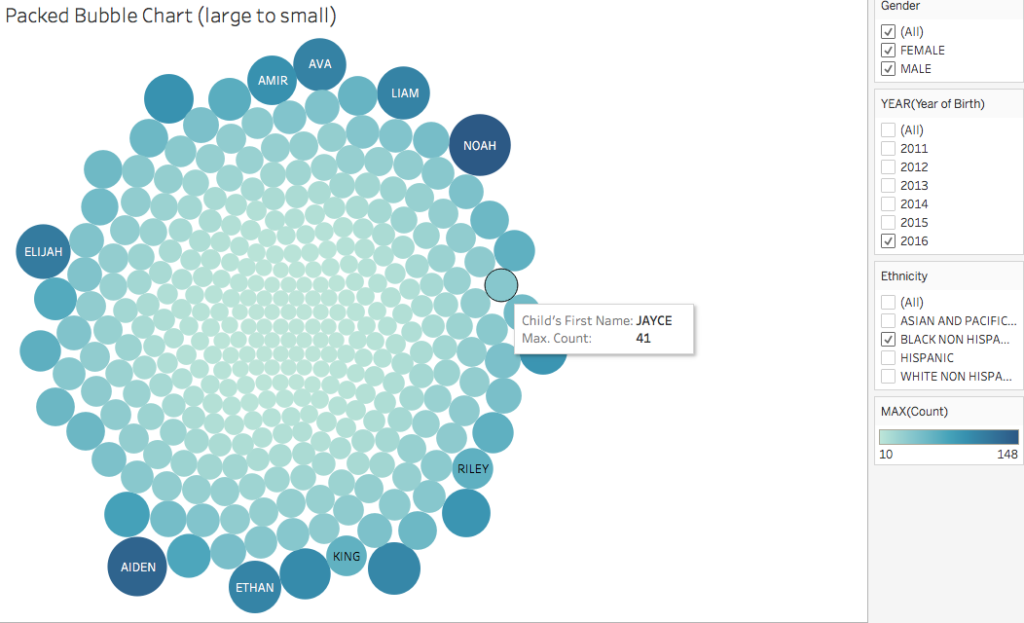
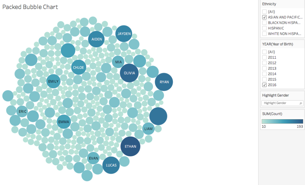
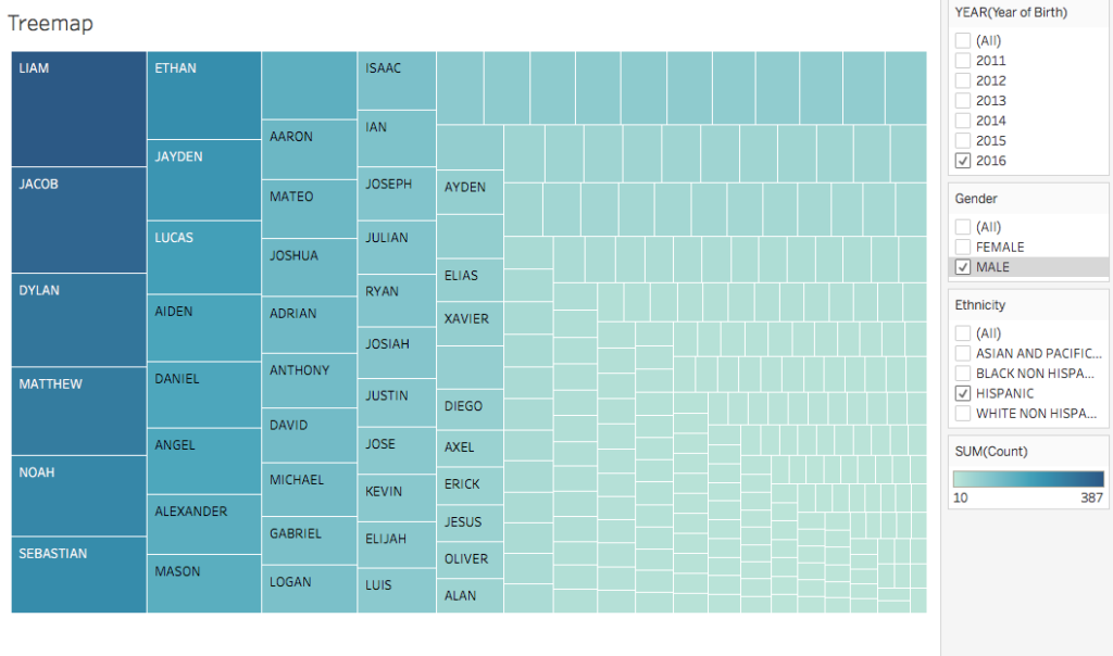
The packed bubble charts and treemap offer exploratory ways of interacting with the data as they use color and size to compare name popularities. They allow for filtering by year (2011-2016), gender, and ethnicity.
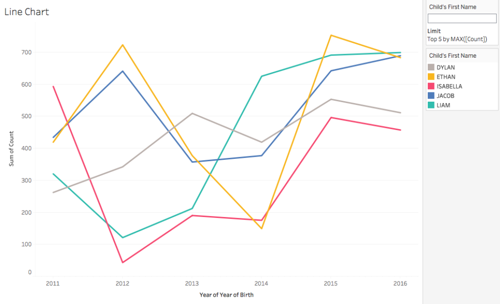
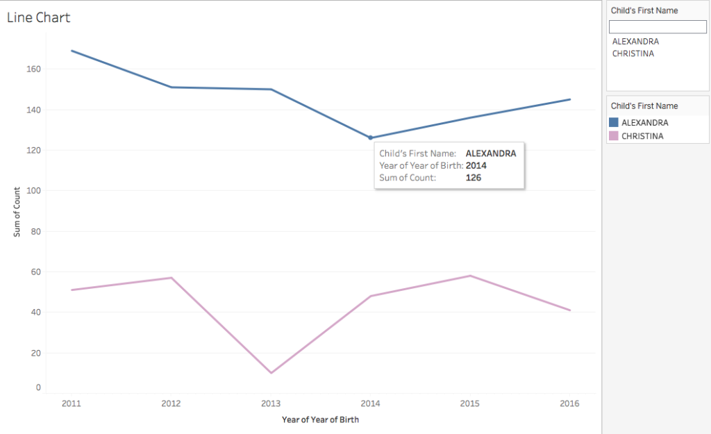
The line chart provides a view of the top five baby names by the overall count of births. The chart allows selection of individual names and takes it a step further by allowing viewers to specify any name(s) in the search box. As long as that name is in the dataset it will appear independently on the chart with a view of its popularity over the years. You can specify more than one name for comparison as well. It should be noted that the Sum of Count axis will change to represent the name(s) specified in the search box.
The visualizations offer a look at how names can rise and fall in popularity, a prominent example is Liam, which rose in popularity to a count of 625 in the year 2014 whereas in previous years it remained below 350.
An interesting discovery are the names particular to a variety of cultures and religions, for example the popularity of Hebrew names can indicate that NYC has a large Jewish population.
LINK TO FULL PROJECT ON TABLEAU PUBLIC
Reflection and Future Directions
My initial experience with Tableau Public was a lot more trial and error than I thought it would be, but after much practice and trying out a few different things I started to see a pattern and gained more control in working with the data to fit the visualizations I wanted. Learning how to use Tableau can be straightforward, but because I’m not familiar in working with datasets, it took more time to understand the technical aspects of the tool.
Reflecting on the visualizations themselves, the treemap and line chart were originally my least favorite, but I’ve come to realize that they are possibly the most informative and exploratory of them all. The treemap provides a clearer way of looking at comparisons as opposed to the bubble charts, mainly in how it is organized and easier to read. The line chart offers the flexibility of choosing specific names and comparing them with others, providing an opportunity for personalization and direct comparisons.
Future directions would be to explore the popularity of names over a greater span of years. Even further would be to examine top names for various regions across the world to see if there’s a trend in how popular names travel from places over time.
The post NYC’s Popular Baby Names 2011-2016 appeared first on Information Visualization.
